The next Chart Trader will be posted on Thursday morning, June 6th.
The weight of the evidence remains bullish for stocks. SPY and QQQ hit new highs and continue to lead the market. The S&P 500 EW ETF (RSP) and Russell 2000 ETF (IWM) did not exceed their spring highs and continue to lag. Large-caps and large-cap techs are the place to be. There are no setups for SPY and QQQ because both are extending after their early May breakouts. Today’s report will highlight a classic continuation breakout in TradeDesk and some bullish setups in the crypto world. Caveat Emptor!
%Above 200-day Remains Bullish
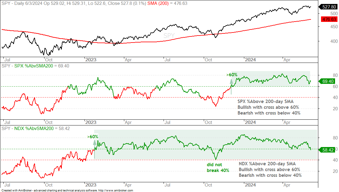
The percentage of stocks above the 200-day SMA remains net bullish for the S&P 500 and Nasdaq 100. SPX %Above 200-day is at 69.4% and has been above 60% since December 1st. No problem here. It is bullish until a cross below 40%, which is nowhere close. NDX %Above 200-day SMA fell below 60% and this means we are seeing less strength within the Nasdaq 100. At 58.42%, this indicator is at its lowest level since November 9th. Deteriorating breadth within the Nasdaq 100 is a concern, but this indicator will not turn bearish until a cross below 40%.
26-wk High-Low Percent Remains Bullish
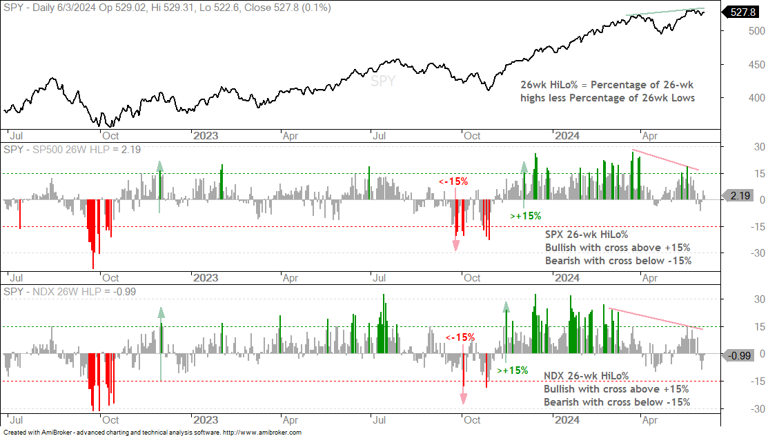
26-wk High-Low Percent is the percentage of stocks making 26-week highs less the percentage making 26-week lows. SPX 26wk High-Low Percent turned bullish with a move above +15% on December 1st and NDX 26wk High-Low Percent turned bullish with a move above +15% on November 14th. They remain bullish until a cross below -15%. As with the %Above 200-day SMA indicators, these are long-term market timing signals. I am also seeing less strength over the last few weeks. SPY and QQQ hit new highs in late May, but fewer stocks recorded 26wk Highs (red lines). While this may suggest a correction in the offing, these indicators would not turn bearish until both move below -15%.
4wk High-Low Percent is Bullish, but Mixed
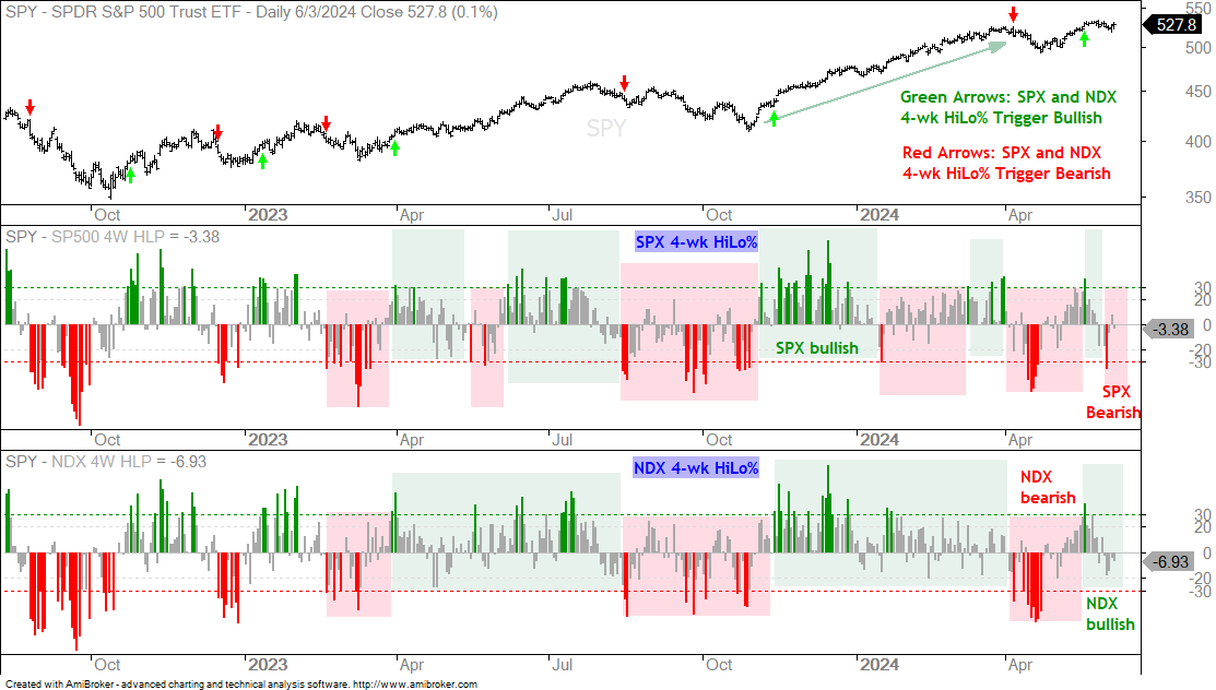
The next chart shows 4wk High-Low Percent for the S&P 500 and Nasdaq 100. These indicators are used for short-term trend timing. An uptrend signals when both exceed +30% and a downtrend signals when BOTH break below -30%. The red and green shadings show some signals for each index. The red and green arrows on the price chart show the combination signals. A bullish signal triggered on May 16th when both surged above +30%. SPX 4wk High-Low Percent plunged below -30% last week to turn bearish. This signal has yet to be confirmed by NDX 4wk High-Low Percent. Thus, the combo signal remains bullish. A plunge below -30% on NDX HiLo% would turn the indicator combo bearish and argue for a correction in the broader market.
SPY and QQQ Confirm Bearish Engulfing Patterns
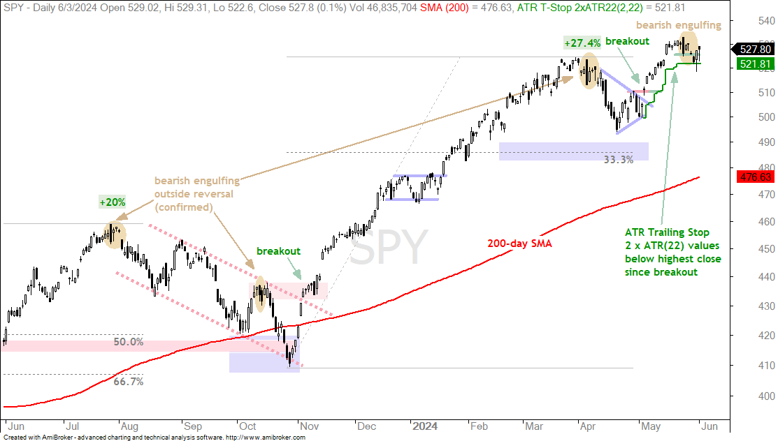
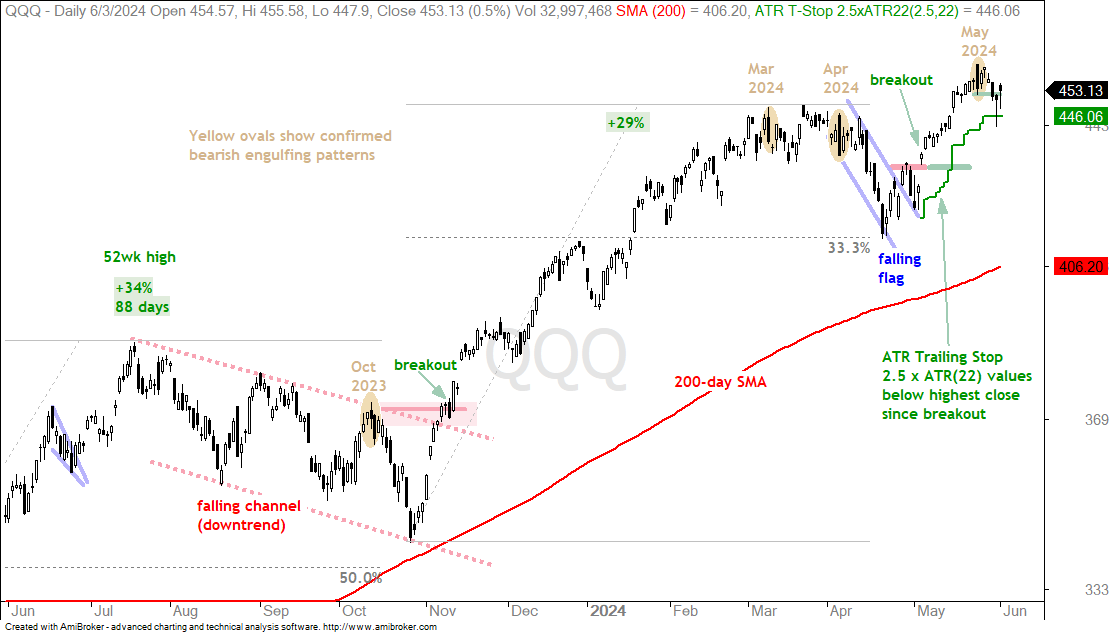
First, SPY remains in a long-term uptrend. The ETF is well above its rising 200-day SMA and recently recorded a 52-week high. The short-term trend is down because SPY close below the low of the bearish engulfing (and SPX 4wk HiLo% is bearish). This argues for a pullback within the bigger uptrend. SPY formed a large bearish engulfing pattern on May 23rd and confirmed this reversal with a close below the pattern low on May 30th. SPY bounced after this “confirmation”, but a bounce after a three day decline is fairly normal. For reference, SPY held the ATR Trailing Stop, which is 2 ATR(22) values below the highest close since the breakout on May 10th. A close below 521.81 would trigger this stop.
The next chart shows QQQ in an uptrend as well. The ETF is well above its 200-day SMA and it recorded a 52-week high in late May. As with SPY, QQQ formed a bearish engulfing pattern and confirmed this pattern with a break below the pattern low (green line). QQQ bounced on Monday, but I think the short-term trend is down and we could see more correction. Keep in mind that any weakness within a long-term uptrend is considered a correction that would lead to the next tradable pullback. For reference, the ATR Trailing Stop (2.5 x ATR(22)) is at 446.06 (call it 446).
The following charts show price bars with the 200-day SMA (red line), the 50-day SMA (green line), the price-relative (ITB/RSP ratio) with the 200-day SMA and the percentage difference between the 5 and 200 day SMAs. On the price chart, I am looking for tradable pullbacks within a bigger uptrend or bullish consolidation patterns. With the price-relative, I am looking for relative strength. The price-relative (ITB/RSP ratio) rises when the ETF or stock outperforms. And finally, the percentage difference between the 5 and 200 day SMA is bullish (long-term uptrend) with a move above 3% and stays bullish until a move below -3%. This basically measures the tide or long-term bias.
TLT Recovers after Short-term Support Break
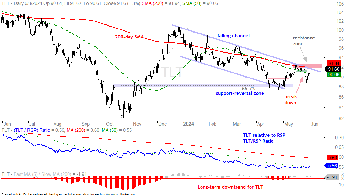
The 20+ Yr Treasury Bond ETF (TLT) broke short-term support last week with a sharp decline on Tuesday (28-May). TLT fell further on Wednesday and then surged the last three days. This move is impressive because TLT gained 3% in three days and closed back above the 50-day SMA. TLT is again at a moment of truth. The 200-day SMA, upper line of the falling channel and May highs mark the red resistance zone. A close above 92.5 would trigger a breakout and reverse the falling channel decline. This could be a big signal because a falling channel breakout would signal a continuation of the October-December surge and target a move to the 104 area.
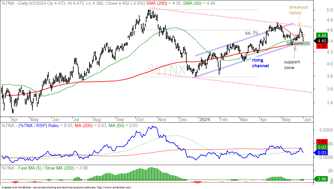
The next chart shows the 10-yr Treasury Yield with a mirror image. $TNX surged above 4.6% and then fell back to 4.4% the last three days. The upside breakout failed and a support test is at hand. A break below 4.3% would signal a continuation lower for Treasury yields. Rates fall for two reasons: lower inflation and slower growth.
S&P SmallCap 600 SPDR Forms Cup-with-handle
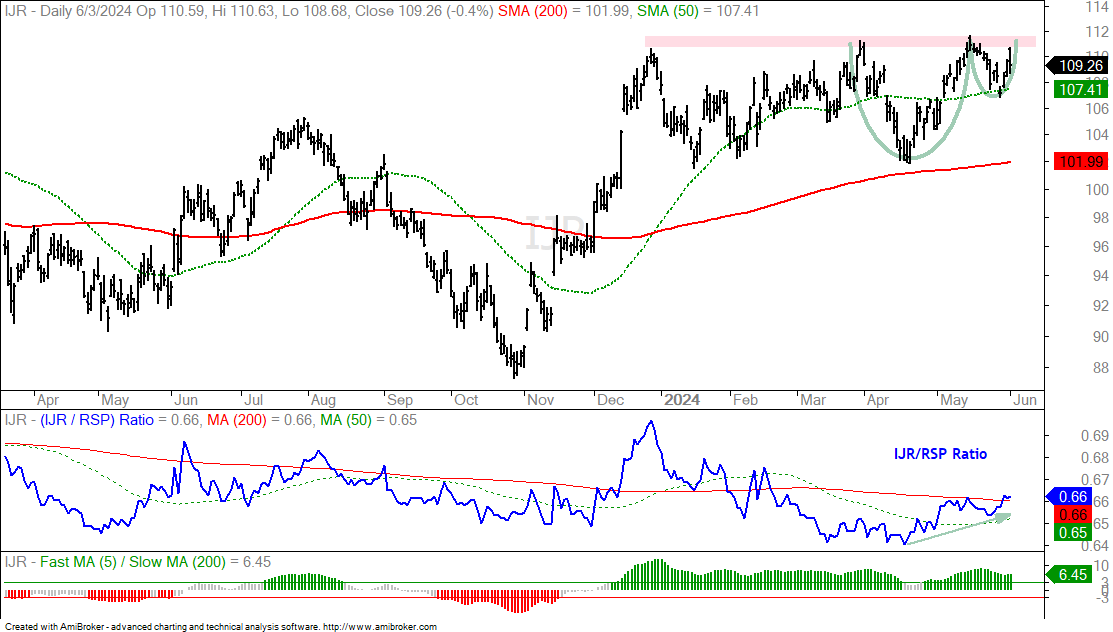
Even though short-term breadth, SPY and QQQ suggest a correction, I notice that the S&P SmallCap 600 SPDR (IJR) is setting up bullish. Note that small-caps are more sensitive to interest rates than large-caps and a breakout in TLT could be positive. IJR surged with the market in November-December and then moved into a trading range. The ETF established resistance in the 111-112 area and a breakout here would be bullish. The right side of the pattern shows a possible cup-with-handle, which is a bullish continuation pattern. A close below the 50-day SMA would negate this setup.
Weakness within the Tech Sector
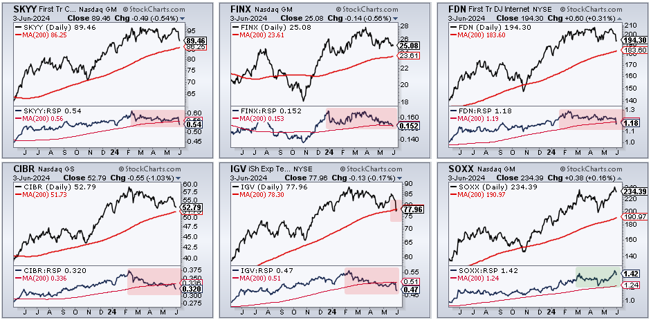
Five of the six tech-related ETFs were hit hard the last two weeks and are showing long-term relative weakness. The CandleGlance charts show the Cloud Computing ETF (SKYY), FinTech ETF (FINX), Internet ETF (FDN), Cybersecurity ETF (CIBR), Software ETF (IGV) and Semiconductor ETF (SOXX). The main window shows a line chart with the 200-day SMA and the indicator window shows the price-relative (SOXX/RSP ratio) with the 200-day SMA. SOXX is the only one that hit a new high in late May and the only one with a price-relative (SOXX/RSP ratio) above its 200-day SMA. The other price-relatives are below their 200-day SMAs and showing long-term relative weakness (red shading). IGV even closed below its 200-day SMA as software stocks were hit hard the last two weeks. Basically, only one group is holding up within the tech sector (semis).
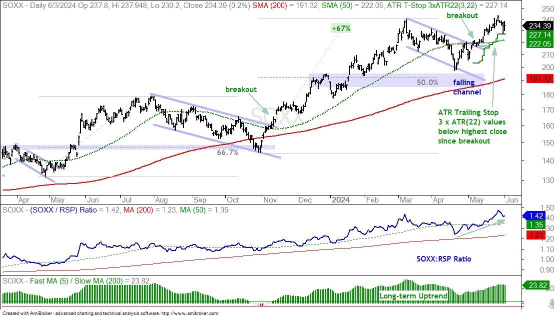
The next chart shows the Semiconductor ETF (SOXX) with a breakout on May 6th and a follow through advance to new highs. SOXX is the only one of the six to hold its breakout. The rest failed. I do not see a setup on the SOXX chart. It is simply extending on its early May breakout. For reference, the ATR Trailing Stop (3 x ATR(22)) is at 227.14.
Bitcoin ETF Holds Breakout
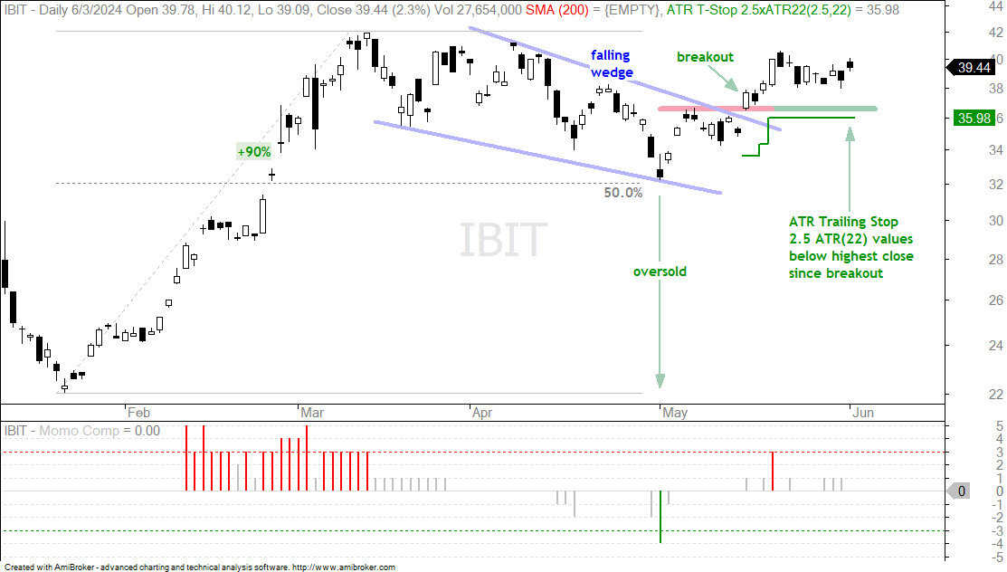
The Bitcoin ETF (IBIT) was featured on May 16th as it broke out of the falling wedge and highlighted several crypto-related names on May 28th. I will not rehash the setup and breakout, but instead update the ATR Trailing Stop. IBIT broke out and this breakout is holding as the ETF consolidates just above the breakout zone. Broken resistance (red line) turns first support and a strong breakout should hold. The ATR Trailing Stop (2.5 ATR(22)) is just below the breakout level. A close below 35.98 would negate the breakout.
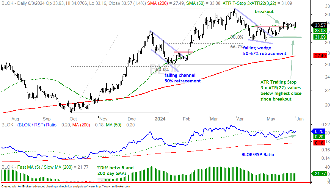
The next chart shows the Transformational Data Sharing ETF (BLOK) with a breakout on May 20th and a consolidation the last two weeks. We have yet to see an extension or follow through, and the breakout has yet to fail. The mid May low, just before the breakout, marks the re-evaluation level at 31. This level also coincides with the ATR Trailing Stop (3 ATR(22)).
Biotech SPDR Consolidates after Breakout
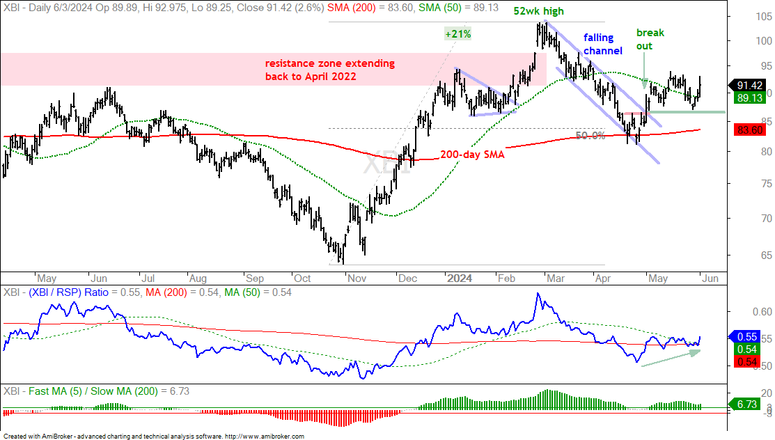
The Biotech SPDR (XBI) was featured on May 2nd with a falling channel breakout and on May 21st with a weekly chart for a long-term perspective. This is an update on the channel breakout from May 2nd. XBI broke out at 87 on May 2nd and closed above 92 two weeks later (follow through). It fell back last week, tested the breakout zone (green line) and bounced the last three days. This bounce affirms support here and a close below 86 would negate the breakout. This is pretty much the strategy at work. Look for a corrective pattern within a long-term uptrend, trade the breakout and identify the level where the breakout would fail. Implement a stop-loss or profit target should the breakout extend.
Oil Extends Lower after Channel Break
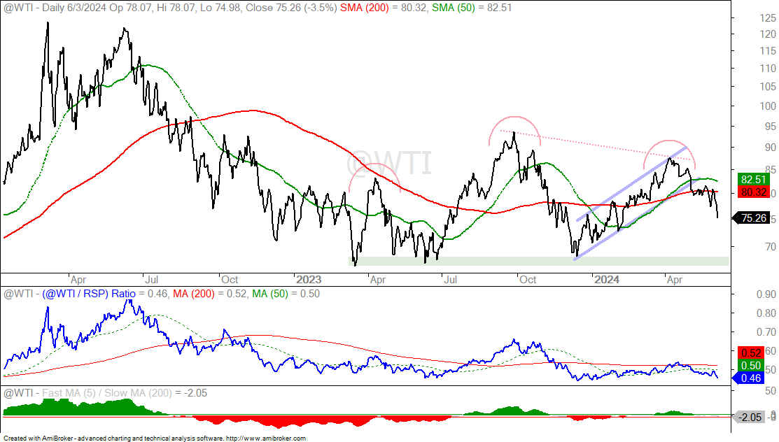
West Texas Intermediate ($WTIC) was featured on May 16th as it broke channel support. This rising channel was also the right shoulder of a head-and-shoulders continuation pattern. Oil toyed with its 200-day SMA (red line) after the break and then extended sharply lower. The next support zone is in the 66-67 area, which is also neckline support. Energy stocks are not an option when oil is below its 200-day SMA.
Berkshire Challenges Wedge Resistance
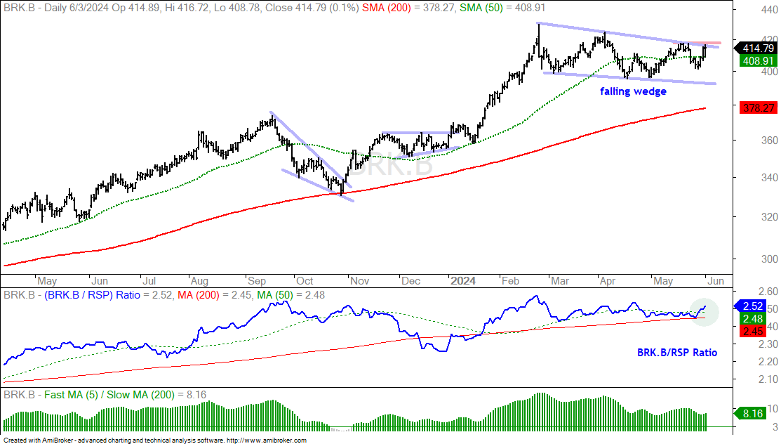
The next chart shows Berkshire Hathaway (BRK.B) with a new high in February, a falling wedge correction into May and a surge to wedge resistance over the last three days. The falling wedge is deemed a correction within a bigger uptrend and a breakout would signal a continuation higher. The BRK.B/RSP ratio held its 200-day SMA last week and moved back above the 50-day SMA (green circle). This means the stock is showing relative strength again.
Booking.com Holds Breakout
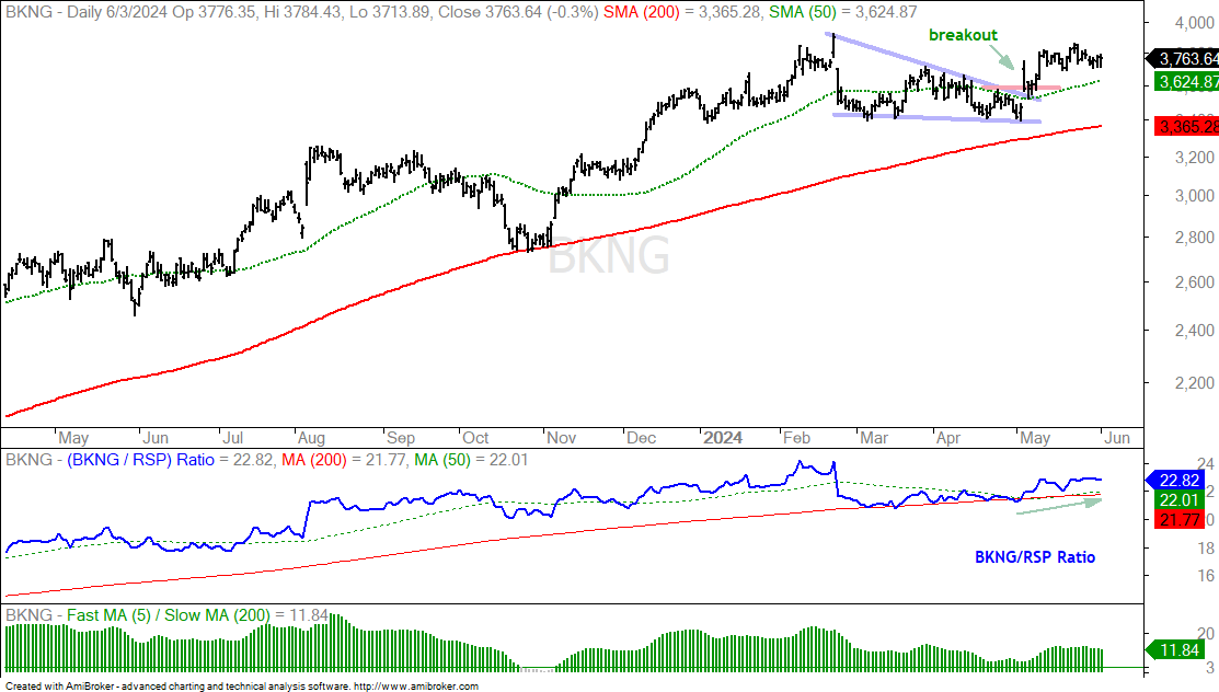
The next chart shows Booking.com (BKNG) with a falling wedge into early May and a breakout in mid May. BKNG extended after the breakout and remains above the 50-day SMA (green line). A close below the 50-day would negate this breakout.