Breadth Shows Energy and Utilities Leading Tech – Finding Mean-Reversion Setups

Breadth Shows Energy and Utilities Leading Tech – Finding Mean-Reversion Setups

Welcome to the Chart Fix!

Technology and Communication Services led the market since April, but they are not the strongest sectors when measuring internal strength. Energy and Utilities still stand out with the highest percentage of stocks in uptrends. The Utilities SPDR, in particular, looks interesting with a long-term uptrend and an oversold setup brewing.

  • Energy and Utilities Lead Sector Breadth
  • XLU in Uptrend with Bullish Long-term Breadth
  • A Mean-Reversion Setup using Short-term Breadth

Recent Reports, Signals and Master ChartList

  • Breadth Lags, but Models Remain Bullish and Yield Spreads Narrow
  • Stock Setups in Defense, Materials and Biotechnology
  • Semis Hit Extreme as Industrials & Materials Hold Breakouts
  • Trend Trio Signals for Dow 30 Stocks and the 11 Sectors
  • Click here to take a trial and gain full access.

Energy and Utilities Lead Sector Breadth

The table below shows the percentage of stocks above their 200-day EMAs for the 11 sectors and the S&P 500. Three things stand out. First, the S&P 500 is in the middle with 55.6% of its stocks above their 200-day EMAs. While 55.6% of SPX stocks are in long-term uptrends, 44.4% are below their 200-day EMAs and in long-term downtrends. With the S&P 500 trading at new highs, this percentage is rather large.

Second, the Energy SPDR (XLE) and the Utilities SPDR (XLU) have the highest percentage of stocks in long-term uptrends, 90.91% and 74.19%, respectively. There is still broad strength in these sectors.

Third, the Consumer Discretionary sector has the lowest percentage of stocks in uptrends. Only 31.25% of stocks are above their 200-day EMAs, which means 68.75% are in long-term downtrends. This is the most economically sensitive sector and it is by far the weakest of the eleven.

Something is rotten in the kingdom of the stock market.

XLU in Uptrend with Bullish Long-term Breadth

The next chart shows the Utilities SPDR (XLU) with XLU High-Low Percent ($XLUHLP), XLU %Above 200-day EMA (!GT200XLU) and the PPO(5,200,0). High-Low Percent is the percentage of 52-week highs less the percentage of 52-week lows. PPO(5,200,0) measures the percentage difference between the 5 and 200 day EMAs.

XLU is in an uptrend because the PPO(5,200,0) is positive. Smoothing the close with a short moving average can reduce, but not fully eliminate, whipsaws. The PPO whipsawed in April and remained positive in January. Currently, the 5-day EMA is 1.898% above the 200-day EMA.

The middle window shows High-Low Percent in positive territory for almost all of 2026. High-Low Percent exceeded 40% in February, March and April, but softened in May and even dipped into negative territory for two days (-3.23%). Despite this negative dip, new highs are outpacing new lows throughout 2026 and this indicator remains bullish. The trouble starts when new lows expand significantly and High-Low Percent moves below -10%.

The bottom window shows the percentage of XLU stocks above their 200-day EMAs. This indicator has been above 50% (pink line) for over two years and is currently at 74.19%. The vast majority of stocks are in long-term uptrends. This sector is where chartists should be looking for individual stock setups.

A Mean-Reversion Setup using Short-term Breadth

The next chart shows XLU with XLU %Above 20-day EMA, which is a short-term breadth indicator. In general, short-term indicators are best suited for mean-reversion setups. In contrast, long-term indicators, such as %Above 200-day EMA, are better suited for trend signals.

First, the price chart shows XLU hitting a new high in late February and then correcting since March. This looks like a consolidation after the January-February surge, which makes it a bullish continuation pattern. A breakout at 47.5 would end the correction and signal a continuation higher. Chartists looking for a jump on this breakout can watch for a short-term breadth thrust.

A mean-reversion setup occurs when %Above 20-day EMA moves below 10% and becomes oversold during a long-term uptrend. The bottom window shows oversold conditions in September, December-January, March, April and May. The blue dashed arrow lines show when the indicator surges above 80%, after being oversold. This shows a participation thrust that can signal the end of a pullback.

A bullish signal triggered in early April, but %Above 20-day EMA fell back below 10% in late April and early May. Another setup is in the making. A surge above 80% would confirm this setup and trigger a bullish signal.

Recent Reports, Signals and Master ChartList

  • Breadth Lags, but Models Remain Bullish and Yield Spreads Narrow
  • Stock Setups in Defense, Materials and Biotechnology
  • Semis Hit Extreme as Industrials & Materials Hold Breakouts
  • Trend Trio Signals for Dow 30 Stocks and the 11 Sectors
  • Click here to take a trial and gain full access.

Rotation Investor NDX100 – Ranking Table

This page covers the ranking table for the rotation strategy trading Nasdaq 100 stocks (RO-Investor-NDX). The ranking table includes the sector and industry for sorting to find specific groups (software, semiconductor). Table indicators include the Momentum Rank, PPO Trend (up/down), Broad Breadth Model (bull/bear), the NDX momentum indicator and the 5-day change in momentum. The default sort puts the strongest stocks at the top and each stock includes a SharpChart link.

Rotation Investor NDX100 – Ranking Table Read More »

Rotation Investor NDX100 – Signals & Portfolio

This page covers the signals and portfolio for the rotation strategy trading Nasdaq 100 stocks (RO-Investor-NDX). The strategy starts with our stock market breadth model to define the broad market environment. There is a table showing the current portfolio, gain/loss and new entry/exit signals. Two sidebars make it easy to compare the current ranking with the prior week’s ranking, and see which stocks made the cut. A second table shows the most recent closed positions with their gain/loss and bars traded.

Rotation Investor NDX100 – Signals & Portfolio Read More »

Rotation Investor SPX500 – Signals & Portfolio

This page covers the signals and portfolio for the rotation strategy trading S&P 500 stocks (RO-Investor-SPX). The strategy starts with our stock market breadth model to define the broad market environment. There is a table showing the current portfolio, gain/loss and new entry/exit signals. Two sidebars make it easy to compare the current ranking with the prior week’s ranking, and see which stocks made the cut. A second table shows the most recent closed positions with their gain/loss and bars traded.

Rotation Investor SPX500 – Signals & Portfolio Read More »

Rotation Investor ETF – Signals and Portfolio

This page covers the signals and portfolio for the rotation strategy trading ETFs (RO-Investor-ETF). The strategy starts with our stock market breadth model to define ETF eligibility. There is a table showing the current portfolio, gain/loss and new entry/exit signals. Two sidebars make it easy to compare the current ranking with the prior week’s ranking, and see which ETFs made the cut. A second table shows the most recent closed positions with their gain/loss and bars traded.

Rotation Investor ETF – Signals and Portfolio Read More »

Rotation Investor SPX500 – Ranking Table

This page covers the ranking table for the rotation strategy trading S&P 500 stocks (RO-Investor-SPX). The ranking table includes the sector and industry for sorting to find specific groups (housing, semiconductor). Table indicators include the Momentum Rank, Trend Filter (strong/not), Broad Breadth Model (bull/bear), the SPX momentum indicator and the 5-day change in momentum. The default sort puts the strongest stocks at the top and each stock includes a SharpChart link.

Rotation Investor SPX500 – Ranking Table Read More »

Trend Trio Signals & Momentum Scores: ETF Master List (250+ ETFs)

This page tracks Trend Trio signals and momentum ranking for over 250 ETFs. Users can identify new trend signals, track existing signals and see the percentage change. Sortable columns make it easy to filter for uptrends and then sort by momentum to rank trend strength. The table includes links to a StockCharts chart with corresponding indicators.

Trend Trio Signals & Momentum Scores: ETF Master List (250+ ETFs) Read More »

Stock Market Model – Current Signal

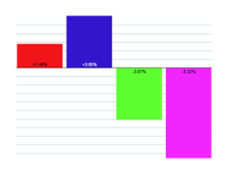
Updated at the end of every week (usually Saturday mornings), this page shows charts and current signals for the Broad Breadth Model (BBM). The model uses an array of breadth indicators from various indexes for a weight of the evidence approach to assess conditions for the broader stock market (large-caps, mid-caps, small-caps). Stock market conditions are favorable when this model is bullish (positive) and unfavorable when the model is bearish (negative).

Stock Market Model – Current Signal Read More »

Rotation Investor ETF – Ranking Table

This page covers the ranking table for the rotation strategy trading ETFs (RO-Investor-ETF). The ranking table shows the ETF universe with a sortable prefix, which makes it easy to find specific groups (tech ETFs, commodity ETFs). Table indicators include the Momentum Rank, Trend Trio (up/down), Broad Breadth Model (bull/bear), the momentum indicator and the 5-day change in momentum. The default sort puts the strongest ETFs at the top and each ETF includes a SharpChart link.

Rotation Investor ETF – Ranking Table Read More »

Scroll to Top