")
The Infrastructure ETF (IFRA) came to life here in October with a six percent surge that could signal the beginning of the end for a long correction. IFRA underperformed from May to mid September, but is now showing some relative strength. We will look at the long-term picture and show how to time the swing within a pattern to get the jump on a possible breakout.
The chart below shows IFRA surging some 58% from late September to early May 2020 and then embarking on a rather long correction into September. This looks like a correction for four reasons. First, the ETF was entitled to a rest after a 58% decline. Second, the decline was just 7.5% and retraced around a quarter of the prior advance. This is pretty mild for a pullback. Third, the ETF found support near the rising 200-day. And finally, a big consolidation formed and a consolidation after a sharp advance is typically a bullish continuation pattern. As such, the odds favor a breakout and continuation higher.
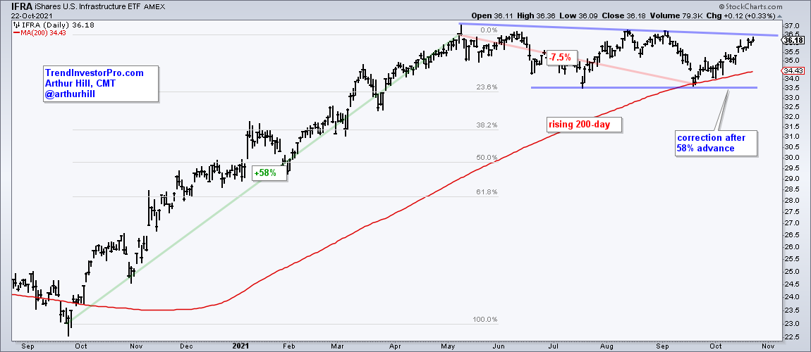
Attention now turns to price action since May and the consolidation to time an upswing within the pattern. IFRA fell from May to mid July and underperformed the S&P 500 (green/red lines). Notice how SPX moved higher when INFR moved lower. Even though IFRA broke out in late July, it was not from a position of strength and the breakout attempt failed.

Fast forward to the present and we can see another short-term breakout in mid October. This breakout occurred from a position of strength because IFRA held up better than SPX from late September to early October (green/red lines). Notice that IFRA forged a higher low when SPX forged a lower low. IFRA went on to break short-term resistance and the swing within the bigger correction is up. The green zone marks support at 34.8-.35 and a break below this area would call for a re-evaluation.
There are a number of ETFs with similar patterns at work and these were featured at TrendInvestorPro this week. Commentary highlights include:
- Biotech Spotlight: Top Stocks, IBB and XBI
- Broadening Participation, Seasonal Patterns and 10-yr Yield
- ETFs Related to the Materials and Industrials Sectors Trigger Signals
- Essential Breadth Indicator ChartList (100+ Charts & Dozens of Indicators)
- Weekend Video covering Broad Market, ETF Trends, Patterns and Setups