")
Today’s report to put trend and volatility together so we can identify the best conditions, the worst conditions and the questionable conditions. Most of us know that current conditions are the worst for stocks because we are in a bear market with high volatility. We will chart volatility to show when it is deemed high and then compare volatility using tables for the major index ETFs, sectors and commodity ETFs. Charts for SPY, QQQ, XLE, XLV and GLD are also included.
About the ETF Trends, Patterns and Setups Report
This report contains discretionary chart analysis based on my interpretation of the price charts. This is different from the fully systematic approach in the Trend Composite strategy series. In this ETF Trends, Patterns and Setups report, I am looking for leading uptrends and tradable setups within these uptrends. While I use indicators to help define the trend and identify oversold conditions within uptrends, the assessments are mostly based on price action and the price chart (higher highs, higher lows, patterns in play). Sometimes the chart assessment can be at odds with the indicators.
You can learn more about my chart strategy in this article covering the different timeframes, chart settings, StochClose, RSI and StochRSI.
Trend and Volatility Scenarios
There are basically two trends and two conditions for stock prices: uptrend, downtrend, high volatility and low volatility. We could add trading range and average volatility for more nuance, but I will stick to the first four for now. This means we have four different combinations possible:
- uptrend with low volatility (best scenario)
- uptrend with high volatility (risk increasing)
- downtrend with low volatility (risk decreasing)
- downtrend with high volatility (worst scenario)
Obviously, the ideal trading environment is an uptrend with low volatility, which we had for almost all of 2021. The current environment is the least ideal: downtrend with high volatility. High volatility often accompanies a downtrend and basically doubles the risk.
SPY Is in a Downtrend with High Volatility
The chart below shows SPY with Bollinger Bands (125,1) on the price chart and three volatility measures. The Bollinger Bands are set 1-Standard Deviation above/below the 125-day SMA. Volatility is increasing when the bands widen and decreasing when the bands narrow. The 22-day SMA of the 1-day Absolute Rate-of-Change tells us the average percentage move over the past month and it has been above 1% since late April (red). The 22-day Annualized Standard Deviation of log price changes represents monthly volatility and has been above 20% since late April (red). Bollinger BandWidth (125,1) represents the percentage difference between the upper and lower Bollinger Bands and it has been rising since February (above the 125-day SMA).

Notice that the volatility measures on the chart above were under control in 2021, except for a brief pop in late December (red bars). Currently, the 22-day average change in SPY is 1.5% and the monthly Standard Deviation is near 30%. These numbers confirm that volatility is high and this means risk is above average. BandWidth is above 12% and at its highest level since October 2020. High volatility also explains why bear market rallies can be so sharp.
Comparing Volatility Values
Volatility measures are relevant to the ETF or stock, but can also be compared. We use the charts to determine when volatility levels are relatively high for each ETF. For example, compare 2021 levels with 2022 levels. We can also compare levels against other ETFs. QQQ inherently has higher volatility than SPY, and the Technology SPDR (XLK) has higher volatility than the Consumer Staples SPDR (XLP). As such, I set the thresholds a little higher for QQQ. The next chart shows QQQ with the 22-day SMA of 1-day Abs ROC above 1.5% for most of the time since February. The monthly annualized standard deviation has been above 30% and BandWidth has been rising since late February. This is also a downtrend with high volatility.

The Trend Composite aggregates signals in five trend indicators: Bollinger Bands (125,1), Keltner Channels (125,2), 5-day Rate-of-Change of 125-day SMA, StochClose (125,5) and CCI-Close (125). The Trend Composite and ten other indicators are part of the TIP Indicator Edge Plugin for StockCharts ACP
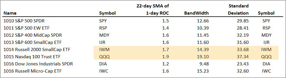
Volatility Tables for Major index ETFs and Sectors
We cannot use volatility indicators to generate bullish and bearish signals. These indicators simply represent conditions and allow traders to put risk into perspective. QQQ is clearly more volatile and riskier than SPY because its volatility measures are generally higher. The table below shows the volatility indicator values for the major index ETFs. QQQ and IWM are the most volatile of the group (yellow shading), while the S&P 500 EW ETF (RSP) and Dow Diamonds (DIA) are the least volatile. Expect a wilder ride if trading QQQ and IWM.
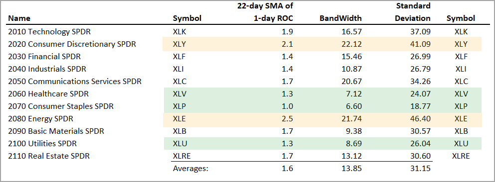
The next table shows the sector SPDRs with the volatility indicators. The Consumer Discretionary SPDR (XLY) and Energy SPDR (XLE) stand out as the most volatile sectors with the Technology SPDR (XLK) not far behind. XLK and XLY are in downtrends, but XLE is in an uptrend. It is also the most volatile sector and this means traders should brace themselves for a wild ride. Note that an uptrend with high volatility means risk is increasing.
You can learn more about exit strategies in this post,
which includes a video and charting options for everyone.
Comparing XLV to XLE
The chart below shows XLV, which is one of the best houses in a bad neighborhood. The bear market is the neighborhood and XLV is a stock-based ETF (one of the houses). This means it is vulnerable because the neighborhood is not what it used to be. XLV is in a downtrend now and volatility has been above average since mid February. Even though its volatility relatively low compared to the other sectors, its volatility levels are much higher now than in 2021. XLV is the one of the better houses in the neighborhood because it is one of the few sectors that got back above its February-May lows.

The next chart shows XLE falling back into the Bollinger Band area with a sharp decline in June. The long-term trend is still up, but volatility is rearing its ugly head as the 22-day SMA of the Absolute 1-day Rate-of-Change nears 2.5%. The red bars show when this indicator is above 2% and most bars are red since early May. The standard deviation is also mostly red with most bars above 40% since early May. XLE is in an uptrend, but it is less than ideal right now. The same applies for the other energy-related ETFs.

Traders wishing to manage volatility can consider position sizing, which is what the Turtle Traders and many trend followers do. Basically, the size of the position is reduced when volatility is above average. XLE volatility is well above the average and traders wishing to lessen risk can consider smaller positions (say 50% of a normal positions).
The Momentum Composite aggregates signals in five momentum-type indicators to identify short-term overbought and oversold conditions. This indicator is part of the TIP Indicator Edge Plugin for StockCharts ACP
Commodity-Based ETFs
The next table shows the commodity ETFs with the volatility values. The Gold SPDR (GLD), DB Agriculture ETF (DBA) and Sugar ETF (CANE) have the lowest volatility of the group. The Palladium ETF (PALL), Coffee ETF (JO) and Wheat ETF (WEAT) have the highest volatility and the most risk. DBA, CANE, WEAT and JO were featured on Tuesday.
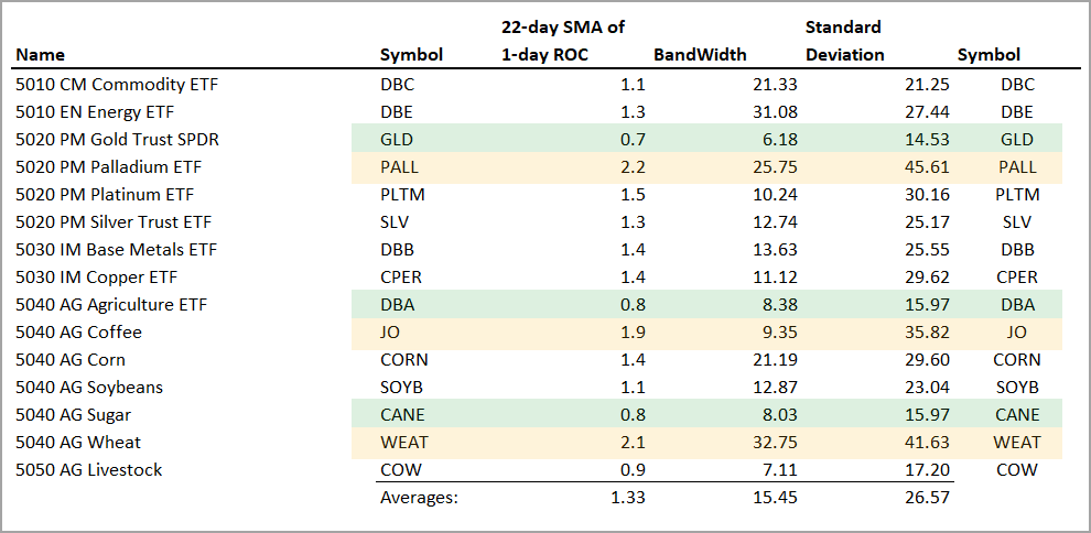
The Gold SPDR (GLD) remains in a downtrend with relatively low volatility. A break above 175 is needed to reverse the falling channel.

Charting Note
I am using the 22-day Annualized Standard Deviation of Log Price changes. This is a mouthful. Many charting sites have the Standard Deviation of closing prices, which is NOT the same. This is a point-based number, not a percentage based number that can be compared against itself over time and against other ETFs. StockCharts uses the close-based Standard Deviation and I could not find this indicator on TradingView (affiliate link here). I was, however, able to plot the 1-day Abs(ROC) and add a 22-day SMA to the indicator.

Previous Commentary and Video
Wednesday Market and ETF Video (here)
Market Regime Update with Breadth Model and Yield Spreads (here)
Topics Covered in Tuesday’s Report (here)
- Bear Market Bounces and Credit Spreads
- Big Bounces in High Beta ETFs
- SPY Enters Resistance-Reversal Zone
- Oil Bounces off Support-Reversal Zone ($WTIC)
- Nat Gas Hits Support-Reversal Zone (!NG)
- Energy SPDR Becomes Oversold at Support (XLE)
- Pullbacks, Falling Knives and Overshoots (XES)
- Wheat ETF Plunges to Prior Uptrend (WEAT)
- Big Three Drag Down the DB Agriculture ETF (DBA)
- Sugar ETF Enters Support-Reversal Zone (CANE)
- Coffee ETF Fails to Follow Through (JO)
- Follow Through on Short-term Breakouts (XBI, ICLN, LIT)
You can learn more about my chart strategy in this article covering the different timeframes, chart settings, StochClose, RSI and StochRSI.