

Video and Report Headlines
- 4wk High-Low Percent Combo Remains Bullish
- Big Surge in Small-cap Participation
- Outsized Moves for IWM, MAGS and XLK
- IPAY and FINX: Price and Relative Strength Breakouts
- A Dozen Stocks for Your Setup/Signal List
- GEHC,BIIB,TECH,TRMB,IT,CSX,PHM,ADM,URI,VZ,FTNT,SPG
The next Chart Trader will be posted on Tuesday morning, July 23rd.
This report starts with the big breadth surge in small-caps. We put this surge into perspective and show what it means going forward. The surge in small-caps, however, was offset with outsized declines in large-cap tech stocks. We will show charts for MAGS and XLK to put these declines into perspective and mark the first support zones to watch. And finally, banks led the surge in small-caps and we will feature two fintech ETFs. This report ends with a dozen stock setups and signals on a CandleGlance chart.
4wk High-Low Percent Combo Remains Bullish
The next chart shows 4wk HiLo% for the S&P 500 and Nasdaq 100. First, note that SPX 4wk HiLo% surged to +53% last week and this was the highest reading since mid December. This is a short-term breadth thrust that shows a big increase in upside participation. It is a bullish signal, especially for small-caps and mid-caps. Short-term, SPX and NDX 4wk HiLo% turned bullish on May 15th for a bullish combo signal. SPX 4wk HiLo% turned bearish in late May, but the bullish combo signal was not reversed because NDX 4wk HiLo% stayed bullish. Most recently, SPX 4wk HiLo% surged back above 30% to turn bullish and both indicators are bullish again.
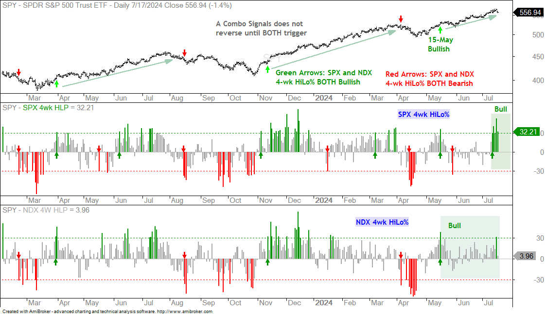
The 4wk High-Low Percent indicators turn bullish with a move above 30% and bearish with a move below -30%. For short-term market signals, a bullish combo signal triggers when BOTH are bullish and this remains in place until BOTH turn bearish. Note that a bullish (bearish) combo signal does not reverse when just one turns bearish (bullish).
Big Surge in Small-cap Participation
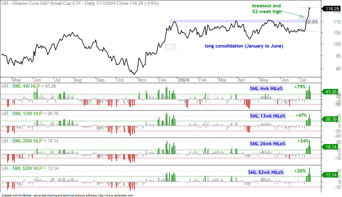
The next chart shows the High-Low Percent indicators for the S&P SmallCap 600 SPDR (IJR). These include 4-week, 13-week, 26-week and 52-week High-Low Percents. The green numbers show the levels achieved on Tuesday’s close: 4wk HiLo% (+79%), 13wk HiLo% (+47%), 26-wk HiLo% (+34%) and 52-wk HiLo% (+26%). These levels are above the mid December levels, which means we are seeing serious upside participation. This is the December moment for small-caps. If you will recall, there was a massive breadth surge in within S&P 500 and Nasdaq 100 from early November to early December. This surge foreshadowed an extended advance into mid March. Before leaving this chart, notice that IJR broke a big resistance zone with the surge over the last two weeks. The breakout zone and 50% retracement mark first support should we see a throwback.
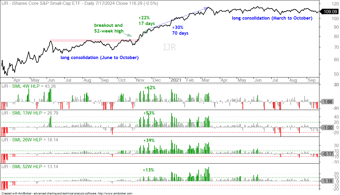
The breadth surge in small-caps is the largest since November 2020. The chart below shows IJR and the same indicators from March 2020 to April 2021. IJR surged from March to June 2020 and then consolidated until October (four months). The ETF then broke out with a big move in November (+22% in 17 trading days). There was no throwback to the breakout zone as IJR continued higher over the next few months. The ETF gained another 30% over the next 70 trading days, but then moved into a long consolidation from March to October 2021. This is the story with small-caps: short-term surge, medium-term continuation and long-term consolidation. I think we are entering the medium-term continuation period.
Outsized Moves for IWM, MAGS and XLK
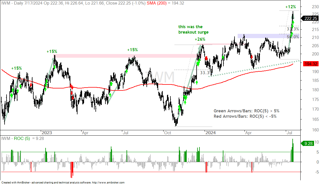
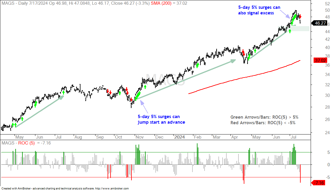
The next charts show the Russell 2000 ETF (IWM), Mag7 ETF (MAGS) and Technology SPDR (XLK) with the 5-day Rate-of-Change. IWM surged over 10% in 5 days for an outsized gain, but MAGS and XLK fell over 5% for outsized declines. IWM represents small-caps and MAGS represents the big seven (NVDA, MSFT, GOOGL, AMZN, AAPL, META, TSLA). Tesla (TSLA) is by far the smallest of the group, sorry Elon. In any case, IWM represents one end of the market (small-caps) and MAGS represents the other end (largest of the large). Note that the total market cap for the Russell 2000 is around $3.2 trillion, which is still less than the market cap of Apple ($3.5 trillion). Wow!
The first chart shows IWM with the 5-day Rate-of-Change (ROC) hitting 11.52% on Tuesday’s close. This is the largest 5 day advance since the surge off the covid low (March 2020). The green arrows/bars show prior 5-day surges that were greater than +5% and the red arrows/bars show 5-day plunges that were greater than -5%. We can see some green arrow clusters when IWM advanced 15%. See the three +15% labels on the chart. IWM surged 26% into December 2024 and broke out to new highs. This was the big breakout surge. The ETF then meandered around for six months and surged here in July. This is an outsized move that could jump start a sustained advance, but this follow through will likely be at a slower pace. The 210-215 area marks a support zone to watch should we see a throwback.
The next chart shows MAGS with 5-day ROC. Coming off a low or a pullback, a 5-day 5% surge can jump start an extended advance. See late April 2023, November 2023 and March 2024. We also saw a string of 5-day 5% surges from July 1st to July 10th (six). These occurred after an extended advance (late April to late June) and marked a sign of excess (froth). MAGS fell sharply the last five days (-7.16%) and this decline is working off these excesses. I view this as an outsized decline that signals the start of a corrective process. The June consolidation marks first support in the 44-46 area.
The next chart shows the Technology SPDR (XLK) with 5-day ROC. On the far left, we can see a decline starting with a 5-day -5% plunge in August 2022. This decline also started below the falling 200-day SMA. 5-day +5% surges kicked off big advances in January 2023, November 2023 and May 2024 (blue arrow-lines). The red shading marks two areas were outsized declines (-5% in 5 days) marked the beginning of the end of the pullback. Currently, XLK fell 5.6% the last five days and gapped down on Wednesday. I view this as a breakaway gap and outsized decline that is signaling the start of a correction within a bigger uptrend. The blue shading marks a Support-Retracement Zone in the 21-22 area. Broken resistance turns into support and the 50% retracement resides here as well. This is the first area to watch for a bounce.
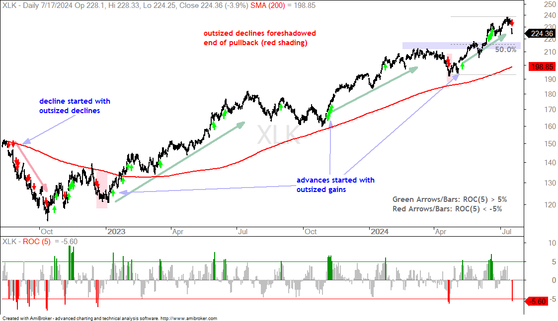
Chart Analysis, Setups and Trading Ideas
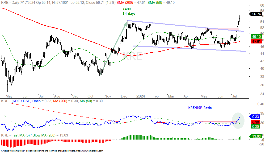
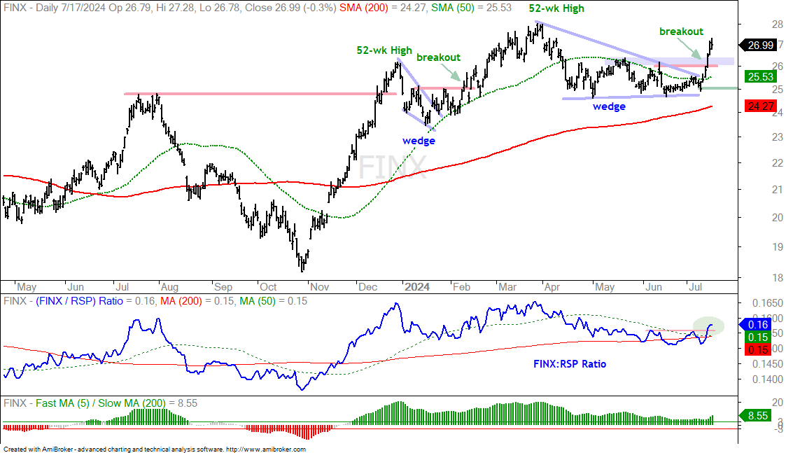
The following charts show price bars with the 200-day SMA (red line), the 50-day SMA (green line), the price-relative (ITB/RSP ratio) with the 200-day SMA and the percentage difference between the 5 and 200 day SMAs. On the price chart, I am looking for tradable pullbacks within a bigger uptrend or bullish consolidation patterns. With the price-relative, I am looking for relative strength. The price-relative (ITB/RSP ratio) rises when the ETF or stock outperforms. And finally, the percentage difference between the 5 and 200 day SMA is bullish (long-term uptrend) with a move above 3% and stays bullish until a move below -3%. This basically measures the tide or long-term bias.
IPAY and FINX: Price and Relative Strength Breakouts
There was a clear changing of the guard over the last two weeks. Tech-related stocks suddenly corrected and underperformed, while non-tech stocks caught a strong bid and broke out. The Bank ETF (KRE) was below its 200-day SMA in mid June and surged 18% the last seven days. KRE broke wedge resistance and tagged a fresh 52-week high in the process.
In a related area, I am seeing breakouts in the FinTech ETF (FINX) and the Mobile Payments ETF (IPAY). The first chart shows FINX hitting a 52-week high in March and then correcting into June as large-cap techs dominated the market. The long-term trend is up and this wedge is a correction within that long-term uptrend. FINX found support near 25 from April to June (lower trendline of wedge) and broke out with an outsized surge the last two weeks. This signals an end to the correction and a resumption of the bigger uptrend. The breakout zone in the 26-26.5 area mark first support, should we see a throwback to the breakout. Zone. Key support is set at 25 for now. The middle window shows the price-relative (FINX:RSP ratio) breaking out and this means FINX is showing relative strength again.
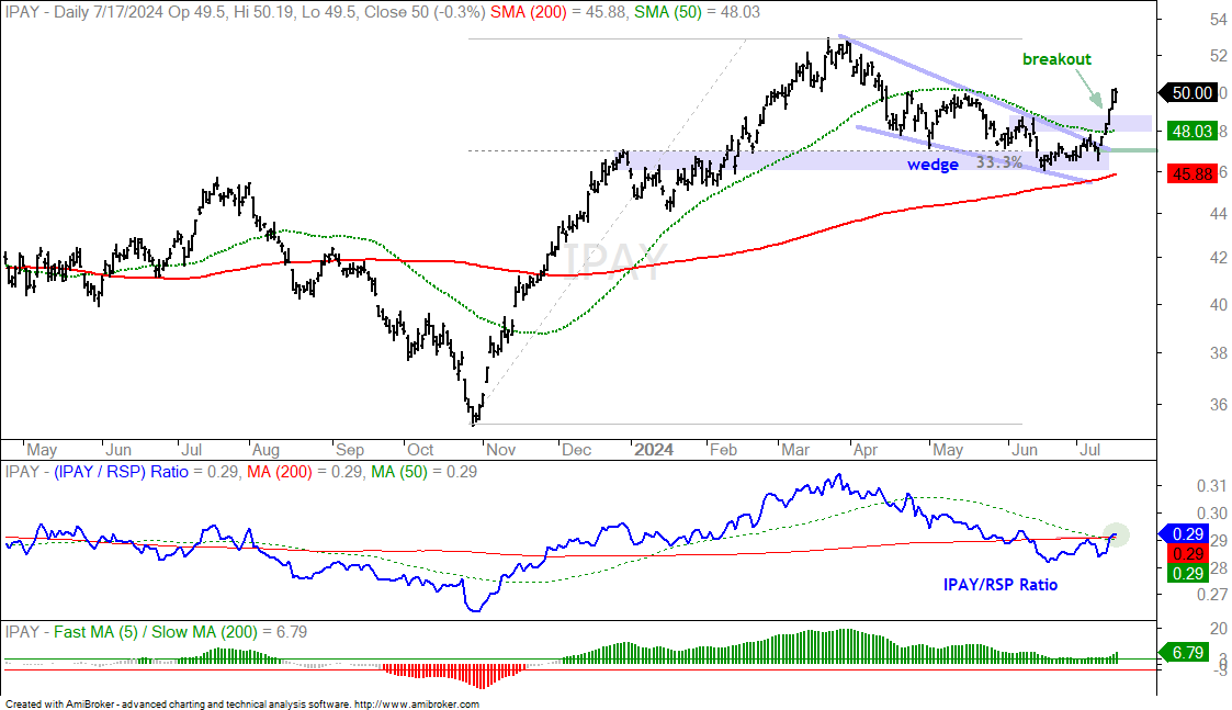
The next chart shows IPAY finding support in the 46 area in June and breaking out with a surge the last two weeks. The breakout zone and 50-day mark first support in the 48-48.5 area, would we see a short pullback. Key support is set at 47.
A Dozen Stocks for Your Setup/Signal List
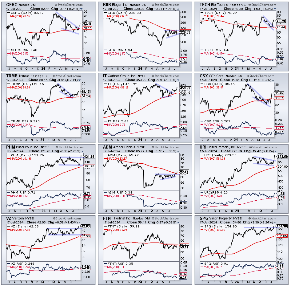
Earnings season is underway and the vast majority of stocks report in the next 2-3 weeks. This increases the likelihood of an outsized move, in either direction. For discretionary trading, I usually avoid stocks that are reporting within a week or two, but this makes for thin picking during earnings season. Nevertheless, I put together a list of stocks with setups in the making or recent breakouts.
Here are the earnings dates:
- GEHC 7/31
- BIIB 8/1
- TECH 8/2
- TRMB 7/31
- IT 7/30
- CSX 8/5
- PHM 7/21
- ADM 7/31
- URI 7/24
- VZ 7/22
- FTNT 8/6
- SPG 8/5