The next Chart Trader will be posted on Thursday morning, July 25th.
This report starts with the long-term breadth indicators to confirm the bull market. Overall, S&P 500 stocks are stronger than Nasdaq 100 stocks. Our short-term breadth indicators are also bullish. QQQ is in the midst of a pullback and has yet to become oversold. XLK and MAGS are also in pullback mode and could have further to go. Money is clearly rotating out of tech-related stocks and into non-tech stocks. We will then feature breakouts in four non-tech sectors and some industry group ETFs. Note that I am not featuring any stocks today because most are reporting earnings in the next 1-3 weeks.
Plenty of Stocks Above their 200-day SMAs
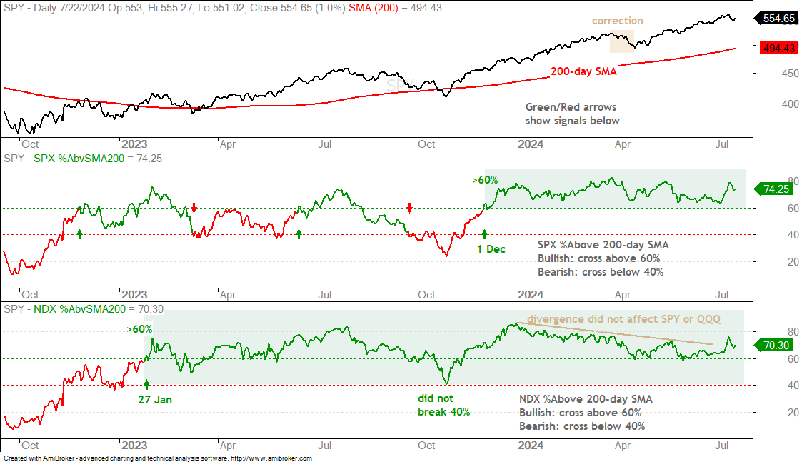
70% of Nasdaq 100 stocks and 74% of S&P 500 stocks are above their 200-day SMAs, which means they are in long-term uptrends of some sort. This is enough to support a bull market. Overall, SPX %Above 200-day has been bullish since December 1st and NDX %Above 200-day has been bullish since January 27th (2023). As the yellow shading on the SPY chart shows, the last corrective period was from late March to late April. Just keep in mind that corrective periods and 5-8 percent pullbacks are possible during bull runs.
SPX Leads 26wk High-Low Percent
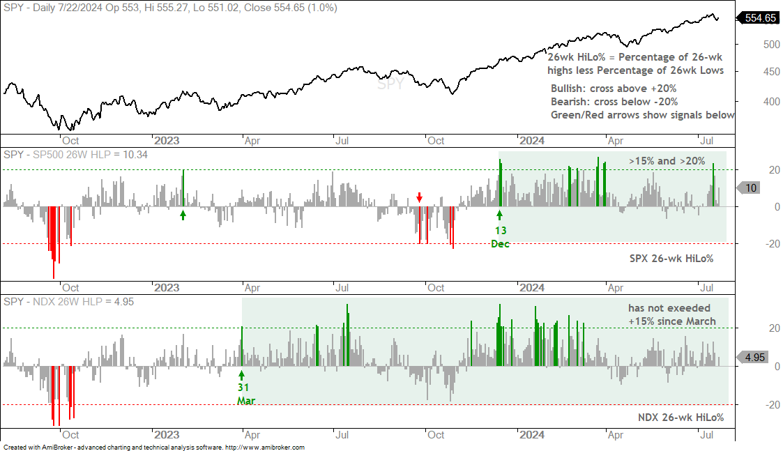
NDX 26wk HiLo% has been bullish since March 31st (2023), but SPX 26wk HiLo% has been stronger since May. More S&P 500 stocks are hitting 26wk highs. SPX 26wk HiLo% exceeded +15% in May and exceeded +20% in July. NDX 26wk HiLo% has not exceeded +15% since March. This means we are seeing strength outside of the tech sector as the bull market broadens. Note that NDX 26wk HiLo% is by no means bearish. It is just less strong.
4wk HiLo% Combo Remains Bullish
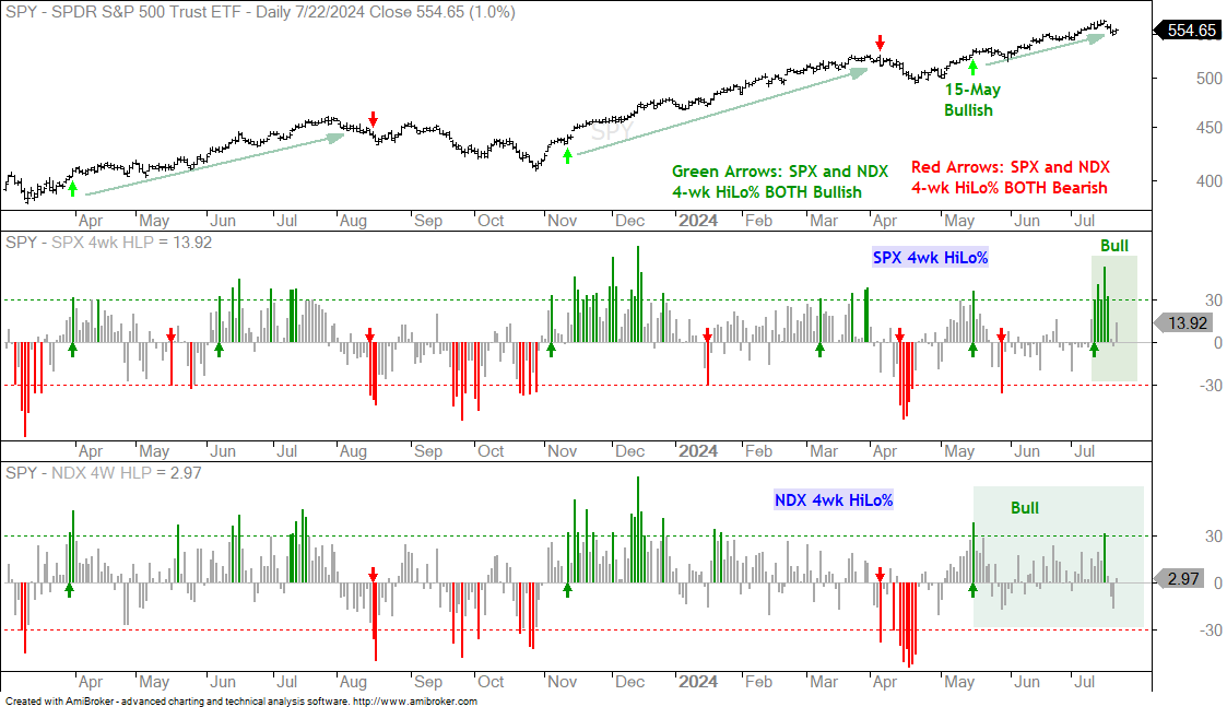
SPX 4wk HiLo% surged above 50% on July 16th and exceeded +30% five days in a row (green bars). This shows a serious broadening of strength within the S&P 500. NDX 4wk HiLo% was already in bull mode and exceeded +30% on July 16th. Both indicators turned bullish on May 15th for a bullish combo signal (see green arrows on price chart). This combo signal does not reverse until both turn bearish (< -30%). Even though Nasdaq 100 stocks stumbled over the last five days, we have yet to see a bearish combo signal to reverse the short-term uptrend.
QQQ is Not yet Oversold
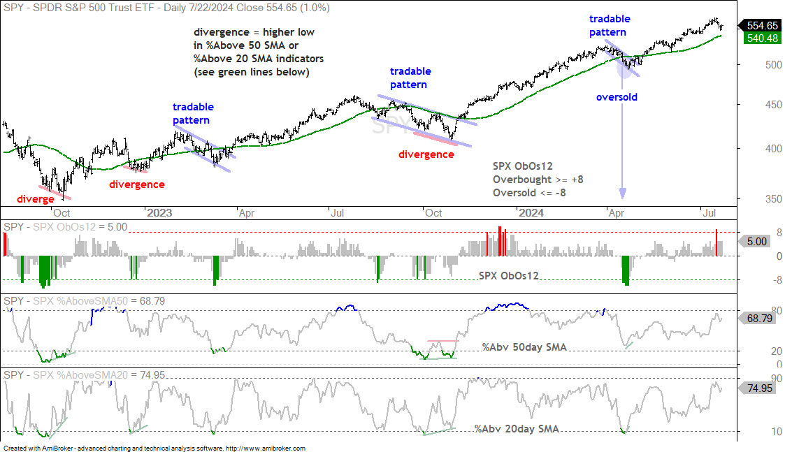
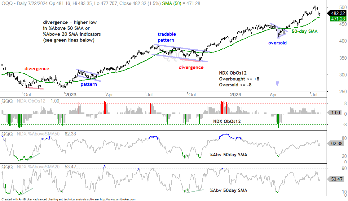
The next charts show SPY and QQQ with three short-term oscillators. The first is a 12 indicator overbought/oversold oscillator based on six breadth indicators and six price indicators. It becomes oversold with a dip below -8 and overbought with a move above +8. Most of the time, I look for oversold conditions within a bigger uptrend. This means there was a decent pullback within the uptrend. Both SPY and QQQ are in long-term uptrends so I am looking/waiting for short-term oversold conditions. Once the ObOs12 indicator becomes oversold, I look for a tradable pattern on the price chart, a bullish divergence in %Above SMA indicators in the lower windows or a short-term upside catalyst.
The chart below shows SPY hitting a new high last week and falling around 2% the last five days. The ETF is above its 50-day SMA (green line). A dip below the 50-day SMA often leads to the first oversold conditions. The last dip below the 50-day and oversold condition occurred in April (blue arrow-line). SPX ObOs12 is currently at +5 and has yet to become short-term oversold.
The next chart shows QQQ hitting a new high eight days ago and falling around 4%. QQQ remains above its 50-day SMA and the NDX ObOs12 indicator is at +1. Even though NDX ObOs12 did not become oversold, QQQ was oversold at the end of last week and got a small bounce. As with SPY, the last oversold condition occurred in April when QQQ dipped below its 50-day SMA and NDX ObOs12 dipped below -8 (blue arrow-line). We are not there yet.
Chart Analysis, Setups and Trading Ideas
The following charts show price bars with the 200-day SMA (red line), the 50-day SMA (green line), the price-relative (ITB/RSP ratio) with the 200-day SMA and the percentage difference between the 5 and 200 day SMAs. On the price chart, I am looking for tradable pullbacks within a bigger uptrend or bullish consolidation patterns. With the price-relative, I am looking for relative strength. The price-relative (ITB/RSP ratio) rises when the ETF or stock outperforms. And finally, the percentage difference between the 5 and 200 day SMA is bullish (long-term uptrend) with a move above 3% and stays bullish until a move below -3%. This basically measures the tide or long-term bias.
XLK and MAGS are in Pullback Mode
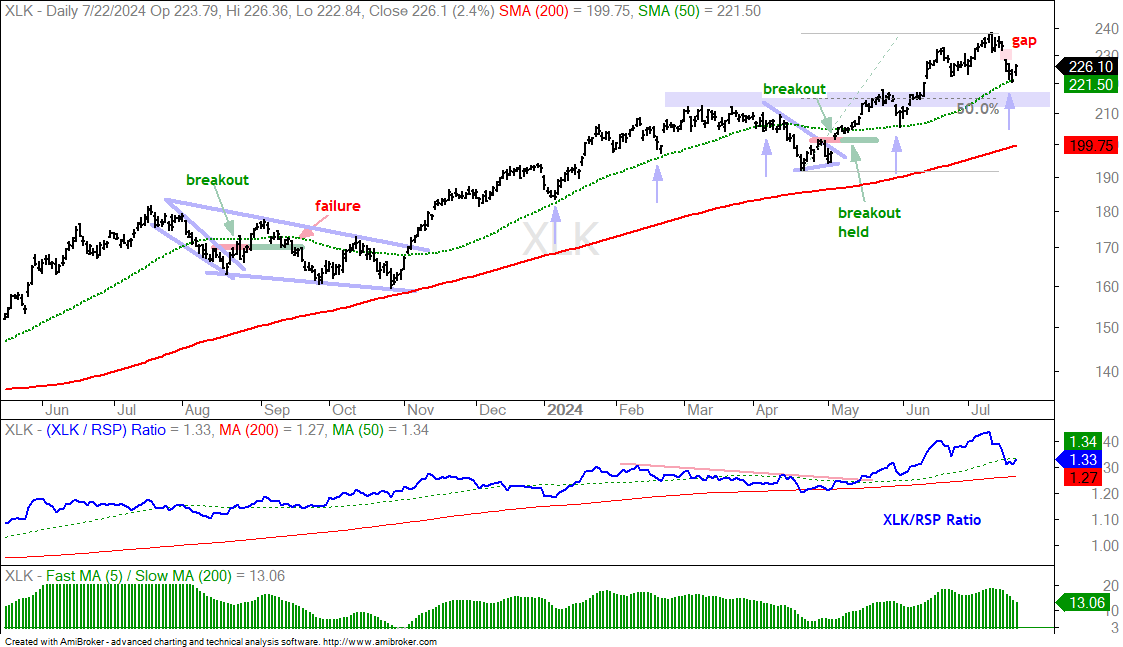
There are many definitions for oversold. It mostly depends on your timeframe and the depth of the dip. The next chart shows XLK falling 7% in 7 days and hitting its 50-day SMA on Friday’s close. This is a short-term oversold condition that gave way to a bounce on Monday. The blue arrows show XLK bouncing near the 50-day SMA in January, February, April (failed) and May. Even though XLK bounced on Monday, I think the correction could have further to run. There was a sharp shift away from tech over the last two weeks, the 7-day 7% decline showed above average selling pressure and XLK gapped down on July 17th. I am marking first support in the 212-217 area. This zone stems from broken resistance turning support and the 50% retracement.
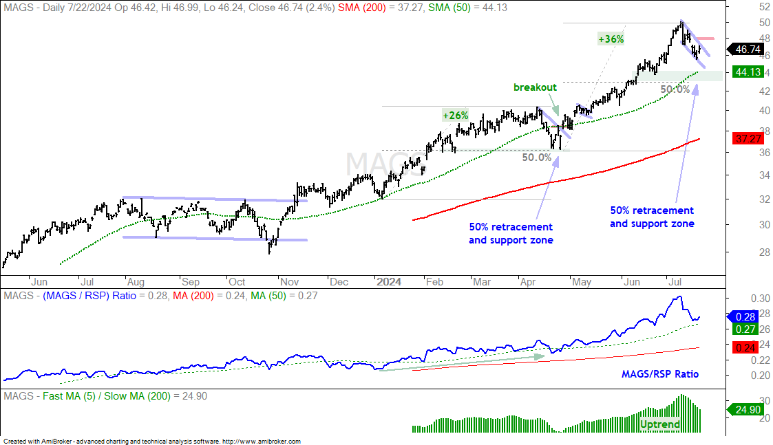
The next chart shows the Mag7 ETF (MAGS) falling 8.5% in 7 days and then bouncing with a 2.4% gain on Monday. Again, MAGS was short-term oversold last week and ripe for a bounce. Short-term, the blue lines mark a falling wedge or pennant and the top of the gap is at 48. A breakout here would reverse the short-term pullback. Until such a reversal, I would expect the pullback to extend towards the first target in the 43-44 area (50-day SMA, 50% retracement, late June low).
Non-Tech Sectors Break Out
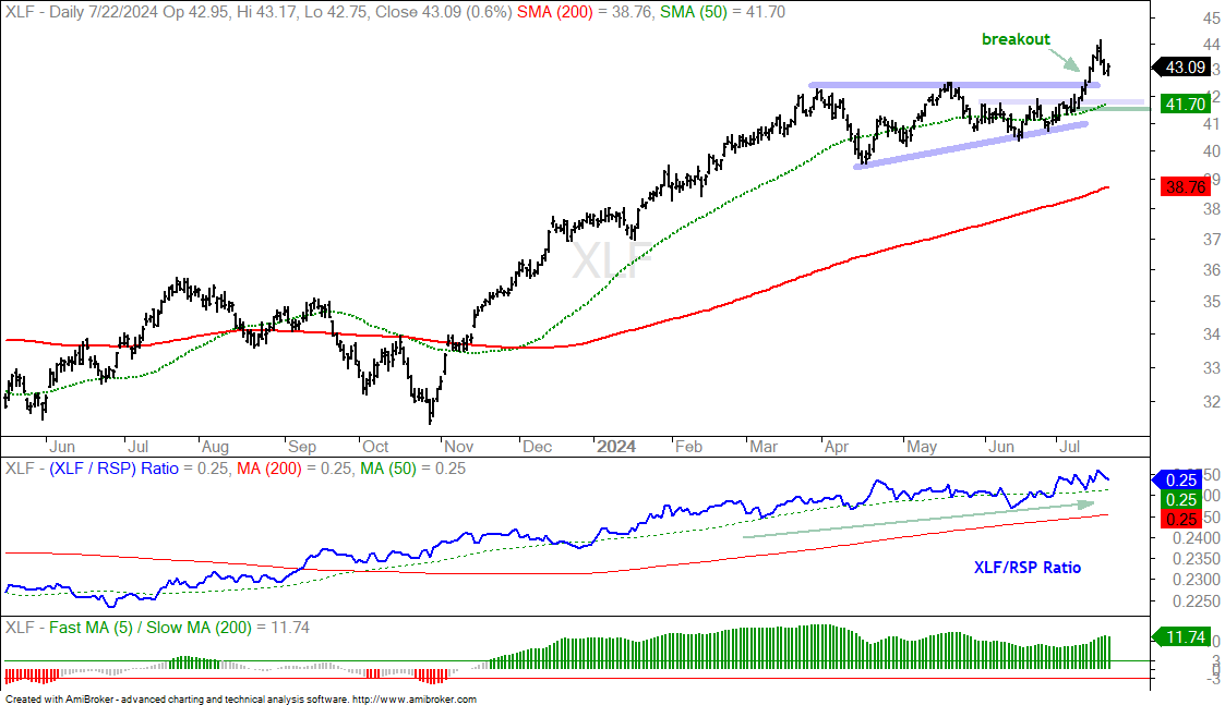
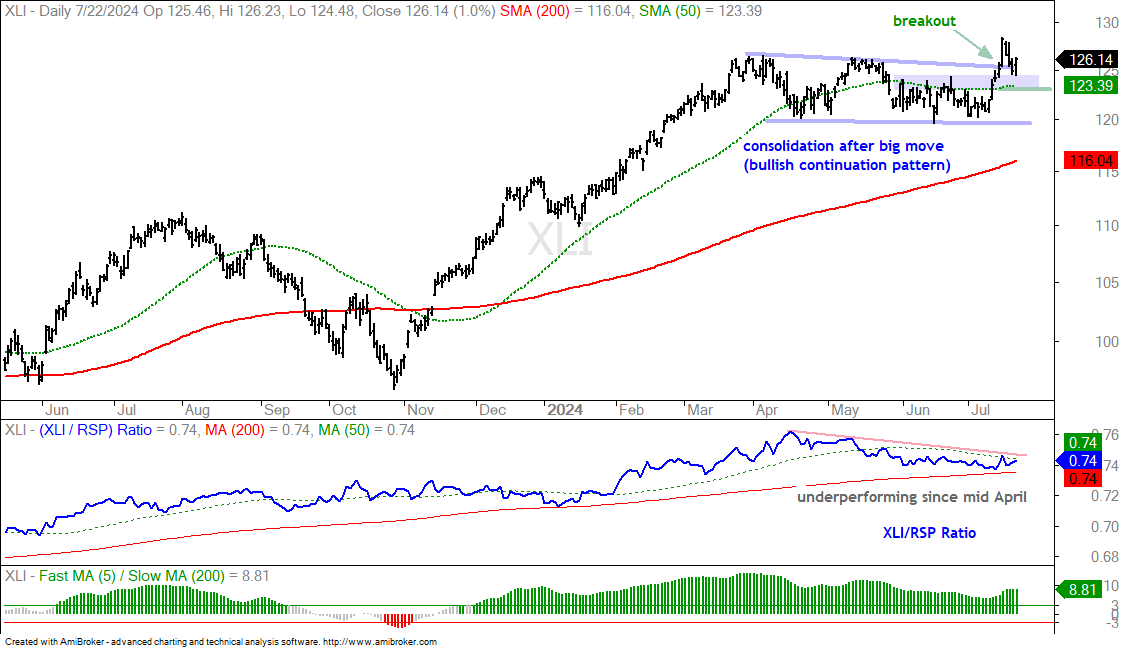
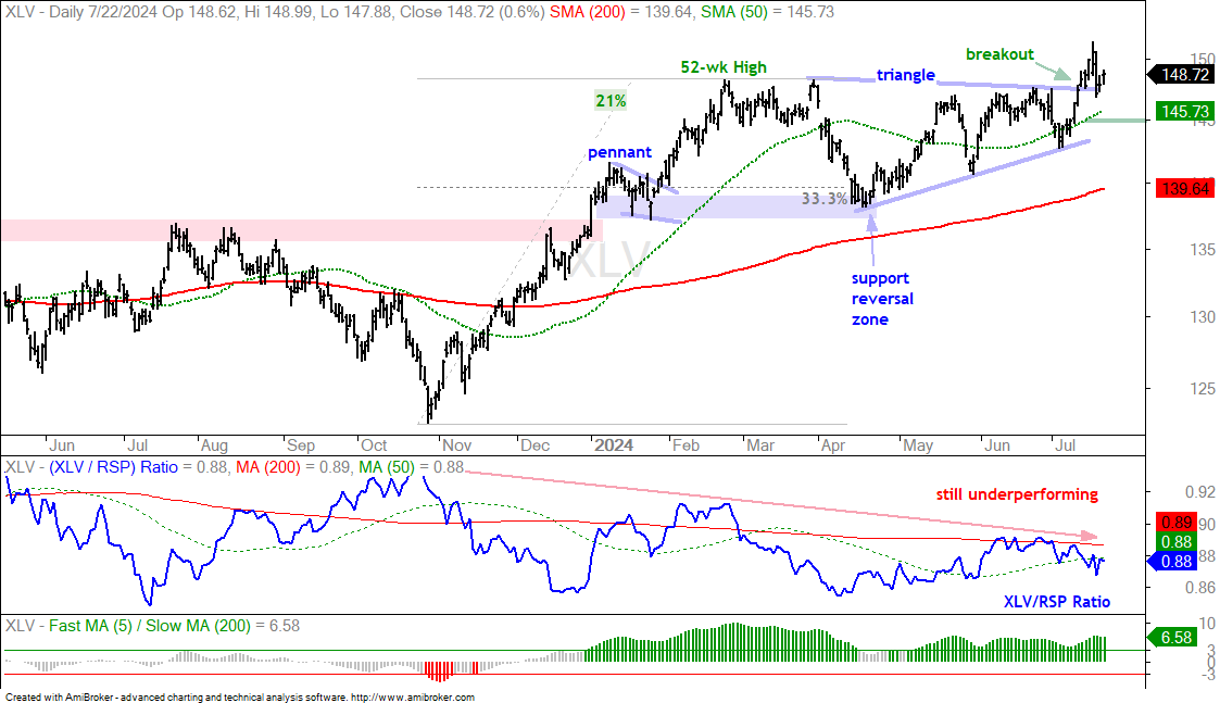
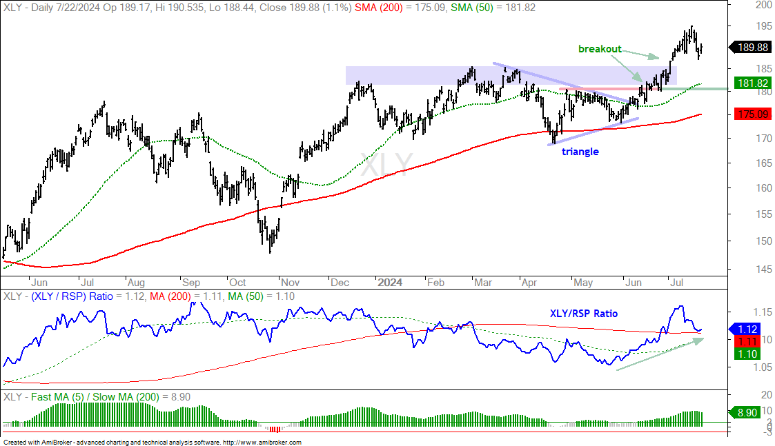
The four big non-tech sector SPDRs broke out as money rotated from tech to non-tech. These sectors include Finance, Industrials, Healthcare and Consumer Discretionary. Together, they account for 43% of the S&P 500. Technology and Communication Services account for 32% and 9%, respectively. Basically, the four non-tech sectors weigh roughly the same as the two tech-dominated sectors. All four broke out and hit new highs this month. It is important that these breakouts hold so I will mark re-evaluation support levels to watch going forward.
The first chart shows the Finance SPDR (XLF) with a 34% advance into March, a consolidation into June and a breakout in July. The breakout and new high are bullish. Within the consolidation, I see a short-term resistance zone and the 50-day SMA. It is important that these levels hold. A close below 41.5 (green line) would negate the breakout and be negative.
The next chart shows the Industrials SPDR (XLI) advancing 30% into March and then consolidating into early July. A falling wedge formed as XLI digested these big gains. XLI broke out with a big move and then fell back to the breakout zone. The blue shading marks a resistance zone within the consolidation. This zone turns into first support and a close below the 123 (green line) would suggest that the breakout is failing.
The next chart shows the Healthcare SPDR (XLV) with a 21% gain into February and a choppy consolidation into early June (triangle). XLV broke out and forged a new high in mid July. I am marking re-evaluation support at 145 (green line). A close below this level would negate the breakout.
The next chart shows the Consumer Discretionary SPDR (XLY) breaking out of a triangle in late June and hitting new highs in July. The breakout zone turns first support and I am marking a re-evaluation level at 180.
IPAY and FINX Return to Breakout Zones
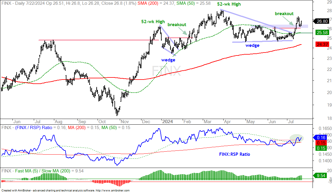
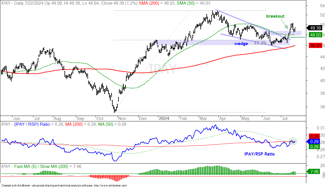
The Mobile Payments ETF (IPAY) and FinTech ETF (FINX) were featured last week Thursday as they broke out of falling wedge patterns. Both fell back last Thursday-Friday and bounced on Monday. The blue shading marks support from broken resistance. These bounces affirm the breakouts and re-enforce support. I am going to raise my re-evaluation levels at notch on both: 25.5 for FINX and 47.5 for IPAY. A close below these levels would negate the breakouts and call for a re-evaluation.
PAVE Goes for a Breakout
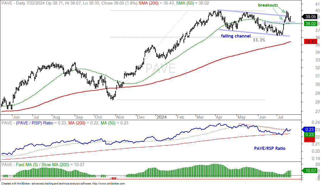
The Global Infrastructure ETF (PAVE) chart looks very similar to the charts above. There is a big advance into March, a consolidation into June and a breakout in July. PAVE fell back after the breakout and tested the 50-day SMA. It also returned to broken resistance within the falling channel (blue shading). This was the breakout within the pattern and the broken resistance zone turns support. A close below 38 would negate this breakout and call for a re-evaluation.
Square Surges off Support-Retracement Zone
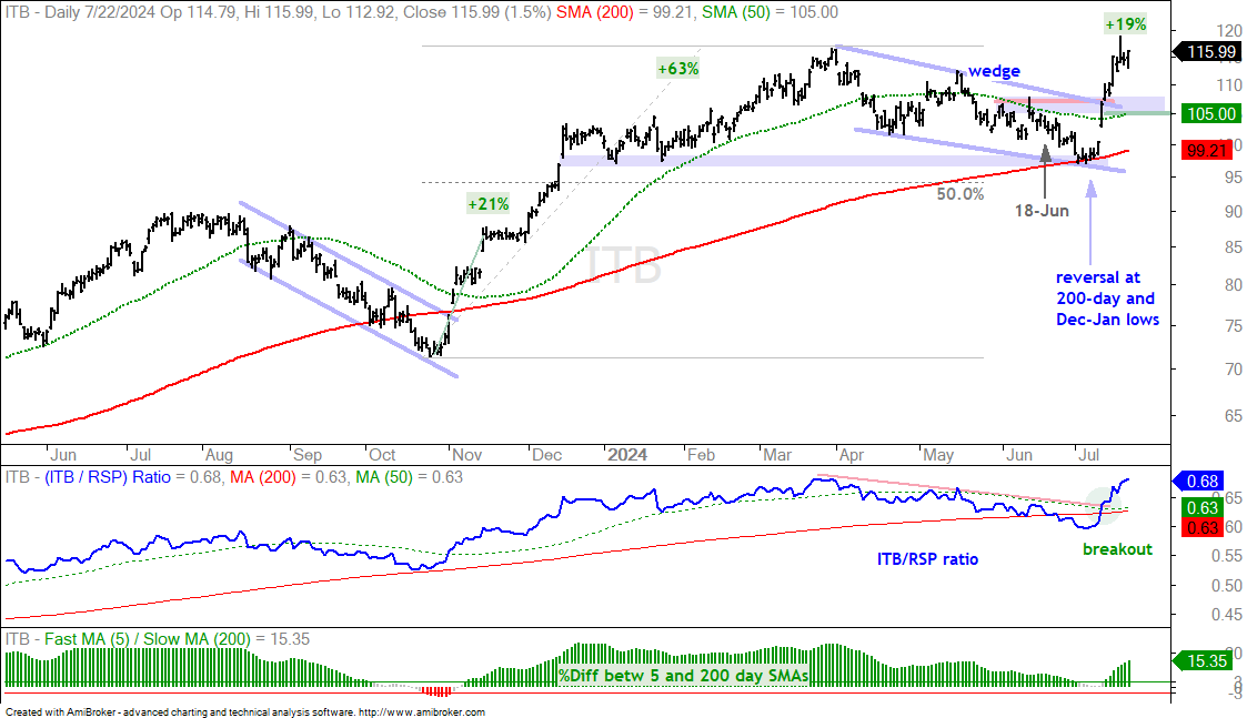
I featured corrective patterns in the Home Construction ETF (ITB) and four homebuilders on June 18th. The timing was early because they fell into early July and then produced breakout surges over the last two weeks. Timing corrections is a challenge because we never know how far and how long they will extend. Some last a few weeks and some last a few months. Some retrace 25% of the prior advance and some retrace 67%. A decline is considered a correction within a bigger uptrend as long as the bigger uptrend holds. This is the key. As long as the bigger uptrend is in play, chartists should keep an eye on these corrective patterns. Corrections end when there is some sort of upside catalyst, such as a breakout or outsized move.
The chart below shows ITB hitting a new high in early April as it advanced 63%. The ETF then corrected into early July with a decline back to the 200-day SMA. ITB actually closed below the 200-day on July 5th, but the 5/200 %Differential in the bottom window did not turn negative. This means the 5-day SMA never crossed below the 200-day SMA and the long-term trend was still up. Thus, I considered the decline from early April to early July as a correction within the bigger uptrend.
ITB broke out with a 19% surge over the last two weeks. This is a strong move and a valid breakout. Note that ITB surged 21% during the early November breakout. The current breakout signals a continuation of the bigger uptrend and I would expect higher prices over the next few months. Short-term, the breakout zone in the 105-108 area turns first support. A throwback to this area would offer a second chance to partake in the breakout. I am marking re-evaluation support at 105 and a close below this level would negate the breakout.