The weight of the evidence for stocks remains bullish because the big trends are up, the breadth models are bullish and yield spreads are narrow. Stocks are up considerably since late October and we started seeing signs of excess in January. This week we started seeing signs that some uptrends are under threat. There were outsized declines in some key ETFs, the RSI above 50 streak ended for SPY and there were three bearish breadth thrusts in the sector breadth model. We also saw deterioration in a short-term breadth indicator. Details further below.
The evidence is building for a corrective period in the stock market. Corrections are a normal part of the ebb and flow of an uptrend, but we never know what path the correction will take or how long a correction will last. We could see choppy sideways trading (time correction), a pullback that retraces a portion of the prior advance (price correction) or a combination of the two. It is even possible that stocks simply grind higher as buyers step in on the dips. Yes, we might not even get a correction in the true sense of the word.
Note that we are currently in the turn of the month period, which shows a strong bullish bias. This period extends from the last four trading days of the current month to the first four days of the next month. A bullish bias in this period makes sense because the beginning of the month is when new money is put to work and traders front run this expectation in the last four days of the month. Thus, we could see strength into early February.
SPY Sets the Tone
There is no real change on the weekly charts, even with this week’s decline. SPY and QQQ are down a little over 2% so far this week and IWM is down around 3%. Small-cap stocks have higher betas and typically move more than large-caps. This means a garden variety pullback in SPY (7-8%) could coincide with a 14-16% pullback in IWM. This also makes sense because SPY was up around 17% the prior 12 weeks and IWM was up 40%.
SPY remains my go-to chart for defining the correction targets and the first target is in the 350 area. There is only one problem with this target: the vast majority of chartists are probably also identifying this level. Why? Well, an 8% pullback would retrace around 50% of the prior advance and broken resistance turns into support. This is pretty classic stuff from the technical analysis books. Sorry for the cynical take, we cannot predict the future. I would like to see a correction because this would provide the next setup to partake in the bigger uptrend.
The next chart shows QQQ and an 11-12% decline would return to the breakout zone and retrace 1/2 to 2/3 of the prior advance.
Garden Variety for IWM
The next chart shows IWM and what a 15% decline from the current highs would look like. I have found that classical technical analysis does not work as well for small-caps and IWM (support, broken resistance, retracements, moving averages). Classical technical analysis works better for large-caps and the S&P 500. Therefore, I will refrain from marking potential support on this IWM chart.
RSI Ends Above 50 Run
This next chart shows SPY and the number of trading days that RSI(14) holds above 50. The vertical lines mark times when RSI held above 50 for at least 49 consecutive days and then moved below 50. A strong uptrend is present when RSI holds above 50 and the dip below 50 shows the first signs that the uptrend is under pressure. The yellow shading next to each line shows what happen in the following three months. Price action was largely flat in most cases, and prices fell sharply twice (Sept-Oct 2018 and Feb-Mar 2020). Overall, the recent move below 50 (after an extended time above 50) shows that the uptrend is under pressure and a corrective period could unfold.
No ROC Shock for SPY so Far
There were a number of bearish ROC shocks this week, but we have yet to see bearish shocks in SPY, QQQ or IWM. This week’s ROC Shocks included: SOXX, XLB, XME, IYT, XLF, FINX. The next chart shows SPY with two versions of Normalized ROC, which measures the ROC Shock. The first is the 20-day Dollar price change divided by ATR(250) and the second is the 5-day Dollar price change divided by ATR(250). Five days covers a week, 20 days covers a month and 250 day Average True Range (ATR) measures of annual volatility in Dollar terms (as opposed to percentage terms). These Normalized ROC indicators show the weekly and monthly price change in ATR terms. For example, SPY fell $6.61 the last five days, rose $6.17 the last twenty days and ATR(250) equals 4.92. The 5-day decline was 1.34 ATR(250) values and the 20-day advance was 1.25 ATR(250) values.
As with many indicators, such as RSI, Normalized ROC is a switch hitter. An RSI move below 30 shows a short-term oversold condition that can lead to a bounce, but it also shows strong downside momentum that could lead to an extended trend. Similarly, a move above 3 or below -3 shows a ROC Shock in Normalized $ROC5/ATR250. 5 and -5 are used for Normalized $ROC20/ATR250. These ROC Shocks reflect an outsized move that could signal the start of an extended trend. Normalized $ROC20/ATR250 triggered a bullish ROC Shock on April 9th and remains bullish (green shading). Normalized $ROC5/ATR250 is more sensitive and triggers more signals. It remains on a bullish signal since November 4th (blue shading).
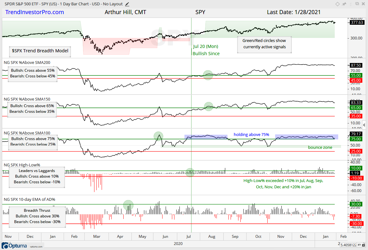
Trend and Thrust Breadth Models
The Trend and Thrust Breadth Models remain bullish with no changes. The trend model is designed to absorb a correction and is unlikely to turn bearish should SPY correct as it did in September-October or even pull back to the 350 zone (8%). Such a correction would be pretty normal, but not feel normal should it happen.
The chart below shows the five indicators for the trend model. The percentage of stocks above the 200-day and 150-day SMAs has been above 80% since early November (two months), while the percentage of stocks above the 100-day has been above 75%. This is a long stretch of strength and we have yet to see much deterioration. A move below 75% would show deterioration that could lead to a correction. Should this happen, I will then watch the 40-50 zone because prior corrections ended when hitting this zone (green shading – bounce zone).
The next chart shows the three indicators in the thrust model. These indicators are more short-term oriented and hence more sensitive to market shifts. Notice that the percentage of stocks above the 50-day SMA moved below 60% for the first time since November 3rd. In addition, the percentage of stocks above the 20-day SMA did not get above 80% in January and fell below 50% this week. This shows short-term deterioration and we saw something similar in August-September.
The tables below show a summary for the Trend and Thrust Model Signals for the five major indexes. There are no changes.
You can learn more about the methodology and historical performance for these breadth models in this article.
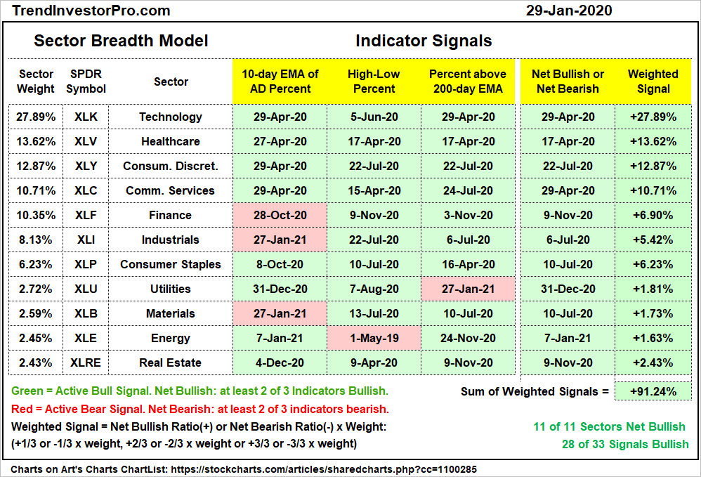
Three Bearish Signals in Sector Breadth Model
The Sector Breadth Model remains firmly bullish, but there were three new bearish signals this week. The percentage of stocks above the 200-day EMA moved below 40% for the Utilities sector to turn bearish. The 10-day EMA of Advance-Decline Percent moved below -30% to trigger bearish breadth thrusts in the Industrials and Materials sectors. This indicator was already with an active bearish signal for the Finance sector (since October 28th) and re-triggered this week as well. Thus, there were three bearish breadth thrusts this week. Normal selling pressure, such as profit taking, should not be strong enough to trigger a bearish breadth thrust in two big sectors, such as Industrials and Finance. These signals are a concern and reinforce the prognosis for a corrective period in the stock market.
The chart below shows XLF with the three breadth indicators. High-Low% ($XLFHLP) and %Above 200-day EMA (!GT200XLF) remain bullish since early November (green circles). The bearish breadth thrust triggered in late October (red circle) and this indicator did not get above +30% during the November-December surge to reverse this signal. Selling pressure was quite intense over the last two weeks and this pushed the 10-day EMA of AD% below -30%. Not a good sign.
The next chart shows XLI with High-Low% ($XLIHLP) and %Above 200-day EMA (!GT200XLI) triggering bullish in July and remaining with bullish signals. The 10-day EMA of AD% whipsawed with a bearish signal in late October and bullish signal in early November (blue shading). The indicator is back to bearish this week with a move below -30% (red circle).
Gold Continues to Firm
Gold is strong in early trading on Friday, but just short of a short-term breakout. I covered gold and silver in detail on Monday. Silver was already bullish and holding its breakout. The August-December decline in GLD looks like a big correction because it retraced around 50% of the March-August advance with a falling channel and returned to the rising 200-day SMA. The retracement amount and pattern are typical for corrections, but the channel is still falling and StochClose remains with a bearish signal. A break above the November-December highs would reverse this downtrend.
Short-term, GLD firmed at the rising 200-day SMA the last few weeks. Also notice that the January decline retraced 2/3 of the prior advance (late November to early January) and RSI firmed in the 40 area. This puts GLD at a short-term make or break area and a short-term breakout at 176 could lead to a bigger breakout.
Yield Spreads and Fed Balance Sheet
Yield spreads fell from September 25th to January 21st and this facilitated a big advance in mid-caps and small-caps. Note that the S&P MidCap 400 SPDR (MDY) and Russell 2000 ETF (IWM) bottomed on September 24th and rose 30+ and 40+ percent, respectively. There is generally a negative correlation between yield spreads and stocks.
Overall, yield spreads are at low levels and show no signs of stress in the credit markets. Yield spreads would not become a big problem for stocks unless they rise sharply and move above their pre-crisis highs. With yield spreads low overall, they could fluctuate within a range and still remain below their pre-crisis highs. Yield spreads could rise if stocks correct, but it would not become an issue unless they exceed their pre-crisis highs.
The Fed’s balance sheet contracted a little this week ($10 billion). Overall, the trajectory since mid July remains up and the balance sheet hit a new high last week.
")