While intermarket narratives make for interesting debate over a beer, we cannot possibly know all the factors driving asset prices and their weighted influence. Well, at least I cannot. How to we factor in Fed policy, interest rates, interest rate differentials, inflationary pressures, inflation differentials, fiscal stimulus, debt, trade flows, current accounts, economic growth, internal politics and geopolitics. You get the picture.
We have an idea which narratives were dominant and worked in the past (hindsight), but we do not know which narratives will work going forward. I will leave the narratives up to the macro forecasters and economists. For chartists, narratives become dangerous when they trigger biases that affect our analysis process. If we absorb bearish narratives through the financial media, we are likely to have a bearish bias when analyzing the chart.
At the end of the day, price action and trend structure are much more important than narratives. A systematic and objective approach will help us see what is really on the chart and avoid seeing what we "want" to see.
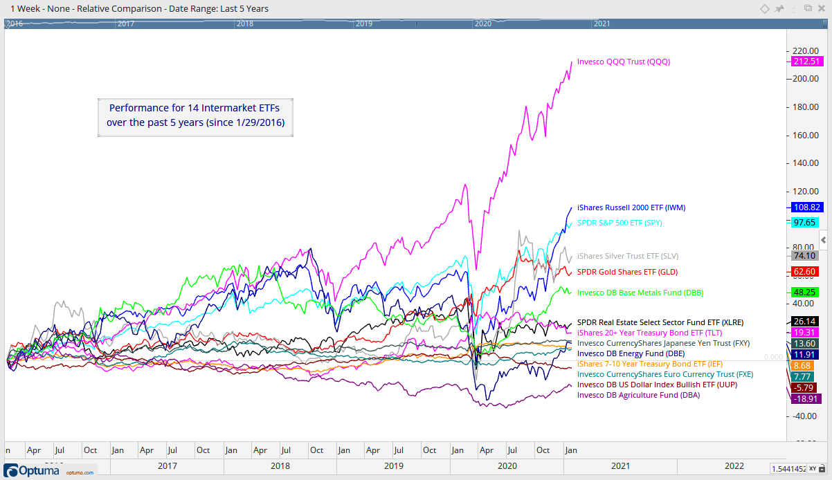
Intermarket Performance
Most of my focus is on stock-related ETFs and the equity markets. In addition, stocks are usually the best game in town during a bull market and we can expect stock returns to exceed those of bonds, gold, the Dollar and commodities. Note that QQQ, IWM and SPY are the top three performers over the last five years. However, note that commodities are performing quite well with the Silver ETF (SLV), Gold SPDR (GLD) and DB Base Metals ETF (DBB) in the next three spots.
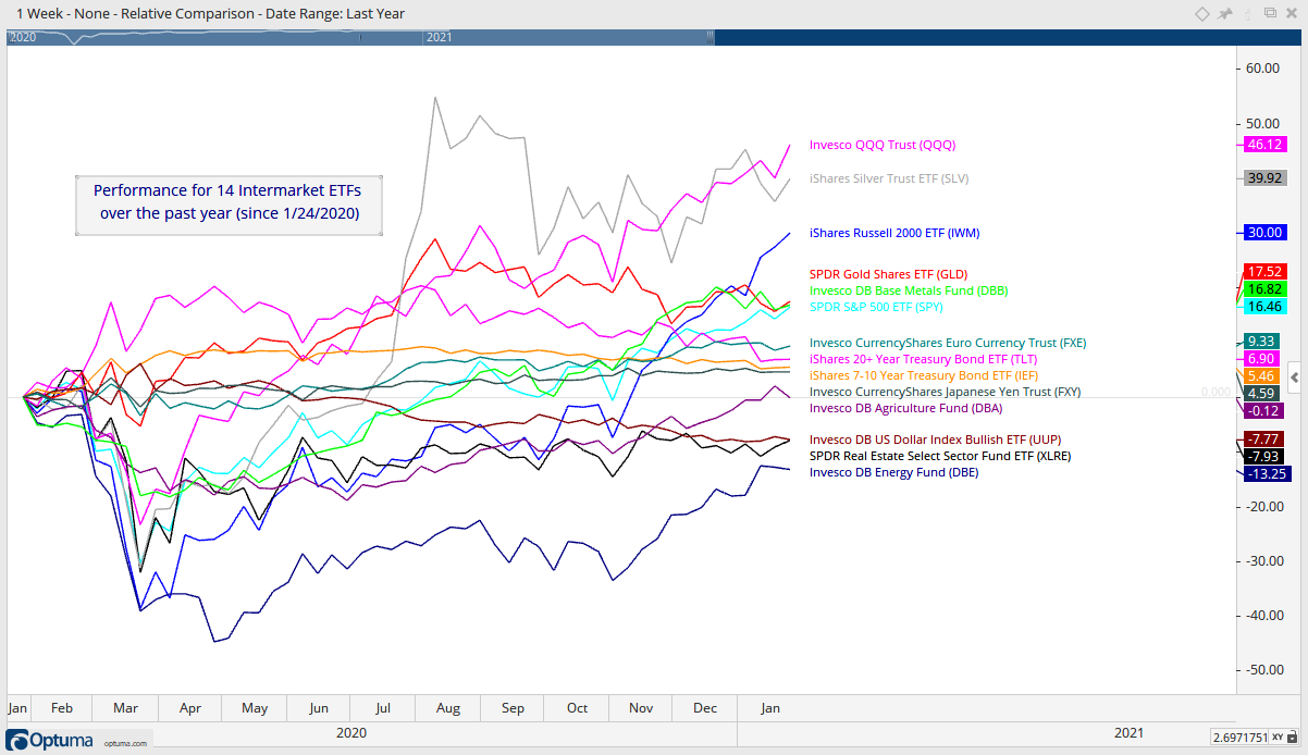
Commodities also put in a strong performance over the past year with the Silver ETF (SLV) in second place (+39.92%), the Gold SPDR (GLD) in fourth place (+17.52%) and the DB Base Metals ETF (DBB) in fifth place (+16.82%), just edging out SPY (+16.46%), which is in sixth place.
A Systematic Approach to Gold and Silver
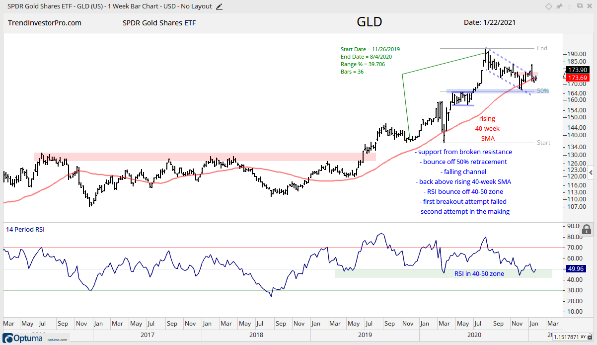
Even though stocks are the usually the best game in town, there is a place for commodities so we will cover the Gold SPDR (GLD) and the Silver ETF (SLV) with three timeframes. First, the weekly charts show GLD attempting to break out of a corrective channel and SLV breaking out of a triangle consolidation. Second, the daily charts show GLD in a downtrend since August and SLV with a trend-reversing breakout in late December. Third, short-term analysis (8 weeks) shows GLD at a potential reversal point and SLV holding its breakout. Let’s break it down.
The first chart shows weekly bars for GLD with a 40% surge to new highs in August and a falling channel decline back to the rising 40-week SMA. Structurally, this looks like a primary advance and a secondary correction. In Elliott wave terms, it would be an impulse move higher and corrective wave lower.
I think this is a correction within a bigger uptrend for three reasons. First, the decline retraced around 1/2 of the prior advance, which represents two steps forward and one step backward. Charles Dow asserted that corrections typically retrace 1/3 to 2/3 of the prior advance with 1/2 being the base case. Second, a falling channel formed and this pattern is typical for a corrective move. Third, GLD is firming near the rising 40-week SMA and RSI is firming in the 40-50 zone.
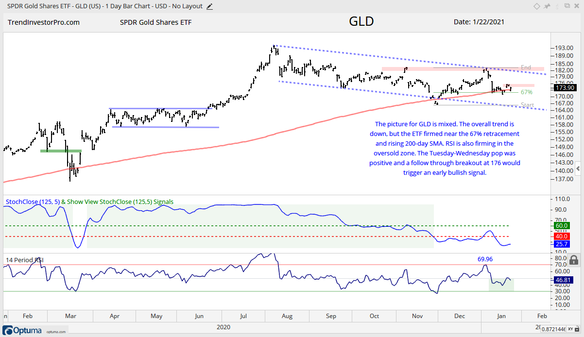
Technically, the daily chart is bearish. StochClose triggered bearish in late November and GLD moved lower the last five months. A break above the October-January highs and StochClose move above 60 would reverse the downtrend. We could then turn to the weekly chart to suggest that this would signal a continuation of the prior advance (March to August).
Despite bearish evidence on the daily chart, note that GLD is firming near the rising 200-day and RSI dipped into the oversold zone. Also notice that the January decline retraced 2/3 of the prior advance. This means we could be near a short-term reversal zone. GLD popped last Wednesday and fell back on Thursday-Friday. A breakout at 176 would signal follow through to last week’s pop and could set the stage for a bigger breakout.
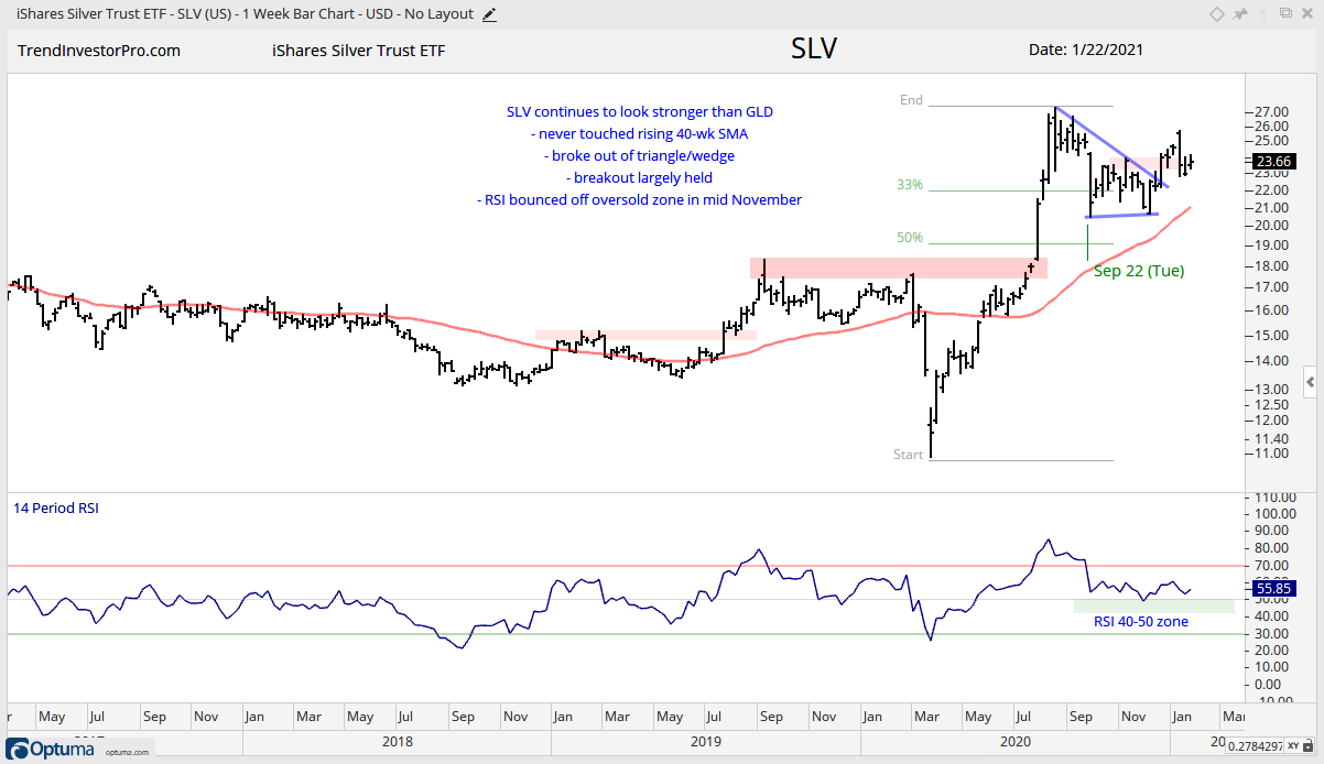
The Silver ETF (SLV) looks stronger than GLD on all timeframes. First, SLV held the September low during its corrective phase (August to December). Second, SLV broke out of its triangle and followed through after the breakout. Also note that SLV did not come close to its rising 40-week and RSI barely dipped below 50 during the correction.
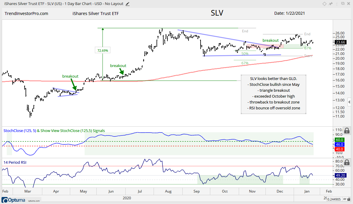
Technically, the daily chart is bullish for SLV. StochClose triggered bullish in mid May and remains bullish, while SLV remains above its rising 200-day SMA. The ETF broke out of the triangle and exceeded the October high in December. The January throwback to the breakout zone was quite hard, but SLV quickly firmed and held the breakout zone. As with GLD, SLV is also in a short-term reversal zone as RSI dipped into the oversold zone and price retraced 2/3 of the prior advance.
The systematic approach used in this analysis can be applied to any chart. First, identify the bigger trend structure using a weekly chart or longer lookback. Second, define the immediate trend using a daily chart or six month lookback. Third, hone in on short-term price action to get a jump on a breakout that could lead to a bigger breakout on the daily or weekly chart.
")