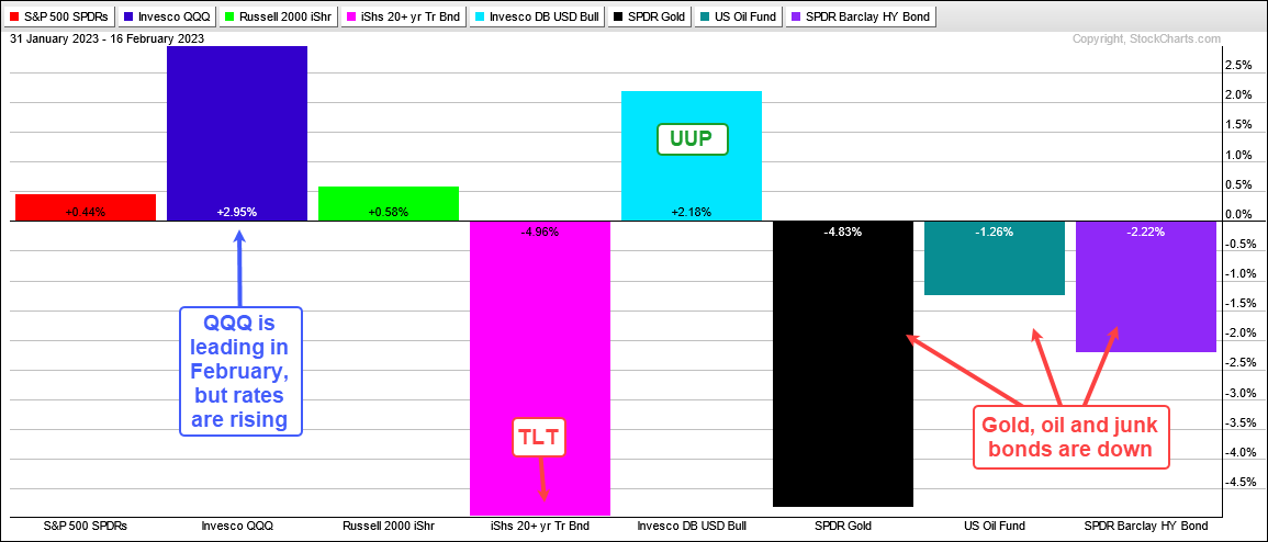
The weight of the evidence remains bullish for stocks, but rates are rising again and stock market volatility is above average. Rising rates are putting a bid in the Dollar and weighing on gold. Tech, housing and retail related ETFs are holding up for now, but rising rates could also weigh on these groups. At the very least, the high-beta trade is quite extended and at least due for a correction, which could involve a pullback or a consolidation. Today’s commentary will look at TLT, the 10-yr Treasury Yield, the Dollar and gold. We will then turn to the S&P 500 and address recent volatility. The S&P 500 SPDR (SPY) holds the key to my broad market bias. Using SPY, I will show what would prove the bulls otherwise and bring back the bears.
About the ETF Trends, Patterns and Setups Report
This report contains discretionary chart analysis based on my interpretation of the price charts. This is different from the fully systematic approach in the Trend Composite strategy series. In this ETF Trends, Patterns and Setups report, I am looking for leading uptrends and tradable setups within these uptrends. While I use indicators to help define the trend and identify oversold conditions within uptrends, the assessments are mostly based on price action and the price chart (higher highs, higher lows, patterns in play). Sometimes the chart assessment can be at odds with the indicators.
Bonds Broke Down and Interest Rates Moved Sharply Higher
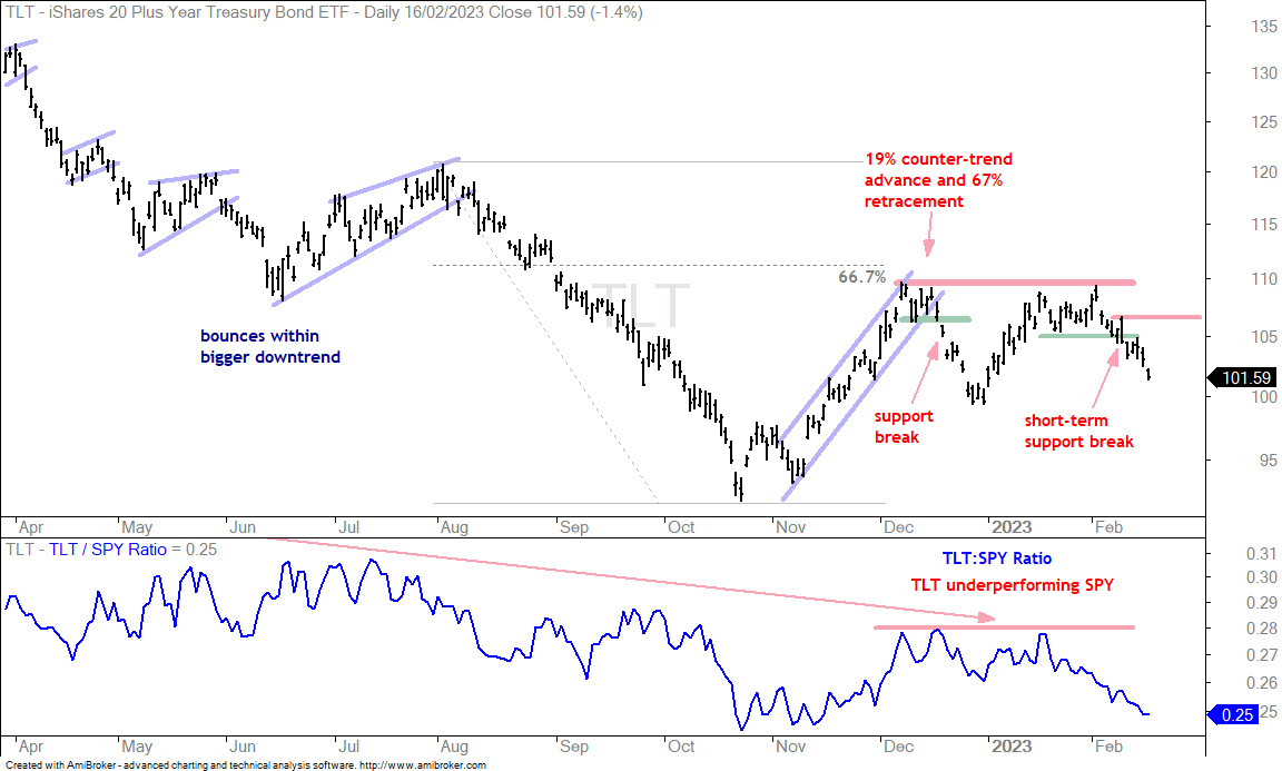
The first chart shows the 20+ Yr Treasury Bond ETF (TLT) failing at resistance in the 110 area in early February and breaking short-term support on February 9th. The long-term trend was already down and this short-term support break reversed the short-term upswing. Both trends are now down and this targets a move towards the October-November lows.
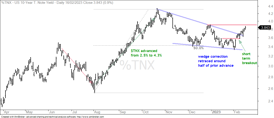
The next chart shows the 10-yr Treasury Yield with a falling wedge that retraced around half of the prior advance. The pattern and retracement are typical for corrections after big advances. The swing within the falling wedge was down from early January to early February. TNX broke short-term resistance on February 6th and this was the first signal that rates would move higher. The 10-yr Yield moved above 3.8% this week and is poised to complete a trend reversal with a break above the December high.
Counter-Trend Rally and Short-term Break in Junk Bond ETF
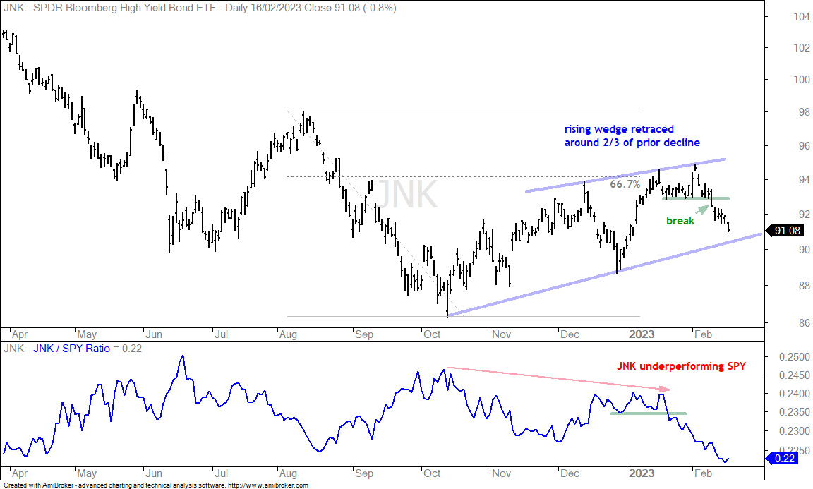
Junk bonds are the riskiest bonds in the corporate bond market and they are the canaries in the economic coalmine. Every Wednesday I look at junk bond spreads to assess the fear/confidence factor in the credit markets. Bond investors are “assumed” to be more sophisticated than equity investors. The Junk and BBB spreads have yet to turn up significantly and signal stress, but I am seeing a bearish pattern and short-term breakdown in the Junk Bond ETF (JNK). The chart shows JNK retracing around 2/3 of the prior decline with a rising wedge and breaking short-term support with a sharp decline the last two weeks. This is the first signal that the counter-trend bounce is reversing and the long-term downtrend is resuming.
Dollar is Following Rates Higher
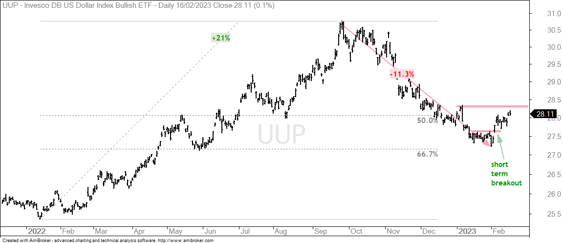
The Dollar Bullish ETF (UUP) surged along with the 10-yr Treasury Yield and broke short-term resistance on February 6th. Overall, UUP surged some 21% and fell around 11%. This decline retraced 50-67 percent of the prior advance. I am not going to force-fit a falling wedge pattern on the chart and will simply label resistance. A break above the January high would be bullish and argue for further strength in the greenback.
Strong Dollar is Weighing on Precious Metals
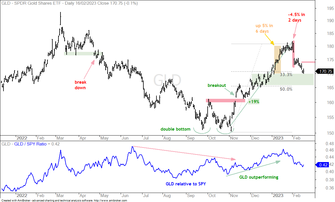
The Gold SPDR (GLD) rose 19% as the Dollar fell from November to early February and then fell around 6% as the Dollar surged the last two weeks. There is a clear bottoming pattern in Sep-Oct and a breakout in November. I do not see a clear topping pattern or even a key support level now. There is, however, the 4.5% decline in two days, which is an outsized decline. Even though there is a gap on the chart, this is largely because GLD trades on NYSE hours. Gold futures trade 24/7 and GLD is simply reacting to trading that already took place. Nevertheless, this outsized decline reversed the immediate uptrend and the short-term trend is down. I am marking resistance at 174. Further strength in the 10-yr Treasury Yield and Dollar would be negative for gold.
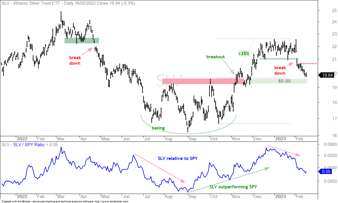
The next chart shows the Silver ETF (SLV) breaking short-term support with a sharp decline below 21. Short-term breaks sometimes lead to big swings. This break is bearish and SLV is in a clear downtrend with resistance marked at 20.70.
Oil Failed to Break Resistance
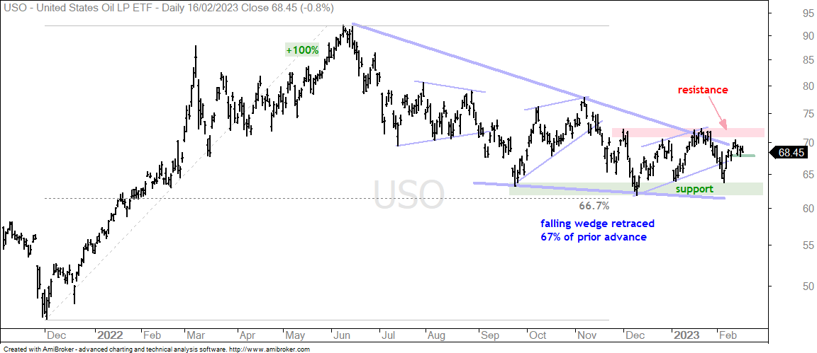
The US Oil Fund (USO) remains in a long-term downtrend and a trading range since December. A trading range means the long-term downtrend has yet to reverse. Overall, there is a falling wedge that retraced 67% of the prior advance. This looks like a big correction after the 100% advance. USO found support in the 62-64 area from September to February, but has yet to get the breakout needed to reverse the long-term downtrend. Namely, a break above the January high.
90% Down Day for NDX
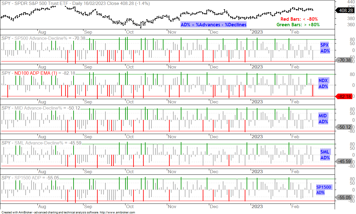
Stocks fell sharply on Thursday with the Nasdaq 100 leading the way lower. SPY fell 1.38%, QQQ declined -1.88% and the Russell 2000 ETF (IWM) was down .96%. The chart below shows Advance-Decline Percent for the S&P 500, Nasdaq 100, S&P MidCap 400, S&P SmallCap 600 and S&P 1500. AD% equals percent advancers less percent decliners. If 10% of stocks advance and 90% decline, then AD% equals -80%. This is a 90% down day. The second indicator window shows NDX AD% hitting -82%, which means 91% of Nasdaq 100 stocks fell (9% – 91% = -82%). Broad selling pressure within the Nasdaq 100 shows that the rise in the 10-yr Treasury Yield is affecting large-caps tech stocks the most.
13 Week High-Low Line Rising
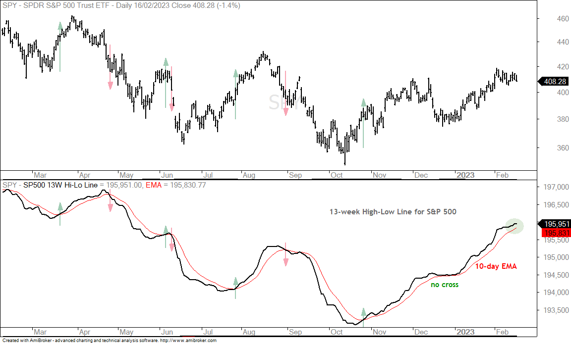
The next chart shows SPY with the 13-week High-Low Line for S&P 500 stocks. This is the number of 13-week highs less the number of 13-week lows. 13 weeks covers three months and this indicator captures short-term swings. A rising line means 13-week highs are outpacing 13-week lows (bullish), and a falling line means 13-week lows are winning the battle. The indicator has a little lag, but can keep us on the right side of the current swing. The line has been rising since October 26th and remains above the 10-day EMA. A cross would signal a downturn and expansion in 13-week lows.
Year of the Big Swing
The S&P 500 SPDR (SPY) is a period of big swings and above average volatility. There were six swings of at least 10% from late January to early February 2023. Looking at other 12-14 month periods, this is the fourth most in the last 23 years. There were 13 in 2008, 8 in 2000 and 6 in 2011. 2008 marked the Global Financial Crisis, while 2000-2001 marked a bear market. 2011 was a chaotic period when the European Sovereign Debt crisis rocked the markets. Note that I am not using exact calendar years. I added a month or two of padding to show the general idea.
The chart below shows the swings from January 2022 to February 2023. Most recently, there was a 10% upswing from mid October to mid December and then an 8.8% downswing. This decline does not count as a 10% swing so the Zigzag did not draw a line down. This means the October to February swing is one big “zag” higher.
So what does this mean? It means that volatility is above average, which increases the chances of a reversal and another big swing. SPY broke above its December high and has an uptrend working since October (higher low and higher high). Volatility remains a concern going forward and a short-term reversal at this point could lead to another sizable downswing. Short-term, SPY a falling flag is taking shape and a breakout at 415 would be bullish.
Walking a Fine Line with SPY
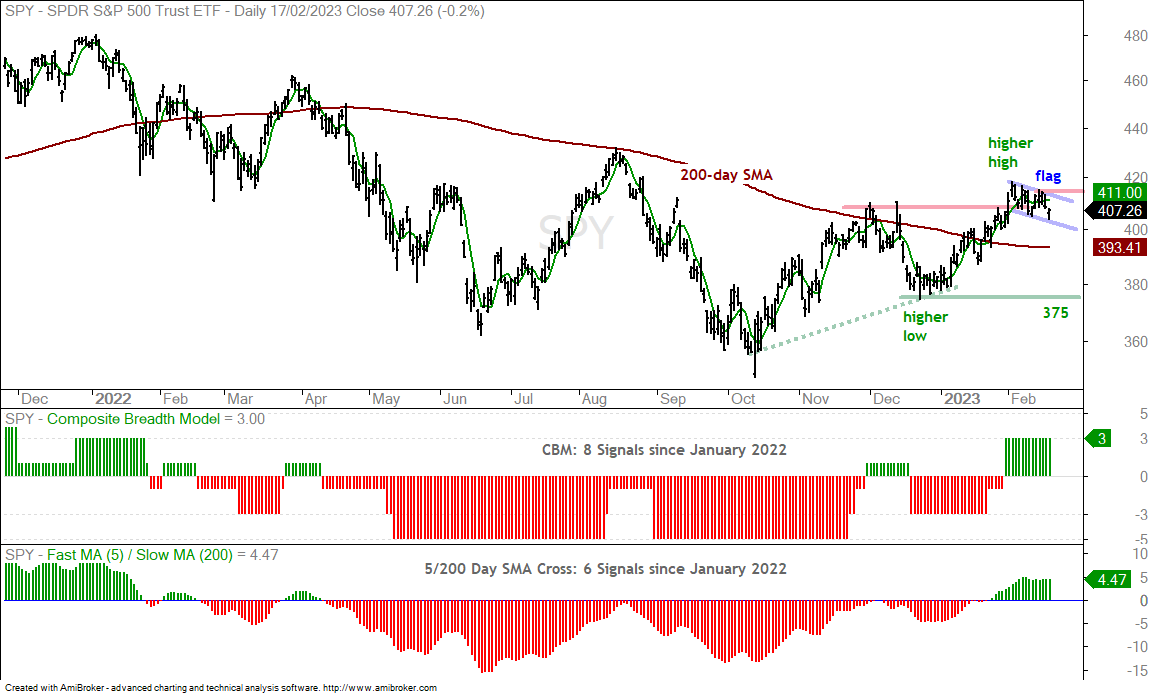
There is no such thing as a trend-following indicator without whipsaws. We have to absorb the whipsaws to catch the big trends. We never know ahead of time which signals will lead to whipsaws and which will foreshadow a big trend. The chart below shows SPY with the 5-day SMA and 200-day SMA, the CBM in the first window and the 5/200 cross in the bottom window. The Composite Breadth Model whipsawed throughout 2022, which means signals resulted in losses. The 5-200 cross also whipsawed in 2022 with six crosses between January 2022 and February 2023. Most recently, the CBM turned positive on January 31st and the 5-day crossed above the 200-day SMA on January 25th.
The weight of the evidence is bullish right now and we must now decide what it would take to prove this bullish stance otherwise (wrong). Technical analysis is always walking a fine line. Put another way: looking for the holy grail. We want timely signals with a low probability of whipsaw. Good luck on that one! Leading signals usually result in more whipsaws, while lagging signals reduce the chances of whipsaws.
The chart shows two support levels: 405 for short-term support and 375 for long-term support. A break below 405 would be the leading signal and the one most prone to whipsaw. A break below 375 would be the lagging signal and it is 8% lower. Instead of chart levels, I will opt for one of two signals for my long-term bias: the CBM turning negative or the 5-day crossing below the 200-day. Giving recent volatility and the propensity for big swings, I would like to take the first of these signals. My guess is that the 5/200 cross would trigger before the CBM.
For those keeping score at home…The 5/200 cross outperformed the Composite Breadth Model in 2022 because it lost 10.9% (vs 18.2%). However, the CBM outperformed the 5/200 cross when testing since 2003. The CBM had a Compound Annual Return (CAR) of 8.81% and a Maximum Drawdown (MDD) of 18.68%. The 5/200 cross had a CAR of 7.9% and an MDD of 20.62%.