Tech, Cloud and Software with Pennant Breakouts (XLK, SKYY, IGV)
Semis and Cybersecurity Lead within Tech (SOXX, CIBR)
Healthcare SPDR Returns to Breakout Zone (XLV)
Energy SPDR Extends on Breakout
Aerospace & Defense ETF Breaks Out of Pennant (PPA)
Airline ETF Corrects with Falling Wedge (JETS)
Clean Energy ETF Returns to Breakout Zone (PBW, ACES, PBD)
Biotech ETF Forms Falling Wedge within Large Triangle (IBB)
Biotech SPDR Finds Support at 50% Retracement (XBI)
Gold and Gold Miners Extend Pullbacks (GLD, GDX, SLV)
Weight of Evidence Bullish
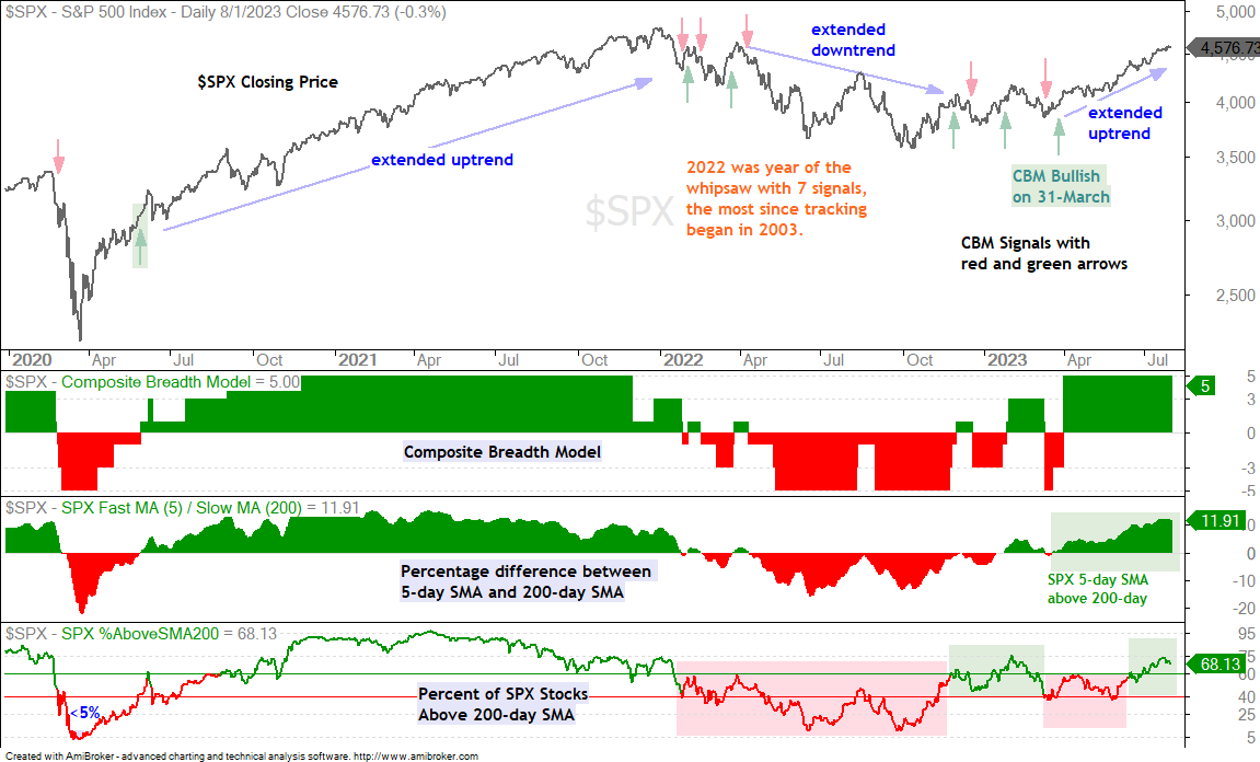
The weight of the evidence remains bullish for stocks. The Composite Breadth Model is positive (since March 31st), yield spreads show no stress and upside participation remains strong. SPY and QQQ remain in short-term uptrends, even though they are quite extended after big moves. I am watching the M top in the 50-percent AD Line for clues on this short-term uptrend. This indicator is explained further down.
Programming Note: I will update the ETF Trend-Momentum Strategy on Thursday. This strategy uses the eSlope for trend identification and Normalized-ROC for ranking. It also employs a 10% profit target. You can read more on this strategy here and see the signal table here.
Significant Readings in Advance-Decline Percent
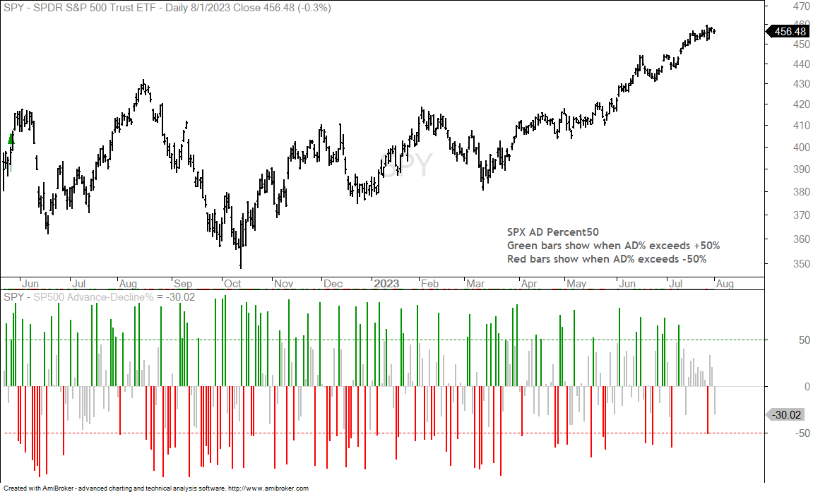
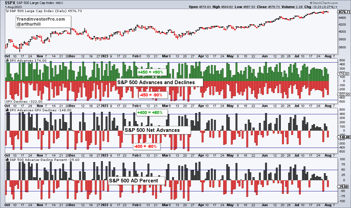
The next chart may seem complicated, but bear with me. There are two indicators and they are based on Advance-Decline Percent 50 for the S&P 500. SPX AD Percent is the percentage of advances less the percentage of declines for the S&P 500. Instead of using every AD Percent value, it only uses values that are above 50% and below -50%. In other words, it ignores values between +49% and -49%. This means it only counts days with significant moves. AD Percent of +60% means 80% advances and 20% declines (80 – 20 = +60). AD Percent of -70% means 15% advances and 85% declines (15 – 85 = -70).
M and W Patterns
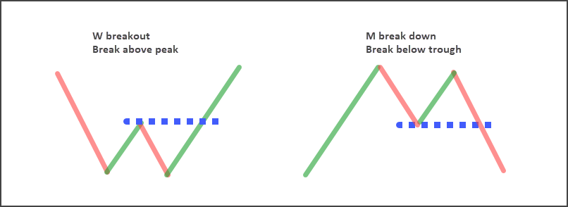
I created an AD Line based on this indicator. It rises +1 when SPX AD Percent50 is above +50% and falls -1 when SPX AD Percent50 is below -50%. It is flat when SPX AD Percent is between -49% and +49%. I am using W breakouts for bullish signals and M breakdowns for bearish signals. These M and W patterns were developed by Robert Levy and categorized by Arthur Merril (link here). A “W” forms when there is a bounce and a pullback that forms a peak. There must be a bounce and pullback. A bounce and flat line does not count as a peak. The W breakout occurs with a move above the peak. An “M” forms when there is a pullback and bounce that forms a trough. The M breakdown occurs with a break below the trough.
SPX AD Line50 Forms M Top
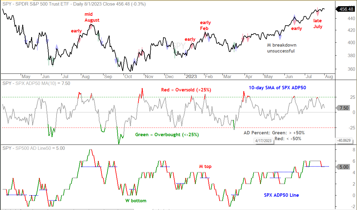
Before looking at the W and M breakouts, let’s review the overbought and oversold indicator. The first indicator window shows the 10-day SMA of SPX AD Percent50. I showed this indicator last week. It becomes overbought when above +25% (red) and oversold when below -25% (green). The overbought and oversold readings are shown with the red and green arrows on the price chart in the top window. We can see some timely oversold reading sin mid June, mid September, mid December and mid March. There was an errant oversold reading in late August. Unsurprisingly, oversold readings tend to work better than overbought readings.
The bottom window shows the SPX AD Line50, which is based on SPX AD Percent50. The dotted blue lines mark the peaks and troughs for the M tops and W bottoms. The breaks are shown with the blue arrows on the SPY price chart. The swing signals from June to March were quite timely. The M breakdown in May was unsuccessful as SPY continued higher. The blue dotted line at 5 marks the current trough low for an M top that is forming. The SPX AD Line50 fell to this level and flat lined the last few days (gray line). Another move below -50% in SPX AD% would trigger an M breakdown and argue for a downswing.
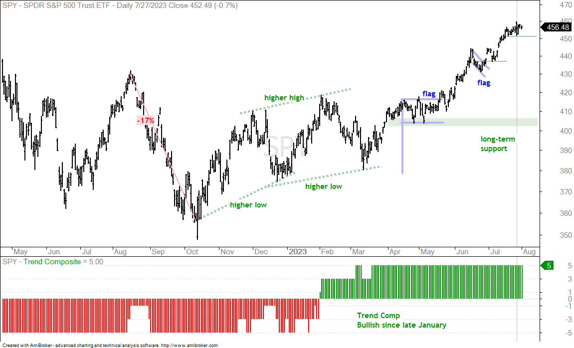
The long-term trend is clearly up as SPY trades near a 52-week high. The short-term trend is up after the flag breakouts in mid May and late June. SPY is currently “in trend”, which means there are no setups right now. SPY opened strong and closed weak on July 27th to form a large outside reversal day, but then rebounded the last three days. This rebound formed a short-term support level at 451 and a break here could give way to a pullback.
Note that I am not interested in short positions during bull markets and when the long-term trend is up. While a support break at 451 would technically reverse the short-term uptrend, it would also pave the way to an oversold condition and mean-reversion setup.
Short Pullback and Pop for QQQ
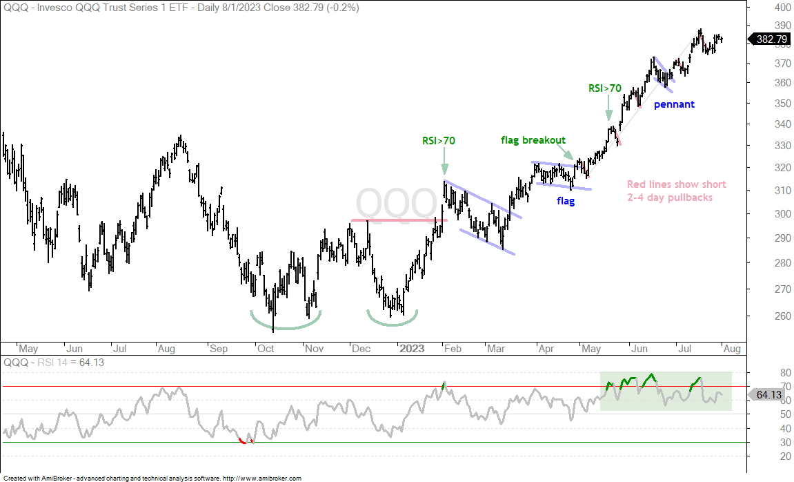
QQQ also remains within long-term and short-term utprends, and there is no setup on the chart. The short red lines from May to July show 2-4 day pullbacks that led to bounces. QQQ pulled back on July 19, 20 and 21, and then bounced the last few days. The indicator window shows RSI becoming overbought on February 2nd and this overbought reading foreshadowed a pullback. RSI also became overbought on May 18th. This overbought reading foreshadowed a two-day pullback, but SPY moved sharply higher on the third day. RSI became “overbought” through out June and July. This is a classic case of becoming overbought and remaining overbought during a strong uptrend. Most of the time we should just forget about overbought conditions in uptrends and wait for some sort of oversold condition.
Tech, Cloud and Software with Pennantss (XLK, SKYY, IGV)
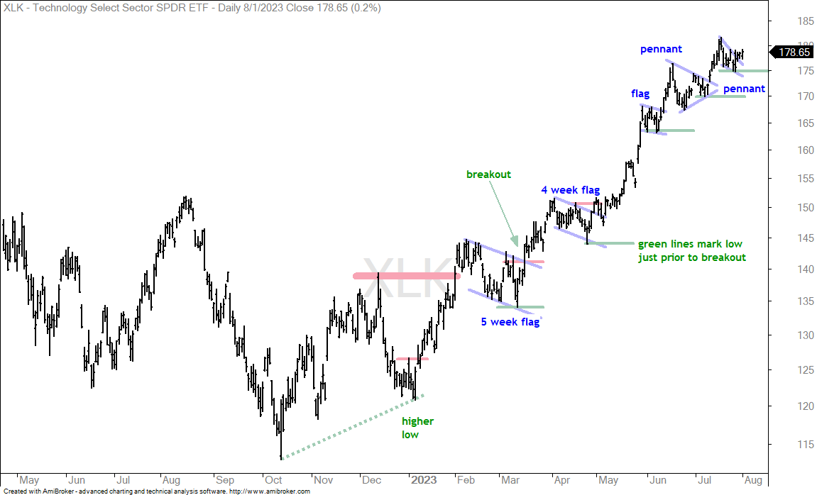
The Technology SPDR (XLK) remains one of the leading sectors this year and over the last three months. The setups since April have been quite short-term (1-4 weeks). XLK tagged a new high in mid July and then pulled back with a pennant. It broke out of this pennant last week and the pennant lows marks first support going forward. The green lines since April mark the pattern lows just before the breakouts. XLK never looked back after the breakouts from May to July. A break below the late July low (pennant low) would represent the first failed pattern in months.
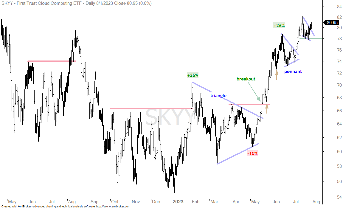
The next chart shows the Cloud Computing ETF (SKYY) with a pennant breakout and the lows marking first support at 78.
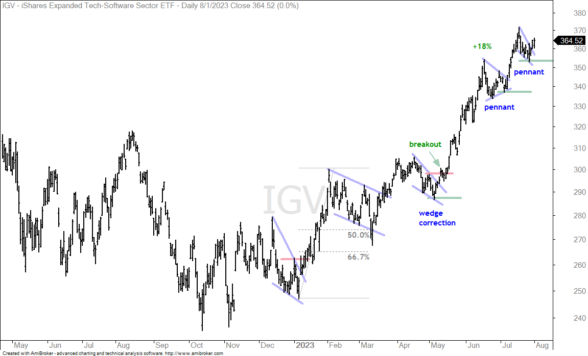
The next chart shows the Software ETF (IGV) with a pennant breakout and the lows marking first support at 353.
Semis and Cybersecurity Lead within Tech (SOXX, CIBR)
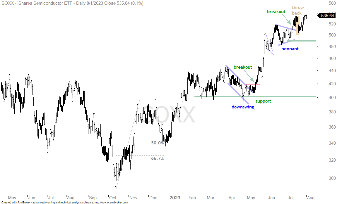
The next chart shows the Semiconductor ETF (SOXX) leading the way with a pennant breakout in mid July and a new high this week. The yellow shading highlights a two-day throwback after the pennant breakout. This throwback features a gap down and 5% decline. Seems scary, but it was more of an opportunity than a threat because SOXX moved to new highs afterwards. Keep this setup in mind: breakout surge and hard 2-3 day throwback to breakout area.
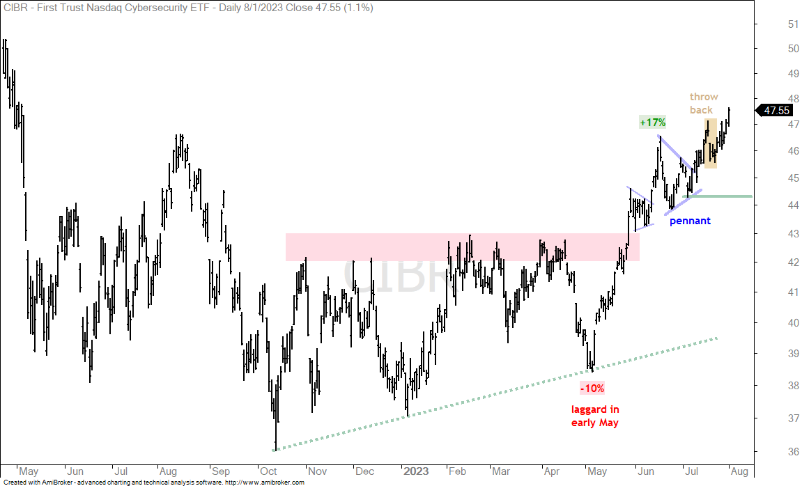
The next chart shows the Cybersecurity ETF (CIBR) with similar characteristics. These two are leading because SPY and QQQ did not hit new highs this week. SOXX and CIBR, on the other hand, did.
Healthcare SPDR Returns to Breakout Zone (XLV)
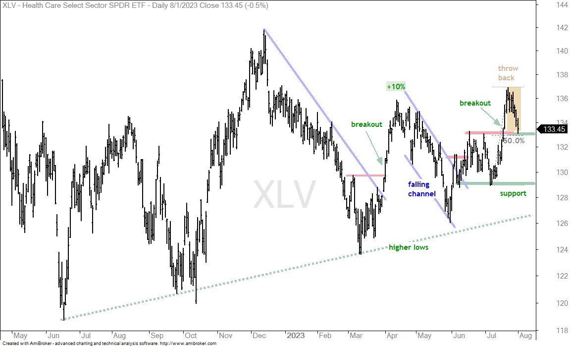
The next chart shows the Healthcare SPDR (XLV) with a different throwback. It extends seven days and it retraced around half of the prior surge. XLV broke out with this surge and then returned to the breakout zone, which turns first support. This is an area to watch for firming and a bounce.
Energy SPDR Extends on Breakout
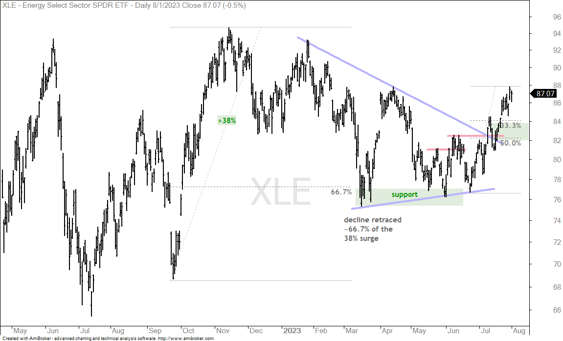
The Energy SPDR (XLE) and energy-related ETFs were some of the best performers in July. The chart shows XLE forming a large triangle consolidation and breaking out in mid July. The green zone marks a throwback area to watch for support, should XLE pull back. Broken resistance and the 33-50 percent retracement area define this zone.
Aerospace & Defense ETF Breaks Out of Pennant (PPA)
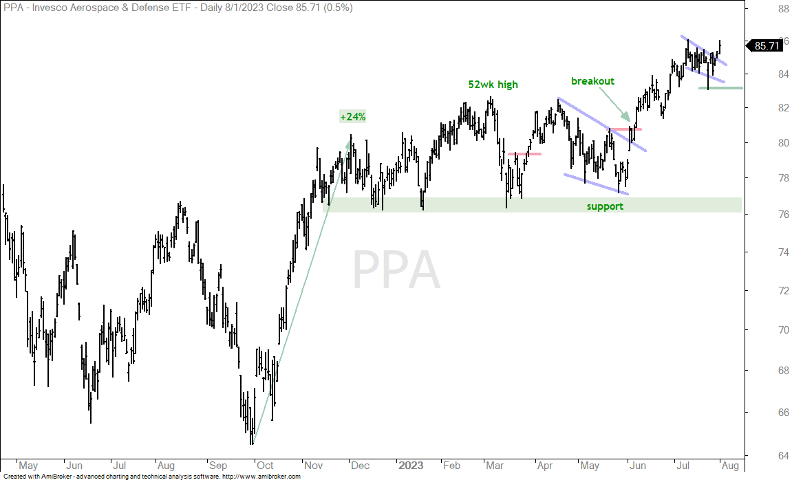
The Aerospace & Defense ETF (PPA) remains a leader with a pennant breakout and fresh closing high. The ETF did not hit an intraday high on Tuesday. Nevertheless, the big trend is up and the pennant breakout keeps the short-term uptrend intact. I will mark first support at 83, which is the pennant low.
Airline ETF Corrects with Falling Wedge (JETS)
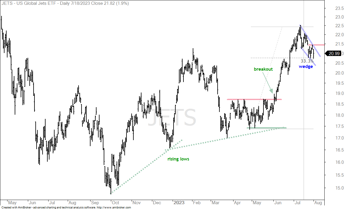
The Industrials SPDR (XLI) is one of the strongest sectors right now and the Airline ETF (JETS) is part of this sector. Airlines account for just 2.55% of the sector. Aerospace & Defense is also part of the sector and accounts for 19%. The chart below shows JETS with a massive surge in June and a falling wedge pullback in July. This pullback retraced around 33% of the prior advance. The pattern and the retracement amount are normal for corrections within bigger uptrends. A breakout at 21.5 would end the correction and signal a continuation higher.
Clean Energy ETF Returns to Breakout Zone (PBW, ACES, PBD)
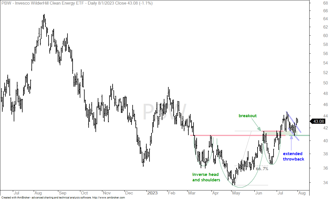
Before looking at the Clean Energy ETF (PBW), note that TAN, ICLN and FAN are not performing well. The Solar Energy ETF (TAN) and Global Clean Energy ETF (ICLN) are near their lows for the year. The Wind Energy ETF (FAN) fell sharply the last five days and is near its March-July lows. These three are the weakest in the group. The next three charts show the Clean Energy ETF (PBW), Clean Energy ETF (ACES) and Global Clean Energy ETF (PBD) with breakout surges in July and pullbacks into August. These look like throwback corrections after big surges and breakouts would be short-term bullish. The first chart shows PBW with a breakout and support marked at 40.90
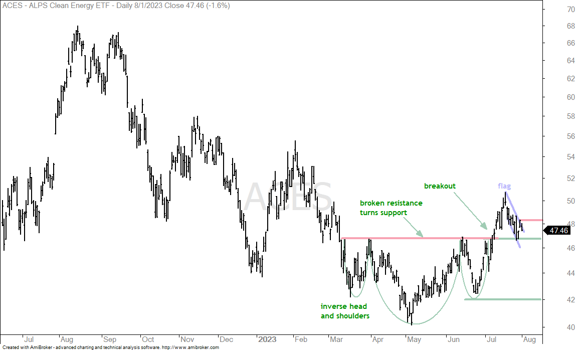
The next chart shows ACES with a breakout and throwback to the breakout zone. A flag breakout at 48.3 would be bullish.
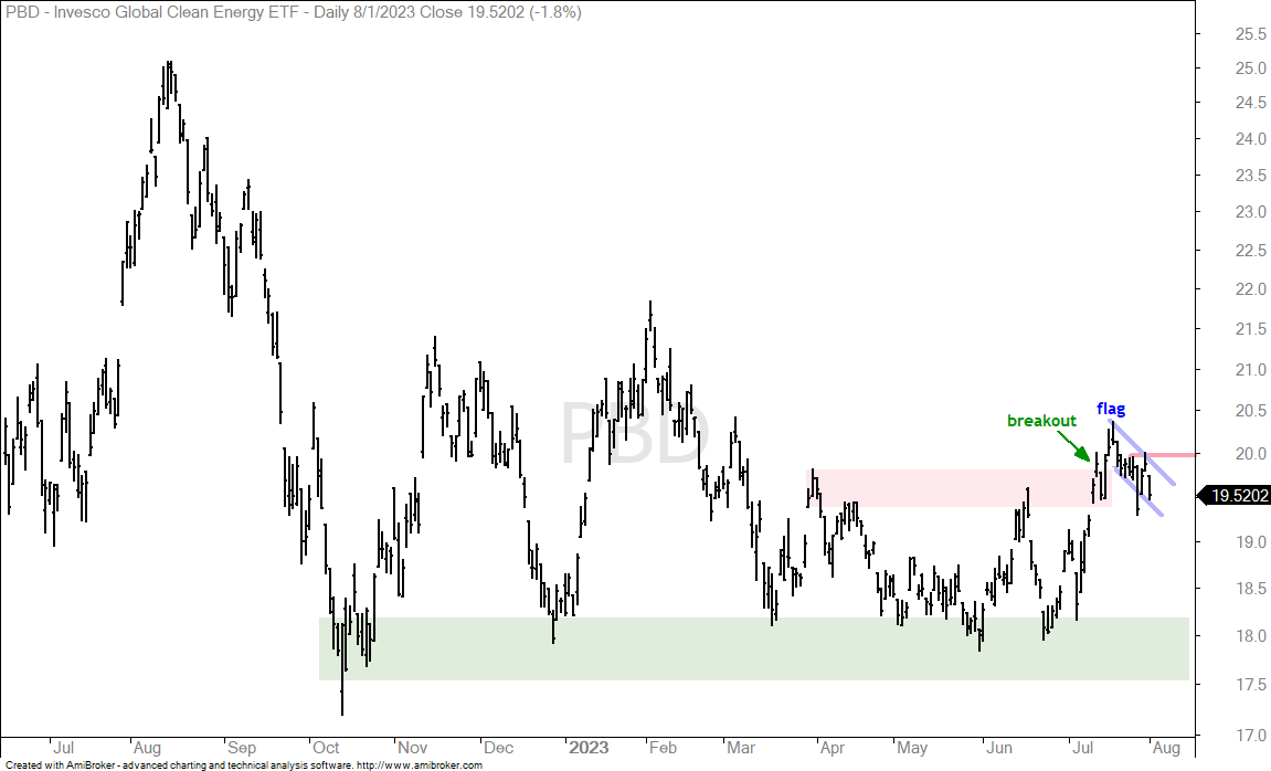
The next chart shows PBD with a breakout and falling flag. A breakout at 20 would be bullish.
Biotech ETF Forms Falling Wedge within Large Triangle (IBB)
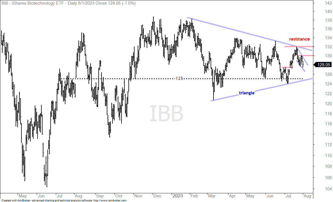
Biotechs are out of favor this year and not participating in the bull run. SPY is up some 19% this year, but the Biotech ETF (IBB) is down 2.5% and the Biotech SPDR (XBI) is up just .36%. On the price chart, IBB remains in a large triangle consolidation this year. IBB advanced to the upper end and fell the last two weeks with a falling wedge. A wedge breakout at 130 would be short-term bullish and increases the chances for a bigger triangle breakout.
Biotech SPDR Finds Support at 50% Retracement (XBI)
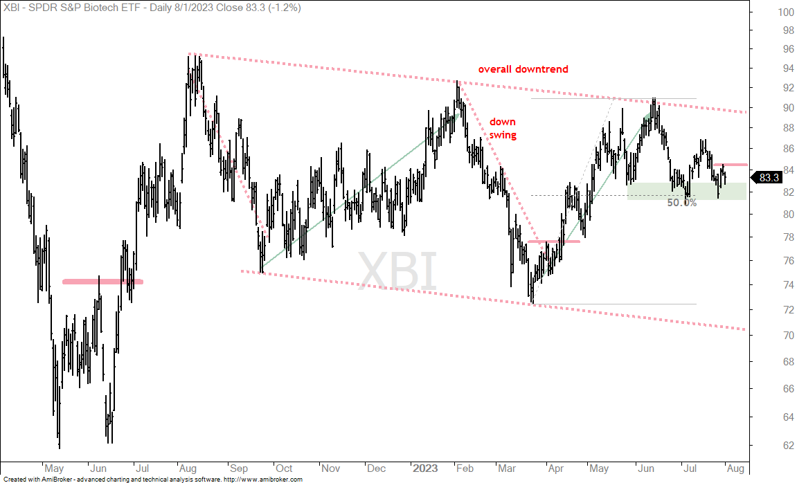
The next chart shows XBI within a large falling channel. The ETF hit the upper line in June and fell back in July. XBI caught my eye because it retraced around 50% of the prior advance and found support in the 81-83 area from mid May to July (green shading). XBI did a little pop and drop the last few days and this establishes resistance at 84.5. A short-term breakout here would be bullish.
Gold and Gold Miners Extend Pullbacks (GLD, GDX, SLV)
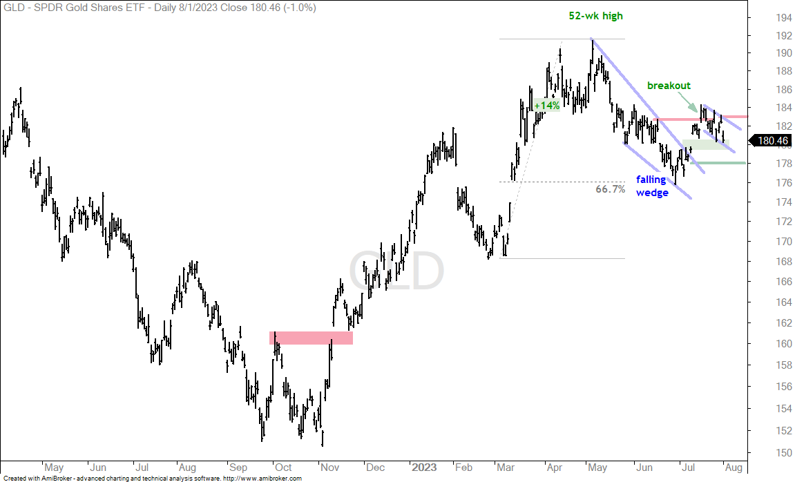
The Gold SPDR (GLD) continued its pullback after the July breakout surge. First, GLD is in a long-term uptrend and the falling wedge retraced around 67% of the prior advance. Second, GLD broke out with a surge above 183. Third, the ETF pulled back after this breakout surge with a falling flag taking shape. A second breakout at 183 would reverse the falling flag and signal a resumption of the bigger uptrend. Support is marked at 178.
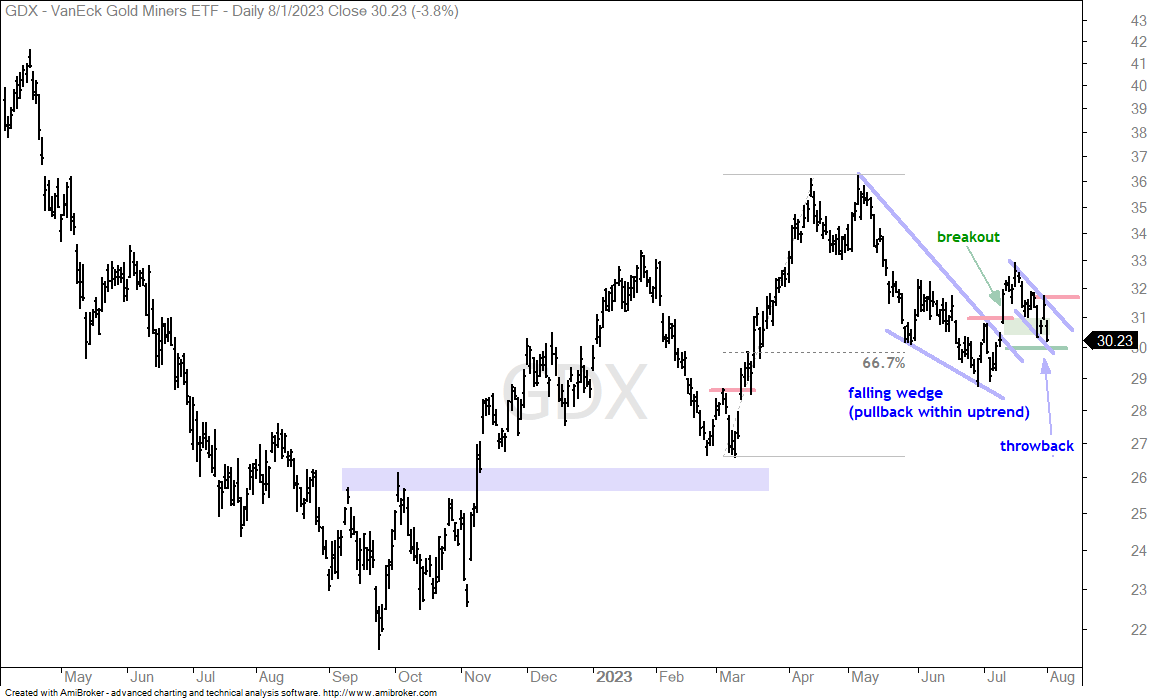
The next chart shows the Gold Miners ETF (GDX) with a breakout and extended throwback. Some throwbacks are short and turn on a dime. Others extend and evolve into falling flags or wedges. GDX has a falling flag taking shape with Monday’s high marking resistance. A breakout here would be bullish.
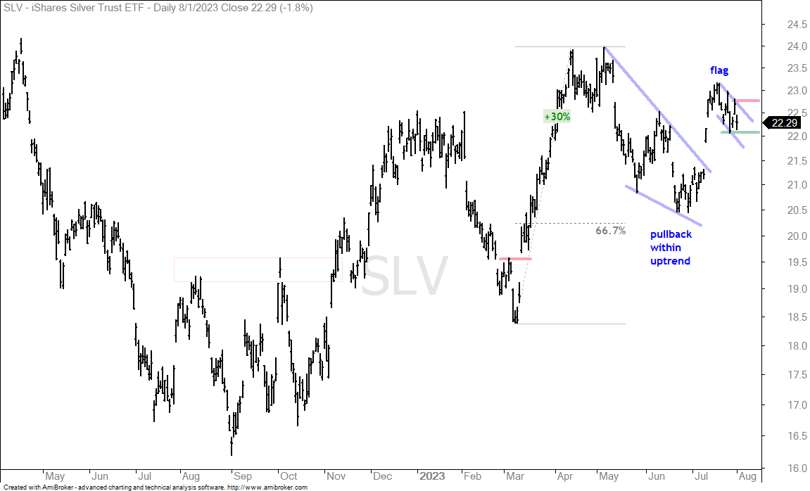
For those with strong stomachs…the next chart shows the Silver ETF (SLV) with a falling flag after the mid July surge. A break above Monday’s high would be bullish. Chartists can then use the flag lows to set first support.