We know the S&P 500 is driven by large-caps, especially the big four, which account for over 20% of the index (AAPL, MSFT, AMZN, GOOGL). Furthermore, most of us are aware that breadth measures are not as strong as the S&P 500 and this is reflected in the S&P 500 EW ETF (RSP), which has yet to clear its June high. Breadth, however, is not exactly weak. It is just strong enough to sustain the advance. In other words, the cup is half full, not half empty.
There are still concerns because SPY is getting frothy and QQQ has been frothy for almost two months. QQQ is currently some 28% above its 200-day SMA and this is the most since early 2000. Note that QQQ was over 20% above its 200-day on July 6th and this did not derail the advance. Overextended conditions increase the odds of a corrective period, but they are not very good indicators for timing corrections.
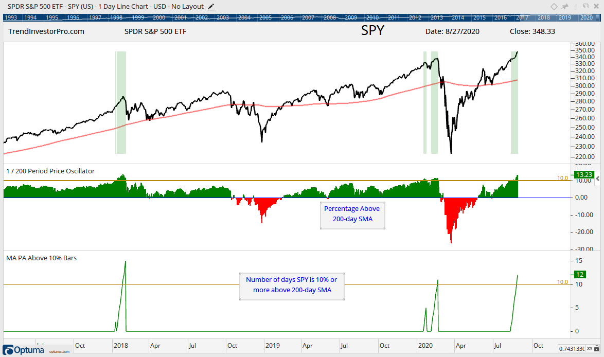
The chart below shows SPY and the 1/200 Price Oscillator, which measures the percentage difference between the close and the 200-day SMA. The yellow line is at 10%, the green shading shows when this Price Oscillator is above 10% and the bottom window shows the number of days above 10%. SPY has been more than 10% above its 200-day for 12 days now. Prior runs were 11 days on 20-Feb-2020 and 15 days on 1-Feb-2019. What’s the deal with February?
The February 2019 run foreshadowed a sharp correction later that month, while the February 2020 run foreshadowed the March 2020 crash. I am not going to speculate on the depth or speed of a correction, but will simply note that SPY is as frothy as it was the last two Februaries.
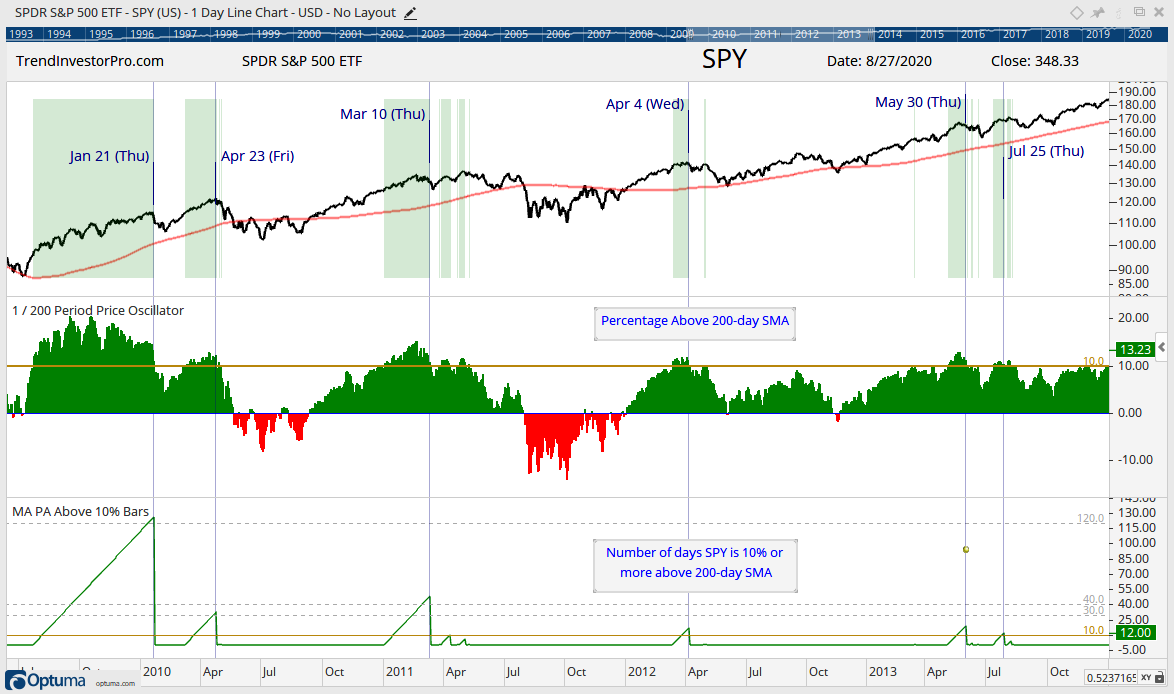
A true assessment would require more data points and perhaps even a backtest. The next chart shows the period from July 2009 to October 2013. Note that SPY doubled during this bull run with a move from 90 to 180. Here we can see a number examples when SPY became overextended and remained so: January 2010 (126 days), April 2010 (32 days), March 2011 (48 days), April 2012 (17 days), May 2013 (19 days) and July 2013 (11 days).
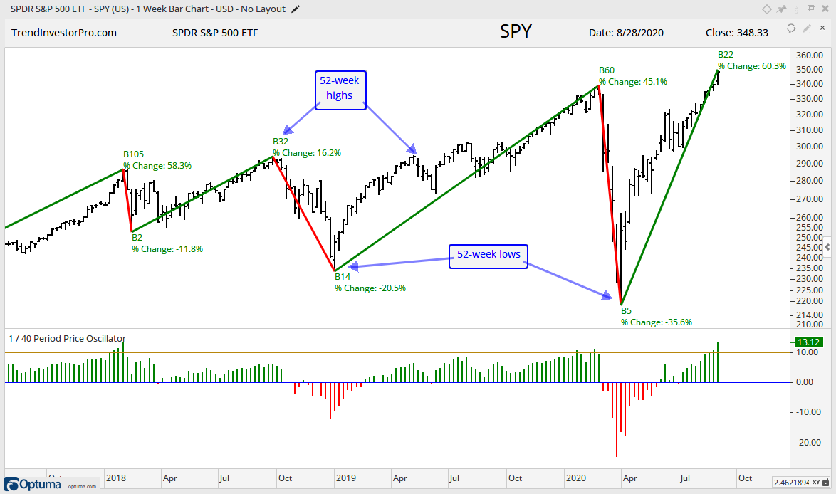
Corrections eventually materialized, but we cannot really time one just because the market “seems” overextended. On a subjective note, I will suggest that the nature of the market changed at the beginning of 2018 as volatility picked up and the swings became bigger and faster. This means the 3 to 6 month trends are key. The current upswing is +60% in 22 weeks (see B22 and %Change at end of swing on chart). As such, I am monitoring the health of this upswing using the medium-term indicators.
Medium-term Indicators Remain Net Bullish
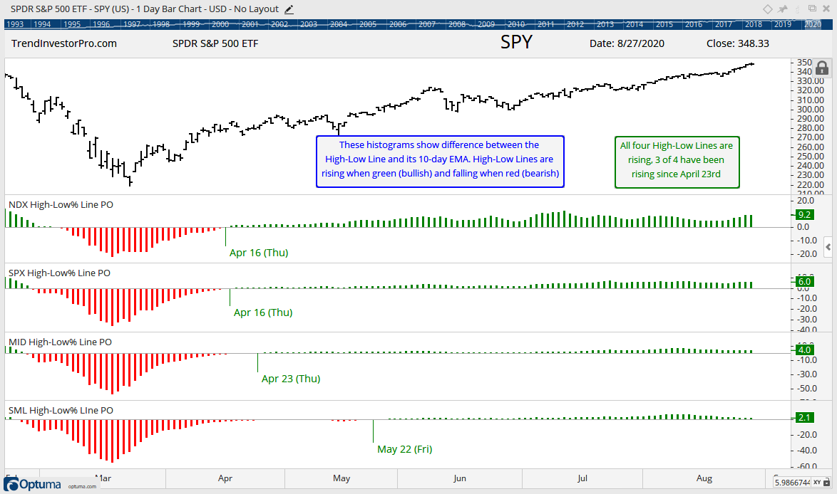
The next chart shows the High-Low Lines in a different format. The histograms reflect the percentage difference between the High-Low Line and its 10-day EMA. The histogram as green when the High-Low Line is above its 10-day EMA (bullish) and red when below. As the chart shows, 3 of 4 histograms have been positive since April 23rd and all four are currently positive.
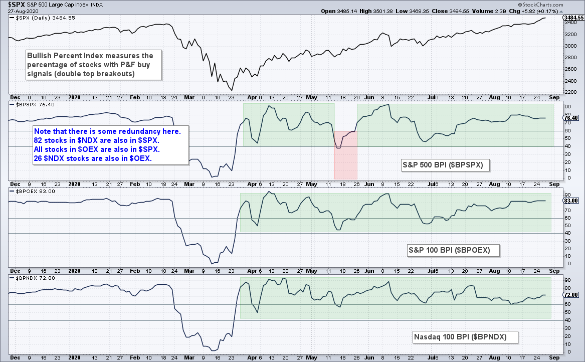
The Bullish Percent Indexes remain bullish for the S&P 500, S&P 100 and Nasdaq 100. The S&P 500 BPI faltered in mid May with a dip below 40%, but quickly recovered and turned back to bullish with a move above 60% before month-end. Currently, over 80% of S&P 100 stocks are on P&F buy signals (double top breakouts). 76% of S&P 500 stocks are on P&F buy signals, as are 72% of Nasdaq 100 stocks.
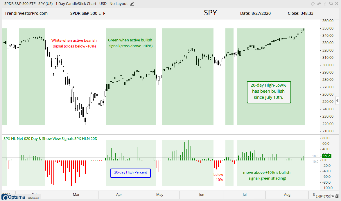
SPY moved to another new high this week and recorded lots of 20-day highs since July 21st. Not as many stocks joined the 20-day high parade. 20-day High-Low Percent expanded in mid July and early August, but shrunk over the last two weeks. Fewer 20-day highs is not bearish though. While it does show less upside participation, it does not show an expansion of downside participation (20-day lows). This indicator remains net bullish until a move below -10%.
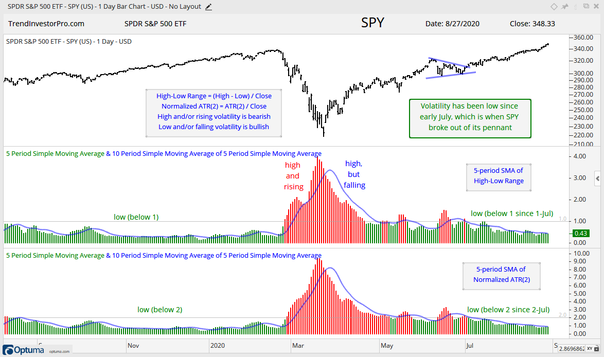
There is a lot of chatter regarding volatility lately. Note that $VIX and $VXN are both positive over the last 20 days. These volatility measures actually rose along with the S&P 500 and Nasdaq 100. It is an unusual occurrence to see these two rising when stocks rise. My homegrown volatility measures, however, remain tame and have yet to turn up. The 5-day SMA of the High-Low Range remains well below 1 and the 5-day SMA of Normalized ATR(2) remains well below 2. These are levels last seen in, gulp, mid February. Nevertheless, these indicators are considered bullish until we see moves above their respective thresholds.
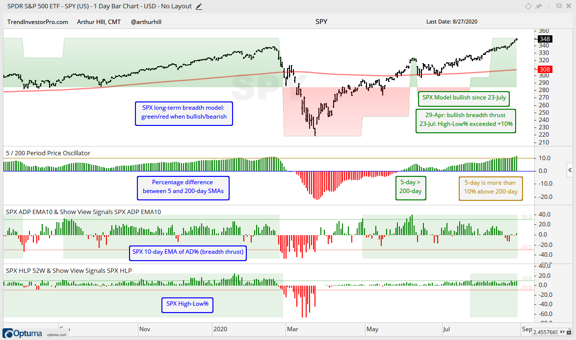
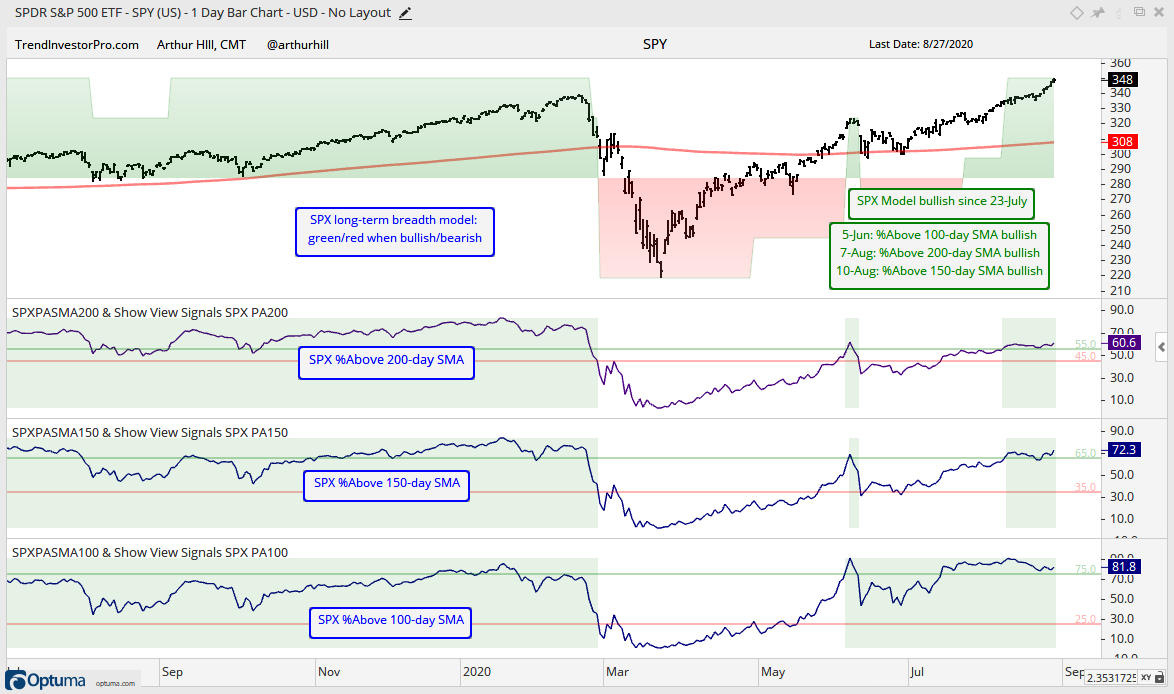
S&P 500 Model Bullish, but Underwhelming
The S&P 500 breadth model remains bullish with all five indicators on bullish signals and the 5-day SMA for SPY is above the 200-day SMA. The breadth thrust triggered first with a move above +30% on 29-Apr, the 5-day SMA crossed the 200-day SMA on 29-May and High-Low Percent finally caught up with a bullish signal on 23-Jul. High-Low Percent is still relatively low considering that the S&P 500 is trading at a new high.
The next chart shows the three %Above SMA indicators. The %Above 100-day SMA turned bullish way back on 5-June and remained bullish. The %Above 150-day SMA and 200-day SMA whipsawed and turned back to bullish on 10-Aug and 7-Aug, respectively. Currently, some 60% of S&P 500 stocks are above their 200-day SMAs, which implies that 40% are below. While this is net bullish, these are not the numbers one would expect with the S&P 500 at new highs.
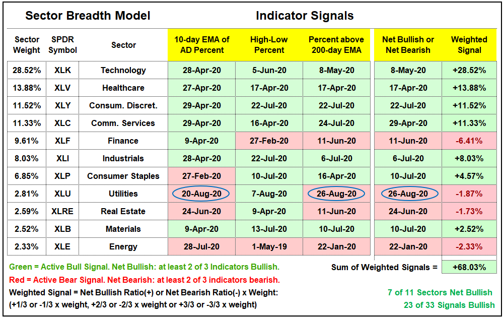
There is not much change in the Sector Breadth Model as a whole, but one small sector flipped bearish this week. Overall, seven of eleven sectors are net bullish. Finance is the only one of the big sectors to remain bearish. Actually, there are perhaps just four big sectors now because we are getting more separation. The top four account for 65% of the S&P 500. Finance is less than 10% of the index and Industrials come in at a lowly 8%. Tech increased its weighting to 28.5%.
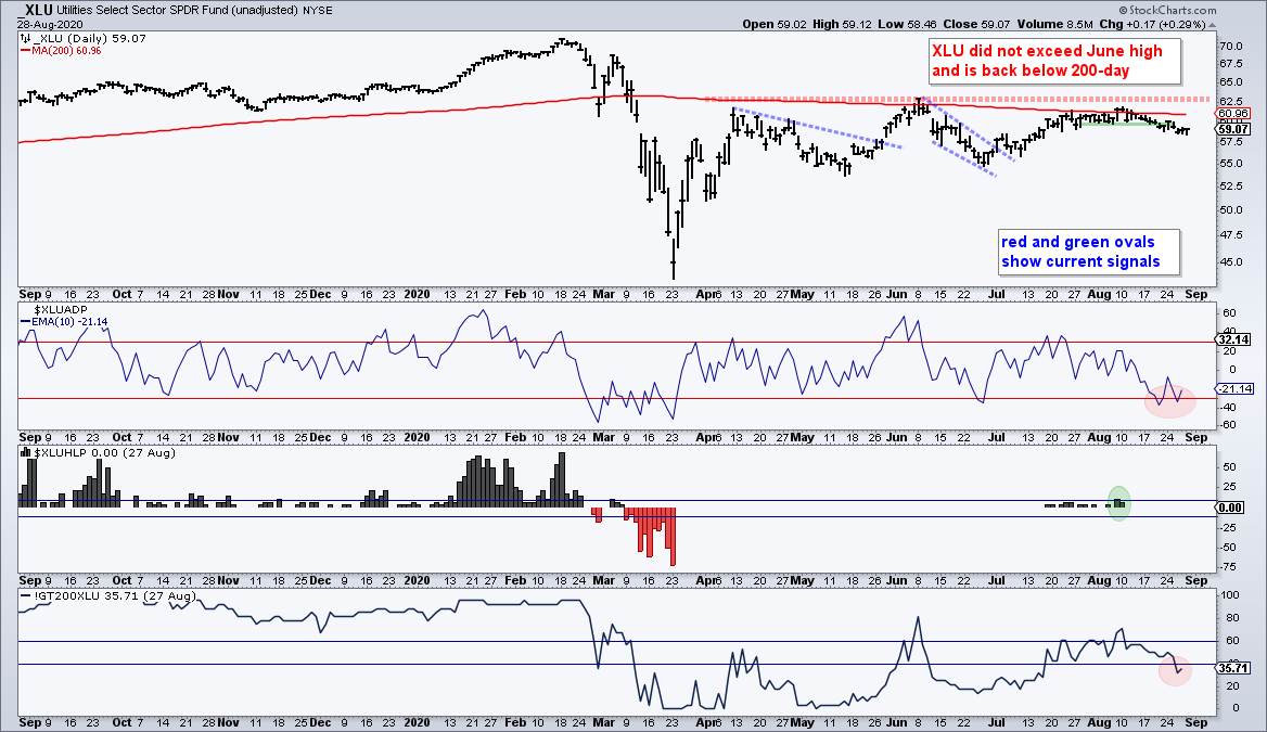
The Utilities SPDR (XLU) turned net bearish as the 10-day EMA of AD Percent plunged below -30% for a bearish breadth thrust and %Above 200-day EMA moved below 40%. This sector has gone nowhere for months and the recent rise in Treasury yields (fall in bonds) could weigh on this bond proxy.
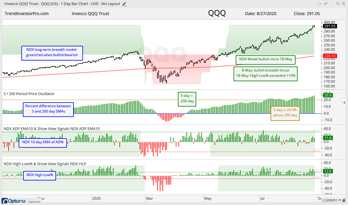
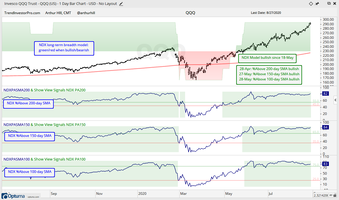
Nasdaq 100 Model Bullish with Broad Strength
The Nasdaq 100 breadth model turned net bullish on 18-May and all five breadth indicators have been on active bullish signals since 28-May. Large-cap techs pushed the 5-day SMA of QQQ above the 200-day SMA way back in mid April. A breadth thrust followed in early May, while %Above 200-day and High-Low Percent triggered bullish in mid May. High-Low Percent remains strong and continues to punch above +10% on a regular basis.
The %Above SMAs for the Nasdaq 100 are strong, very strong. All three are above 80% and this reflects broad strength in the index. In fact, all three have been largely above their bullish signal lines (green) since mid May. The only negative is that the 5-day SMA of QQQ is more than 26.9% above the 200-day SMA. Of course, QQQ was extended on July 9th, rested for two weeks with a consolidation and then powered higher.
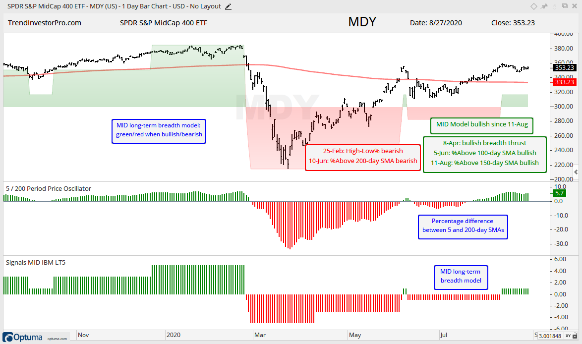
Mid-cap Model is Net Bullish, but High-Low Percent Drags
Three of the five breadth indicators are on active bullish signals for the S&P MidCap 400, with the two longer-term indicators dragging their feet. %Above 200-day SMA has been on a bearish signal since 10-Jun and just 52% of mid-caps are above their 200-day SMA. High-Low Percent triggered bearish in late February and has yet to fully recover. New highs are outpacing new lows, but High-Low Percent has not been above +10% since February 12th. Overall, mid-caps are mixed.
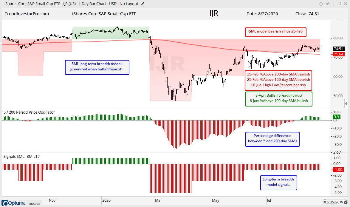
Small-cap Model is Net Bearish
Small-caps continue to represent the weakest area of the stock market. Three of the five breadth indicators are on active bearish signals and the breadth model has been net bearish since 25-Feb. Just 47% of small-caps are above their 200-day SMAs and High-Low Percent has not been above +10% since August 2018. New highs are still outpacing new lows, but the total number of new highs reflects narrow leadership within the S&P SmallCap 600.
Treasuries, Banks, the Fed Balance Sheet and Yield Spreads
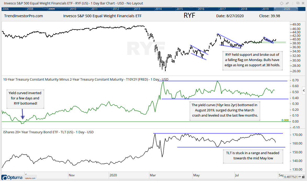
The Fed made a historic change on Thursday when Chairman Powell announced that employment is the top priority, as opposed to inflation. This sent the 20+ Yr Treasury Bond ETF (TLT) sharply lower, the 10-yr Treasury Yield sharply higher and widened the yield spread, which could be positive for banks. Note that the Fed rarely leads the bond market. It is usually the other way around.
Analysts suggested that this was nothing new and reflected Fed behavior over the last few months. The bond market, however, was clearly shocked and reacted negatively. Treasury bonds loath inflation. Gold fell on Thursday, but is up sharply in early trading on Friday.
How will this historic change affect the stock market? It is interesting to speculate, but there are simply too many variables at work and I will simply cue off stock market related charts. Jim Bianco noted that the Fed decision is not a green light for stocks, but it takes away the red light. For now, TLT is stuck in a range, just like XLU. The EW Finance ETF (RYF) broke out of a small flag and has a bullish bias as long as support at 38 holds. KRE and KBE have similar looking charts.
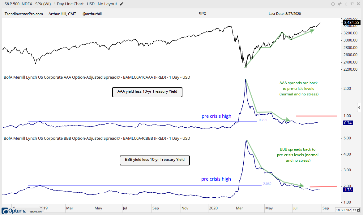
The yield spreads are probably the most important non-stock market factors to watch. The AAA and BBB spreads fell back to pre-crisis levels and remain low, which is bullish for stocks. Well, it may not be a green light, but it takes away the red light. The red lines, which are subjective, mark the danger lines and moves above these levels would show a widening that would suggest stress in the credit markets.
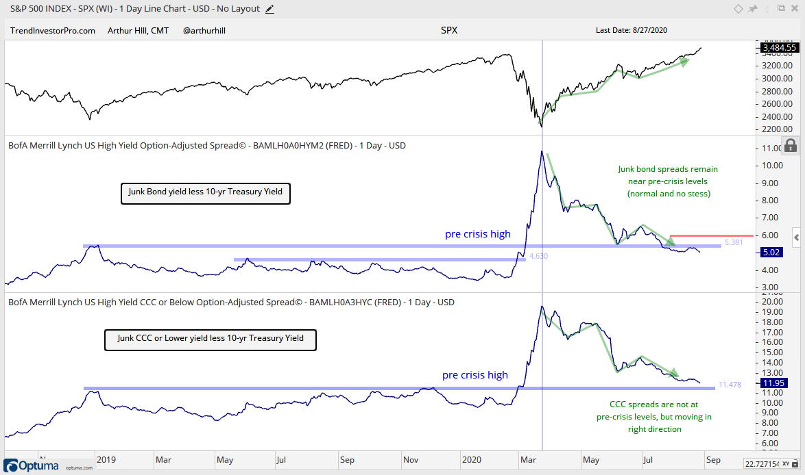
The junk bond spread also fell back to pre-crisis levels and remains normal. A move above 6 would show widening and be negative. CCC spreads are not back to pre-crisis levels, but are moving in the right direction and not flashing the red light.
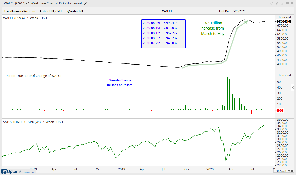
The Fed balance sheet is on hold after the historic expansion. I guess the Fed has moved on to Pandemic Strategy 3.0. The first phase involved buying corporate bonds and the second phase was the balance sheet expansion. Phase 3 is the focus on employment first and inflation second. Good luck on that!
")