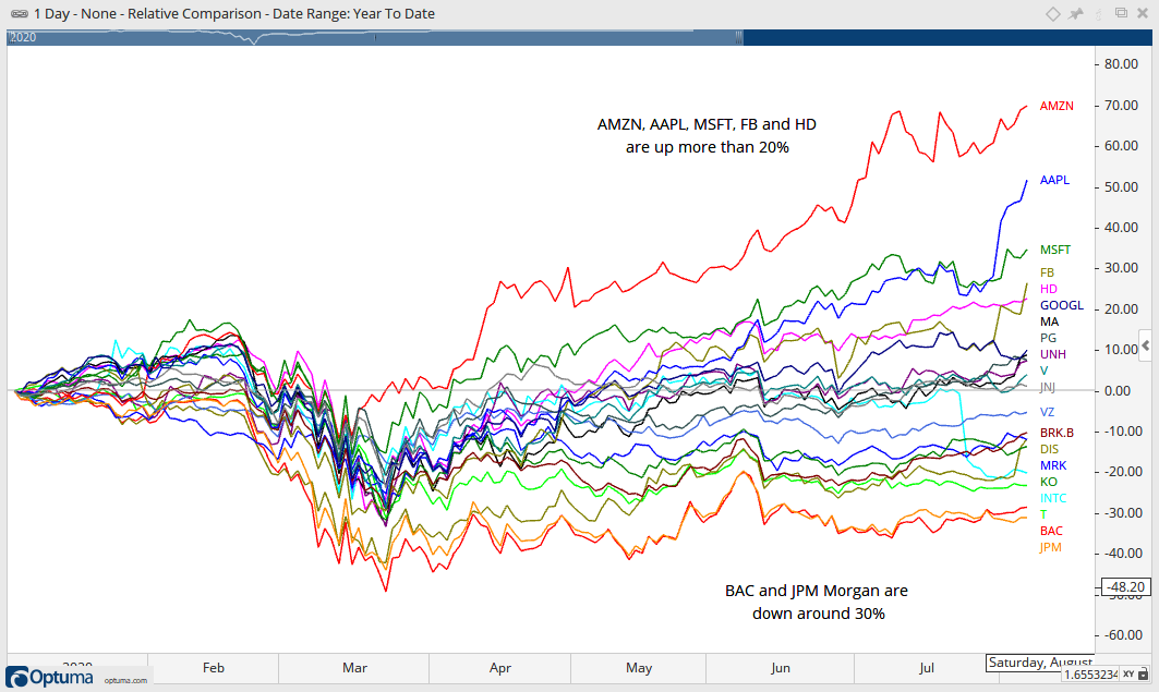
The chart below shows year-to-date performance for the top 20 stocks in the S&P 500. Overall, the year is mixed with eleven up and nine down. Amazon is up over 70%, Apple is up over 50% and Microsoft is up over 30%. Facebook and Home Depot are dragging their feet with gains greater than 20%. As strong as the stock market seems, strength is clearly concentrated in a few stocks. Moreover, these few stocks are up big, really big.
The images in this commentary are linked to a StockCharts chart version when possible.
The two worst performers year-to-date are Bank of America and JP Morgan. Both are down around 30% year-to-date and weighing on the Finance sector, which is the second weakest sector overall. Thus, as strong as the stock market seems, it is really a mixed bag out there. There are still some pockets of serious weakness in some key groups, such as banks. Techs are doing the heavy lifting right now and the broader market is quite reliant on this sector as it grows in size.
I remain in trend monitoring mode for the stock market. After a surge from late March to May, stocks rested in June and bullish continuation patterns formed (triangles and small wedges). Many ETFs broke out in early-mid July. Some moved sharply higher after their breakouts (ITB, XRT) and some just drifted higher (XLI, RSP). The June lows now mark key supports pretty much across the board. A pullback in stocks would be tolerated as long as the key ETFs hold these lows.
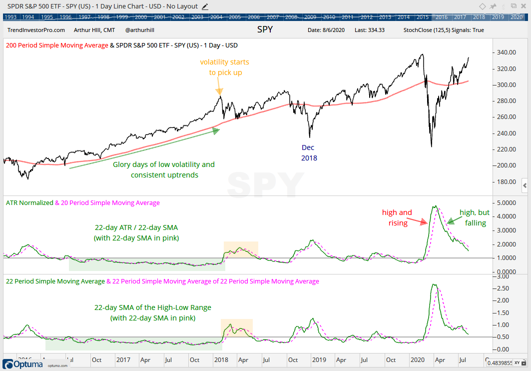
Bear markets and price declines typically feature high and/or rising volatility. Bull markets and price advances, on the other hand, feature low and/or falling volatility. Volatility, however, is a moving target because it appears to have increased in general since January 2018. Nevertheless, we can still use volatility indicators to assess the overall state of the stock market.
The chart below shows two volatility indicators. First, there is normalized ATR, which is the 22-day Average True Range divided by the 22-day SMA. ATR is a volatility indicator and dividing by the SMA normalizes it. Even though chartists can use plain ATR, normalized ATR can be compared across securities and timeframes. The second indicator is the 22-day SMA of the High-Low Range, which is the high less the low divided by the close. This indicator rises when the high-low range expands and falls when the high-low range contracts.
Volatility was low from the summer of 2016 until January 2018 and SPY marched steadily higher. Volatility picked up from February to May 2018 and then subsided into October. Both indicators started rising in October 2018 and this rise coincided with the decline into December 2018. Most recently, we saw volatility rise sharply in March 2020 as the stock market crashed and then fall sharply as the stock market rebounded. Overall, volatility is still a little above average, but it is falling and this is net positive for stocks. An upturn in these two indicators would be negative.
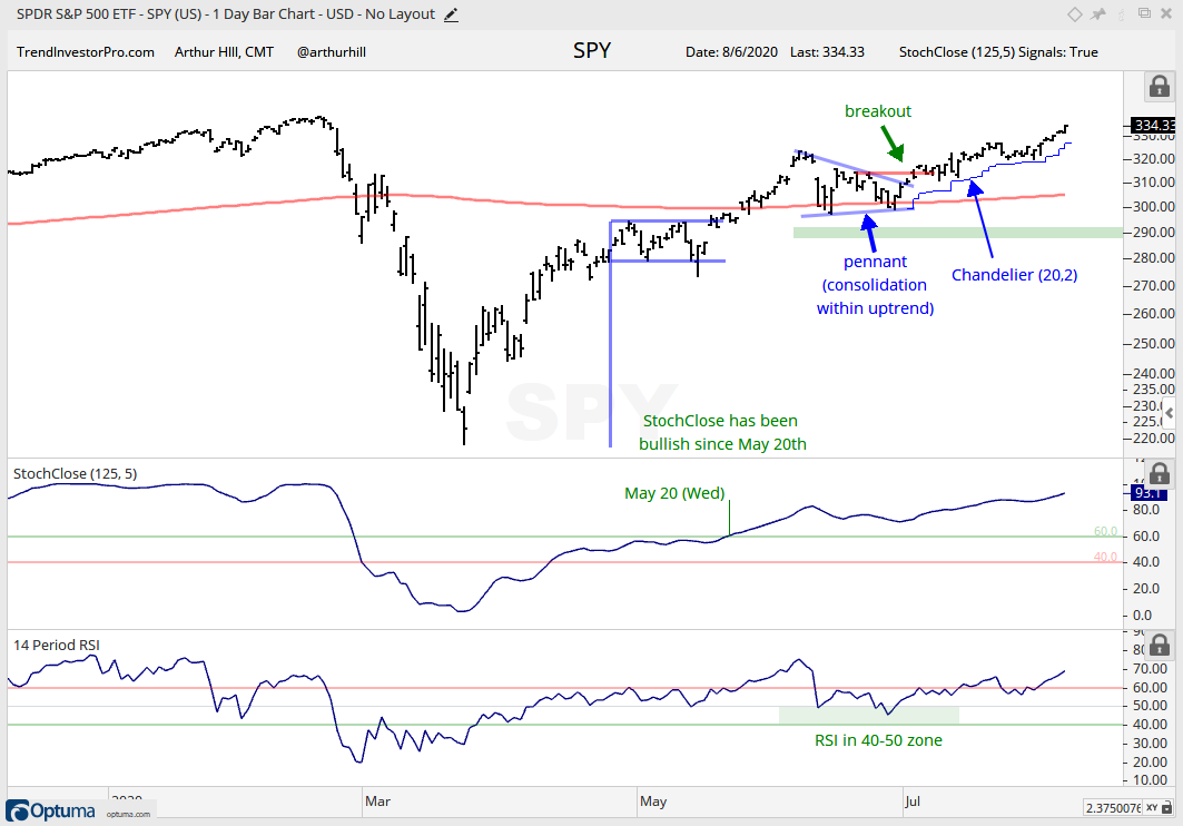
SPY versus RSP
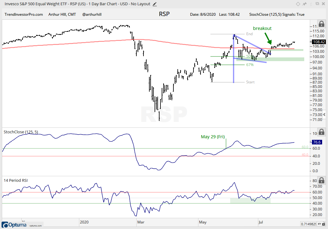
SPY and the S&P 500 EW ETF (RSP) remain the key ETFs to watch as far as the broader market is concerned. SPY represents large-caps, which are leading. RSP represents the average stock in the S&P 500. The Russell 2000 ETF and S&P MidCap 400 SPDR will follow the lead of RSP. SPY remains strong with a triangle breakout in early July and a move above the June high. The ETF is up a cool 11.5% the last 28 trading days.
At this point, I remain in the monitoring phase for the current advance. I could look for short-term support levels, but I am just going to mark key support at the June lows. The blue jagged line marks the Chandelier Exit (20,2) Anyone who is nervous or wishes to use a trailing stop can consider this indicator. It will rise as long as SPY rises and trail the advance.
RSP is not as strong as SPY because it has yet to exceed its June high. Nevertheless, the ETF broke out, the breakout held and prices edged higher the last few weeks. RSP is still close to the breakout zone and this means the breakout could still fail (close below 103). Such a move would also break the 200-day. Key support remains at the June lows (98).
Medium-term Indicators Remain Net Bullish
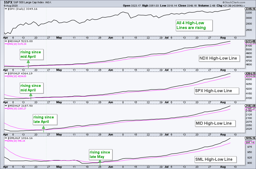
The High-Low Lines continue to rise and we even saw a modest uptick in the small-cap and mid-cap High-Low Lines. The SPX and NDX High-Low Lines have been rising since mid April, the MID High-Low Line has been rising since late April and the SML High-Low Line has been rising since late May. This indicator group is bullish until at least two of the four turn down and break their 10-day EMAs.
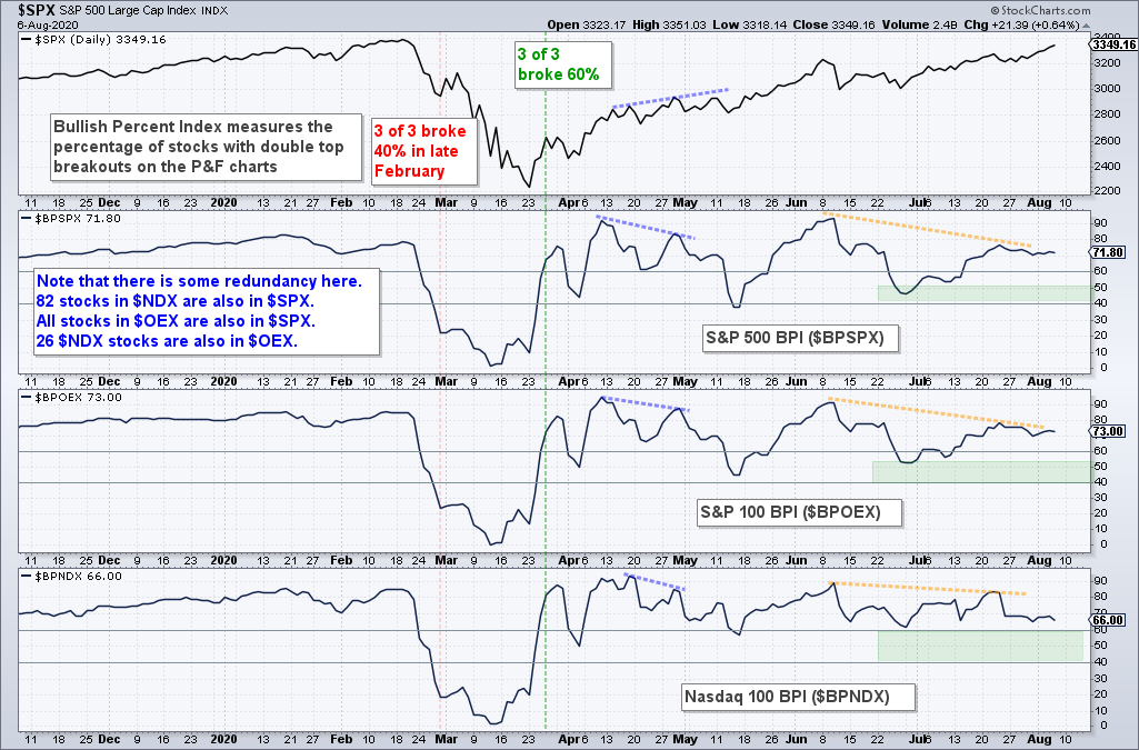
Signs of waning participation are evident in the Bullish Percent Indexes. The SPX and OEX BPIs exceeded 90% in early June and did not exceed 80% in late July, even as SPX and OEX moved to new highs for the move. Nevertheless, both BPIs are above 70% and strong overall. NDX BPI is actually the weakest of the three because 66% of stocks have P&F buy signals. Again, this is well above 50% and still technically bullish. A move below 40% in two of the three would turn this indicator group bearish.
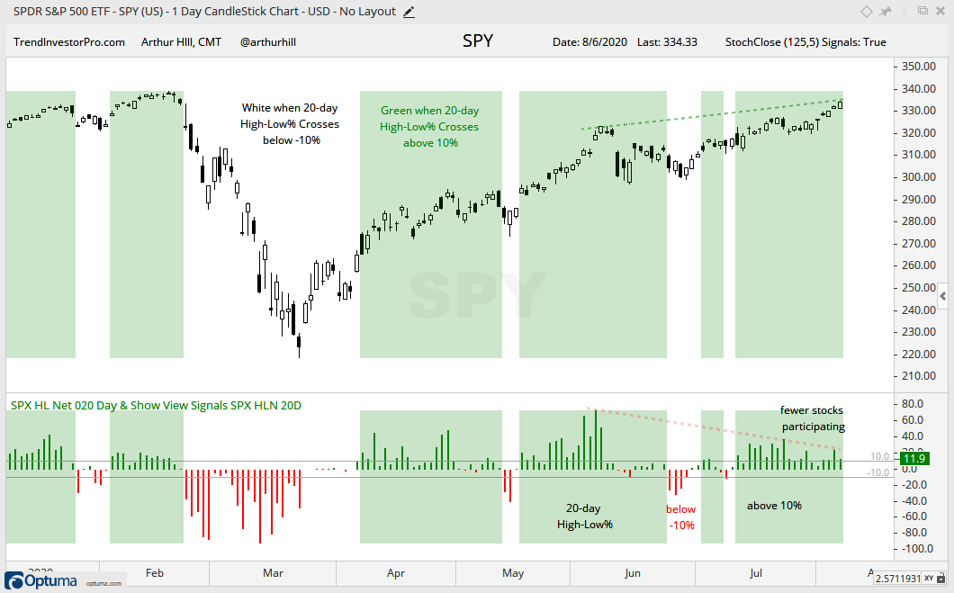
The 20-day High-Low Percent indicator triggered bullish on July 13th and remains bullish (green shading). However, as SPY raced to a new high for the current move, 20-day HLP formed a lower high in late July and another lower high here in August (red line). SPY is powering higher and fewer stocks are participating in this advance. Nevertheless, the indicator remains bullish until there is a move below -10%.
As a group, all three indicators are bullish and supportive of the medium-term uptrend. The group would turn net bearish when two of three trigger bearish signals.
SPY Advances with Fewer Stocks
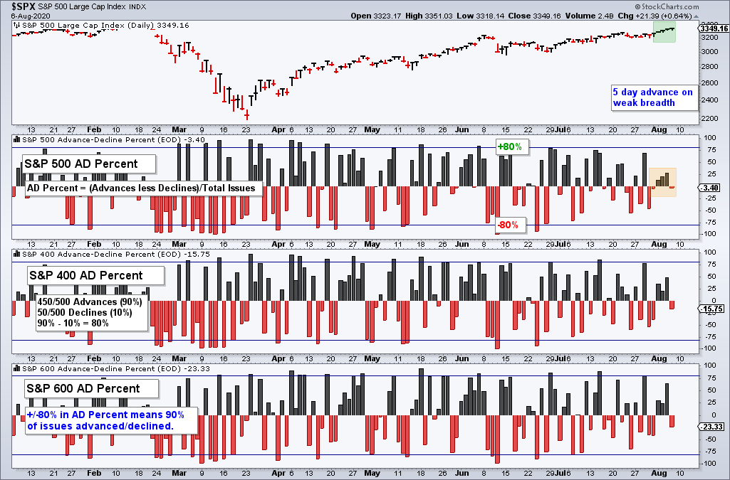
The next chart shows the Advance-Decline Percent indicators for the S&P 500, S&P MidCap 400 and S&P SmallCap 600. SPY is up five days straight, but the SPX AD Percent is positive just three of the last five days. Even with AD Percent was positive, the positive readings failed to exceed +30%. MID AD Percent and SML AD Percent popped on Wednesday, but SML AD Percent was the only one to exceed +50%. Thus, while SPY moved higher the last five trading days, breadth was uninspiring as fewer stocks participated.
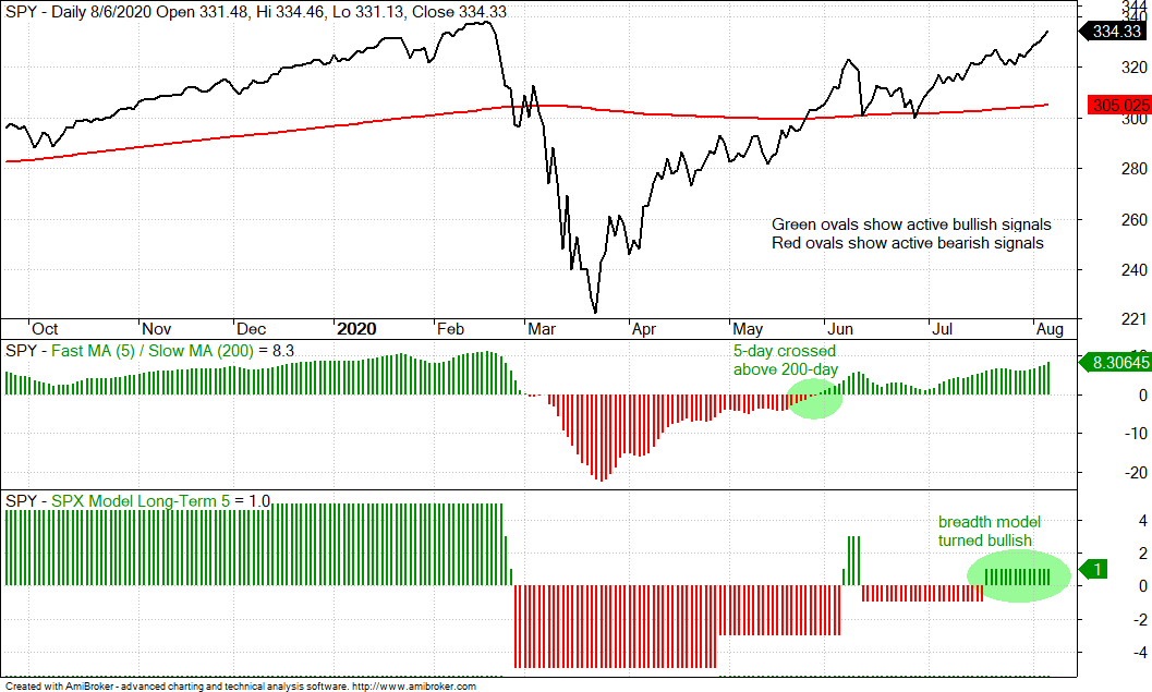
S&P 500 Model and Trend Remain Bullish
The S&P 500 breadth model remains net bullish with three indicators on active bullish signals and two on active bearish signals. The 5-day SMA moved above the 200-day SMA in late May and SPY is within 2% of a 52-week high.
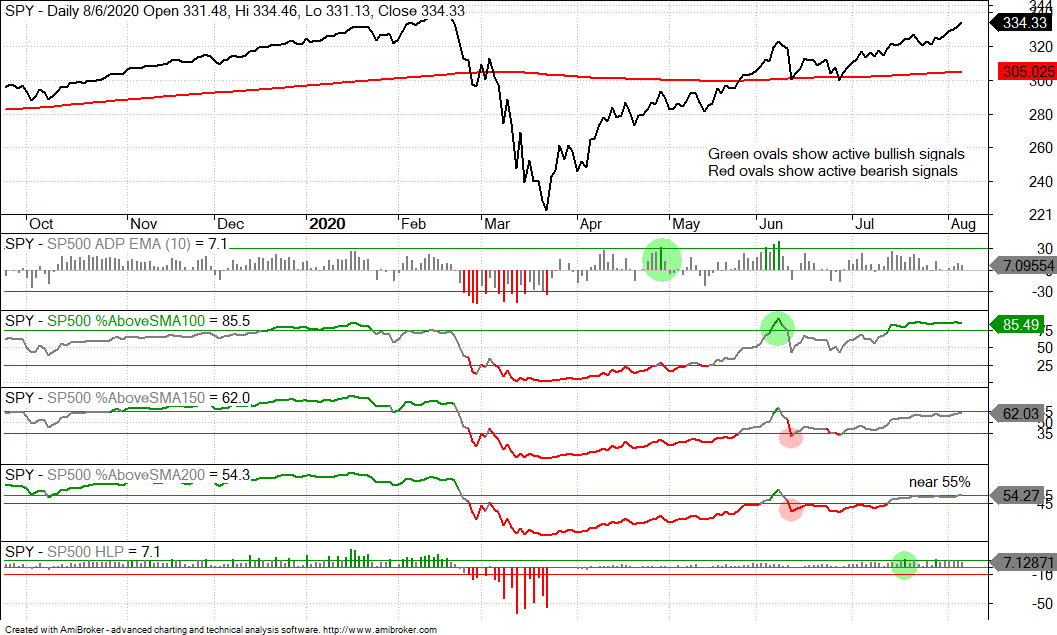
The %Above the 200-day SMA is one of the indicators that has yet to turn bullish with a move above 55%. It has been knocking on the door with several readings above 54% the last few weeks, but has yet to break above the bullish threshold. One big up day in the S&P 500 would likely push this indicator into bull mode. Perhaps we will get it when the stimulus passes. The flipside is that some 45% of stocks in the S&P 500 are below their 200-day SMA. This is not the kind of number associated with a bull market. Nevertheless, one indicator does not a bull market make (or break) and this is why I have five in the breadth model. The weight of the evidence is currently bullish.
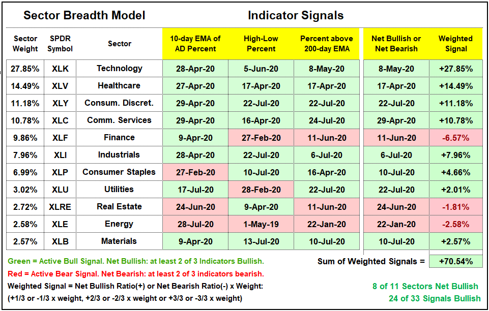
There is no change in the sector breadth model. Eight of eleven sectors are net bullish and 24 of 33 indicators are on active bullish signals. All three indicators are bullish for the four biggest sectors and these four account for a whopping 64% of the S&P 500. These sectors are driven by large-cap technology, Amazon and large-cap healthcare stocks. The Finance sector continues to stick out like a sore thumb, and a red one at that. Just 36% of stocks in XLF are above their 200-day EMA. Elsewhere, Energy and REITs are net bearish. I suspect that both sectors could continue to suffer from big trends in their respective industries. Energy is dealing with waning demand for oil and REITs are suffering from waning demand for commercial real estate.
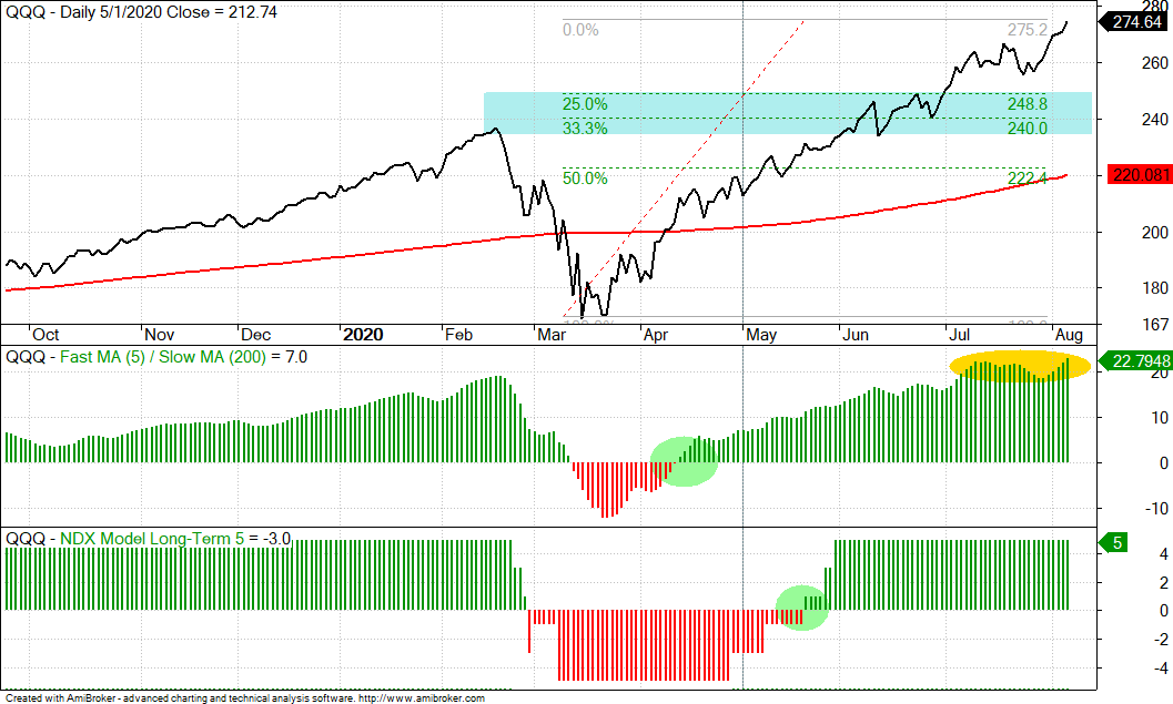
QQQ Hits New High
The Nasdaq 100 breadth model remains bullish with all five indicators on active bullish signals. QQQ raced to another new high and the 5-day SMA is now over 22% above the 200-day SMA. This is shaded yellow for caution because QQQ is getting quite extended without a correction. The blue zone marks a potential correction target, but timing a correction is another ball game. Broken resistance, the June consolidation and the 25-33% retracement zones mark the target zone should a correction ever get here.
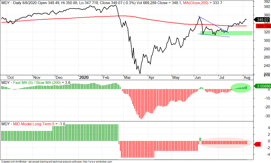
Mid-cap Model Remains Bearish, but Trend is Up
The mid-cap breadth model remains net bearish with three indicators on active bearish signals and two on active bullish signals. There are signs of a split because some 47% of mid-caps are above their 200-day SMAs, which means around 53% are below. The S&P MidCap 400 SPDR (MDY) is above its 200-day and the 5-day SMA is above the 200-day SMA. Moreover, MDY held its breakout from mid July and extended higher the last three weeks. The June lows mark key support going forward.
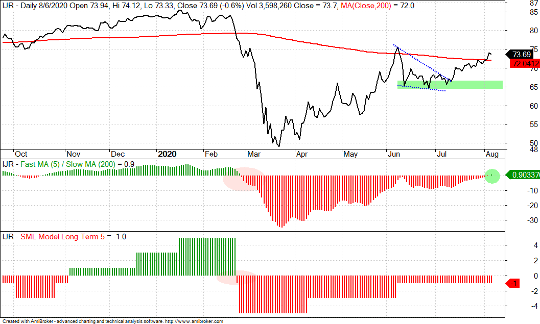
IJR Extends on Breakout, Despite Weak Breadth
The situation with small-caps is similar to mid-caps. The model remains net bearish and some 44% of small-caps are above their 200-day SMA (56% below). Despite more downtrends than uptrends, IJR broke out in mid July and extended above the 200-day SMA this week. In addition, the 5-day SMA crossed above the 200-day SMA for the first time since late February. As with SPY and MDY, the June lows mark key support for IJR and a break here would reverse the uptrend since late March.
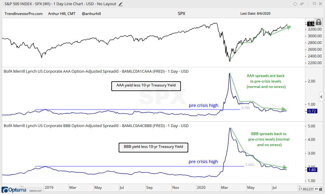
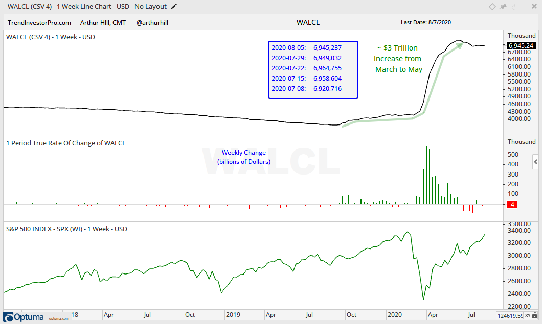
Yield Spreads and Fed Balance Sheet
There is no real change in the yield spreads or the Fed balance sheet. Congress is doing its usual theatrics regarding the next stimulus bill, but these things almost always go down to the wire and almost always pass.
The AAA and BBB spreads are back to pre-crisis levels and normal. This shows no stress at the investment grade end of the bond market. The narrowing of BBB spreads has been quite remarkable as the spread narrowed from 4.88 to 1.80. This is probably where the Fed was most active.
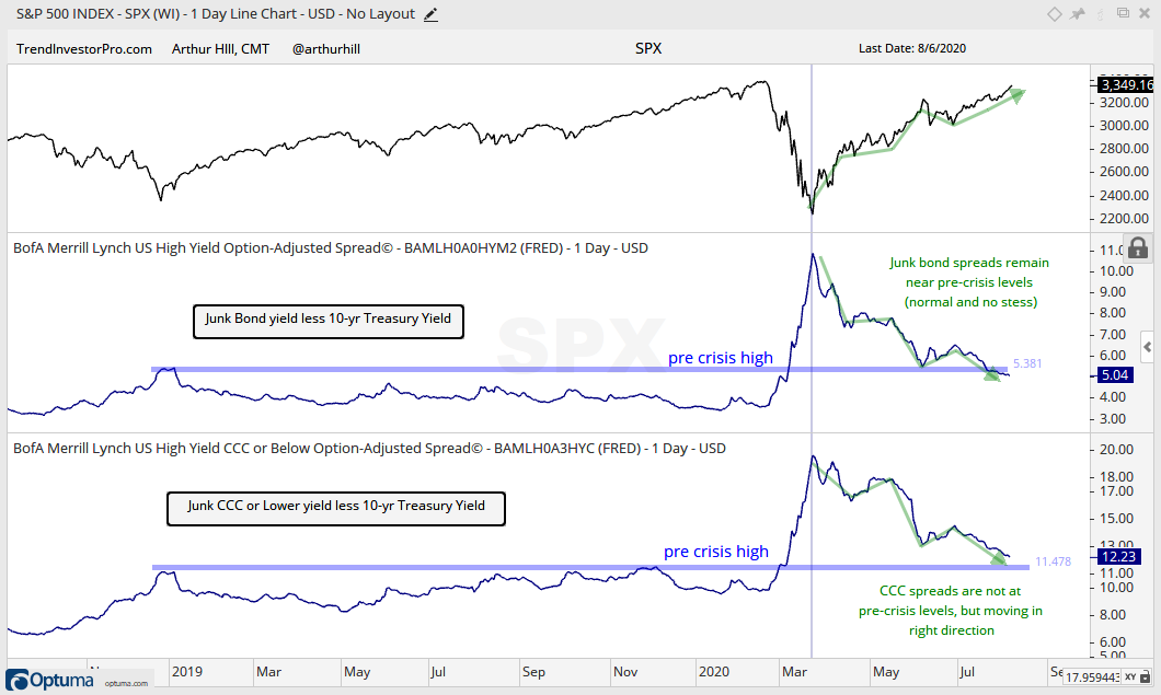
Junk bond spreads fell further again this week and are back below the pre-crisis high, which was 5.38 in January 2019. Thus, the junk bond market is normal and not showing signs of stress. The CCC spread also fell, but has yet to move below their pre-crisis highs.
The Fed balance sheet contracted a little this past week.
")