The stock market remains mixed, which means it is a stock picker’s market. As the broad breadth measures suggest, this is not a bull market that lifts all boats and makes everyone look smart. This is a relatively narrow bull market with tech, healthcare and communication services leading the way. The EW Consumer Discretionary ETF (RCD), EW Finance ETF (RYF) and EW Industrials ETF (RGI) are still 10 to 20 percent below their 2020 highs.
Now let’s take a short test. The chart below shows weekly closing prices for three ETFs. Which one has the strongest trend? Which one has the weakest trend? Which one of the three would you rather own? Which one of the three would you avoid?
The ETF in the top window is up 38% over the last two years, the ETF in the middle window is up 45% and the ETF in the lower window is up 15%. SPY, which is up around 15%, is not performing that bad, but seriously underperforming the other two, which are stock alternatives.
GLD and TLT are in clear uptrends and have stronger price charts. While this does not guarantee future outperformance, it does speak to the present situation and raises a few questions. Gold and Treasuries are stock alternatives and safe havens. Gold is an alternative to fiat currencies and may benefit from heightened inflationary expectations. Treasuries are safe havens that benefit from uncertainty, of which there is an abundance, especially in the coming three to four months (back to school or not, covid trends, election, weakest four month stretch).
The chart above shows monthly seasonal patterns for the S&P 500 over the last 20 years. July finished positive 65% of the time with an average gain of 1.1%. August and September did not fair as well. Both finished positive 58% of the time, but the average gain was actually a loss (-.50% and -.60%). We are heading into a seasonally weak period.
While I prefer to focus solely on technical analysis, there are also some sizable outside influences to consider. First, the Fed balance sheet expanded this week and yield spreads are back near pre-crisis levels, most likely because of Fed buying. Second, the current stimulus program is set to expire at the end of July, but another plan is in the works. Third, hopes for vaccines and treatments remain high.
My focus remains on the medium-term uptrends in the S&P 500 SPDR and the S&P 500 EW ETF. Both established support with the June lows and broke out of consolidation patterns recently. These lows and the indicators below hold the key for the bulls right now. Bearish seasonality looms, but the medium-term uptrends hold more sway.
Medium-term Indicators Remain Net Bullish
All three medium-term indicators are bullish and supportive of the medium-term uptrend. 20-day High-Low Percent for the S&P 500 went through some whipsaw signals, which often happens during a consolidation or trading range. The indicator triggered bullish on Monday with a move above +10% and remains bullish.
The S&P 500 Bullish Percent Index improved over the last few weeks and moved above 60% this week. 68% of stocks in the S&P 500 have P&F double top breakouts working (higher highs). Conversely, 32% have P&F double bottom breakdowns working (lower lows). There are clearly more higher highs than lower lows right now. All three Bullish Percent Indexes remain in bull mode right now.
The total number of new highs in the S&P 500, S&P MidCap 400 and S&P SmallCap 600 is not inspiring, but there are still more new highs than new lows and this is keeping the High-Low Line afloat. The three broad index High-Low Lines are above their 10-day EMAs (rising) and this is medium-term bullish. The Nasdaq 100 High-Low Line actually stalled a little the last four days, but also remains above its 10-day EMA.
SPY Holds Breakout
Post breakout price action is different this time, but the current breakout is holding all the same. SPY broke out of a flag on May 18th and zoomed higher. The ETF broke out of a pennant on July 6th and edged higher. Post breakout price action is not as strong on the pennant breakout, but the breakout is holding and remains bullish until proven otherwise. A strong breakout should hold so I am watching 310 for the first signs of cold feet. As far as the medium-term uptrend is concerned, I am watching 296. A move below this level would break the June lows and the 200-day SMA.
Small and Mid Caps Join the Breakout Party
Speaking of breakouts, we are also seeing breakouts in the S&P 500 EW ETF (RSP), S&P MidCap 400 SPDR (MDY) and Russell 2000 ETF (IWM). This suggests that average stocks, mid-caps and small-caps are coming to life. As the chart below shows, these three were on the verge of breakdowns after failing near their 200-day SMAs (red ovals). Instead of breaking down, all three found support with tight consolidations and broke out with surges on Tuesday-Wednesday. RSP and IWM are back above their 200-day SMAs and MDY is close. The cup is half full again, but it would not take much to return to half empty. A move below the June lows would break support and reverse the medium-term uptrends.
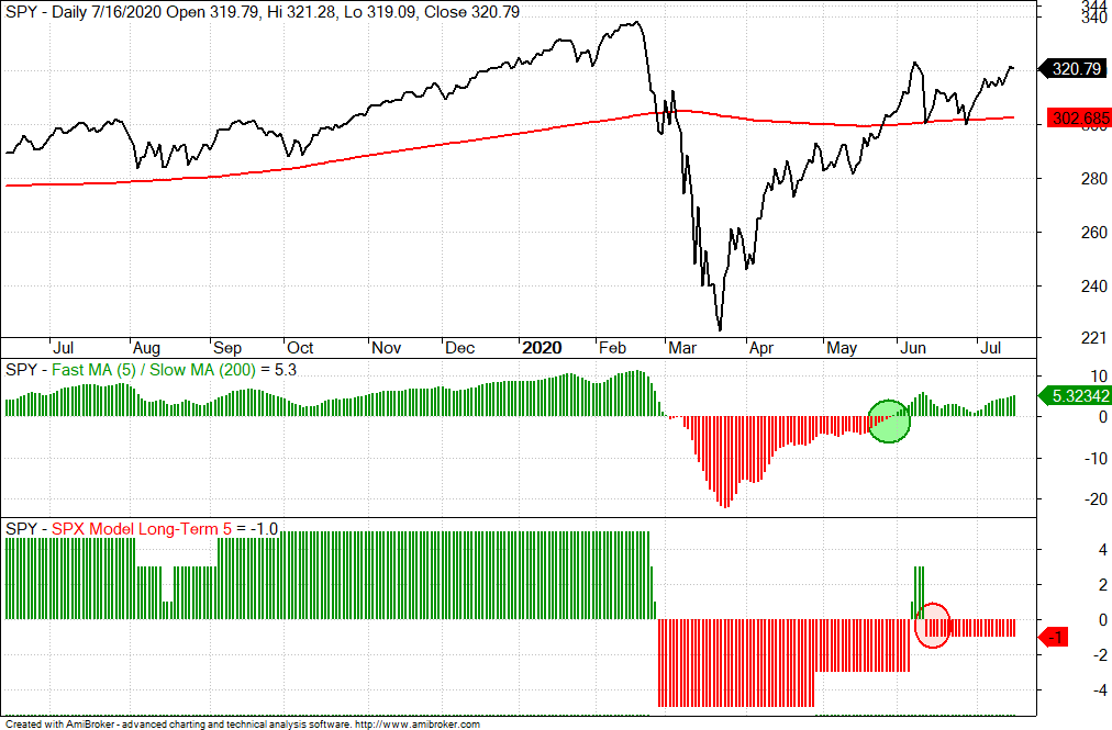
S&P 500 Long-term Breadth Model Remains Net Bearish
The percent-above moving average indicators improved this week in the S&P 500 breadth model. 82% of stocks are above their 100-day SMAs, 54% are above their 150-day SMAs and 50% are above their 200-day SMAs. The last number tells the real story: the market is mixed. Half of the stocks are in long-term uptrends and half are in long-term downtrends.
We can also see the split market on the chart below. SPY, which is benefiting from strength in large-caps and the fab five of QQQ, is above its 200-day SMA and the 5-day SMA has been above the 200-day SMA since late May (green oval). The breadth model flipped bullish in early June, but this only lasted a few days as the model flipped back to bearish on June 11th.
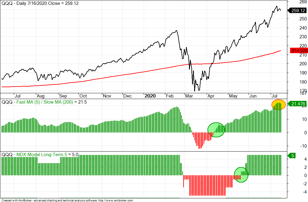
The Nasdaq 100 breadth model turned bullish on May 20th. Prior to that, the 5-day SMA for QQQ moved above the 200-day SMA on April 14th. Again, strength in large-cap tech stocks pushed the market-cap weighted QQQ higher first. The 5-day SMA is currently 21.5% above the 200-day SMA (yellow oval) and this is the biggest margin since 2009 (July to November). QQQ is clearly stretched and ripe for a correction after a 50+ percent advance off the March lows. Around 80 stocks from QQQ are also in SPY and these 80 account for 40% of SPY. The top four QQQ stocks (AAPL, MSFT, AMZN, GOOGL) account for 20% of SPY.
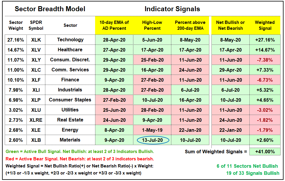
Sector Breadth Model Remains Bullish
There was one new signal in the Sector Breadth Model as XLB High-Low% ($XLBHLP) exceeded +10%. XLB joins XLK and XLV as the only sectors with all three indicators on active bullish signals. Of course, XLB accounts for just 2.6% of the S&P 500 and will not move the needle much. The whole materials sector weighs less than Apple! Note that the weighting of the Technology sector fell from 27.93% to 27.16% over the past week. Overall, the three biggest sectors have been net bullish since Apr/May. Industrials turned bullish in early July and this means the cup is half full for the S&P 500. Keep in mind that this model reflects the performance of large-caps because I am using the sector weightings. The S&P 500 breadth model with five indicators does not take market cap into consideration.
Technology, Healthcare and Communication Services account for 50% of the S&P 500. Throw in a few random bullish signals in other sectors, and the sum of the weighted signals is positive (+16.89%). Even so, strength in the S&P 500 is concentrated and not wide spread. At best, we have a mixed market when it comes to large-caps. At worst, we have underlying weakness in some key sectors: Consumer Discretionary, Finance and Industrials.
%Above SMAs Indicators Improve in Mids and Smalls
The mid-cap and small-cap breadth models remain net bearish, but we did see the percentage of stocks above the 100, 150 and 200 day SMA indicators improve. The first chart shows that 74% of mid-cap stocks are above their 100-day SMAs and this indicator remains on a bullish signal. However, less than 50% of mid-caps are above their 150-day SMAs and less than 40% are above their 200-day SMAs. Despite the improvement this week, these are not bull market numbers.
Small-cap stocks are fairing even worse with less than 40% above their 150-day SMAs and less than 35% above their 200-day SMAs (dark ovals). The red shaded ovals show the bearish signals in late February and the green shaded ovals show the bullish signals. There are currently three active bearish signals and two active bullish signals.
Yield Spreads and Fed Balance Sheet
The AAA and BBB bond spreads fell to pre-crisis levels in late May and remain at these levels. This indicates that the corporate bond market is not stressed or the Fed has the bond market’s back. In other words, the Fed gave the bond market a healthy doze of Xanax. Whatever the reason, it is net positive to see these yield spreads holding near pre-crisis levels.
The junk bond spread fell back to its pre-crisis high in late May and then stabilized the last two months. There was a slight uptick, but not enough to rattle the market and the spread fell back the last two weeks. CCC spreads are still well above pre-crisis levels, but they are not rising and not showing stress at the low end of the credit markets.
After four weeks of contraction, the Fed balance sheet expanded again, by a paltry $38 billion. This used to be a pretty big injection, but it pales relative to the injections seen in April and May. In any case, the balance sheet is near $7 trillion and this shows that the Fed has the market’s back.
")