XLK, XLC, XLI, XLF and XLU are the Leading Sectors
Chart Analysis for the Five Leading Sectors
SPY and QQQ are Doing All the Work
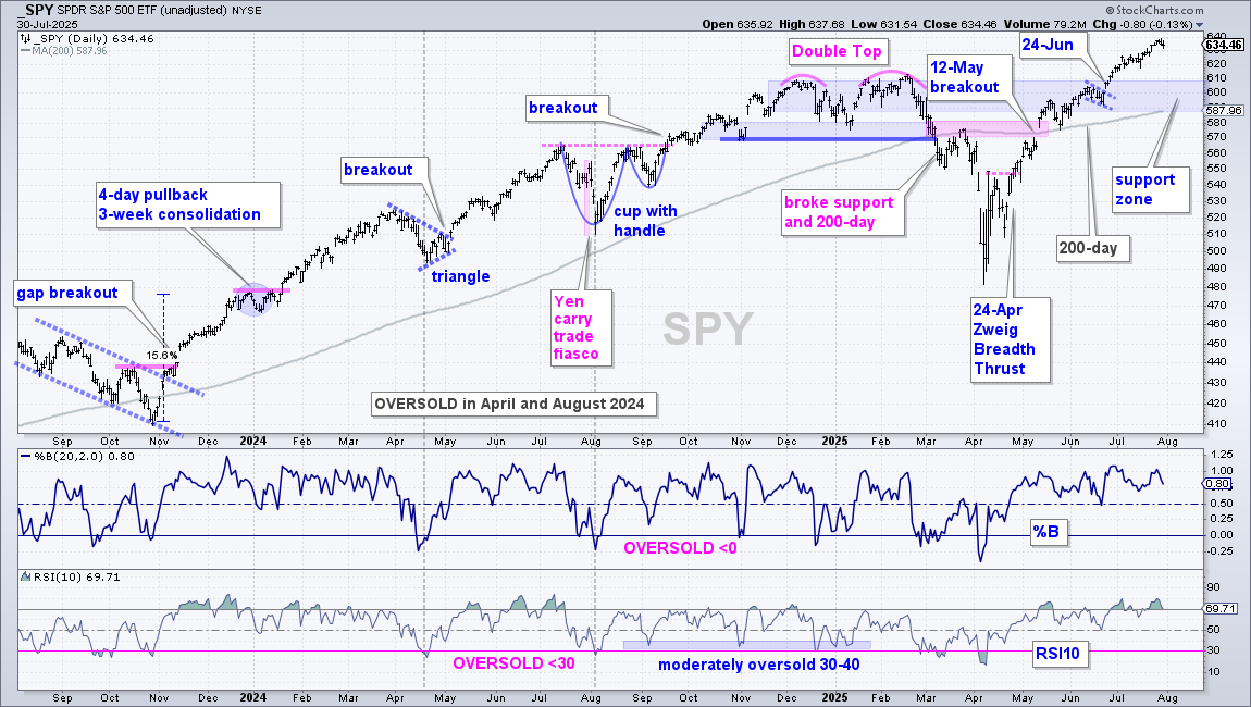
SPY and QQQ are in leading uptrends with fresh new highs in late July. The first chart shows SPY with the big trend-reversing breakout on May 12th. This is when it broke the late March high, negated the Double Top and gapped above the 200-day SMA. SPY extended to new highs and shows no signs of weakness. SPY looks overbought and ripe for a pullback but it is extremely difficult to time corrections within leading uptrends.
The blue shading marks the first support zone to watch, should we get a pullback. Broken resistance, the June flag and rising 200-day SMA mark support in the 590-610 area. I will also watch an oversold setup and mean-reversion opportunity using %B and RSI(10). %B becomes oversold near 0 and RSI becomes oversold near 30.
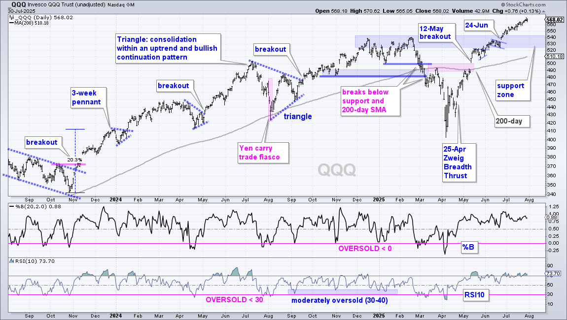
The next chart shows QQQ with similar characteristics. Broken resistance and the June flag mark the first support zone in the 525-545 area. A pullback into this zone and/or an oversold reading in the oscillators would provide a tradable setup.
Small and Mid-cap Still Struggling
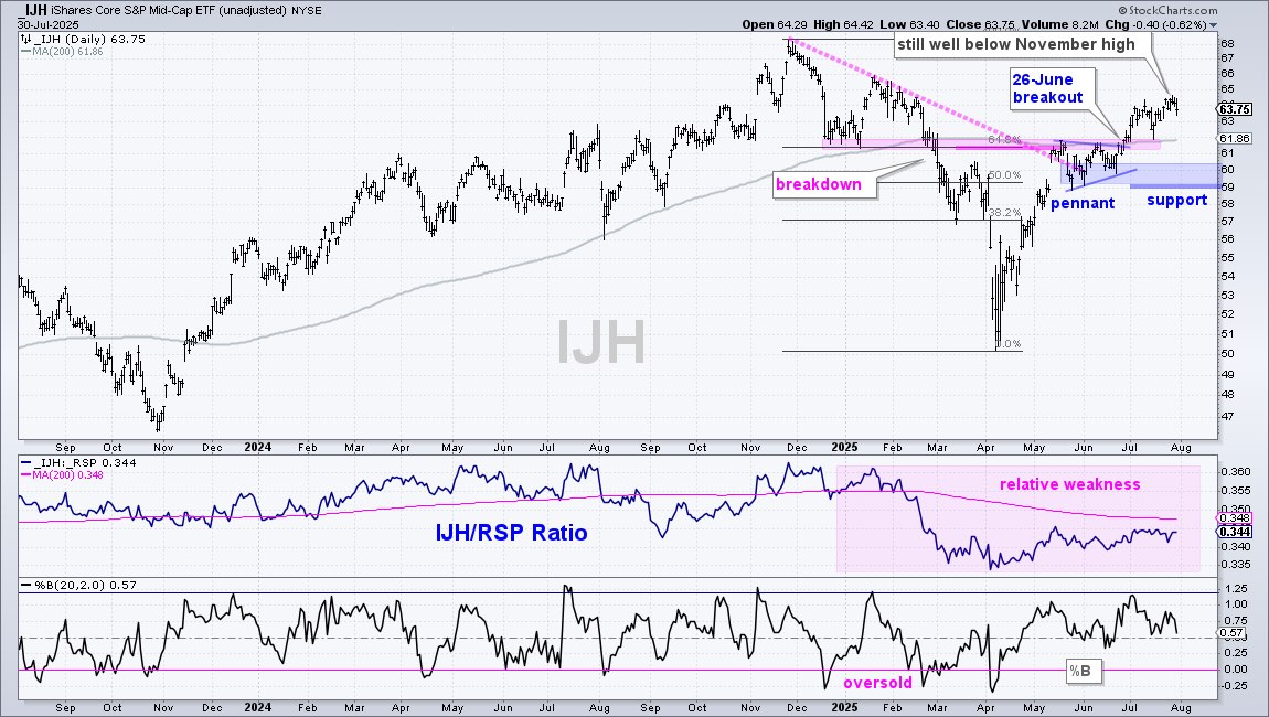
The next chart shows the S&P MidCap 400 ETF (IJH) with an uptrend, but a lagging uptrend. IJR broke out on June 26th with a surge above the prior support break, the mid May high and 200-day SMA. The ETF extended on this breakout and there is an uptrend working with the pennant lows marking key support at 59. IJH, however, shows relative weakness because the price-relative remains below the 200-day SMA (pink shading). IJH is also well below its late November high and lagging on the price chart.
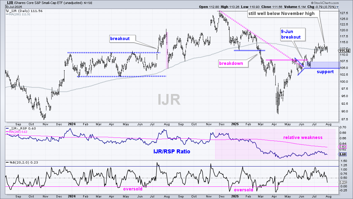
The next chart shows IJR trading well below its November high and battling its 200-day SMA. IJR crossed the 200-day SMA eight times this month and closed below this SMA on Wednesday. Despite this battle, there is an uptrend since the June 9th breakout. I am marking key support at 105. As with mid-caps, IJR shows relative weakness because the price-relative is well below its 200-day SMA (pink shading).
XLI, XLK, XLC, XLI, XLF and XLU are the Leading Sectors
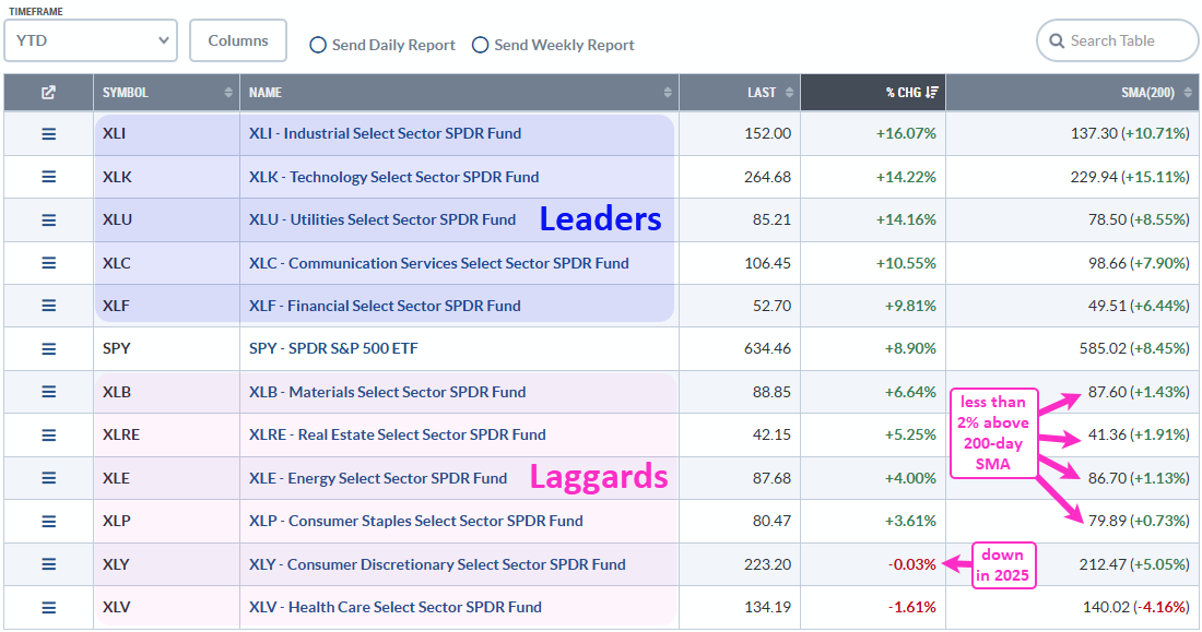
The table below shows the “Summary” view for a ChartList of the 11 sector SPDRs and SPY. In the far left corner, the timeframe is set at year-to-date and the table is sorted by the %CHG column (year-to-date percentage change). The blue shading marks the five leading sectors (Industrials, Tech, Utes, Communication Services, Finance). They are up more than SPY and more than 5% above their 200-day SMAs (right column).
Despite a bull market in large-caps, two sectors are down year-to-date (Consumer Discretionary and Healthcare). And four sectors are less than 2% above their 200-day SMAs (Materials, REITs, Energy, Staples). Six of the twelve sectors are not performing well. Healthcare is by far the weakest and the most out of favor. Perhaps this is a contrarian play.
XLK, XLC and XLI Lead the Way
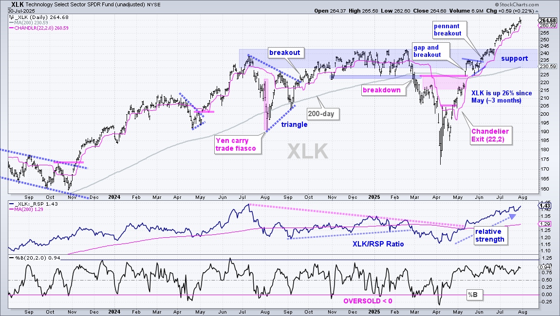
The first chart shows the Technology SPDR (XLK) with a 26% gain since May (~ three months). The ETF broke out to new highs in June and remains in a leading uptrend. Overbought conditions are the only concern going forward. This advance is straight up since May and the ETF looks ripe for a corrective period. Broken resistance and the rising 200-day SMA mark support in the 230-243 area (blue shading).
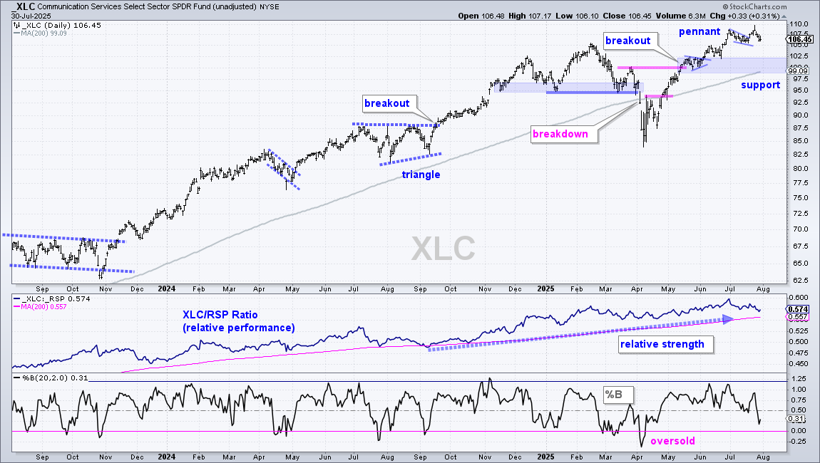
The next chart shows the Communication Services SPDR (XLC) hitting new highs in June and July. A small pennant formed in the first half of July and XLC broke out at 107.50. The ETF fell back this week, but will likely bounce today after the blowout report from META, which is the second largest holding (17.95%). GOOGL is the largest holding (19.83%).
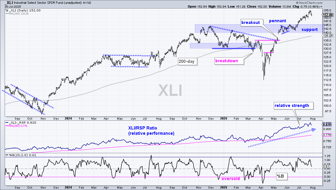
The next chart shows the Industrials SPDR (XLI) hitting new highs throughout July and the price-relative following suit (middle window). The breakout zone and May-June consolidations combine to mark support in the 140-145 area.
XLU Gets a Breakout and New High
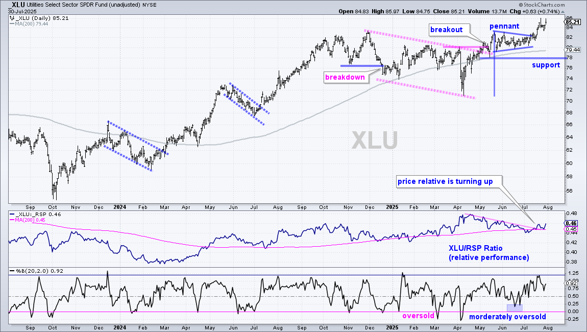
The next chart shows the Utilities SPDR (XLU) breaking falling channel resistance in May, forming a pennant into July and breaking out again in mid July. XLU tagged new highs over the last few weeks and remains a chart leader. The middle window shows the price-relative (XLU/RSP ratio) falling into early July and turning up over the last few weeks. This indicates that XLU is outperforming again.
XLF Hits New High, but Price-relative Flattens
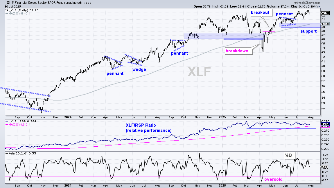
The next chart shows the Finance SPDR (XLF) with the weakest uptrend of the leading five. To be fair, XLF hit new highs this month and remains above the rising 200-day SMA. Support is marked at 49. The middle window shows the price-relative flattening over the last six months. Even though XLF is not a laggard, lackluster relative performance is a concern. A break below the 200-day SMA (pink line) would show relative weakness.
Send feedback to support(at)trendinvestorpro.com or use the contact form.