The medium-term indicators and breadth models are still bullish, but the ROC Shock in early September and some waning breadth indicators argue for at least a correction of the March-September advance. I covered the ROC Shock in detail last week and will review the findings. First, keep in mind that the character of the market (SPY) changed in January 2018 as the swings became bigger and 52-week lows were interspersed with 52-week highs. Big swings and volatility are the order of the day for now.
The current swing remains up, but early signs of a reversal are taking shape. First, there were signs of excess in late August and early September because SPY was more than 15% above its 200-day SMA and QQQ was more than 20% above. Second, SPY formed a big spinning top candlestick and outside week three weeks ago (red shading). Third, SPY followed through on this outside week with a 2% decline the following week (follow through). Fourth, there was an outsized decline as the 5-day Rate-of-Change exceeded -5%.
The chart above recaps the outsized decline with the red shading showing 5-day declines greater than 5% and the gold arrows showing when these declines occur after a 52-week high. The outsized declines in February 2018 and August 2019 led to extended corrective periods (10 weeks), while the outsized declines in October 2018 and February 2020 led to bear markets. The call now is for a corrective period that could last until November.
The breadth models are not designed to pick up corrections and remain bullish overall. The medium-term trend indicators are more sensitive, but the majority remain bullish. SPY fell around 7% in early September and then moved sideways the last week or so. Coming off of a new high and big advance, this is not enough weakness to affect High-Low Lines, Bullish Percent Indexes, Silver Crosses or Golden Crosses. As long as the majority of indicators and models are bullish, the current decline is viewed as a correction within a bigger uptrend (bull market environment).
The S&P 500 SPDR (SPY) serves as the base-case for a correction and I would expect the majority of stocks and stock-related ETFs to follow SPY. The pennant, rising 200-day SMA and 33% retracement line converge in the 310-320 area for a target zone. It is also normal for a return to the rising 200-day after an initial break. A 13% decline to the 310 area may seem extreme, but remember that SPY is digesting a 64% advance (three steps forward). One step backward would retrace a third of this move.
Medium-term Indicators are Net Bullish
Strong trends in one direction or another produce relatively consistent indicator signals (all bullish or all bearish). Indicator signals often turned mixed and whipsaw during counter-trend moves and trading ranges. Counter-trend moves are bounces within a bigger downtrend and pullbacks within a bigger uptrend (corrections). SPY is currently in some sort of correction right now and the more sensitive indicators are whipsawing.
On the bullish side, the High-Low Lines are rising, the %Golden-Cross lines are rising, the %Silver-Cross lines remain above their bullish thresholds and two of the three Bullish Percent Indexes remain bullish. 20-day High-Low Percent and the Volatility indicators triggered back to bullish again this week. These two are the most sensitive of the group and more prone to whipsaws
The percentage of stocks with silver crosses (20-day EMA above 50-day EMA) remains bullish overall, but the percentage has been steadily declining since mid August. This is short-term bearish and supports the argument for a correction in SPY. Longer term, all four remain above 40% and have yet to cross below their bearish thresholds.
The next chart shows the percentage of stocks with golden crosses. Nasdaq 100 %Golden-Crosses moved above its 20-day EMA in late April and moved above 80% in late July. The indicator flattened over the last seven weeks, but remains at relatively high levels and bullish. Perhaps a move below 70% would be negative. SPX and MID %Golden-Crosses followed with moves above the 20-day EMA in early May, while SML %Golden-Crosses finally joined in mid May. All three lines are rising and above their 20-day EMAs (bullish until proven otherwise).
The High-Low Lines are still rising because the histograms are positive. These histograms show the difference between the High-Low Line and its 10-day EMA.
The Bullish Percent Indexes remain mixed with the Nasdaq 100 BPI moving below 40% to turn bearish last week. The S&P 500 and S&P 100 BPIs remain above 60% and did not come close to triggering bearish.
20-day High-Low Percent whipsawed this week with a move above +10%. This is a pretty sensitive indicator that is often the first to turn, up or down.
The Volatility indicators moved lower this week and back below 2, which suggests low volatility (bullish). Of course, keep in mind that the S&P 500 fell 1.6% on the open Thursday, advanced 1.3% from 9:35 to 11:15, the fell 1.4% to retest the low by 12:15. All this in less than 3 hours. Sounds volatile to me. (Hat-tip @FrankCappelieri)
9 of 10 Breadth Models Bullish
Four of the five long-term breadth models are bullish (SPX, NDX, OEX and MID). The S&P SmallCap 600 model is net bearish. All five short-term models are bullish.
Long-term Breadth Models
– S&P 500: bullish since 23-Jul
– Nasdaq 100: bullish since 18-May
– S&P 100: bullish since 2-Jul
– S&P MidCap 400: bullish since 10-Aug
– S&P SmallCap 600: bearish since 25-Feb
Short-term Breadth Models
– S&P 500: bullish since 23-Jul
– Nasdaq 100: bullish since 29-Apr
– S&P 100: bullish since 26-May
– S&P MidCap 400: bullish since 9-Apr
– S&P SmallCap 600: bullish since 9-Apr
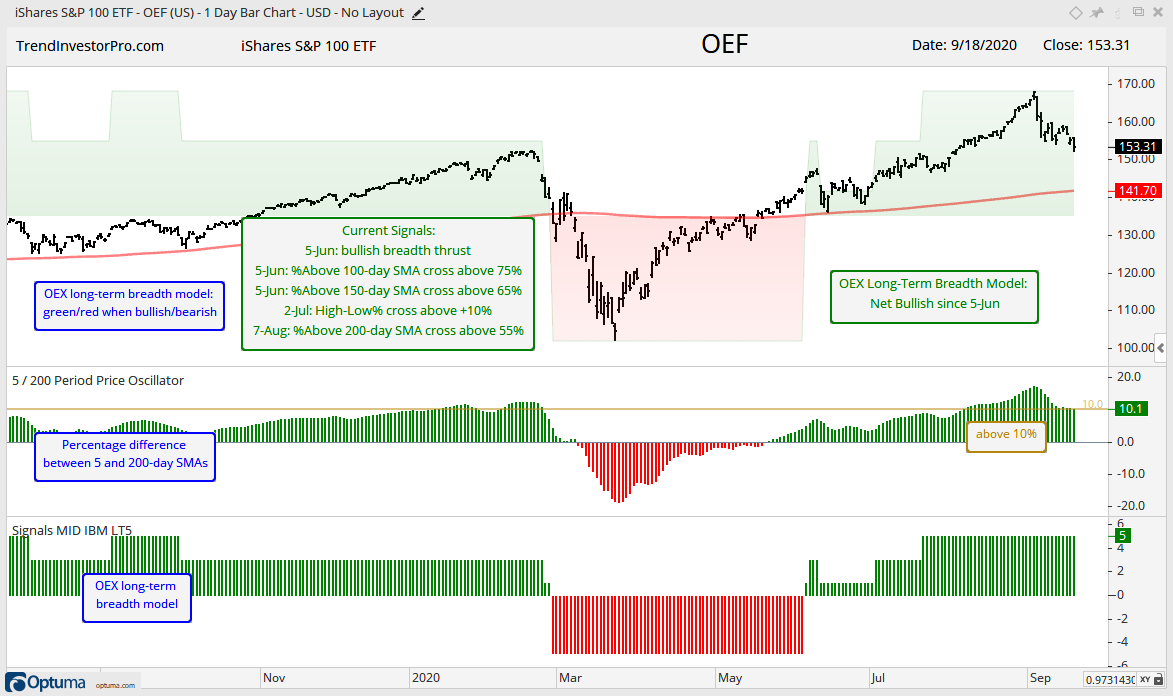
Even though small-caps and mid-caps led the initial surge off the March lows, large-caps and large-cap techs took over and dominated on the way to new highs. The Nasdaq 100 long-term breadth model was the first to turn bullish (18-May) and the S&P 100 model followed with a bullish signal on 2-July. Today I will focus on the S&P 100 breadth models because these 100 stocks are the biggest drivers of the S&P 500. Also note that 26 stocks in the Nasdaq 100 are in the S&P 100 ($OEX). OEX is the 800 pound gorilla in the room and its breadth indicators should be watched closely.
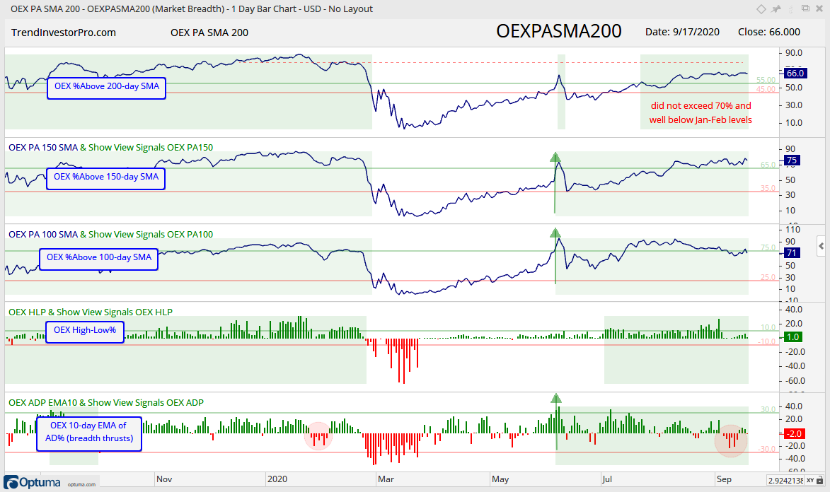
The first chart shows the S&P 100 ETF (OEF) with the 5-indicator long-term breadth model overlay. The model is green when net bullish and red when net bearish. The bottom window shows the model with the actual levels. +3 means 4 indicators are bullish and 1 bearish (4 – 1 = +3). Currently, all five indicators are bullish.
The next chart shows the individual indicators that make up the breadth model and the signal levels with the red and green lines. The model signals are shaded green when bullish and unshaded when bearish. This model caught the February downturn in timely fashion, but was late to the rebound party and did not turn bullish until OEF was above its 200-day. The %Above 150-day, %Above 100-day and 10-day EMA of Advance-Decline Percent were the first to trigger and turn the model bullish in early June (green arrows).
The model remains fully bullish, but we can see that %Above 200-day SMA did not clear 70%, even when OEF was hitting new highs. Fewer stocks moved into long-term uptrends in August-September, as opposed to November-February when this indicator exceeded 80%. The red ovals on the 10-day EMA of AD% highlight the dip in early January and the dip in early September. These dips were not enough to trigger a bearish breadth thrust, which requires a move below -30%. The September dip, however, was fairly strong and showed the most downside participation since late March.
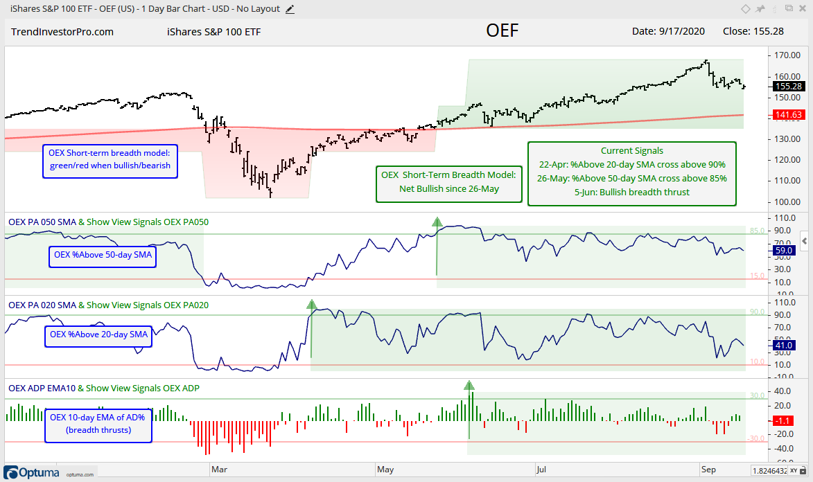
The next chart shows the short-term breadth model and indicators for the S&P 100. The model turned bullish on 26-May. Notice how %Above 20-day SMA surged above 90% in late March to signal the first breadth thrusts of sorts. The %Above 50-day SMA exceeded 85% on 26-May to turn the model net bullish.
All three indicators are currently bullish, but we have seen some deterioration over the last few months. Individual bearish breadth thrusts would trigger if %Above 50-day SMA moves below 15%, %Above 20-day SMA moves below 10% and the 10-day EMA of AD% moves below -30% (red lines). The early September decline was a warning shot and a follow through decline from here could tilt the balance. Stay tuned…
Stocks firmed this week with the Materials SPDR (XLB) and Industrials SPDR (XLI) leading the chart. Advance-Decline Percent for these two sectors was positive the last five days straight. AD% for the other nine sectors was mixed. All three breadth indicators are already bullish for XLB and XLI so these moves did not reverse any signals.
Overall, seven of eleven sectors are net bullish with five of the top six sectors net bullish. This is enough to support the long-term uptrend in SPY and bull market environment. Finance is the only one of the big sectors that is net bearish. Utilities and REITs are also net bearish, as is Energy. XLF accounts for 10% of the S&P 500, while XLU, XLRE and XLE each weigh less than 3%. Yes, they are small and have little effect on SPY, which is dominated by large-caps and big sectors.
Bonds and Bond Proxies
XLU and XLRE are bond proxies because they have relatively high yields, 3.24% and 3.09%, respectively. For reference, SPY yields 1.8%, QQQ yields 1.44%, VIG yields 1.71% and the yield on the 30-year is around 1.4%. Yes, SPY yields more than the Dividend Appreciation ETF (VIG). In a world where there is no alternative to stocks (TINA), the yields on XLU and XLRE seem pretty juicy.
The chart below shows TLT, XLU and XLRE for comparison. XLU and XLRE may be bond proxies, but they are still stocks. The green line shows when all three moved higher (SPY also moved higher). The red line shows when XLU and XLRE moved lower along with SPY. The blue line shows when all three moved sideways from mid April to mid September.
Short-term, TLT broke out of a wedge and I am waiting for follow thru above the early September high. XLU broke out of a falling flag and this breakout is largely holding, despite lack of follow through. XLRE hit its highest level since early June with a breakout in early September, but did not follow through either. The green lines mark support for all three.
Two things to keep in mind. First, TLT is the only real alternative to stocks. A decline in stocks, however, does not guarantee an advance in TLT, but it certainly increases the odds for a move higher. Second, XLU and XLRE are still part of the stock market and may not be immune to broad market weakness. Correlations among sectors tend to rise when SPY declines.
Yield Spreads and the Fed Balance Sheet
There is no real change in the AAA or BBB bond spreads. Both fell back to their pre-crisis levels and stabilized. The red lines mark my subjective lines in the sand. A move above 1 in the AAA spread and 2 in the BBB spread would show some stress in the credit markets and be negative.
The Junk bond spread fell back below its pre-crisis highs and stabilized the last few months. Stabilization at relatively low levels is ok. An upturn would not be ok. A move above 6 would show stress in the junk bond market and be negative for stocks. Note that junk bonds act more like stocks because they are tied to the economy. Unless, of course, there is an invisible hand buying up junk.
The Fed balance sheet continues to inch higher, if you consider a $54 billion increase inching higher. Of course, the increase over the last ten weeks looks small relative to the $3 trillion increase from March to May. The Fed took its foot off the gas pedal for a few weeks (mid June to early July) and then put its foot back on in mid July (green shading).
")