The long-term trend is up for the S&P 500 and Nasdaq 100, but questionable for the S&P SmallCap 600 and S&P MidCap 400. Small-caps and mid-caps are largely off my radar right now. Despite long-term uptrends and bullish evidence for large-caps, I remain in the correction camp for three reasons. First, SPY and QQQ became extremely extended in early September, as measured by the percentage above the 200-day SMA. Second, S&P 500 breadth did not keep pace in August and September. Third, there was an outsized decline with the fifth ROC Shock since January 2018.
As the chart below shows, ROC Shocks in early 2018 and August 2019 led to ten week corrective periods and choppy trading. ROC Shocks October 2018 and February 2020 led to sharp declines an 52-week lows. A ROC Shock is an outsized move that rattles the existing trend. The trend was up in early September and the above average decline rattled the bulls. It usually takes some time for the bulls to find their footing after such a hit.
The weekly chart shows a big spinning top followed by a three week decline for SPY. The ETF fell around 10% during this decline and became short-term oversold last week, which gave way to this week’s bounce. The base-case is still for a correction that returns to the 40-week SMA (200-day SMA) and retraces around a third of the March-September advance. Such a move would also return SPY to the June consolidation, which should offer support.
The short-term downtrend reversed with a breakout on Monday and this breakout is holding. We are also in the turn of the month period and this eight day window shows a bullish bias over the years. This window covers the last four days of September and first four days of October, and ends next Tuesday.
On the daily chart, SPY broke out of a falling wedge and this breakout is holding, even after opening weak on Friday. The dotted lines show how a possible correction might unfold over the coming weeks. For now, the breakout is bullish until proven otherwise and I am watching Monday’s gap. A close below 328 would fill the gap and negate the breakout. This would then argue for a return to correction mode and we could then see a decline back to the 310 area.
The next chart shows QQQ with a wedge breakout and stronger move this past week. The wedge breakout is also bullish until proven otherwise and Monday’s gap holds the first key. A close below 271 would fill the gap and negate the breakout. This would move QQQ from breakout mode to corrective mode with a target in the 250 area.
SPY and QQQ are the big drivers for the broader market right now. ETFs with late September breakouts have a much better chance of extending on these breakouts as long as SPY and QQQ hold strong. These breakouts were noted on Thursday. Five sector SPDRs broke out: XLK, XLY, XLC, XLV and XLP. A number of tech-related ETFs also broke out: IGV, SOXX, FINX, HACK, IPAY and SKYY. ITB and XRT also broke out, as did IHI and IHF. Healthcare ETFs in general seem to be caught in a whirlwind of events these days.
Medium-term Indicators Get Whippy
Several medium-term indicators are all over the place with the recent swings in the market. The Bullish Percent Indexes, High-Low Lines and 20-day High-Low Percent are not adding any value at this stage so I will not cover them in detail. In short, the S&P 100 Bullish Percent Index moved below 40% to turn bearish, while the Nasdaq 100 Bullish Percent Index moved back above 60% to reverse its bearish signal. The SML and MID High-Low Lines turned back up with the bounce in stocks over the past week. We also saw 20-day High-Low Percent move back above +10% and volatility tick lower with the bounce in stocks.
The %SilverCross indicators continue to fall and remain below their 20-day EMAs. The Nasdaq 100 and S&P 500 have yet to trigger bearish with moves below 40%. However, the Small-cap and Mid-cap %SilverCross indicators moved below 40% for the first time since May.
The S&P 500 and Nasdaq 100 %GoldenCross indicators remain in bull mode, but the Small-cap and Mid-cap %GoldenCross indicators moved below their signal lines last week and remain below their signal lines. Again, we are seeing weakness in small-caps and mid-caps, and these two groups account for the majority of stocks.
Breadth Models Bullish, with a Little Red
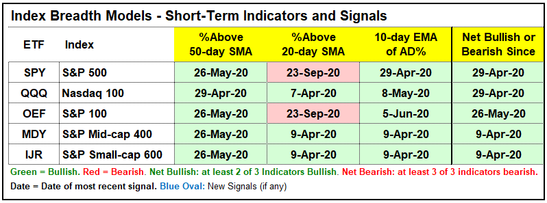
I had to make a change with the breadth models and go back to Amibroker. Optuma is great for charting and displaying data in a clear and customizable format, but Amibroker still rules when it comes to breadth data and testing. I gave Optuma breadth the old college try, but it proved too unstable to use on a regular basis. It is just too bad that the Amibroker charts are not as polished. In any case, the indicators and signals are clearly visible and this is most important.
A few individual signals changed and one model flipped with the move back to Amibroker. We cannot expect two different data sources to produce the same exact signals, especially when it comes to breadth.


You can learn more about the breadth model and its historical performance in this article and video (here).
%Above 200-day Remains Anemic for Small-Caps
The first chart shows the small-cap indicators with bullish signals in green and bearish signals in red. The %Above 150-day SMA for the S&P SmallCap 600 moved above 65% on September 2nd to turn the long-term breadth model bullish for small-caps. Two of the small-cap indicators, however, are still bearish. There are no new highs to speak of and the %Above 200-day SMA is at 43%. Clearly, the majority of small-cap stocks are in long-term downtrends.

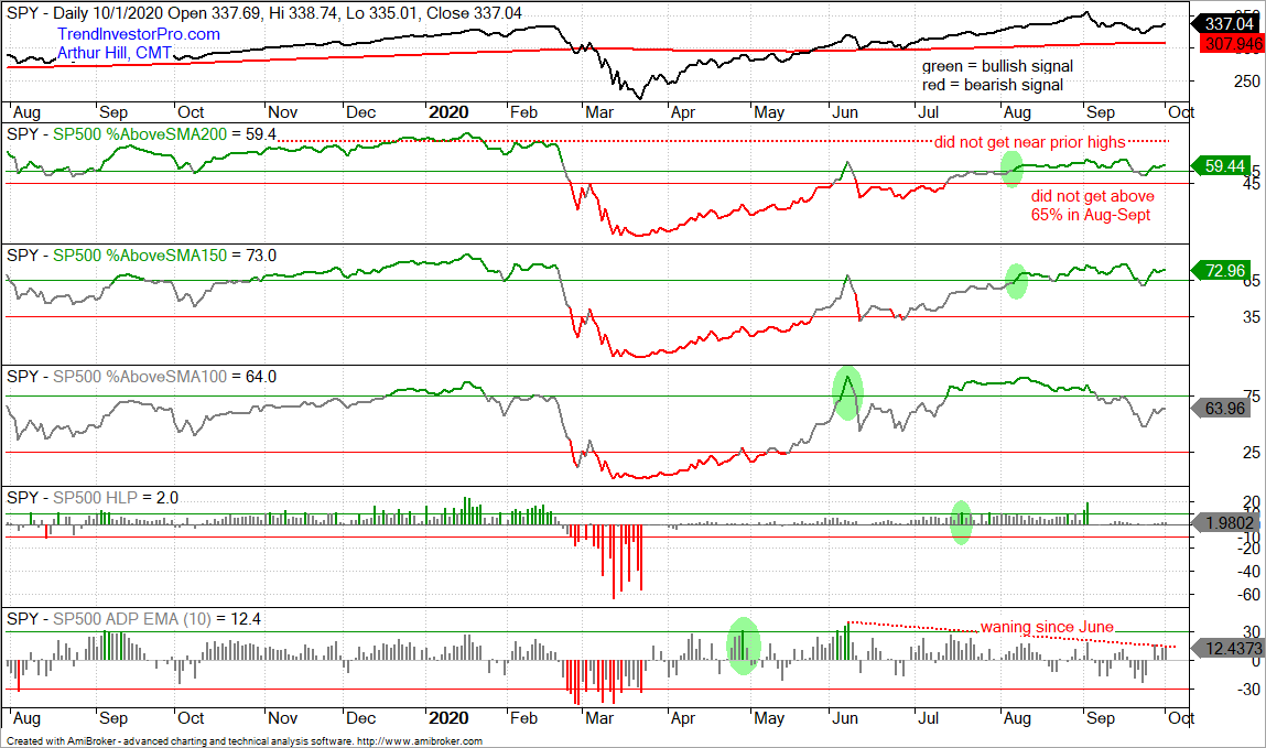
The next chart shows the S&P 500 breadth indicators with all five on bullish signals. Even so, two indicators capture the recent deterioration in participation and a non-confirmation of new highs. Notice that the 10-day EMA of AD%, first indicator window, has been waning since early June. Each positive push petered out at lower and lower levels. This reflects waning participation on the upside.

The next to the last window shows SPX %Above 200-day SMA failing to exceed 65% in August or September, which is when SPY was powering to new highs. The indicator was more bullish than bearish, but a third of SPX components (35%) were still below their 200-day SMAs when SPY was hitting new highs. Note that this indicator regularly exceeded 75% in 2019 and early 2020. Again, there are some sizable pockets of weakness in the S&P 500.
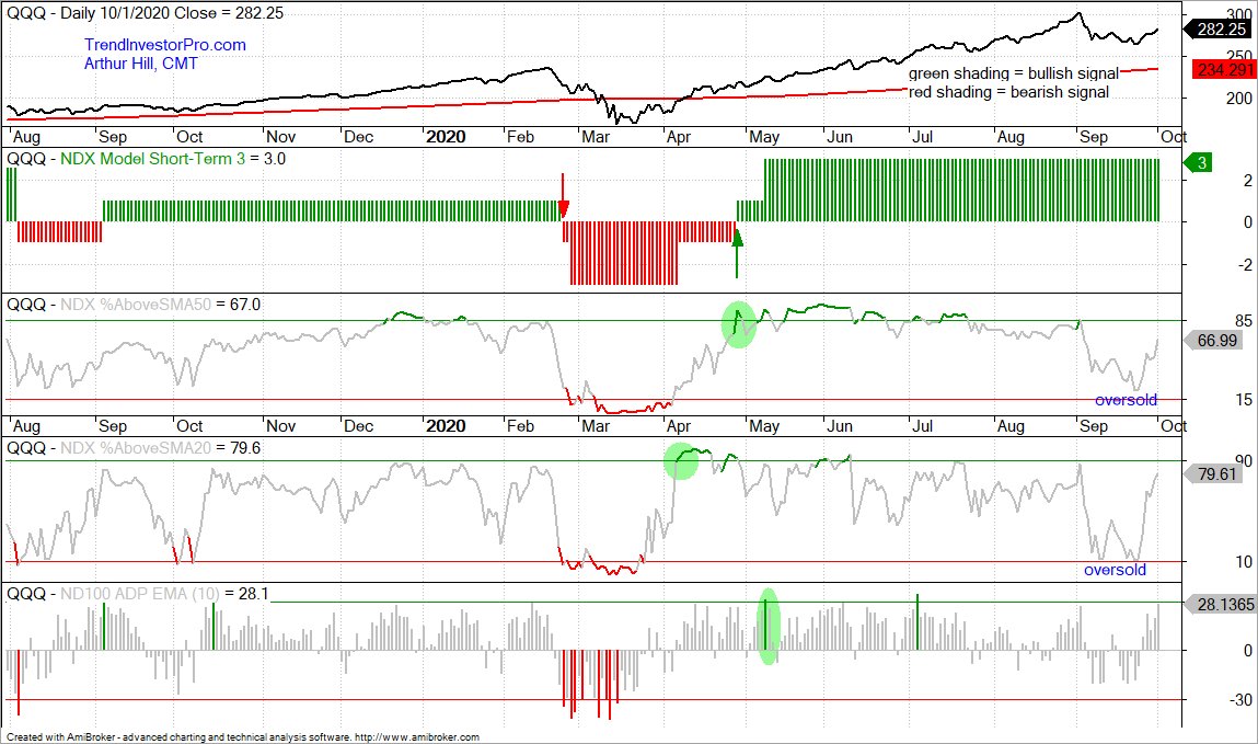
Last week I noted that the Nasdaq 100 short-term breadth indicators did not trigger bearish and were at oversold levels. %Above 20-day SMA and %Above 50-day SMA dipped below 25%, but neither triggered bearish. Both bounced over the past week and the oversold condition is no longer an issue.

You can learn more about the breadth model and its historical performance in this article and video (here).
One New Bullish Signal in Sector Breadth Model
The sector breadth model remains largely bullish with five of the six biggest sectors in bull mode. The Finance SPDR (XLF) is the only one of the big six that is bearish. A new signal triggered in the Utilities SPDR (XLU) as the 10-day EMA of Advance-Decline Percent surged above +30% for a bullish breadth thrust. This flips Utilities net bullish with two of the three indicators on bullish signals. Overall, eight of the eleven sectors are net bullish and 23 of 33 indicators are on active bullish signals.
Even though XLU turned net bullish on the breadth model, the chart is seriously uninspiring. Perhaps XLU is trying to lull us to sleep and then breakout when nobody is watching. The ETF is up over 5% the last seven days, including a .50% pop today. As noted in Thursday’s report, XLU never came close to its February high and the August high was below the June high (red lines). XLU basically formed a long extended triangle consolidation the last few months and is going nowhere slowly.
Yield Spreads and Fed Balance Sheet
The AAA bond spread fell to normal levels in late May and then flattened. This is a no news is not bad news situation. The AAA spread remains at normal levels and does not become a negative unless it turns up and exceeds 1. The BBB spread fell until mid August and then flattened out at relatively low levels (pre-crisis highs). A move back above 2 would show stress and be negative.
Junk bond spreads ticked up in September as the High-Yield Bond ETF (HYG) edged lower. The uptick in junk bond spreads coincided with the decline in stocks because these two are negatively correlated. A small uptick is tolerable, but I would not want to see this spread widen past 6.
The Fed balance sheet ticked lower this past week with the largest contraction since early July. Even with this relatively small contraction, the balance sheet has largely expanded since mid July and remains near the $7 trillion mark.


