Stocks took it on the chin Thursday with the biggest decline since March. Once again, small-caps and mid-caps led the way lower with outsized declines. Even more disconcerting, we saw outsized declines in some key large-cap sectors as the Consumer Discretionary SPDR fell over 5%, the Industrials SPDR fell over 8% and the Finance SPDR fell 7%. Technology and Healthcare did not pick up much of the slack as both fell over 5%. In fact, 499 of 500 stocks were down on Thursday and this shows some seriously broad downside participation. Kroger (KR) was the only gainer.
A Shot Across the Bow
Thursday’s gap down and sharp decline are shots across the bow for the bulls and the intermediate uptrend. SPY advanced above the 200-day in late May, gapped up last week, stalled for a few days and then gapped down. This is a six-day island reversal that could lead to a reversal of the uptrend that began in late March.
SPY moved into its potential support zone and bounced early Friday, but the damage has been done. I will provide the gory details with the breadth model. SPY is in a support zone marked by broken resistance, the 200-day and a 50% retracement of the May-June surge. RSI(14) also entered the 40-50 zone, which acts as momentum support when the trend is up.
Even though this is a good spot for a bounce, the S&P 500 breadth model flipped back to bearish. This means that risk in stocks is above average and stock alternatives are preferred. Keep in mind that SPY fell 30+ percent in 23 days, advanced over 40% in 53 days and fell 5.76% on Thursday. The ETF gapped up 2.4% on the open Friday. Welcome to the rodeo. Volatility has been and remains above average, which means risk is above average.
The next chart, which was created with custom indicators in Optuma, shows 20-day High-Low Percent exceeding 10% to turn bullish (green shading) with the gap and flag breakout. Despite yesterday’s big decline, 20-day High-Low Percent only reached -2.6%. Technically, this short-term indicator remains on a bull signal.
Equal-weights and Small-caps Bear the Brunt
Outside of large-caps and large-cap techs, the picture is more dire as the S&P MidCap 400 SPDR (MDY), S&P 500 EW ETF (RSP) and Russell 2000 ETF (IWM) have bearish wedges working. All three moved above their 200-day SMAs last week and then broke back below with sharp declines on Friday. With a reaction high well below the February high, I drew the upper trendline and the rising wedge. Truth-be-told, the lower trendline and support zone are what really matter because they define the immediate trend, which is still up. Yes, even with the gap and 11% decline in three days, the trend for RSP is still up since late March. Both are near support and RSI is in the 40-50 zone. This could pave the way for a bounce and a reaction low here would affirm support.
Now what?
Looks like I am heading back to the garage for a second round of sorting and cleaning as the long-term breadth model flipped back to bearish. Again, we have a split market with the three biggest sectors holding up (tech, healthcare and communication services). Strength here is offset with renewed weakness in the finance and consumer discretionary sectors. Industrials is on the fence and it would not take much to push it into bear mode again. At best, we are due for a correction after the big advance from late March to early June. At worst, the bear market bounce is ending and the bear market is resuming.
5 Indicator Long-term Breadth Model
After some trial and error, I developed a long-term breadth model using data from Norgate and Amibroker testing software. At this time, this model only uses data from stocks in the S&P 500. In general, models are more less volatile when they exclude mid-caps and small-caps. There is nothing wrong with StockCharts’ breadth data, but I need data going back further than 2010 and signals that can be quantified. Norgate breadth indicators are based on data that is not adjusted for dividends. I suspect that StockCharts uses dividend-adjusted data for their breadth indicators.
This adjustment issue caused me to adjust the bullish and bearish thresholds. With Stockcharts, I was using 60% and 40% as bullish and bearish thresholds for S&P 500 %Above 200-day EMA (!GT200SPX) and S&P 500 %Above 200-day SMA ($SPXA200R). Dividend-adjusted data has an upward bias because the dividends are added back to prices after the fact. To account for this difference, I am using 55% and 45% for my bullish and bearish thresholds when using Norgate %Above 200-day. The list below shows the indicators with their thresholds.
10-day EMA of SPX Advance-Decline Percent: Bullish breadth thrust with move above +30% and bearish thrust with move below -30%
%Above 200-day SMA for S&P 500 Stocks: Bullish with move above 55% and bearish with move below 45%
%Above 150-day SMA for S&P 500 Stocks: Bullish with move above 65% and bearish with move below 35%
%Above 100-day SMA for S&P 500 Stocks: Bullish with move above 75% and bearish with move below 25%
S&P 500 High-Low Percent: Bullish with move above +10% and bearish with move below -10%
The bullish/bearish thresholds for the middle indicators increase at the same rate (10) as the moving average increases by 50 days. This is a trend-following type model that turns bullish as uptrends increase, new highs increase and a breadth thrust is present. The model is bullish when at least three of the five indicators are on bullish signals and bearish when at least three of the five are on bearish signals. It is never neutral because there are an odd number of indicators.
The chart above shows the individual signals for each indicator in the breadth model. The 10-day EMA of SPX Advance-Decline Percent and SPX %Above 100-day SMA remain on bullish signals. SPX High-Low Percent never fully recovered after its late February plunge and remained on a bearish signal throughout April, May and June. SPX %Above 150-day SMA and SPX %Above 200-day SMA triggered bullish last week, but flipped back to bearish this week. Thus, three of the five indicators are on bearish signals.
Historical Performance MA Crosses
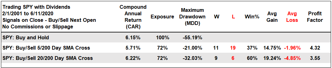
Now let’s test signals from 2/1/2001 to the present. I am starting from 2/1/2001 because the exchanges moved to decimalization on January 30th and this resulted in far fewer unchanged issues. The first table shows results for buy-and-hold, the 5/200 day SMA cross and the 20/200 day SMA cross. A simple timing tool lowered exposure to 72%, lowered drawdowns and maintained the returns.
Market Timing Filter Improves Model Performance
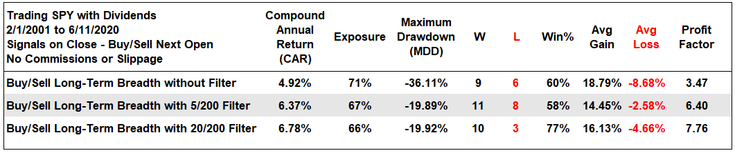
This model also includes a broad market timing filter to help reduce drawdowns. The 5/200 day SMA cross and 20/200 day SMA cross are used for timing the S&P 500. The model is bullish when breadth is bullish AND the S&P 500 is in an uptrend. The model is bearish when breadth is bearish OR the S&P 500 is in a downtrend.
The next table shows results when trading SPY based on the long-term breadth signals on line one. The next two lines show results when adding a market timing filter. Thus, only buy when breadth and the timing filter are bullish. Sell when breadth or the timing filter are bearish. Adding the timing filter offered a great improvement to the raw breadth signals. The returns exceeded those in the first table and the drawdowns were around -20%. Note that the biggest drawdown is happening right now as the long-term breadth model turned bullish on June 8th and bearish on June 11th.
Breadth Model Signals
The next chart shows SPY, the 20-day SMA in green and the 200-day SMA in red. The percentage difference between the 20 and 200 day SMAs is shown in the first indicator window and the values for the breadth model in the lower window. The green/red arrows mark breadth signals that are combined with the market timing filter. The breadth model is -1 (bearish) and the 20-day SMA remains above the 200-day SMA. This is a bearish signal (red arrow). Note that I will be using the 5/200 cross as a filter with the breadth model in the future.
StockCharts Index Breadth Model Turns Bearish
I will update the breadth model using StockCharts indicators, but note that I will be taking signals from the Norgate/Amibroker Breadth model from here on out. Nevertheless, the StockCharts model flipped bearish as the S&P 400 %Above 200-day EMA (!GT200MID) plunged below 40%. The S&P 600 %Above 200-day EMA (!GT200SML) never triggered bullish and S&P 500 %Above 200-day EMA (!GT200SPX) fell to 41%. These kinds of whipsaws happen when so many stocks are close to their 200-day SMAs.
Click here for an article and video explaining the indicators, signals and methodology used in the StockCharts Index Breadth Model. This article also includes the signals of the last five years.
Sector Breadth Model
The top quarter of the breadth model remains bullish, but the rest is net bearish. Basically, the song remains the same. Technology, Healthcare and Communication Services are the three biggest sectors and all nine indicators are bullish. These three account for just over 50% of the weighting in the S&P 500. Six of the other eight sectors are net bearish, including new bearish signals in Finance and Consumer Discretionary. Many stocks in these sectors were trading just above their 200-day SMAs last week and fell back below this week. Fewer than 30% of stocks in these two sectors are above their 200-day SMAs.
Perspective on Stimulus, Models and TINA
I am sticking with technical analysis and charts, even though this is a market on drugs, fiscal and monetary drugs. Heck, I may be on drugs when this is all over. Unfortunately, volatility does not appear to be going away any time soon. Covid-19 is still making the rounds, new lockdowns are looming, anxiety and unrest are gripping the world and we have elections in less than four months. Looking for some sleepless nights? Just ponder the possibilities from now until November.
In any case, here are some numbers to get our heads around. US GDP in 2019 was $21.53 trillion. The CARES Act and interim CARES Act provided around $2.7 trillion in fiscal stimulus (12.5%) of GDP. The HEROES Act is a work in progress with some $3 trillion in new stimulus expected (13.9% of GDP). Thus, fiscal stimulus is set to be 26.5% of GDP. And we have not even gotten to the Fed! The Fed balance sheet went from $4.158 to $7.168 trillion in less than four months. Add $3 trillion from the Fed and the total injection into the economy and markets is around 40% of GDP. I am sure there is another 1 trillion or so that I left out.
In addition to monetary and fiscal stimulus, we also have TINA working in favor of stocks (there is no alternative). Xavier Rolet notes on Bloomberg that 1/4 of all debt outstanding (corp and sovereign) has negative yield. This is pushing pension funds, insurance companies and endowments into stocks.
The market has done what the market does best: make fools of as many people as possible. Nevertheless, I think the last few months prove more than ever that we need a strategy and plan in place before making a trade or investment. In addition, I plan to move even more towards systems and automation. However, try as we might, the models are still built by humans.
This year's market action has been a good reminder that human software wasn't written for this. So forgive yourself. @EdBorgato
Yield Spreads and Fed Balance Sheet
AAA bond spreads fell below their pre-crisis highs and then bounced the last two days. BBB bond spreads fell back to their January 2019 highs and edged higher. Overall, both are at levels that point to stress-less credit markets, at the high end at least.
The junk end of the credit market is not as strong, but strong enough. Junk bond spreads fell sharply into the prior week and bounced this week. They remained above pre-crisis levels and have yet to get back to “normal”. CCC bond spreads fell sharply in May and also remain above pre-crisis levels. This week’s uptick is not a concern unless it continues and spreads start to widen significantly. Would Powell let that happen?
The Fed took a breather this week as the balance sheet expanded by a mere $3.7 billion. This is the smallest weekly increase since the ramp began in early March.
")