The bears fired a shot across the bow, but one or two days is not enough to reverse a strong uptrend. There were already warnings of a correction or pullback because SPY has been more than 10% above its 200-day since August 12th and QQQ has been 20% above its 200-day since July 6th. Of course, overbought indicators are not very good for timing a correction. In fact, I have yet to find a good indicator for timing a peak/pullback during a strong uptrend.
Thursday’s decline amounted to an outsized loss. The 5.07% loss in QQQ was the largest since the 11.97% decline on March 16th, while the 3.44% loss in SPY was the largest since the 5.77% loss on June 11th. An outsized loss is like a hard right to the jaw. While it may not knock the bulls out, it is enough to destabilize the market for a period. SPY stumbled for two to three weeks after the June 11th decline. This implies that a correction needs some time to run its course.
This outsize decline also signals a sudden uptick in volatility. While my volatility indicators below have yet to flash a warning, Thursday’s outsized decline is the first sign that volatility is back and volatility is more associated with price weakness. Stocks are down sharply as I write and a second day of volatility could very well push the volatility indicators above their bearish thresholds.
SPY Tags a New High - And Then...
A new high is not always the breakout that opens the door to blue skies. New highs are bullish because they show buying interest at higher levels. However, a fresh 52-week high after an extended run can sometimes foreshadow a pullback. The chart below shows the S&P 500 SPDR with widening swings since early 2018. As the text on the top right shows, SPY surged 64.4% in 23 bars (weeks). SPY tagged its first new high three weeks ago and this is also when price first became more than 10% above the 40-week SMA.
A look at the last two higher highs shows a pullback soon after tagging a new high. The blue arrows show peaks and higher highs that foreshadowed four week pullbacks. The decline in October 2018 turned the breadth models bearish, while the 7-8% decline in May 2019 was a classic correction within an uptrend. I do not know what kind of correction we will get, but this week’s reversal suggest that a correction is unfolding.
Correction Targets to Consider
The next chart shows retracements for three different moves: March to September (green), mid-May to September (gray) and late-June to September (purple). A correction after an advance can retrace anywhere from 1/3 to 2/3 of the prior advance (1/2 is the based case). The challenge, of course, is picking the right advance and the right retracement. Yep, this is subjective.
Nevertheless, we can look for some clustering and combine this with other aspects of the price chart to come up with a base case. At this point, I see a retracement cluster in the 315 to 330 area. There is also broken resistance from the June highs and a small consolidation in late July in this area. A 10% decline, which would seem like the end of the world, would extend to the middle of this area.
The next chart shows a similar exercise with QQQ. QQQ did not stall in June so I did not include the retracements based on the advance from June to September. A 67% retracement of the July-Sept advance would extend to the 270 area. A 33% retracement of the March-Sept advance would extend to the 257 area and the blue zone marks support from the July consolidation. A move back into this zone would erase 13% from QQQ, which would also feel like the end of the world.
Small-caps Fail to Confirm New High
Small-caps and the Russell 2000 ETF are back to their lagging ways. The next chart shows four different periods when SPY forged ahead with a higher high, but IWM did not confirm and did not exceed its prior high. It is not a big sample size, but two of the last three instances led to declines in the broader market. Also note that IWM remains well below its January-February highs and its August 2018 high.
Bonds vs Stocks vs Gold
Should stocks correct, pull back or decline, I would expect Treasury bonds to catch a bid as an alternative, perhaps gold as well. The chart below shows the 20+ Yr Treasury Bond ETF, the Gold SPDR and the S&P 500 SPDR. All three are up since late March with SPY leading the way. GLD (middle window) is consolidating after hitting a new high in early August. A consolidation within an uptrend is a bullish continuation pattern.
TLT is quite interesting at this juncture because a big bullish consolidation could be forming. TLT surged from early January to early March and hit new highs in February-March. The ETF fell violently in early March as the Fed stepped in, but bottomed on March 18th and surged back to its prior high. TLT has since been moving sideways with a possible Ascending Triangle taking shape.
Regardless of the pattern name, TLT hit a new high March and consolidated into early September. Treasuries got a big bounce this week and TLT could be forming another higher low. This bounce argues for a challenge to resistance and a breakout would signal a continuation of the bigger uptrend. This would also suggest that the 30-yr yield is headed towards 1%.
Medium-term Indicators Remain Bullish
There is no real change in the medium-term indicators, all of which remain bullish. Keep in mind that these indicators are not designed to signal a correction after an extended advance. SPY and QQQ were more than 15% above their 200-day SMAs and these indicators warned of a pullback. The medium-term trend indicators are designed to signal a trend reversal when the majority turn bearish.
The first chart shows the difference between the High-Low Lines and their 10-day EMAs. All histograms are green, which means the High-Low Lines are above their 10-day EMAs (rising). The Nasdaq 100 line is the furthest above (11.3%) and the strongest. The S&P SmallCap 600 line is the closest to its 10-day EMA (2.2%). This group would turn bearish should at least two histograms turn negative (red).
The Bullish Percent Indexes remain bullish for the S&P 500, S&P 100 and Nasdaq 100, but the Nasdaq 100 is the weakest of the three (70%). Currently, 76% of S&P 500 stocks have P&F buy signals (higher highs) and 24% have sell signals (lower lows). 77% of S&P 100 stocks are on buy signals. Overall, the numbers are still strong and this group would not turn bearish unless two of the three break 40%.
Despite a big down day, there were still more 20-day highs (114) than 20-day lows (49) on stocks in the S&P 500. 20-day High-Low Percent finished the day at +12.9% and remains on a bull signal since 13-Jul. A move below -10% is needed to push this indicator into a bear signal.
There was a big uptick in volatility with the outsized decline on Thursday. The 5-day SMA of the High-Low Range surged to 1.57, but remains below 2%, which is the bull/bear threshold. A move above 2% would show above average volatility and volatility is more associated with price declines. The 5-day SMA of Normalized ATR(2) also shot up, but remains below 2%.
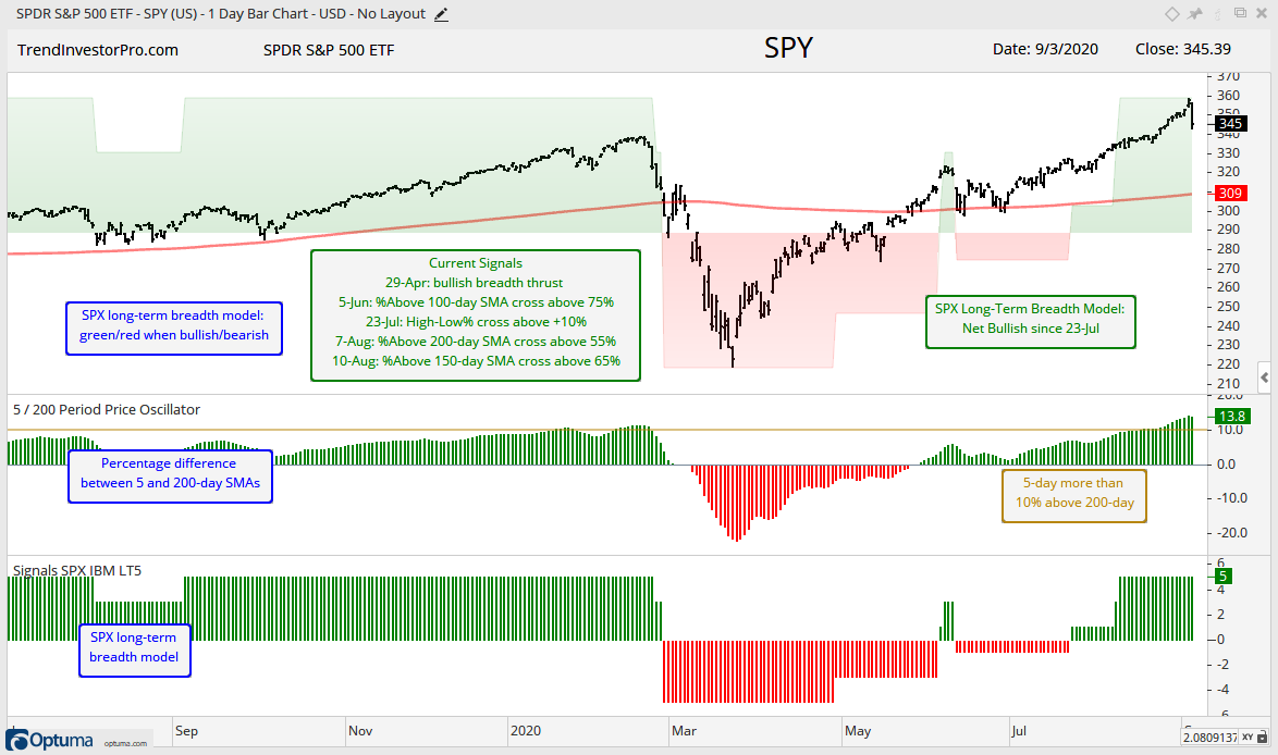
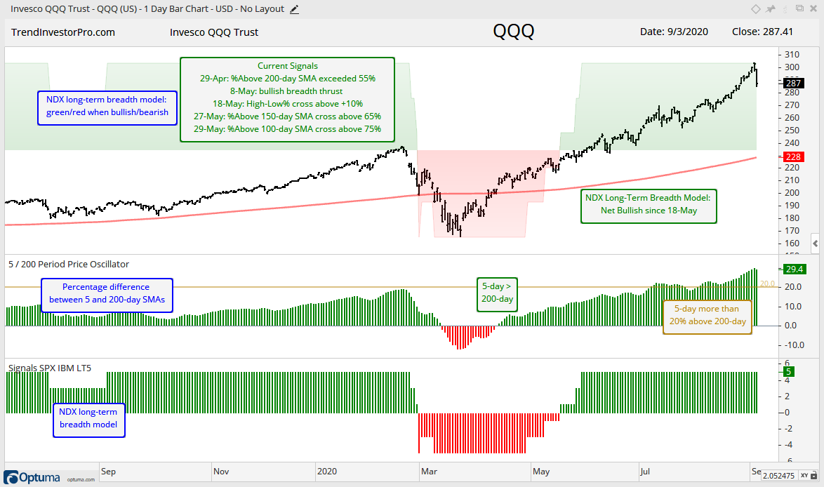
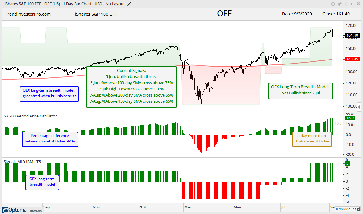
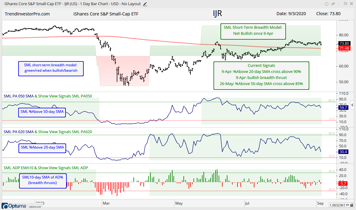
Long-term and Short-term Breadth Models
I am working on ChartBook for the breadth models and indicators. Click here for the first edition. This chartbook contains 15 charts covering five indexes ($SPX, $NDX, $OEX, $MID, $SML). Charts include the indicators for the long-term and short-term models.
We all know that large-caps are leading mid-caps and small-caps, and large-cap tech stocks are leading large-caps in general. With this in mind, I added another index to the breadth models: the S&P 100 ($OEX). This index shows how large-caps in general are performing. Note that 79 stocks from the Nasdaq 100 are in the S&P 500 and 26 are in the S&P 100. Thus, Nasdaq 100 stocks account for around 15.5% of the S&P 500 and 26% of the S&P 100.
First, here is a run down of the current signals and dates for each index:
Long-term Breadth Model
Nasdaq 100 Bullish since 18-May
S&P 100 Bullish since 2-July
S&P 500 Bullish since 23-July
S&P MidCap 400 Bullish since 10-Aug
S&P SmallCap 600 Bearish since 25-Feb
Short-term Breadth Model
Nasdaq 100 Bullish since 29-Apr
S&P 100 Bullish since 26-May
S&P 500 Bullish since 29-Apr
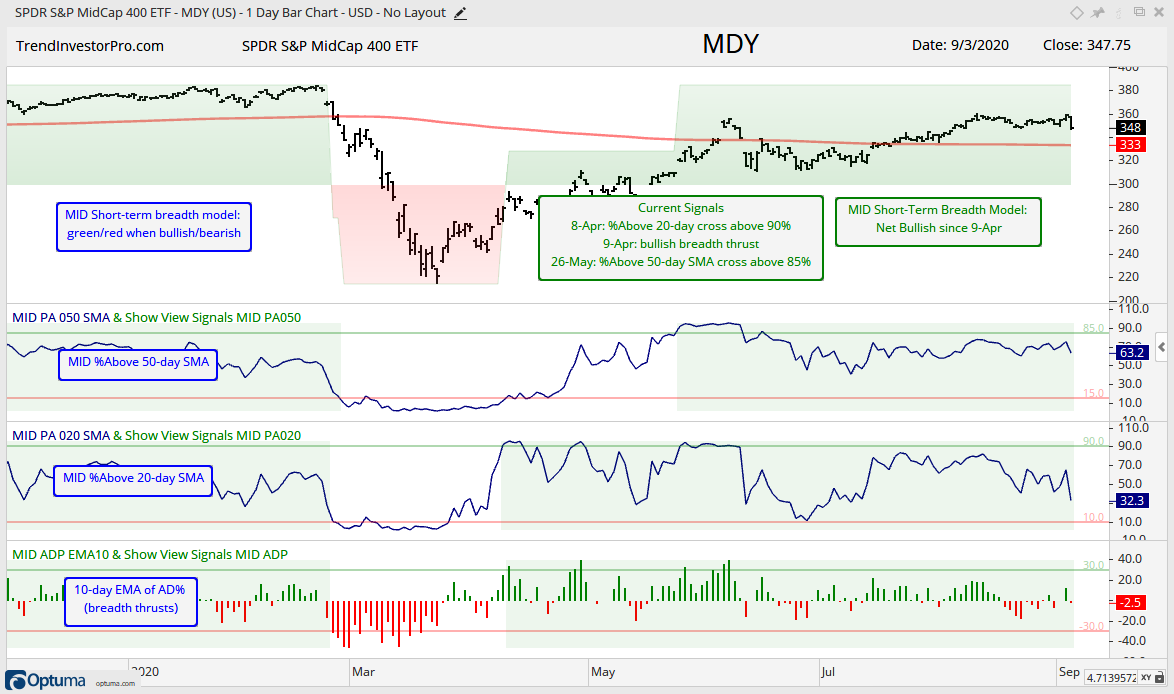
S&P MidCap 400 Bullish since 9-Apr
S&P SmallCap 600 Bullish since 9-Apr
For the long-term models, the Nasdaq 100 was the first to turn net bullish on 18-May. The S&P 100 followed with a bullish signal on 2-Jul and the S&P 500 triggered on 23-Jul. Mid-caps triggered net bullish on 10-Aug and small-caps remain net bearish (three of five indicators are bearish). Despite the bullish models below, we can see that SPY, QQQ and OEF were and are quite extended because their 5-day SMAs are more than 15% above their 200-day SMAs.
For the short-term models, small-caps and mid-caps were the first to trigger bullish (9-Apr). This is quite interesting because money actually moved into the weakest of the five groups first. The Nasdaq 100 and S&P 500 triggered bullish on 29-Apr and the S&P 100 finally caught up on 26-May.
The short-term breadth models trigger bullish when two of the three indicators are on active bullish signals. Bullish/bearish signals trigger when %Above 50-day SMA moves above/below 85%/15%, %Above 20-day SMA moves above/below 90%/10% and the 10-day EMA of AD Percent moves above/below 30%/-30%. Moves that exceed these thresholds show extraordinary participation that can signal the beginning of a new trend.
All told, Four of five long-term models are bullish and all five short-term models are bullish. Long-term and short-term are, of course, subjective. The long-term models use %Above 200, 150 and 100 day SMAs, which are longer term moving averages. The short-term models use %Above 50 and 20 day SMAs, which are shorter term.
Breadth indicators tell us what is happening under the hood of the car (market internals). The large-cap cars (indexes) look all nice and shiny on the outside because they are trading near 52-week highs. The stocks with the biggest weights are doing the heavy lifting for SPY, QQQ and OEF.
Lifting the hood and looking at breadth, we can see that strength is not as broad as it was in late 2019 and early 2020. Fewer stocks are above their 200-day SMAs and there are fewer new highs. This does not always preclude a rise in large-cap dominated indexes. It just means we need to be careful when picking sectors, industry groups, ETFs and stocks because not all groups are participating. This is not a bull market that lifts all boats.
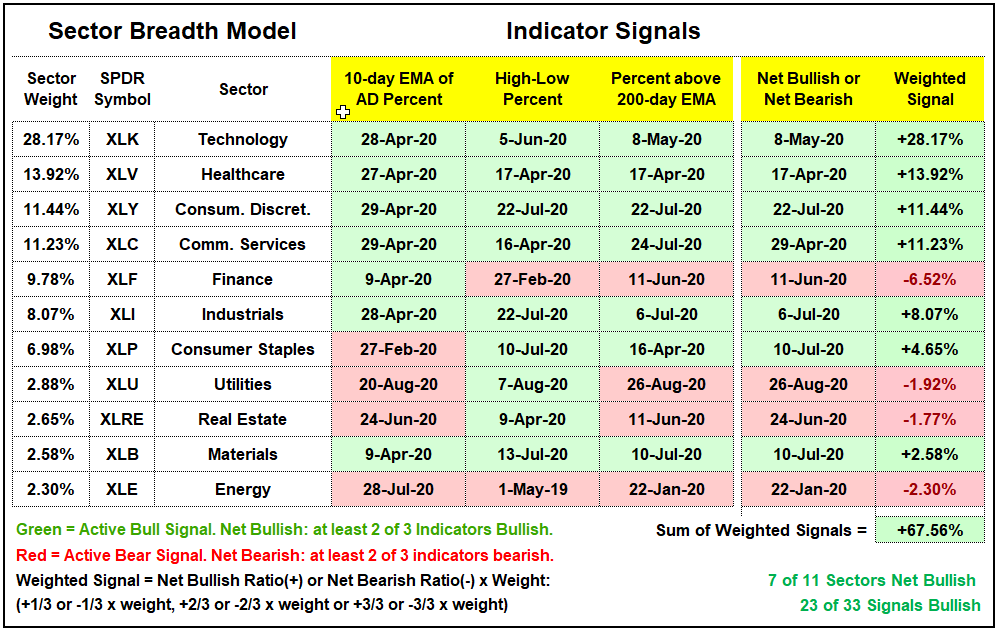
Despite the pummeling on Thursday, the Sector Breadth Model remains unchanged. It will take more than one day of selling pressure to rattle these indicators. Of note, all stocks (100%) in the Technology SPDR, Healthcare SPDR and Materials SPDR (XLB) fell on Thursday, while 95% of stocks in the Industrials SPDR fell. XLB is not much of a concern for the broader market because it accounts for less than 3% of the S&P 500 and has only 27 stocks. XLV, XLI and XLK have more than 60 stocks each and they are the big sectors.
Yield Spreads and the Fed Balance Sheet
There is no change in the AAA or BBB spreads. Bonds rose this week and a rise in bond prices implies a decline in bond yields. This does not mean that spreads narrowed, but the decline in corporate bond yields shows calm within the bond market. The red lines on these charts mark my subjective lines in the sand. Moves above these levels would show stress in the bond market and this could weigh on stocks.
Junk bond spreads and CCC bond spreads moved lower the last two weeks. Junk bond spreads are back in the pre-crisis range and CCC spreads are back near the high end of the pre-crisis range. There are no signs of stress at the junk end of the bond market.
The Fed balance sheet quietly expanded over the last eight weeks. After the massive $2 trillion expansion, the balance sheet contracted a little from early June to early July, which is when SPY consolidated (hmm….). Balance sheet growth picked up again in mid July as the Fed added a cool $100 billion over the last eight weeks.
")