Breadth Shows Energy and Utilities Leading Tech – Finding Mean-Reversion Setups
- Arthur Hill, CMT
")
Welcome to the Chart Fix!
Technology and Communication Services led the market since April, but they are not the strongest sectors when measuring internal strength. Energy and Utilities still stand out with the highest percentage of stocks in uptrends. The Utilities SPDR, in particular, looks interesting with a long-term uptrend and an oversold setup brewing.
- Energy and Utilities Lead Sector Breadth
- XLU in Uptrend with Bullish Long-term Breadth
- A Mean-Reversion Setup using Short-term Breadth
Recent Reports and Videos at TrendInvestorPro
- Small-caps Lead, Space Sets Up, Telecom Breakout
- Stock Setups: First Solar, Quanta and Arista Networks
- Copper and Base Metals Set Up Bullish
- Breadth Supports the Bull Market (%Above 200-day)
- Click here to take a trial and gain full access.
Energy and Utilities Lead Sector Breadth
The table below shows the percentage of stocks above their 200-day EMAs for the 11 sectors and the S&P 500. Three things stand out. First, the S&P 500 is in the middle with 55.6% of its stocks above their 200-day EMAs. While 55.6% of SPX stocks are in long-term uptrends, 44.4% are below their 200-day EMAs and in long-term downtrends. With the S&P 500 trading at new highs, this percentage is rather large.
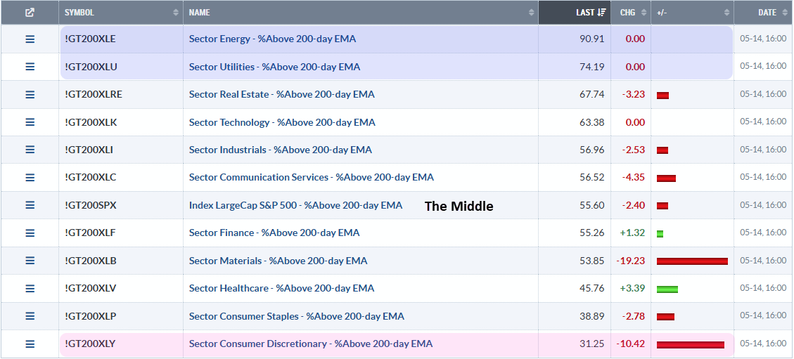
Second, the Energy SPDR (XLE) and the Utilities SPDR (XLU) have the highest percentage of stocks in long-term uptrends, 90.91% and 74.19%, respectively. There is still broad strength in these sectors.
Third, the Consumer Discretionary sector has the lowest percentage of stocks in uptrends. Only 31.25% of stocks are above their 200-day EMAs, which means 68.75% are in long-term downtrends. This is the most economically sensitive sector and it is by far the weakest of the eleven.
Something is rotten in the kingdom of the stock market.
XLU in Uptrend with Bullish Long-term Breadth
The next chart shows the Utilities SPDR (XLU) with XLU High-Low Percent ($XLUHLP), XLU %Above 200-day EMA (!GT200XLU) and the PPO(5,200,0). High-Low Percent is the percentage of 52-week highs less the percentage of 52-week lows. PPO(5,200,0) measures the percentage difference between the 5 and 200 day EMAs.
XLU is in an uptrend because the PPO(5,200,0) is positive. Smoothing the close with a short moving average can reduce, but not fully eliminate, whipsaws. The PPO whipsawed in April and remained positive in January. Currently, the 5-day EMA is 1.898% above the 200-day EMA.
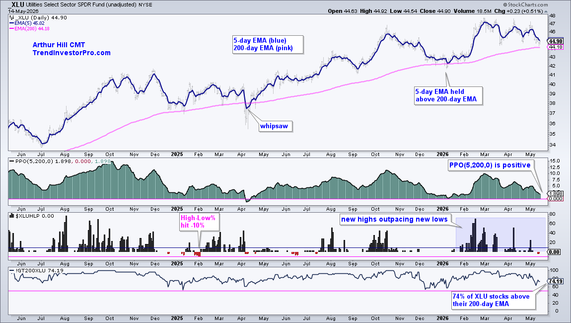
The middle window shows High-Low Percent in positive territory for almost all of 2026. High-Low Percent exceeded 40% in February, March and April, but softened in May and even dipped into negative territory for two days (-3.23%). Despite this negative dip, new highs are outpacing new lows throughout 2026 and this indicator remains bullish. The trouble starts when new lows expand significantly and High-Low Percent moves below -10%.
The bottom window shows the percentage of XLU stocks above their 200-day EMAs. This indicator has been above 50% (pink line) for over two years and is currently at 74.19%. The vast majority of stocks are in long-term uptrends. This sector is where chartists should be looking for individual stock setups.
A Mean-Reversion Setup using Short-term Breadth
The next chart shows XLU with XLU %Above 20-day EMA, which is a short-term breadth indicator. In general, short-term indicators are best suited for mean-reversion setups. In contrast, long-term indicators, such as %Above 200-day EMA, are better suited for trend signals.
First, the price chart shows XLU hitting a new high in late February and then correcting since March. This looks like a consolidation after the January-February surge, which makes it a bullish continuation pattern. A breakout at 47.5 would end the correction and signal a continuation higher. Chartists looking for a jump on this breakout can watch for a short-term breadth thrust.
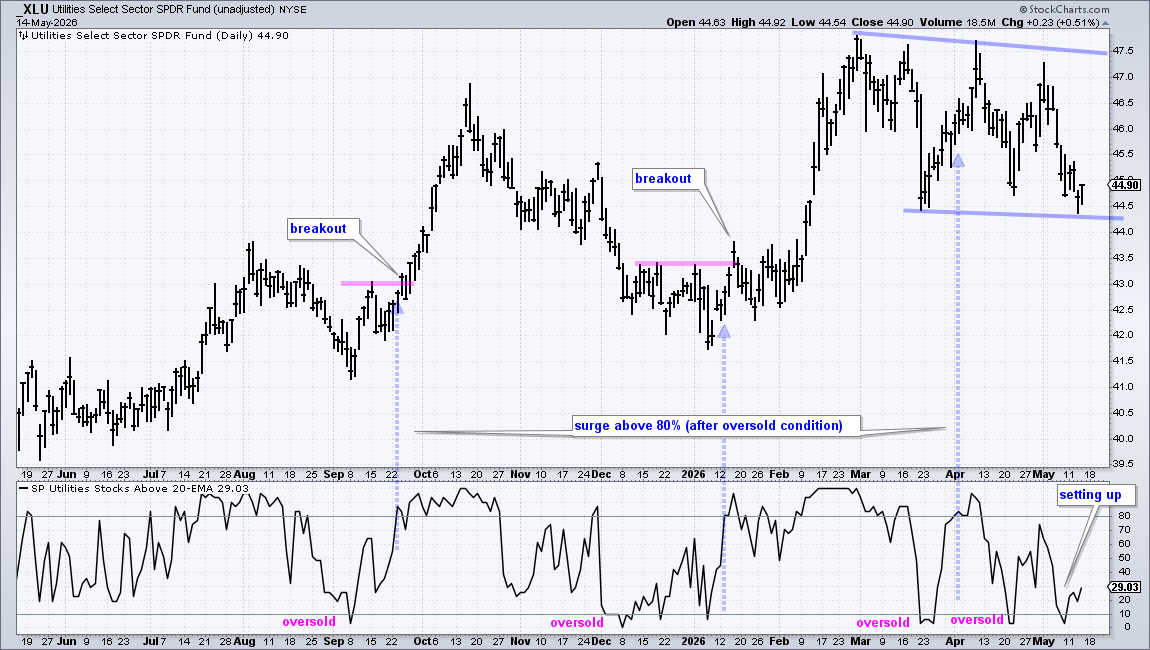
A mean-reversion setup occurs when %Above 20-day EMA moves below 10% and becomes oversold during a long-term uptrend. The bottom window shows oversold conditions in September, December-January, March, April and May. The blue dashed arrow lines show when the indicator surges above 80%, after being oversold. This shows a participation thrust that can signal the end of a pullback.
A bullish signal triggered in early April, but %Above 20-day EMA fell back below 10% in late April and early May. Another setup is in the making. A surge above 80% would confirm this setup and trigger a bullish signal.
Recent Reports and Videos at TrendInvestorPro
- Small-caps Lead, Space Sets Up, Telecom Breakout
- Stock Setups: First Solar, Quanta and Arista Networks
- Copper and Base Metals Set Up Bullish
- Breadth Supports the Bull Market (%Above 200-day)
- Click here to take a trial and gain full access.