The next Chart Trader will be posted on Tuesday morning, June 4th.
A Rough Two Months for Average Stocks
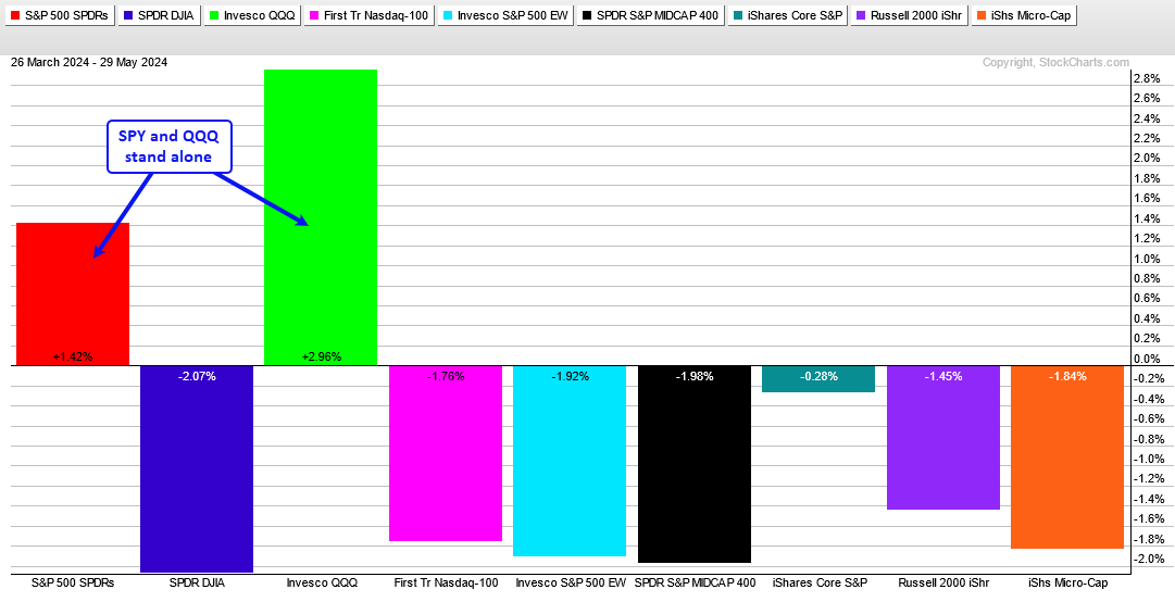
The long-term indicators are still bullish, but I am seeing short-term deterioration under the surface. This is especially pronounced outside of large-cap tech (XLK, QQQ, MAGS, SOXX). SPY and QQQ are up over the last two months and still trading near new highs. The rest of the market, however, is down. The PerfChart below shows two-month performance for SPY, DIA, QQQ, the Nasdaq 100 Equal-Weight ETF (QQEW), the S&P 500 EW ETF (RSP), the S&P MidCap 400 SPDR (MDY), the S&P SmallCap 600 SPDR (IJR), the Russell 2000 ETF (IWM) and the Russell Microcap ETF (IWC). IJR is down just .28%, but the rest are down between 1.45% and 2.07%. Life without large-cap tech stocks is tough.
Consumer Discretionary and Regional Banks Weigh
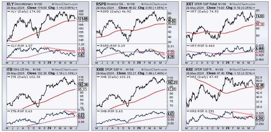
The next charts show two Consumer Discretionary sectors ETF (XLY, RSPD), the Retail ETF (XRT), two Housing ETFs (ITB,XHB) and the Regional Bank ETF (KRE). I added relative strength ratios (XLY:RSP) in the bottom windows. The RSPD:RSP ratio hit a new low and this shows long-term underperformance in the EW Consumer Discretionary ETF. The XLY:RSP ratio is trending lower and below its falling 200-day SMA. The KRE:RSP ratio never recovered after the February plunge and moved below its 200-day SMA. Serious relative weakness in the Consumer Discretionary sector and Regional Bank group is weighing on the broader market.
Short-term Weakness Under the Surface
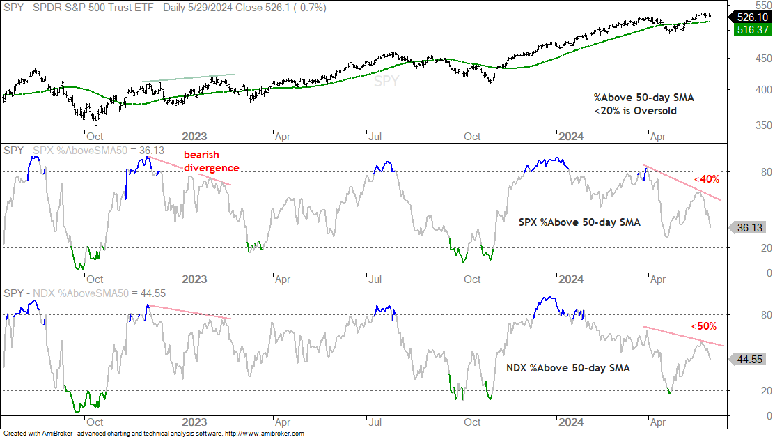
The first chart shows the percentage of stocks above the 50-day SMA for stocks in the S&P 500 and Nasdaq 100. I generally use this indicator to identify short-term oversold conditions when it dips below 20% and I also use bullish divergences for short-term setups. Bearish divergences also occur, but do not always lead to significant declines. A bearish divergence forms when SPY forges a higher high and SPX %Above 50-day SMA forges a lower high. See the red and green lines from December 2022 to February 2023. SPY hit a new high in late May and remains above its 50-day SMA, but fewer stocks made it back above their 50-day SMAs. SPX %Above 50-day peaked at 64% on the 17th and fell below 40% this week. The majority of S&P 500 stocks are struggling at the end of May. The second window shows NDX %Above 50-day SMA forming a lower higher from late March to mid May (red line). Fewer NDX stocks got back above their 50-day SMAs when QQQ hit a new high.
4wk Lows Expand within S&P 500
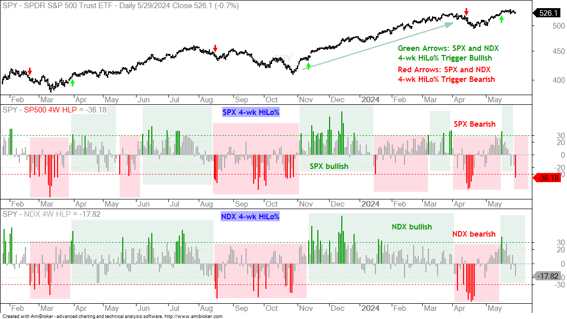
The next chart shows 4wk High-Low Percent for the S&P 500 and Nasdaq 100. This is the percentage of 4wk highs less the percentage of 4wk lows within each index. A move above +30% is bullish and a move below -30% is bearish. A bullish signal triggers when both have exceeded +30% and a bearish signal triggers when both have broken below -30%. Note that a bullish signal remains if only one breaks below -30%. This is the case right now because both triggered bullish with moves above +30% on May 15th. SPX 4wk High-Low Percent plunged to -36.18% on Wednesday, but NDX 4wk High-Low Percent has yet to confirm as it finished at -17.82%. A move below -30% would trigger a combo signal and be bearish. The green and red arrows on the price chart show these combo signals.
Déjà vu with Bearish Engulfing Patterns
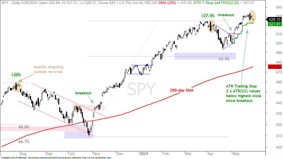
SPY formed a large bearish engulfing pattern last week and then three inside days. This setup looks similar to prior peaks in early April 2024 and late July 2023 (yellow ovals). SPY was up some 20% in late July 2023 when the large bearish engulfing formed. There were three inside days and then a sharp decline with a gap. SPY fell into mid August and ultimately corrected into late October.
SPY was up some 27% in late March 2024 and formed a large bearish engulfing in early April. There were three inside days and then a gap down. SPY extended lower into mid April. Looking at the current setup, SPY hit a new closing high on May 21st and then formed a big bearish engulfing on May 23rd. There were two inside days and then a gap down on Wednesday. Technically, Wednesday’s price action is still within the range of May 23rd so we have three inside days. In any case, SPY is looking short-term toppy here and could be poised for a pullback. The green line shows the ATR Trailing Stop at 521.81.
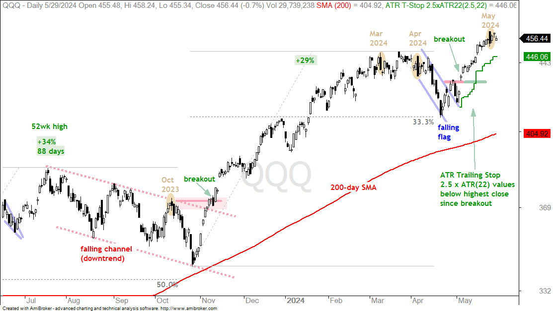
The next chart shows QQQ with four bearish engulfing patterns marked (yellow ovals). These do not exactly correspond with the patterns in SPY though. For example, QQQ did not form a bearish engulfing in late July 2023. The bearish engulfing in mid October 2023 marked a short-term peak. A trading range followed the bearish engulfing in March. A big bearish engulfing formed in early April and there were then six inside days. QQQ then fell sharply into mid April. A bearish engulfing formed last week and we now have three inside days. Technically, a bearish engulfing is confirmed with further weakness below the low of the pattern.
The following charts show price bars with the 200-day SMA (red line), the 50-day SMA (green line), the price-relative (ITB/RSP ratio) with the 200-day SMA and the percentage difference between the 5 and 200 day SMAs. On the price chart, I am looking for tradable pullbacks within a bigger uptrend or bullish consolidation patterns. With the price-relative, I am looking for relative strength. The price-relative (ITB/RSP ratio) rises when the ETF or stock outperforms. And finally, the percentage difference between the 5 and 200 day SMA is bullish (long-term uptrend) with a move above 3% and stays bullish until a move below -3%. This basically measures the tide or long-term bias.
TLT Breaks Down and Yields Surge
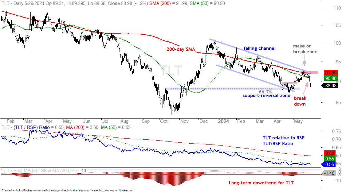
I showed the 20+ Yr Treasury Bond ETF (TLT) at its make or break zone last week Thursday. [8]TLT failed to break out and reversed its short-term upswing with a sharp decline the last two days. The chart below shows TLT hitting a resistance zone from the falling 200-day SMA, the 50-day SMA and the upper line of the falling channel. This falling channel defines the current downtrend. I marked short-term support at the 50-day SMA (91) last week and TLT broke this level with a sharp decline on Tuesday. This reverses the short-term upswing and signals a continuation of the falling channel.
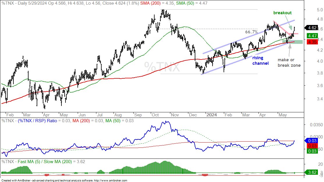
The next chart shows the 10-yr Treasury Yield hitting a make or break zone in the 4.3-4.4 percent area. A rising channel formed and a support break would have signaled a continuation lower. This would have been bullish for stocks. But it did not happen. Instead, TNX reversed its May downswing with a short-term breakout and surged above 4.6%. The sharpness and the direction of this surge are negative for stocks.
Breakouts in Tech ETFs Under Threat
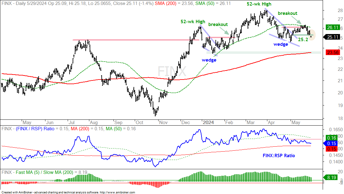
The breakout in the FinTech ETF (FINX) failed to hold (yellow oval). The chart shows FINX with a falling wedge breakout on May 15th, but no follow through and a rather sharp decline the last five days. FINX closed below the breakout level at 25.20 and this breakout has failed. The next target zone is around 23.5 (January low and 200-day SMA).
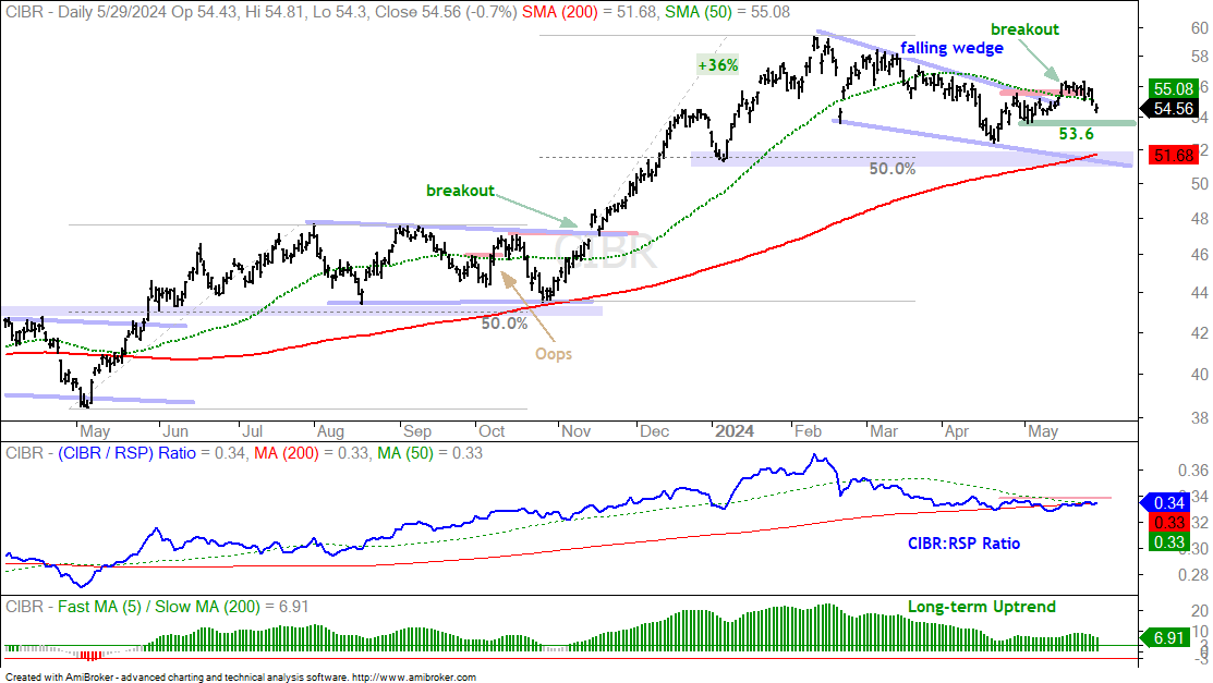
The next chart shows the Cybersecurity ETF (CIBR) breaking out in mid May and falling back the last four days. This breakout is under threat because there was no follow through and CIBR is back below the 50-day SMA. I put the re-evaluation at 53.6 and a close below this level would argue for further weakness.
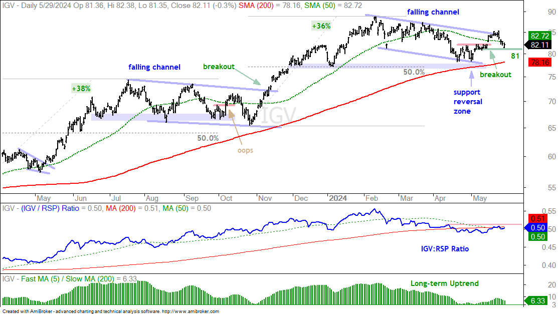
The next chart shows the Software ETF (IGV) with a breakout in mid May and a close above the upper line of the falling channel on May 20th. This breakout is also under threat as IGV fell back below the 50-day SMA over the last few days. My re-evaluation was set at 81 and a close below this level would argue for further weakness.
Semis, XLK and Mag7 Stand Alone
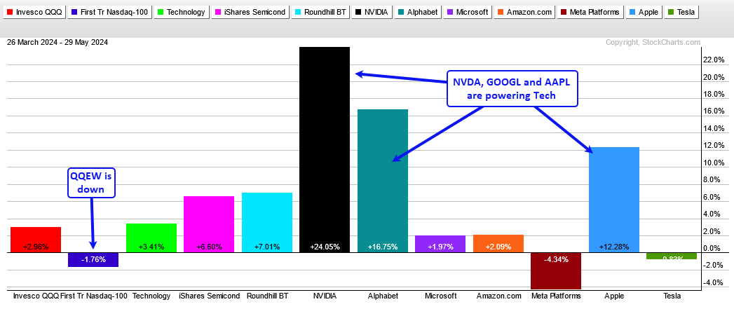
The Semiconductor ETF (SOXX) and the Mag7 ETF (MAGS) are the strongest groups within the Technology SPDR (XLK). Actually, three Mag7 stocks are powering the market over the last two months. The PerfChart below shows the percentage change in QQQ, QQEW, XLK, SOXX and the seven Mag7 stocks. Nvidia (+24%), Alphabet (+16.75%) and Apple (+12.38%) are powering QQQ and XLK. Notice that the Nasdaq 100 Equal-Weight ETF (QQEW) is actually down 1.76% over this period.
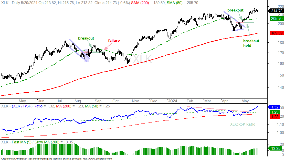
The next chart shows XLK breaking out on May 3rd, holding this breakout and extending higher. A strong breakout should hold and extend. As noted in the ETFs above, failure to hold a breakout is the first sign of weakness. XLK is trading near a 52-week high and still leading. The indicator window shows the XLK:RSP ratio turning up in May and hitting a new high. XLK is up 9.4% in May and perhaps a bit overbought, which means it could correct or consolidate from here.
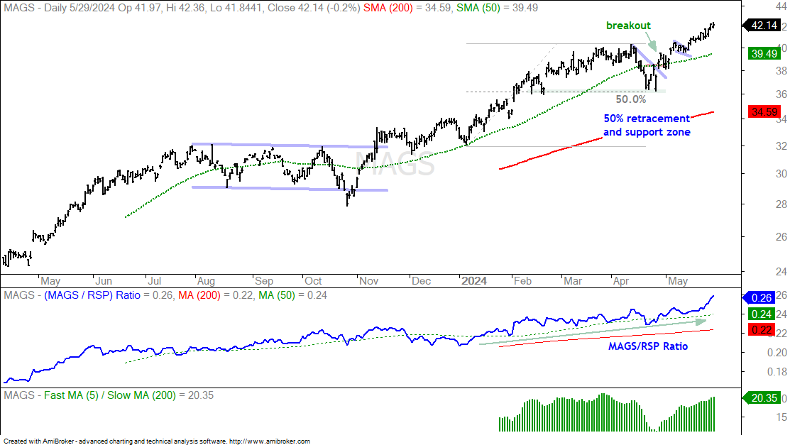
The next chart shows the Mag7 ETF (MAGS) breaking out on April 26th, stalling for a week in mid May and continuing higher the last two weeks. MAGS is up around 15% since mid April and also getting extended. This does not guarantee a pullback or correction, but it does increase the odds.
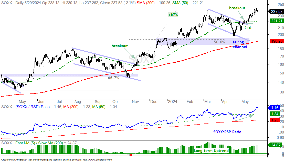
The next chart shows the Semiconductor ETF (SOXX) with a breakout on May 6th and an extension higher the last few weeks. SOXX is up some 21% since mid April and also getting extended.