Defense, Uranium, Banks, Copper, Timber and Semis Lead
TradeDesk Forms Large Cup-with-Handle
Crypto-Related ETFs Get Breakouts
Coinbase and Marathon Break Out
The next Chart Trader will be posted on Thursday morning, May 30th.
The weight of the evidence remains bullish for stocks. SPY and QQQ hit new highs and continue to lead the market. The S&P 500 EW ETF (RSP) and Russell 2000 ETF (IWM) did not exceed their spring highs and continue to lag. Large-caps and large-cap techs are the place to be. There are no setups for SPY and QQQ because both are extending after their early May breakouts. Today’s report will highlight a classic continuation breakout in TradeDesk and some bullish setups in the crypto world. Caveat Emptor!
Weight of Evidence Remains Bullish
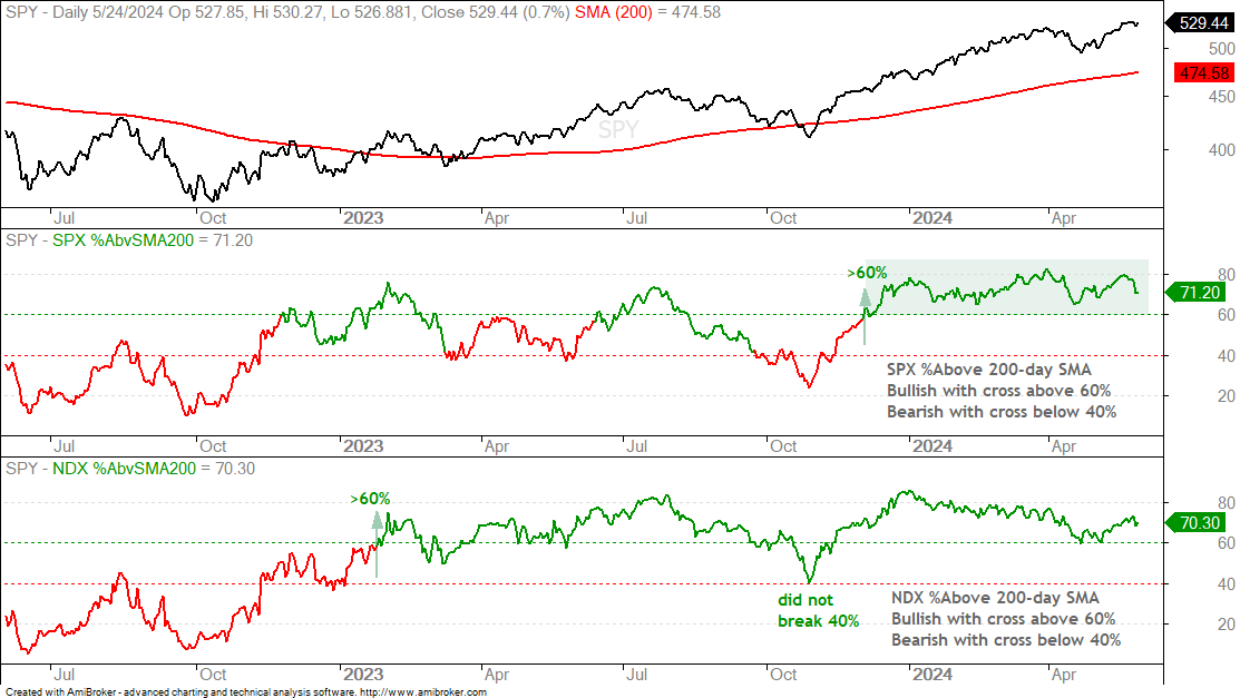
The chart below shows the percentage of stocks above their 200-day SMAs for the S&P 500 and Nasdaq 100. I set my bullish and bearish thresholds at 60 and 40 percent, respectively. A move above 60% triggers bullish and this signal stays bullish until a move below 50%. SPX %Above200 turned bullish on December 1st and held above 60% the last six months. Over 60% of S&P 500 stocks have been above their 200-day SMAs since December 1st. That is strong. NDX %Above 200 turned bullish on January 27th, 2023. It did not break below 40% in October 2023 and remained bullish. Currently, some 70% of Nasdaq 100 stocks are above their 200-day SMAs. This is what a bull market looks like.
26wk High-Low% Confirms Bull Market
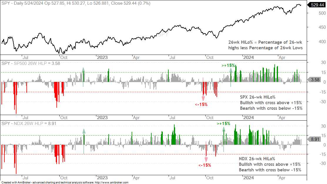
The next chart shows 26-week High-Low Percent for the S&P 500 and Nasdaq 100. This is the percentage stocks making 26-week highs less the percentage making 26-week lows. 26 weeks is equivalent to 6 months. This indicator is more sensitive than 52-week High-Low Percent because it covers a shorter timeframe. Even so, six months fits within my long-term timeframe. In general, a move above +15% is bullish (green bars) and remains bullish until a move below -15% (red bars). NDX 26wk Hilo% surged above 15% on November 14th and SPX 26wk HiLo% exceeded +15% on December 1st. The levels in May were lower than the levels earlier this year as fewer components hit 26-wk highs. This shows less upside participation. As a long-term trend-following breadth indicator, it would not trigger bearish until a move below -15%.
SPY and QQQ Tag New Highs
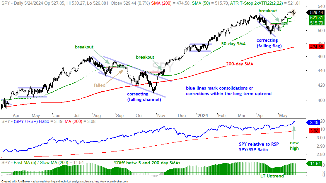
The next chart shows SPY in a long-term uptrend and hitting a fresh 52-week high last week. Price is well above the rising 200-day SMA and the 5-day SMA is 11.54% above the 200-day SMA (bottom window). SPY is also outperforming the S&P 500 EW ETF (RSP) as the SPY/RSP ratio hit a new high. Long-term, the weight of the evidence is bullish.
Short-term, SPY forged an outside reversal day on Thursday as it opened strong and closed weak (yellow oval). This is also a bearish engulfing. These are short-term bearish patterns, but I am not interested in bearish setups when the long-term trend is up and we are in a bull market. Furthermore, it is very hard to predict pullbacks or corrections when the long-term trend is up.
There is no setup on this chart. SPY is simply extending on the flag breakout at 510 (May 3rd). For short-term traders, the green line marks the ATR Trailing Stop, which his 2 ATR(22) values below the highest close since the May 3rd breakout. A close below 521.81 would trigger this stop.
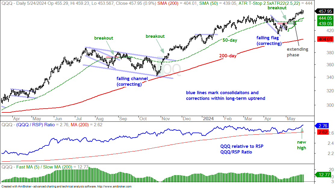
The next chart shows QQQ with similar characteristics (long-term uptrend and extending after breakout). QQQ broke falling flag resistance on May 3rd and extended higher the last few weeks. For short-term traders, the green line marks the ATR Trailing Stop (2.5 x ATR(22)) at 444.05. Note that I used 3 as the multiplier last week, but changed to 2.5 and this tightened the stop a little.
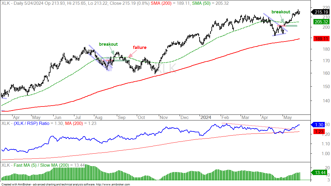
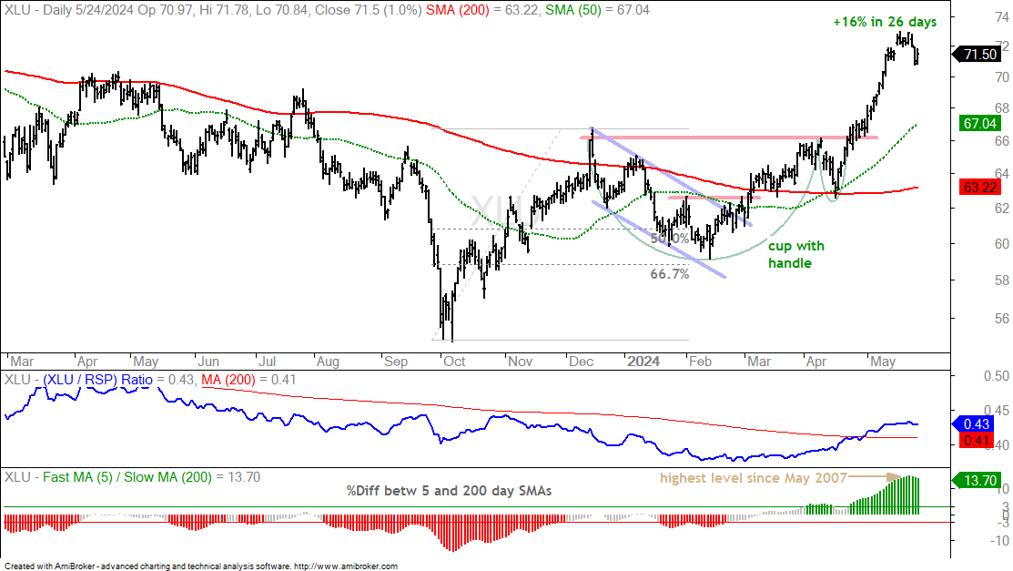
The following charts show price bars with the 200-day SMA (red line), the 50-day SMA (green line), the price-relative (ITB/RSP ratio) with the 200-day SMA and the percentage difference between the 5 and 200 day SMAs. On the price chart, I am looking for tradable pullbacks within a bigger uptrend or bullish consolidation patterns. With the price-relative, I am looking for relative strength. The price-relative (ITB/RSP ratio) rises when the ETF or stock outperforms. And finally, the percentage difference between the 5 and 200 day SMA is bullish (long-term uptrend) with a move above 3% and stays bullish until a move below -3%. This basically measures the tide or long-term bias.
Utilities and Tech Stand Out
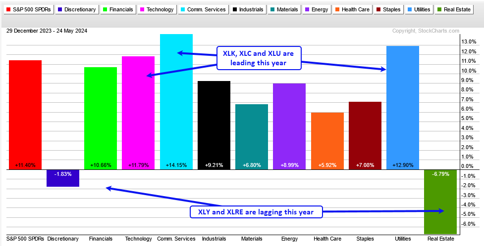
Among the sector SPDRs, the Technology SPDR (XLK), Communication Services SPDR (XLC), Finance SPDR (XLF), Consumer Staples SPDR (XLP) and Utilities SPDR (XLU) recorded new highs in May and are leading.
Among the equal-weight sectors, the EW Technology ETF (RSPT), EW Utilities ETF (RSPU) and EW Materials ETF (RSPM) hit new highs in May and are leading. Only two sectors stand out when we combine the SPDRs and equal-weight sectors: Technology and Utilities. These are the two strongest sectors right now and I suspect they are tied to the AI trade. The chart below shows XLK hitting a new high last week. As with QQQ above, XLK corrected into early May, broke out on May 3rd and extended after this breakout.
The next chart shows XLU with a cup-with-handle breakout in late April and strong follow through into mid May. There is a clear uptrend here, but XLU became very extended because the 5-day SMA was over 14% above the 200-day SMA. This was the highest level since May 2007! XLU needs time to digest recent gains with a consolidation or a correction.
Defense, Uranium, Banks, Copper, Timber and Semis Lead
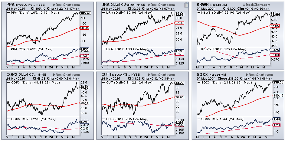
The CandleGlance chart below shows six leading industry ETFs. These ETFs hit new highs over the last two weeks and are in strong uptrends. Their price-relatives (PPA/RSP ratio) are also in uptrends (above the 200-day SMAs).
TradeDesk Forms Large Cup-with-Handle
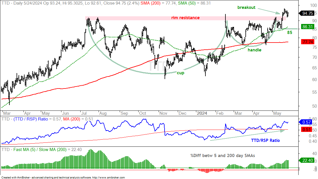
TradeDesk (TTD) is showing leadership as it formed a cup-with-handle pattern and broke out with a surge in mid May. This classic bullish continuation pattern was popularized by William O’Neil of Investors Business Daily (IBD). The cup represents a big base, the handle is a consolidation just below resistance and the breakout confirms the pattern. I am using the low just before the breakout surge to mark re-evaluation support at 85. A close below this level would negate the breakout. The indicator window shows the price-relative (TTD/RSP ratio) moving higher since January (relative strength).
Crypto-Related ETFs Get Breakouts
There are two items to consider before looking at some crypto names. First, keep in mind that anything related to crypto has above average volatility and risk. Second, remember that crypto currencies, ETFs and related stocks are highly correlated. This means they all move in the same direction and there is no diversification benefit from owning them all.
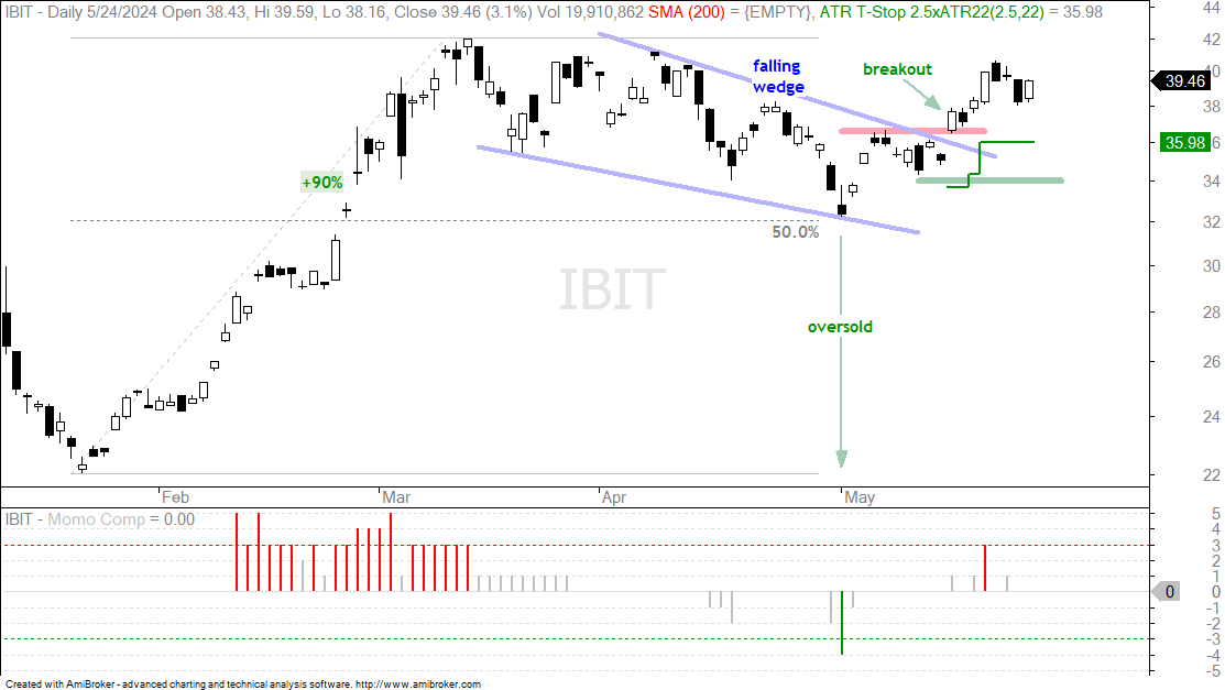
I featured the Bitcoin ETF (IBIT) on May 17th[8] as it broke out of a falling wedge pattern. IBIT followed through with further gains above 40 and then fell back. The breakout is holding and I marked my initial re-evaluation using the 10-May low at 34 (green line). The dark green line marks an ATR Trailing Stop, which is 2.5 ATR(22) values below the highest close since the breakout. This stop rose along with IBIT and is currently at 35.98 (dark green line).
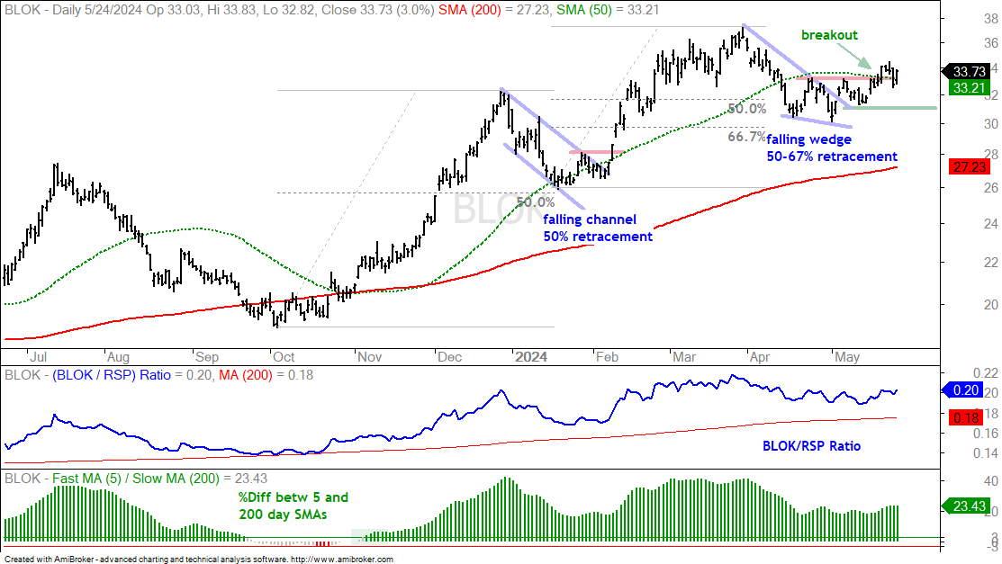
The next chart shows the Transformational Data Sharing ETF (BLOK), which was also featured on May 17th. This ETF is tied to the crypto world. BLOK formed a falling wedge that retraced 50-67% of the prior advance and the ETF broke out with a surge last week. The pattern and the retracement amount are typical for corrections within bigger uptrends. This breakout signals a continuation of the bigger uptrend and argues for a move to new highs. The low just below the breakout marks re-evaluation support at 31.
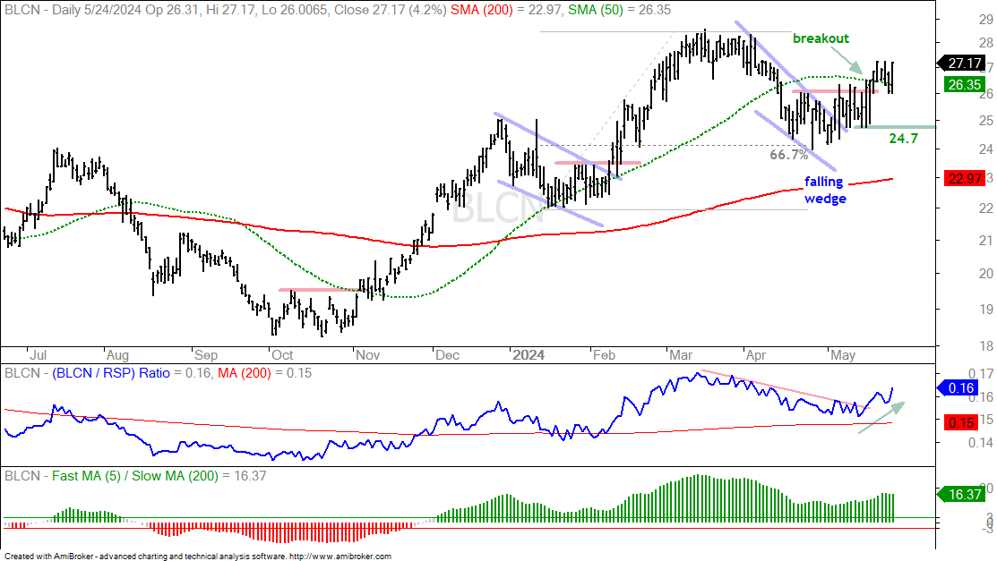
The next chart shows the NextGen Economy ETF (BLCN) with similar characteristics. The green line marks re-evaluation support at 24.70.
Coinbase and Marathon Break Out
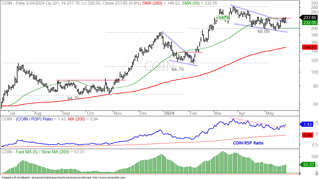
The next chart shows Coinbase (COIN) with a similar chart and pattern. There is a move to new highs in March, a correction into May and a breakout. COIN formed a falling wedge that retraced around half of the prior advance, which was a whopping 147%. The stock broke out with a surge on Friday and this signals a continuation higher. The low just before the breakout marks re-evaluation support at 200, which is 16% before Friday’s close.
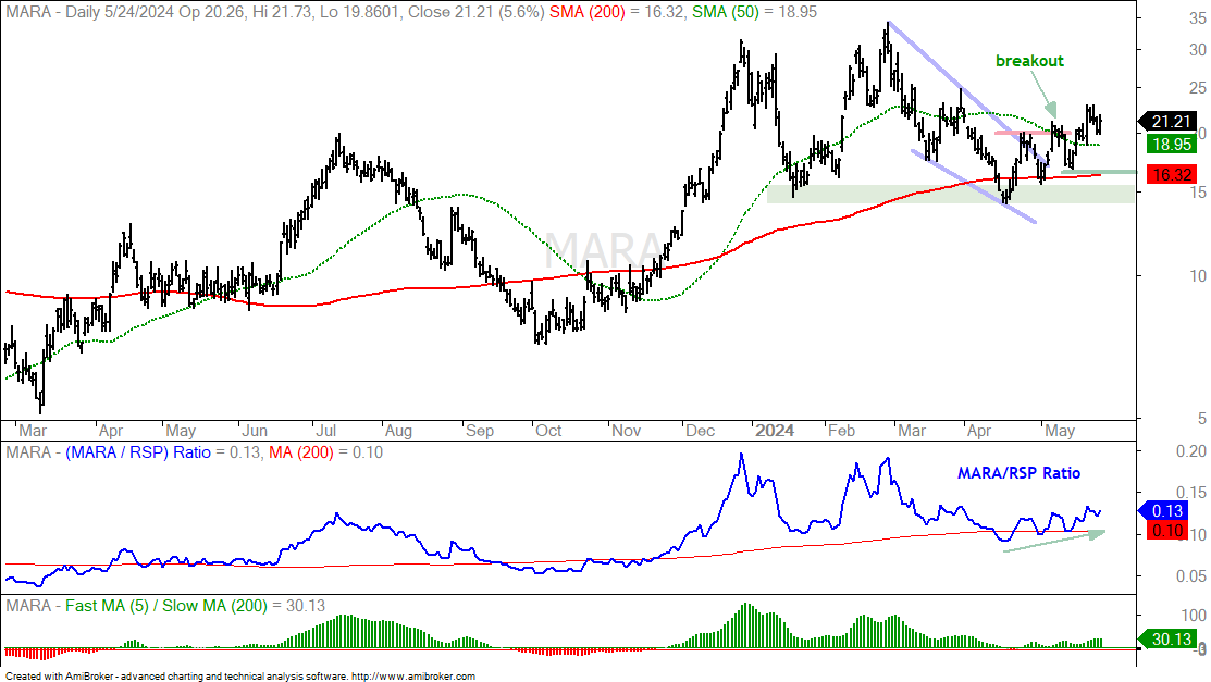
The next chart shows Marathon Digital (MARA), which is involved in crypto mining. MARA hit a new high in late April (31) and then fell back to its 200-day SMA. MARA lost 50% in the process, but ultimately found support near the January lows (green shading). The ETF broke short-term resistance in mid May, fell back right after the breakout and surged above 20 last week. Overall, the breakout remains valid with the early May low marking re-evaluation support at 16.5 (23% lower). MARA has the highest volatility and most risk in this group.