The stock market has a long-term bullish bias and the monthly return metrics reflect this positive bias. Chartists looking for a seasonal edge can compare benchmark metrics with the monthly performance numbers. Months that outperform the benchmarks have a positive bias, while months that seriously underperform have a negative bias. Four months stand out on the upside and four months stand out on the downside.
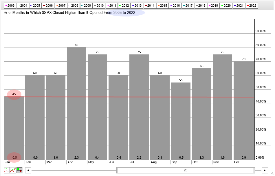
Seasonally, January is one of the weakest months of the year. The chart below shows monthly performance for each month over the last twenty years (2003 to 2022). The numbers at the top of the histogram bars show the percentage of months when the S&P 500 closed higher. The numbers at the bottom show the average of the gains/losses for the month.
Eleven of the twelve months closed higher 55% of the time or more. January is the only month that closed lower less than 50% of the time (45%). The average gain/loss for January is -.50%, which is also the lowest of the twelve months. January has clearly been the toughest month for the S&P 500 over the last twenty years.
I would like to extend the look-back to 2000 because that year marked a peak and the subsequent 2001-2002 bear market. There are 276 months of trading since January 2000. The S&P 500 closed higher 62% of those months and the average gain/loss was a gain of .45%. These performance metrics show a long-term positive bias.
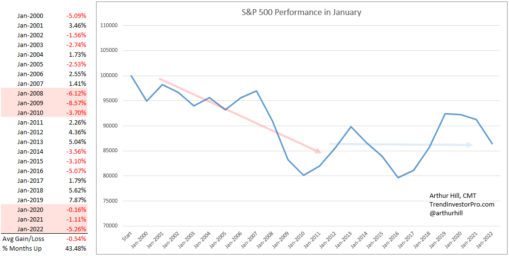
Now let’s look at January again. The next image shows monthly performance for January since 2000. The monthly gains and losses are on the left with the average gain/loss at the bottom and the percentage of months closing higher. January closed higher just 43.5% of the time with an average loss of .54%. January underperformed the benchmark metrics and this suggests a negative bias for the month.
The chart on the right shows a hypothetical equity curve for January. Equity starts at 100,000 and increases or decreases with the monthly changes. January was exceptionally rough from 2000 to 2010 as the equity curve declined (red arrow). Performance turned mixed from 2011 to 2022 as the equity curve bounced up and down (blue line). Overall, there is not a definitive trend for the equity curve and this means the month could go either way.
This report continues for subscribers at TrendInvestorPro.com. [1] We will look equity curves for the next five months and show a performance table for all twelve months. 2023 marked a move towards an even more systematic approach at TrendInvestorPro as we introduced a fully quantified mean-reversion trading strategy for ETFs. Click here for immediate access. [1]
The Trend Composite, Momentum Composite, ATR Trailing Stop and eight other indicators are part of the TrendInvestorPro Indicator Edge Plugin for StockCharts ACP. Click here to learn more and take your analysis process to the next level. [2]

