The S&P 500 SPDR and Nasdaq 100 ETF led the market by surging to new highs. After a bashing at the end of January, these two came roaring out of the gates and answered with big moves in the first week of February. As the chart below shows, SPY held its early January low during the dip and showed relative strength in late January (less weakness).

The S&P 500 EW ETF and Russell 2000 ETF answered with big moves this week, but fell short of their January highs and did not fully recoup the prior losses. These two also dipped below their early January lows and did not hold up as well as SPY. Once again, we are seeing the average stock in the S&P 500 and small-caps underperform. Despite underperformance, all three are above their rising 200-day SMAs and still in long-term uptrends.
Relative weakness in small-caps does not add to the argument for a broader market correction. Small-caps have been lagging for a long time and underperformance in 2020 is nothing new. It would be better to rephrase this as large-caps have been leading for a long time and leadership in 2020 is nothing new.
Despite big recoveries this week, I am still arguing for a corrective period in the coming weeks, perhaps months. SPY and QQQ continue to show signs of excess and volatility reared its ugly head over the last three weeks. It is possible that RSP and IWM broke down in late January and will form lower highs here in February. SPY and QQQ, the real leaders, have yet to break down and are already back at new highs.
Bulls Answer with Huge Week
The bears fired a warning shot with a sharp decline last week, but the bulls answered with an even bigger advance this week, and a new high. Provided the weekly gain remains in excess of 2.8%, this will be the biggest gain since early June and the tallest candlestick of the current advance (Oct to Feb). New highs only occur in strong uptrends and SPY is clearly in a strong uptrend. Nevertheless, signs of excess are back with the outsized gain and outsized candlestick. In addition, SPY is some 9% above its rising 40-week EMA and over 10% above its 40-week SMA.

Bullish Price Action, but Higher Volatility
The next chart shows daily bars for the S&P 500 and a falling pennant breakout. I am calling this a falling pennant because pennants are short-term continuation patterns. Falling wedges, in contrast, are medium-term continuation patterns that extend at least a month (according to Art). The S&P 500 bounced off the rising 50-day SMA like a champ, broke out of the falling pennant and hit fresh new highs. Price action is clearly bullish.

Now let’s look at the indicators. Instead of Average True Range (2), I am going to show ATR(22) and its 22-day SMA. The principle is the same: an upturn in ATR(22) signals an increase in volatility (negative for SPX), while a downturn in ATR(22) signals a decrease in volatility (positive for SPX). The 1-day Rate-of-Change measures volatility and outsized moves. Over the last two weeks, we saw ATR(22) turn up and ROC(1) produce four outsized moves (two below -1% and three above +1%). These indicators show an uptick in volatility and this is more negative than positive for the S&P 500.
25 Years of Percent Above 40-week SMA
In the interest of open mindedness, I will now show prior instances when the S&P 500 was more than 10% above its 40-week SMA using an Amibroker chart. There are a ton of instances since 1995. I chose a 40-week SMA because it represents a true average and is better for capturing the excess above the average. I use a 40-week EMA and the PPO at StockCharts because this is what is available.
I am looking at times when the percent above the 40-week SMA exceeded 10%, but ONLY after a dip below the 40-week SMA. The histogram turns negative (red) when the S&P 500 closes below the 40-week SMA. There are three takeaways. First and foremost, notice how the initial moves above 10% signaled the start of big bull markets in May 1995, June 2003 and July 2009 (green lines). These signals may have lagged, but they marked a long-term momentum thrust that lasted for years.

Second, the red lines show when the indicator exceeded +10% and there was a pullback (March 2000, January 2011, March 2012 and January 2018). Note that the S&P 500 hit a marginal new high in September 2000 and April 2011. Thus, it can sometimes take months for the pullback to arrive. Third, the blue lines show when the indicator exceeded +10% and the S&P 500 simply continued higher (January 1999 and May 2013).
What are the conclusions? First, I think we can rule out the green lines (initial thrust to start a bull market). The current advance started in December 2018 and is not exactly a spring chicken. We could, however, be in a situation similar to April 2013 when the indicator exceeded +10% and the advance was over a year old. There are also four instances when a move above +10% led to at least a corrective period (red lines). Even though we saw marginal new highs after the signals in March 2000 and January 2011, the market essentially moved sideways for months and this is also corrective price action.
Excluding the green line signals, we have four instances that led to a correction and two that did not. This puts the odds in favor of a correction, but a correction is not guaranteed.
Index Breadth Model is Bullish
There is no change in the index breadth model as all indicators remain with active bullish signals. This model as been net bullish since early September.

Click here for an article and video [1] explaining the indicators, signals and methodology used in the Index Breadth Model. This article also includes the signals of the last five years.
September Breadth Thrust Remains Active
Within this Index Breadth Model, I will be watching the 10-day EMAs of Advance-Decline Percent closely in the coming days and weeks. These indicators are all bullish right now, but they are often the first to turn and signal at least a correction. The chart below shows the 10-day EMAs for Advance-Decline Percent for the S&P 500, S&P MidCap 400 and S&P SmallCap 600. A move above +30% triggers a bullish breadth thrust, while a move below -30% triggers a bearish breadth thrust. All three triggered bullish in January 2019 and reaffirmed in early September 2019. The group would turn bearish if two of the three move below -30%.

We saw a triple 90% down day in daily Advance-Decline Percent on January 31s [2]t and this was the first warning shot. In a separate, but related note, the S&P 500 gained .33% on Thursday, but Advance-Decline Percent was actually negative. (The indicators above are based on a 10-day EMA of Advance-Decline Percent and it takes more selling pressure to trigger – at least two weeks or ten days. The signals are not perfect, but they can help us stay on the right side of the bigger trend and they are often the first to turn on the Index Breadth Model. Notice that all three triggered bearish in February 2018 and affirmed this signal in October 2018. There indicator is not perfect because there was no bullish signal in between these two bearish signals.
Sector Breadth Model Remains Bullish
There is no change in the Sector Breadth Model. 11 of the 12 sectors are net bullish and 29 of the 33 indicators are on bullish signals. The Energy sector is the only sector that is net bearish, while the Materials sector has one bearish signal, a bearish breadth thrust.

Watch the Big Six for Clues
The index chart shows the 10-day EMA of Advance-Decline Percent for the six biggest sectors (Technology, Healthcare, Finance, Communication Services, Consumer Discretionary and Industrials). These are the main drivers of the S&P 500 and together account for 80% of the index. The other five account for around 20%! Yes, the big just get bigger. The green lines show when the majority of indicators triggered bullish breadth thrusts (> +30%), while the red lines show when the majority triggered bearish breadth thrusts (< -30%). There were majority bullish signals in early January 2019 and early September 2019, and a majority bearish signal in early August 2019. Healthcare was the last to trigger in late October and all six remain on active bullish signals. The trouble starts when these big sectors start triggering bearish signals.

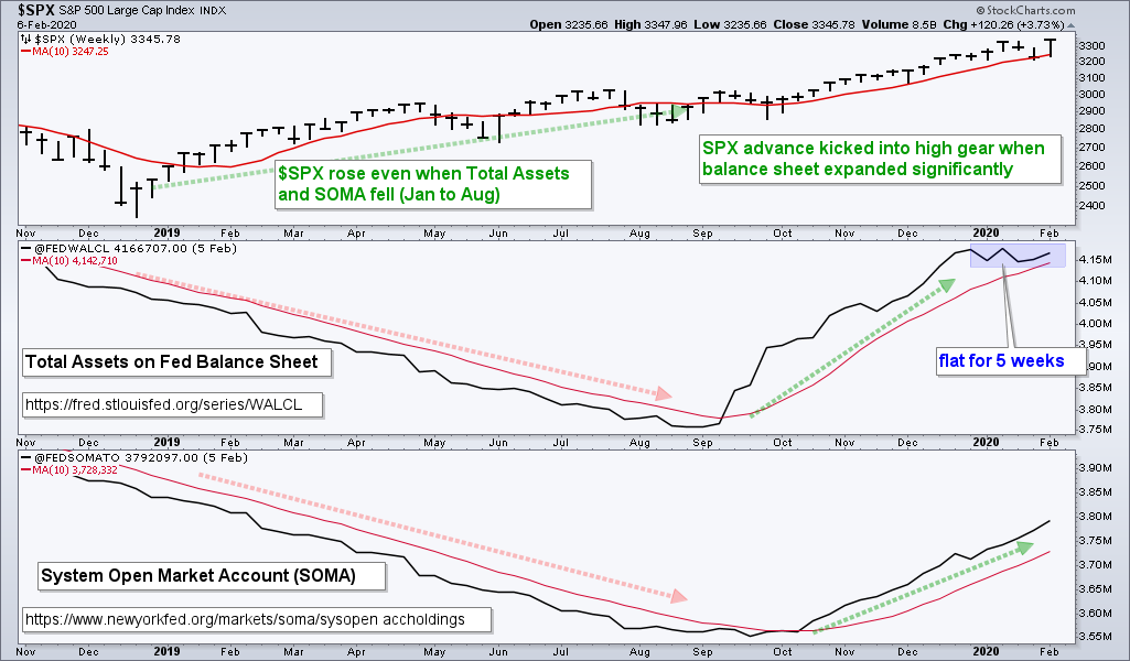
Balance Sheet Growth Flattens
The Fed’s balance sheet and System Open Market Account (SOMA) expanded this week. Balance sheet expansion started in early September with a sharp uptick and continued into late December. This expansion slowed as levels flattened over the last five weeks. SOMA, in contrast, continued to increase the last five weeks. Thus, we have a mixed bag at the Fed. Overall, the Fed is accommodating and a positive influence on stocks. Links: Fed Balance Sheet [3] and System Open Market Account (SOMA). [4]
Bottom Line: Correction within Bull Market
The long-term evidence remains bullish. The S&P 500 is above its rising 200-day SMA and the 20-day SMA is above the 200-day SMA. The Index and Sector Breadth Models are also in bull mode. I will be watching the 10-day EMAs of Advance-Decline Percent for the first signs of trouble.
The short-term evidence points to a corrective period ahead. Keep in mind that prices can retrace a portion of the prior advance or just move sideways during a corrective period. It does not always have to be down. The S&P 500 is up some 15% from October to February without a correction and showing signs of excess again. In addition, we saw a clear uptick in volatility over the last three weeks. The five risk-ratios [5], which were shown last week, turned up this week. However, four are below their January highs and still moving lower the last five weeks.