Timing Models – Trend and Breadth Remain Bullish, Signs of Excess Appear with Unusual Price Action
Posted By
Arthur Hill, CMT
On
In
Archive |
No Comments
The bulk of the evidence remains bullish, but signs of excess and above average volatility are creeping into the picture. In addition, QQQ did not confirm this week’s new high in SPY and large-cap techs are dragging their feet. Today we will review this week’s unusual price action and quantify excesses with %Above 200-day SMA.
Big Pop and Big Drop in SPY
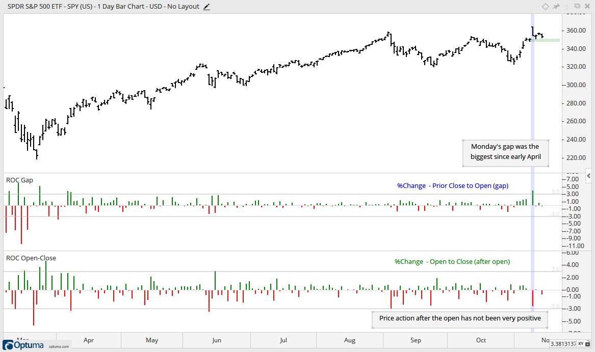
There was some very unusual price action in SPY this week. The ETF gapped up around 4% on Monday morning, fell around 2.5% from this open and still closed up around 1% for the day. Thus, there was a whole lot of noise and still a modest gain. The big gap and big decline after the gap suggest some excess, but SPY remains above last Friday’s close. Thus, it has yet to actually fill the gap. Chartists looking for a reason to get nervous can watch 345. A close below this level would fill the gap and reverse the two week uptrend. Two weeks is obviously short-term stuff and not enough to affect the bigger uptrend.
The middle indicator window shows the percent change from the open to the prior close (gap). Monday’s gap was the largest since early April. A big gap off of a price low is positive (April) and showing a rocket lifting off, but a big gap to new highs can be a sign of excess (November). The lower window shows the percent change from the open to the close (price action after the open). Price action after the open has not been very inspiring since early September. The red bars show some pretty sizable declines after the open.
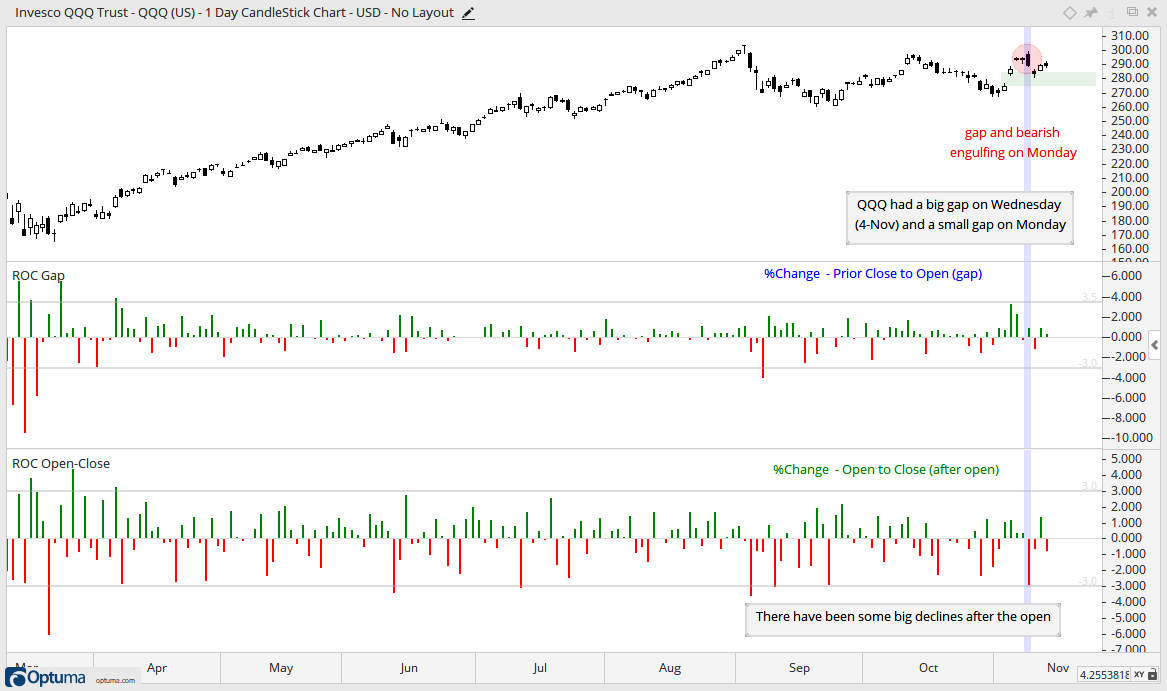
The next chart shows QQQ with a bearish engulfing on Monday. We have yet to see follow through and the ETF is holding the last gap (Wednesday, November 4th). A filling of this gap would be negative. The bottom window shows some pretty sizable declines after the open (red bars). I am not sure if this is actually bearish because there were also some pretty big open to close declines from April to July.
Triangle Breakout Holding
Despite some unusual price action this week, the big trend is up and SPY remains above the triangle line. Thus, the breakout is still holding and bullish until proven otherwise. Long-term, the triangle lows establish support in the 320 area and the bulls rule the long-term trend as long as this zone holds.
The middle indicator window shows that the election week advance was the biggest since April. This big advance led to an uptick in volatility as Normalized ATR moved above 5. This volatility indicator fell back a little this week and gets a reprieve for now.
The big broadening formation looks ominous and some signs of excess are appearing, but these remain on the back burner because the bulk of the evidence is bullish. In addition to the new high and triangle breakout in SPY, the breadth models are bullish and yield spreads show no stress in the credit markets. Furthermore, we also have an Ascending Triangle breakout and new high in the S&P 500 EW ETF, and an uptrend and new high in the Russell 2000 ETF.
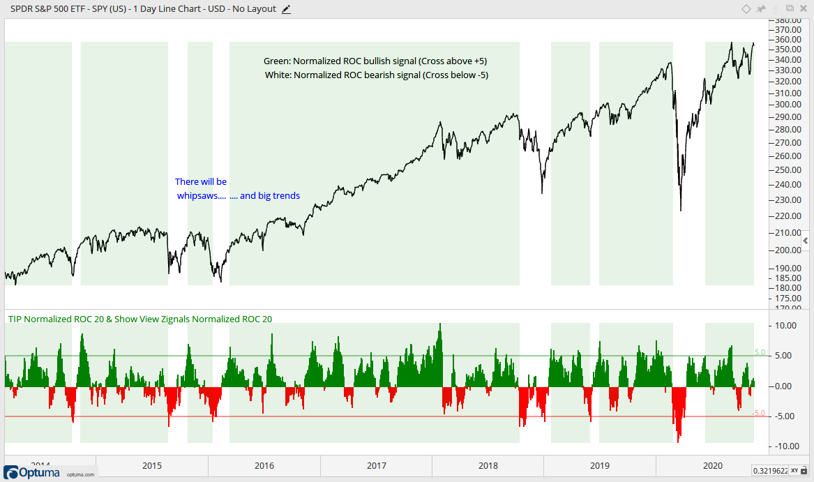
Last Outsized move was Bullish
The chart below shows SPY with 20-period Normalized ROC in the indicator window and its signals overlaid with SPY. Normalized ROC is the 20-day absolute price change divided by 20-day ATR. For example, Normalized ROC would be 5 if the SPY were up 10 points and ATR was 2. This shows when SPY moves 5 or more ATR values in 20 days. Such outsized moves can signal the start of a trend. The green shading starts when the indicator exceeds +5 (bullish signal) and ends when the indicator exceeds -5 (bearish signal).
As with any trend following indicator, there will be timely signals, late signals, whipsaws and big trends. Since 2000, the indicator has triggered 17 bullish signals. When trading SPY with dividends, 8 were profitable (47%) with an average gain of 22% and 9 were unprofitable (53%) with an average loss of 8%. Four of the nine losses occurred during the bear market from October 2000 to March 2003. Even with these losses, the Profit Factor was 2.39, which is well above 2 (total profits / total losses). Sounds good, but this should not be used as a stand alone indicator.
Normalized ROC triggered bullish on June 9th and remains bullish until a move below -5. A move below -5 would show an outsized decline and put the long-term uptrend in jeopardy.
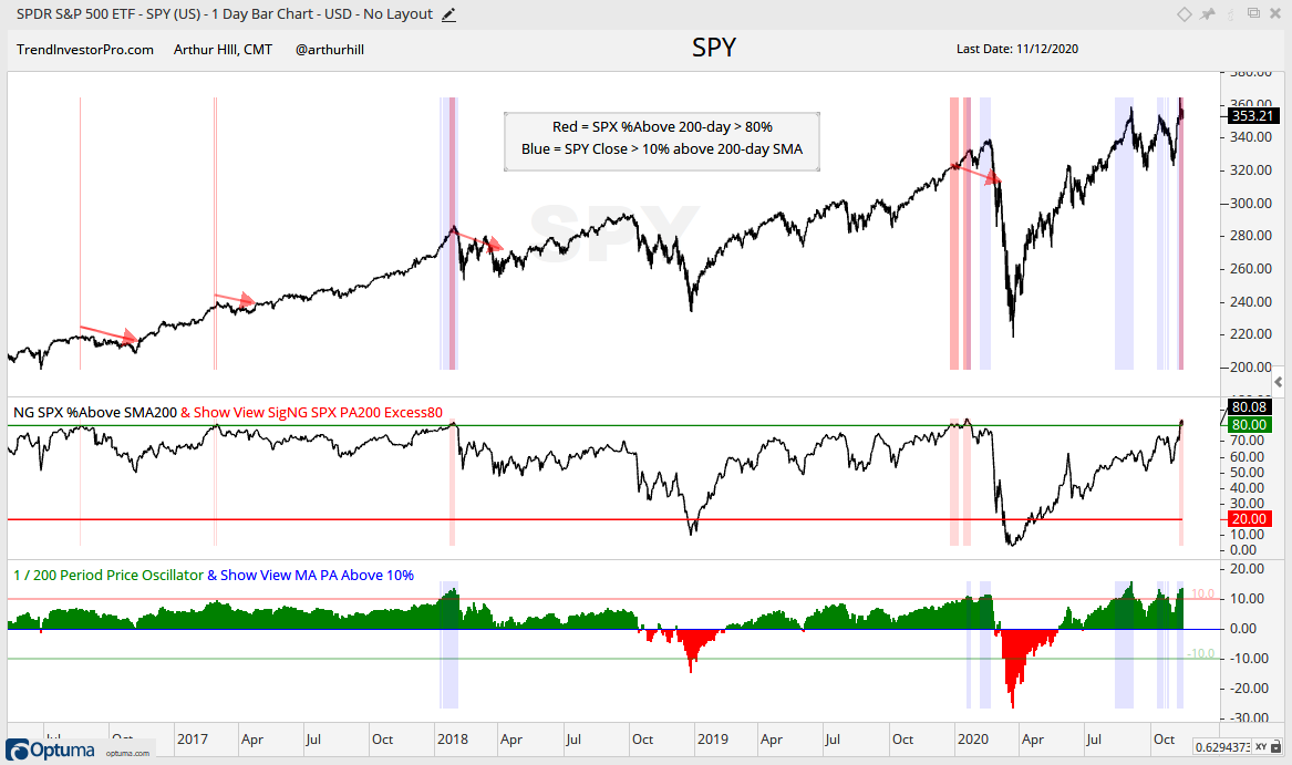
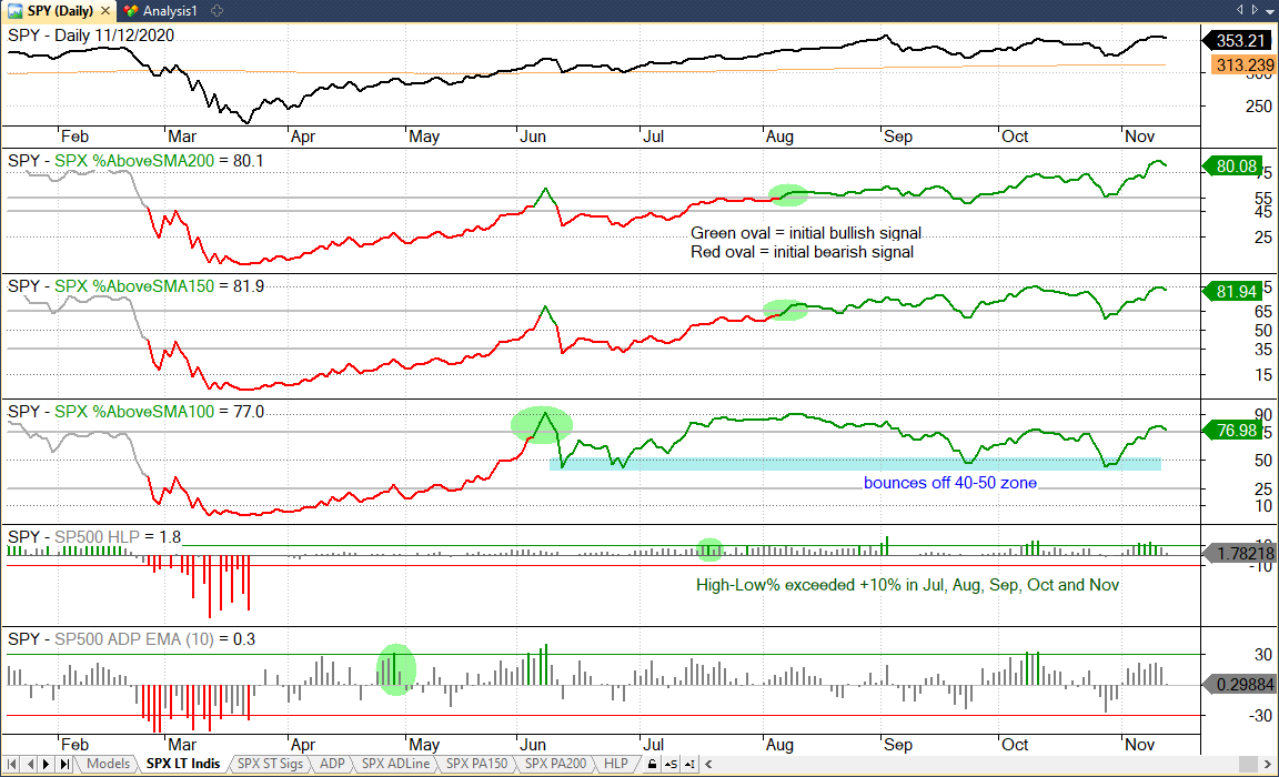
Percent Above 200-day SMA Gets Excessive
The next chart shows SPY with two indicators: the Percentage of SPX Stocks Above their 200-day SMA and the 1/200 Price Oscillator, which shows the percentage difference between the SPX close and its 200-day SMA. Instead of trend type breadth signals, this chart is looking at possible excesses.
The red shading shows when SPX %Above 200-day SMA is above 80% and November 2020 marks the fifth occurrence since August 2016. The others were February 2017, January 2018 and late December 2019. SPY did not always peak with these signals, but the red arrows show that SPY was lower 2-3 months later (each time).
The blue shading shows when SPY is more than 10% above its 200-day SMA. This occurred in January 2018, January 2020, August 2020, October 2020 and November 2020. Again, these readings do not always match a peak, but note that SPY moved lower after these readings each time.
These excesses are not outright bearish, but they do argue for vigilance. The excesses in 2016 and 2017 led to playable pullbacks or mild corrections. The excess in 2018 foreshadowed a sharp decline and two months of high volatility. The S&P 500 moved higher after the excesses in late December 2019 and did not peak until late February.
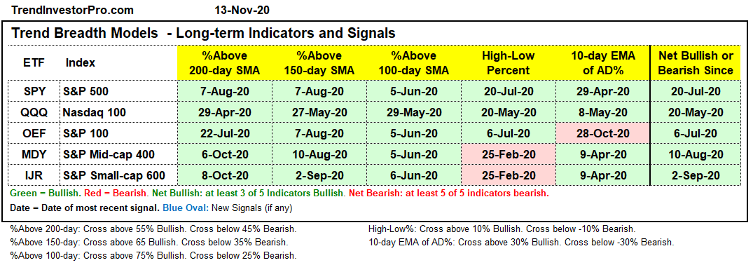
Breadth Models Remain Largely Bullish
There were no new signals for the Breadth Thrust Models. The S&P 100 remains net bearish with two bearish signals and one bullish signal, and there is one bearish signal in the Nasdaq 100. Nevertheless, the vast majority of signals are bullish and have been since April. All three indicators are bullish for the S&P 500, which is the most important of the five.
The chart below shows SPX %Above 50-day SMA and %Above 20-day SMA surging above 75% and nearing prior highs. I would not consider these indicators as overbought or near resistance. Instead, this surge shows broad participation during the November advance.
There is no change in the Trend Breadth Models. Three indicators are on bearish signals and a whopping 22 are on bullish signals. Clearly, the weight of the evidence is bullish and all five indicators for the S&P 500 are bullish.
Note that there are different calculation methods for breadth indicators and this can create discrepancies. StockCharts uses total return data, which includes dividends, and this makes it easier to record a new high. Almost all other vendors use data that is not adjusted for dividends (including Optuma). Most vendors use intraday prices to count new highs and lows, but Norgate uses closing prices (and does not adjust for dividends). This makes it a little harder to cross the +10% bar. Thus, the High-Low Percent indicators for the S&P SmallCap 600 and S&P MidCap 400 did not exceed +10% this week. If using intraday prices, then High-Low Percent did exceed +10% with Tuesday’s strong open. However, High-Low Percent did not when using closing prices because both IJR and MDY closed 3% below their intraday high.
The chart below shows the S&P 500 Trend Model indicators. %Above 200-day and %Above 150-day are above 80%, levels that reflect broad participation and possible excess. S&P 500 High-Low Percent exceeded +10% again this week and continued its streak, which has been running since July.
There were a few new signals in the Sector Breadth model. Finance High-Low% ($XLFHLP) moved above +10% to trigger bullish and turn the sector net bullish. There was a breadth thrust in Industrials as the 10-day EMA of XLI AD Percent ($XLIADP) surged above +30%. All three indicators for XLI are bullish. Overall, nine of eleven sectors are net bullish and 27 of 33 indicators have active bullish signals.
The charts used in the Sector Breadth Model can be found on the Art’s Charts ChartList[1]. They are on page 8 if viewing 10 per page.
Yield Spreads and Fed Balance Sheet
Further narrowing in yield spreads accompanied the surge in banking stocks and groups associated with the re-opening trade. This narrowing points to a healthy credit market and this perhaps gave a lift to banks, as did the widening yield curve. That is the narrative, but we all know that price action is greater than narrative.
The AAA and BBB yield spreads narrowed and hit their lowest levels for the current cycle on Monday. The current cycle started in March when spreads first began to narrow. Both spreads show little or no stress at the investment grade end of the bond market.
Junk and CCC bond spreads narrowed sharply in early November and also hit new lows for the current cycle. Junk bond spreads narrowed and dipped below 5, while CCC spreads dipped below 10 on Monday. These narrowing spreads show little or no stress at the junk end of the bond market.
The Fed balance sheet expanded by $18 billion this past week. This is a pretty small amount, but keeps four month expansion intact.