About the ETF Trends, Patterns and Setups Report
This report contains discretionary chart analysis based on my interpretation of the price charts. This is different from the fully systematic approach in the Trend Composite strategy series. In this ETF Trends, Patterns and Setups report, I am looking for leading uptrends and tradable setups within these uptrends. While I use indicators to help define the trend and identify oversold conditions within uptrends, the assessments are mostly based on price action and the price chart (higher highs, higher lows, patterns in play). Sometimes the chart assessment can be at odds with the indicators.
Report Schedule
- Tuesday – 11-Apr: Market/ETF Report
- Wednesday –12-Apr: Market/ETF Video
- Thursday – 13-Apr: Strategy Update or Report
Systematic Strategies and Tables
Here are the three active strategies and their respective tables.
McClellan Oscillator
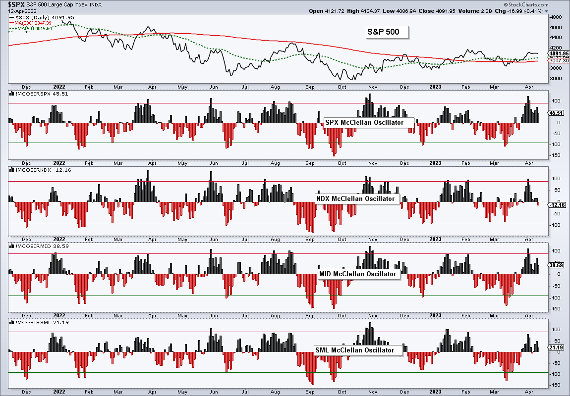
The McClellan Oscillator is a breadth indicator developed by Sherman and Marion McClellan. You can read about it at StockCharts [7] and chart it for various indexes.
McClellan Oscillator in Different Environments
There are several types of market environments. Using SPY as an example, there are strong uptrends, extended downtrends, choppy uptrends, choppy downtrends, trading ranges and more. In general, uptrends tend to be more consistent than downtrends because volatility is lower during uptrends and higher during downtrends. Higher volatility makes it difficult to make money shorting stocks, even in a bear market.
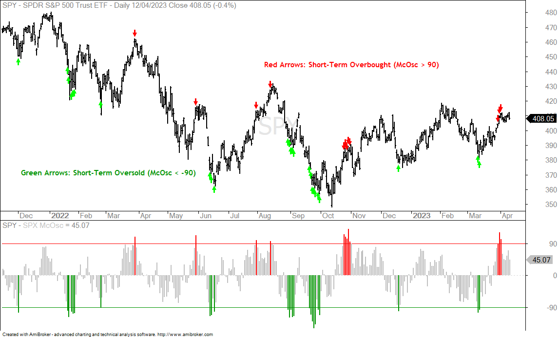
The chart below shows SPY with the McClellan Oscillator. The indicator signals overbought when above 90 and oversold when below -90. I initially used +100 and -100, but changed because +90/-90 worked better during a basic backtest. SPY was in a choppy downtrend for most of 2022 and these levels worked pretty well. The green arrows show short-term oversold conditions and the red arrows show short-term overbought conditions. Notice that the McClellan Oscillator became short-term overbought on March 31st and April 3rd.
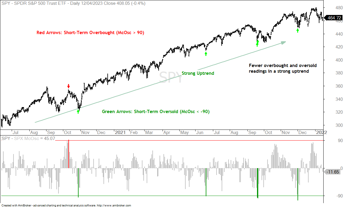
There were 13 overbought/oversold signals from January 2022 to April 2023 (15 months). Note that signal clusters count as one signal. The next chart shows SPY in a strong uptrend from June 2020 to December 2021 (17 months) and there were far fewer signals. SPY became overbought once and oversold four times.
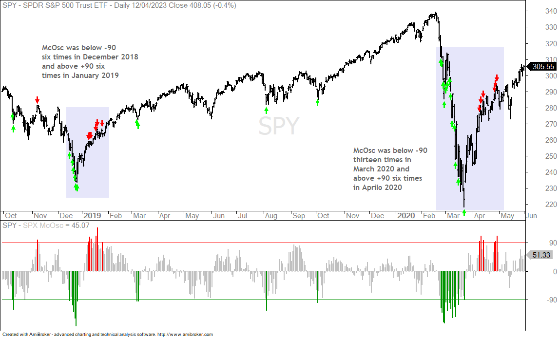
The next chart shows SPY with two plunge-rebound sequences: December 2018-January 2019 and February-March to April 2020. The December 2018 plunged produced six dips below -90 and the sharp rebound generated six pushes above 100 in January 2019. The McClellan Oscillator was below -90 thirteen times from February 25th to March 23rd, 2020. The indicator then exceeded +90 six times in April 2020.
The plunge-surge sequence shows the biggest risk when trading overbought and oversold signals. Namely, SPY can become oversold and remain oversold as a decline continues. SPY can also become overbought and remain overbought after an initial surge. These plunge-surge sequences are more the exception than the norm. More often, SPY is in a trending environment or trading range environment.
Fewer Stocks Above the 50-day SMA
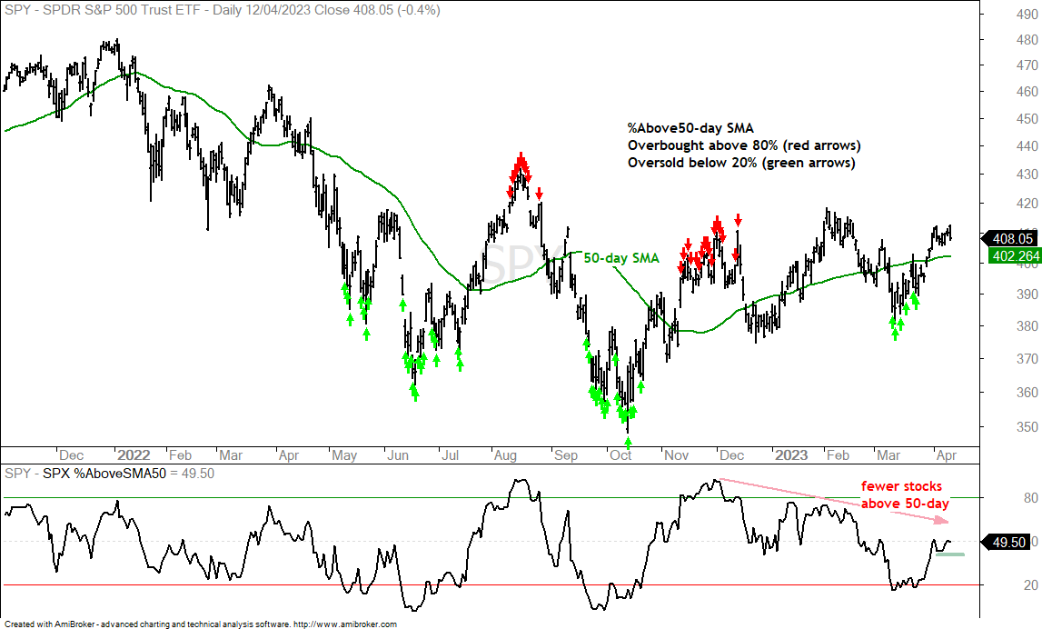
The next chart shows SPY with the percentage of S&P 500 stocks above their 50-day SMA. This indicator signals overbought when above 80% and oversold below 20%. These signals tend to cluster in groups and serve as an alert more than a signal per se. Oversold conditions suggest that the decline is overextended and the odds of a pullback are above average. Overbought conditions suggest that price has moved too far too fast and the odds of a pullback are above average.
My focus here is not on the overbought and oversold alerts, but rather the narrowing participation in the current advance. SPY recorded a higher from December to February, but SPX %Above 50-day SMA peaked in the 75% area and did not come close to its prior peak, which was above 90%. Most recently, SPX %Above 50-day SMA bounced with the market from mid March to early April, but stalled around the 50% area. The percentage of stocks above the 50-day SMA remains relatively weak and this shows narrowing participation in the current advance. I view this as a warning and a break below 40% (green line) would be bearish.
%Above 20-day SMA Setting Up
The first chart showed the S&P 500 McClellan Oscillator becoming overbought on March 31st and April 3rd. The chart above showed waning participation with far fewer stocks above the 50-day SMA. Overall, the market environment is choppy. The market will trend again at some point, but a choppy price chart, overbought conditions and waning upside participation argue for some caution right now.
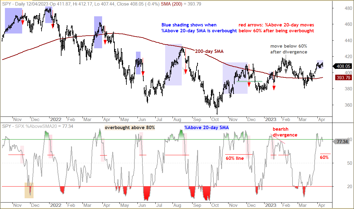
The next chart shows SPX %Above 20-day SMA. This indicator is overbought when above 80% and oversold when below 20%. Overbought and oversold readings serve as the alert. A subsequent signal triggers when %Above 20-day SMA moves below 60% (red line). The blue shading on the price chart shows when %Above 20-day SMA is overbought and the red arrows show the subsequent move below 60%.
The signals worked pretty well from November 2021 to September 2022, which is when SPY was topping and trending lower. The signals in December 2021 and January 2022 did not work because SPY was working its way higher. The bearish divergence and cross below 60% worked in early February. %Above 20-day SMA moved above 80% on March 31st and became overbought. It remains in its overbought state until there is a move below 60%. Such a move would be short-term bearish and signal a reversal in the short-term uptrend.
Key Charts to Watch Going Forward
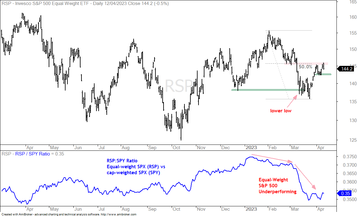
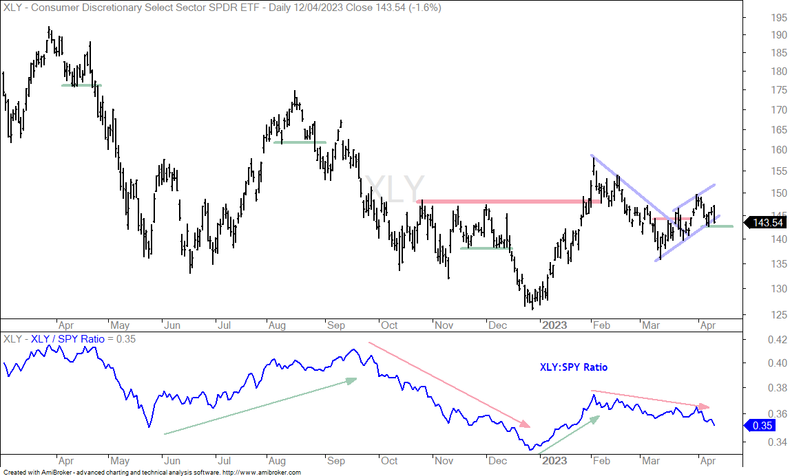
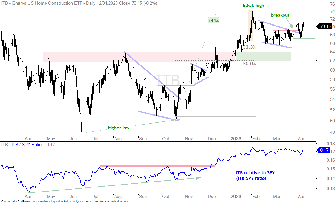
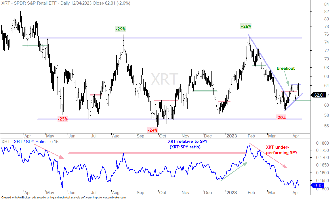
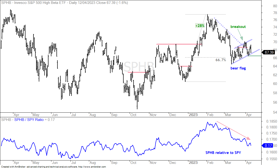
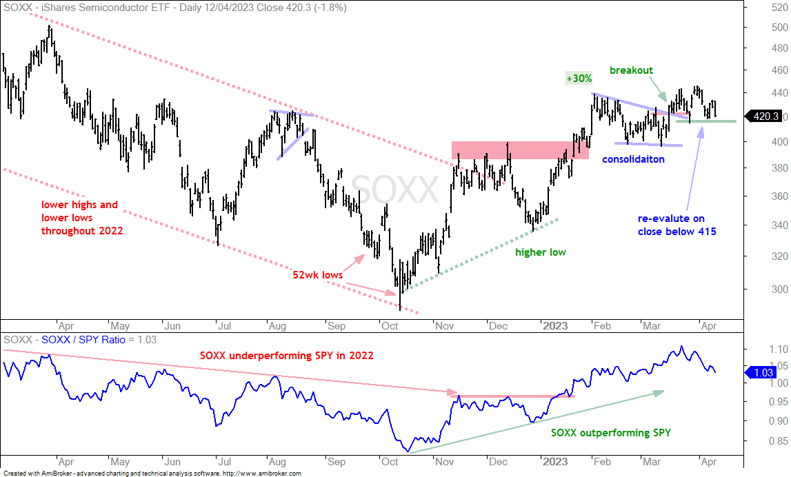
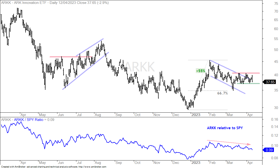
Here are some charts with short-term support levels to watch for further confirmation. The first is the S&P 500 EW ETF (RSP), which represents performance for the average stock in the S&P 500. The next three cover the Consumer Discretionary sector, which is the most economically sensitive sector (XLY, ITB, XRT). The last three represent the high-beta trade and risk appetite in the stock market (SPHB, SOXX, ARKK).