Market Timing Models – Trend, Tape and Fed Maintain the Course
Posted By
Arthur Hill, CMT
On
In
Archive |
No Comments
Stocks have been ripe for a rest or correction for weeks, and yet the current advance continues to broaden and buying pressure continues to outpace selling pressure. We already know that SPY and QQQ are hitting new highs and leading. We are also seeing fresh new highs in the S&P 500 Equal-weight ETF, S&P MidCap 400 SPDR and Russell 2000 ETF.
The Consumer Discretionary sector came back to life this week as the large-cap version (XLY), equal-weight version (RCD) and small-cap version (PSCD) hit new highs. This is the most economically sensitive sector and new highs across the board bode well. Consumer Discretionary was not the only sector with a hat-trick as Technology (XLK, RYT, PSCT), Healthcare (XLV, PSCH, RYH) and Industrials (XLI, RGI, PSCI) also scored new highs in all three groups.
All told, we are seeing broad strength in large-caps, small-caps, Technology, Consumer Discretionary, Industrials and Healthcare. These four sectors are big players and they are leading the market. This is bullish.
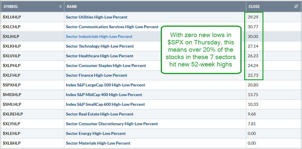
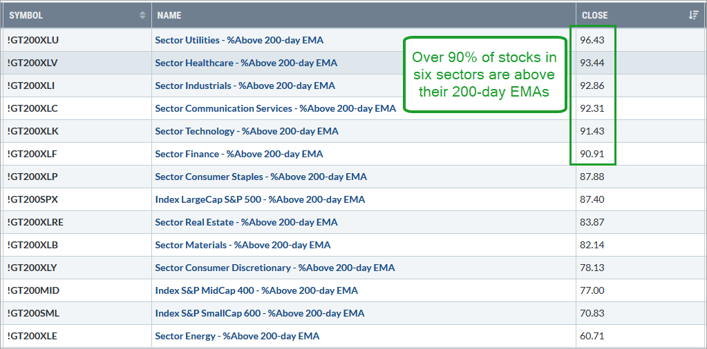
The charts below show market summary screen shots for the Percentage of Stocks above the 200-day EMA and High-Low Percent. The three indexes and eleven sectors are sorted with the highest values at the top. Over 90% of stocks in six sectors are above their 200-day EMAs and over 20% of all stocks in seven sectors recorded 52-week highs.
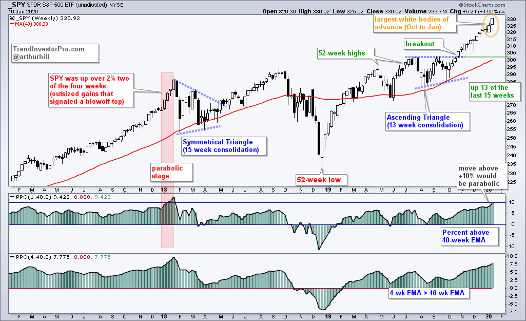
Still Channeling January 2018
It is amazing how closely the S&P 500 SPDR is following the script from September 2017 to January 2018. I first made this comparison on December 20th[1] and SPY is on the verge of hitting the parabolic stage.
After advancing 10% from late August to late December 2017, SPY hit the parabolic stage in January 2018 with three big weekly gains that pushed the PPO(1,40,0) above +10% for three weeks. Also notice that SPY gained over 2% in two of the four weeks (red shading).
We have yet to see weekly gains in excess of 2%, but SPY is currently up 3.25% since Monday’s open on January 6th (almost two weeks). An unscientific eyeballing of the last two candles, also reveals that these are the biggest white bodies of the current move. The open and the close form the body of the candle.
The indicator window shows the PPO(1,40,0) hitting 9.42% and nearing the 10% threshold. The current close is 9.42% above the 40-week EMA and this is the most since January 2018. Even though the parabolic threshold as yet to be reached, the indicator is close enough to warrant a little caution going forward.
The combination of two long white candles and a PPO near 10% suggest that we are close to the parabolic stage. The advance in January 2018 extended until the 26th so we could have another week or two of madness, should this scenario play out.
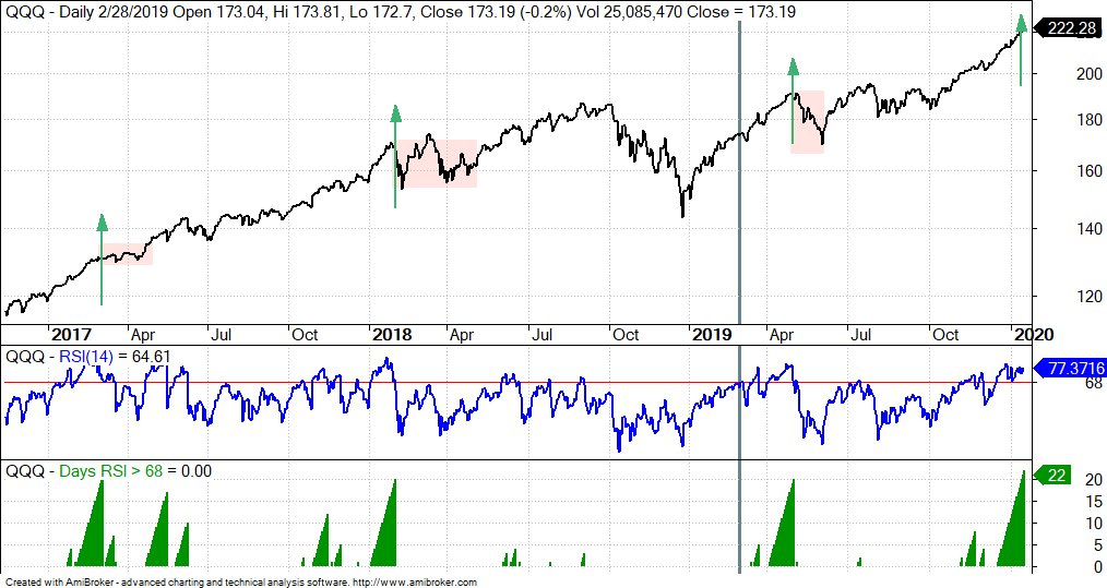
RSI for QQQ above 68 for 22 Days
There are lots of indicators telling us the same thing: the stock market is extended and ripe for a rest. These indicators are really just yellow flags (caution), as opposed to red flags (bearish). Why? Because the market can become overbought and remain overbought in strong uptrends.
In any case, I was studying RSI(14) for QQQ and found that it has been above 68 for 22 days. Technically 70 is overbought. I added a buffer to absorb the early January dip. This stretch above 68 is the longest since March 2017. The chart below shows RSI holding above 68 for 20 or more days four times in the last three years. The green arrows mark the spot on the price chart and the red zones show what happened the next few months.
Three instances hardly make for a robust study, but I think we can use this information to prepare. Notice that there were three different corrections the last time RSI held above 68 for 20 or more days. The first was a basic trading range for two months, the second was a volatile range for four months and the third was a sharp pullback that lasted one month. Corrections are like a box of chocolates…
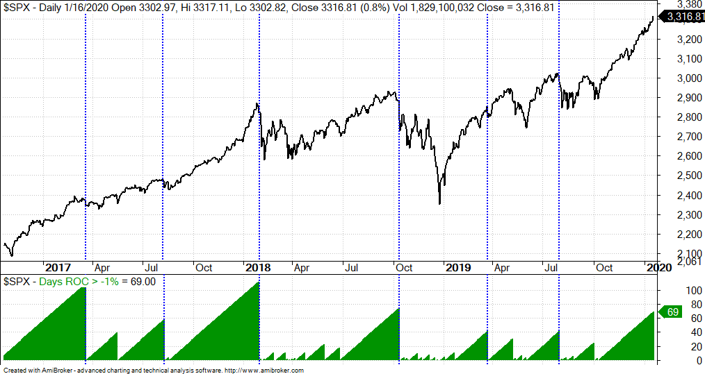
69 Days without a 1% Decline
The S&P 500 has not experienced a decline greater than 1% for 69 days now, and I can now show you what this looks like on the price chart. Since late 2016, the S&P 500 has gone more than 100 days without a 1% decline twice and more than 40 days without a 1% decline another five times. The blue dotted lines mark the first 1-day decline greater than 1%. There were two short corrections in 2017, two deep corrections in 2018, a blip correction in 2019 and the sharp decline in late July.
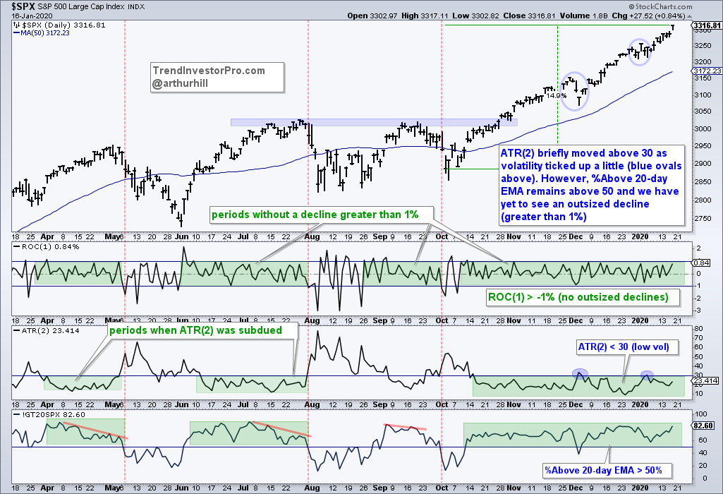
The next chart shows the 1-day ROC to monitor outsized declines, ATR(2) to monitor volatility and the %Above 20-day EMA to monitor short-term breadth. This advance can continue as long as declines are contained, volatility remains subdued and short-term breadth remains positive. This means ROC(1) does not dip below -1%, ATR(2) does not exceed 30 and %Above 20-day EMA does not go below 50%. The trouble could start when ROC(1) moves below -1% and ATR(2) exceeds 30. This strategy is probably dependent on ROC(1) because ATR will increase on the first outsized decline.
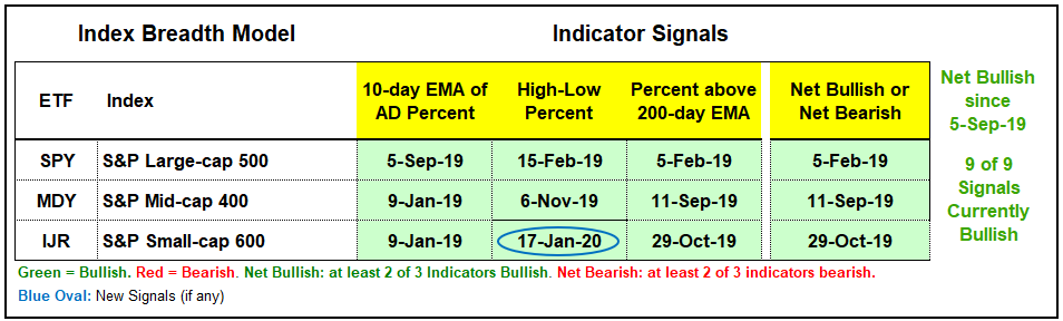
Index Breadth Model Goes Full Bull
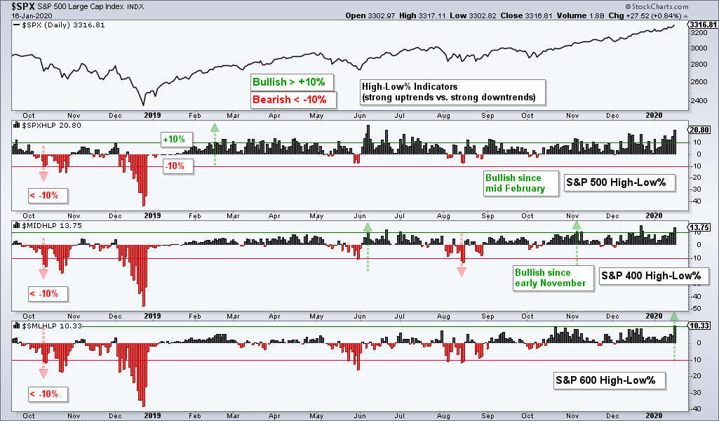
The S&P SmallCap 600 High-Low% ($SMLHLP) finally cleared the +10% threshold to trigger a bullish signal and make the Index Breadth Model 100% bullish. Does this sound the all clear? Hardly. Signals are signals and this model as been net bullish since September 5th. Small-caps have been net bullish since October 29th and IJR recorded a 52-week high on November 4th. Thus, the evidence has been bullish for over two months and this last signal simply confirms what we already know. We are in a bull market environment.
Click here for an article and video[2] explaining the indicators, signals and methodology used in the Index Breadth Model. This article also includes the signals of the last five years.
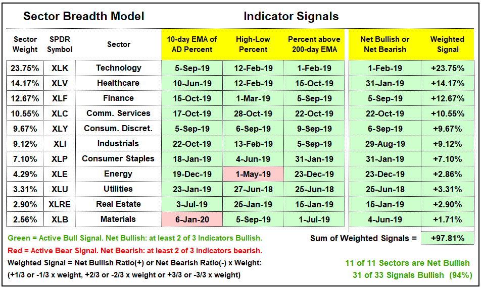
Sector Breadth Model Remains Strong
There is no change in the Sector Breadth Model. Nine of eleven sectors are fully bullish with all three breadth indicators on active bullish signals. The other two, Energy and Materials, are net bullish with two of three indicators on active bullish signals. Overall, 31 of 33 indicators are on bullish signals and this is overwhelmingly bullish. Sorry, for saying “bullish” so may times.
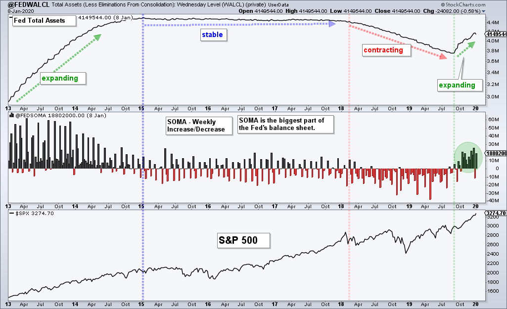
Fed Assets and SOMA Increase
After turning mixed the last two weeks, Total Fed Assets[3] ticked back up and the System Open Market Account (SOMA)[4] also increased. As the green arrow on the chart below shows, Total Assets have been expanding since September and this is positive for stocks. SOMA also started to increase in September (green oval). Even though the S&P 500 is on the verge of going parabolic, the Fed is still siding with the bulls. Thus, the Fed and the tape are bullish and this is a powerful combo.
Bottom Line: Bull Market Environment
Selling pressure is non-existent and a pullback or correction will not unfold until we see a noticeable uptick in selling pressure. Sounds obvious, but I have yet to see this uptick in selling pressure and do not want to front run a signal. I will simply take it one day/week at a time and weigh the evidence.
The trend, the tape and the Fed are all bullish. This was the case in late October when the S&P 500 was up around 4.5% from its lows and remains the case here in mid January, with the S&P 500 up another 9.5%. As the chart and analysis above show, participation is broad and strong, the trends are up and strong, and the Fed is accommodating.
There will be a pullback or correction at some point. We do not know what this correction will look like because they come in all shapes and sizes (depth and duration). The important thing is to plan your response now – before the correction arrives. Planning in the heat of the momentum can lead to rash decisions.