Market Timing Models – The Big Three Sectors versus the Three Next Biggest Sectors
Posted By
Arthur Hill, CMT
On
In
Archive |
No Comments
Today’s report will start with the everywhere and nowhere chart for the S&P 500. We will then weigh the broad market evidence by looking at the weekly RSI range, the S&P 500 Bullish Percent Index and the breadth models. Short-term, the 20-day High-Low Percent indicator triggered a signal on Wednesday’s close and we are seeing short-term breaks in three key equal-weight sectors. Even though tech and healthcare are still holding up, the short-term evidence for the broader market has shifted to the bears.
Backtest Mea Culpa
I was reviewing the trades from the strategy article[1] using profit targets and the StochClose indicator. Turns out that new trades were being initiated on the same day that profit target exits were triggered. There should be a 1 day trade delay so I re-ran the backtests with this adjustment and revised the article. The results are not as good, but still ok.
Everywhere, Nowhere and Stalling
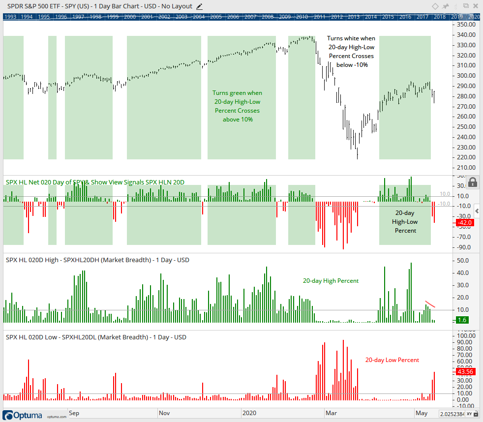
We will start with the everywhere and nowhere chart of the S&P 500. The index is trading back near its January 2018 highs after a big advance off the March lows (220 to 290). This advance started from a 52-week low and has yet to clear the falling 40-week SMA. Thus, it is still a bear market bounce. SPX stalled the last four weeks with some seriously indecisive trading (blue shading). The lows of the last five weeks are in the 271-272 area. A weekly close below 270 would be quite bearish at this stage.
The indicator window shows RSI moving from bull range (40-80) to bear range (20-60) in late February. RSI has yet to make it above 50 on the current bounce and remains in its bear range.
20-day Lows Expand Again
Short-term, the 20-day High-Low Percent indicator triggered bearish with Wednesday’s sharp decline. This chart was first shown in Wednesday’s commentary[2]. Note that this is a custom breadth indicator created in Optuma. 20-day High-Low Percent is a short-term version of 52-week High-Low Percent. Shading turns green when the indicator crosses above +10% and white when the indicator crosses below -10%, which it did with Wednesday’s close. The S&P 500 did not record a 20-day low, but some 43.56% of stocks in the index did and this shows broad weakness within the index.
SPX Bullish Percent Index Plunges
StockCharts calculates and publishes the Bullish Percent Indexes for several major indexes and sectors. Just search for the term $BP[3] to find them because all the symbols begin with these three characters. These indicators are not part of my breadth models, but I do follow them, especially the S&P 500 Bullish Percent Index ($SPXBPI).
The Bullish Percent Indexes are based on double top breakouts and double bottom breakdowns on the Point & Figure charts. The most recent signal on the P&F charts is binary. A stock either has a double top breakout or a double bottom breakdown. A double top breakout occurs when an X column exceeds the prior X column. X columns represent rising prices so this is a higher high. A double bottom breakdown occurs when an O column exceeds the prior O column. O columns represent falling prices so this is a lower low.
As with the %Above 200-day EMA indicators, I set the bullish and bearish thresholds at 60% and 40%, respectively. A move above 60% shows enough double top breakouts to warrant a bullish environment, while a move below 40% shows enough double bottom breakdowns to warrant a bearish environment. A Bullish Percent Index at 40% means 40% of stocks have double top breakouts and 60% have double bottom breakdowns.
I place my signal lines above the midpoint (50%) to reduce whipsaws and generate more convincing signals. Try as I might, whipsaws are part of life for trend indicators. Trend following indicators will not catch the exact bottom or top and they will generate some bad signals, but they should also catch some good trends to make up for these drawbacks. That’s the theory, at least.
The chart above shows the most recent signals with a bearish signal triggering on Thursday. Notice that BPI went from 84% on April 29th to 38% on May 14th. This means that some 62% of stocks in the S&P 500 moved below their prior reaction low. In P&F terms, the current O column exceeded the prior O column for a double bottom breakdown. This shows a lot of weakness within the index and could mark a near-term top.
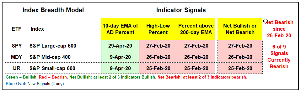
Index Breadth Model Remains Bearish
As far as the broad market environment is concerned, we cannot focus on one indicator or metric for an assessment. Instead, we need a weight of the evidence approach using an array of indicators. It also helps if we quantify signals and reduce ambiguity. This is where the Index Breadth Model comes into play. It is subjective because I set the levels after carefully studying the charts. After that, it is unambiguous because the signals are either bullish or bearish. Two of three S&P 500 signals are bearish and six of nine signals are bearish for the model as a whole. Thus, the broad market environment is considered bearish.
The breadth thrust indicators (10-day EMA of Advance-Decline Percent) triggered on April 9th for $SML and $MID, and on April 29th for $SPX. All three indicators fell back rather sharply the last two weeks and are in negative territory. You can see the EMA values on the far left of the chart. In a bull market environment, such a move might set up a mean-reversion opportunity. However, we are not in a bull market environment so I will not consider it as such.
The strong up/down trend indicators (High-Low Percent) are all on bearish signals since moving below -10% in late February. With some selling pressure in stocks this week, all three weakened and reached their lowest levels since April 3rd. Thus, new lows expanded this week. The expansion was modest in $SPX and $MID, but quite pronounced in $SML as High-Low Percent dipped to -8.3%. Again, small-caps are suffering.
The long-term trend participation indicators (%Above 200-day EMA) turned bearish at the end of February and all three are currently below 30%. Less than 20% of small-caps and mid-caps are above their 200-day EMAs. These numbers are NOT indicative of a bull market.
The next charts show the Index Breadth Model signals over the last five years with the Full Stochastic (125,5,1) for reference. This is similar to the StochClose indicator. Full Stoch uses intraday highs and lows, while StochClose uses closing highs and closing lows.
Click here for an article and video[4] explaining the indicators, signals and methodology used in the Index Breadth Model. This article also includes the signals of the last five years.
%Above 50-day EMA Indicators Deteriorate
The medium-term trend participation indicators (%Above 50-day EMA) are not part of the breadth models, but I follow them closely. These turned bearish with moves below 20% in late February and fell short of bullish signals on April 29th. Again, small-caps are bearing the brunt of selling pressure with just 21% of small-cap stocks above their 50-day EMA. Large-caps are holding up better at 37%. Even though the S&P 500 closed above its 50-day EMA on Thursday, some 57% of stocks in the index are still below their 50-day EMAs. Talk about underlying weakness.
Sector Breadth Model Stays Mixed/Bearish
There was one new signal on the Sector Breadth Model. The 10-day EMA of REIT AD Percent ($XLREADP) moved below -30% for a bearish breadth thrust. This signal flipped the sector from bullish to bearish. The sum of the weighted signals is bullish because the three biggest sectors are net bullish (Technology, Healthcare and Communication Services). The other eight sectors are net bearish, including Consumer Discretionary, Finance and Industrials. 18 of 33 signals are bearish and only the Healthcare sector is 3 for 3 on bullish signals.
The Sector Breadth Model is technically mixed as the three biggest sectors battle the fourth, fifth and sixth biggest sectors. It is a 3-sector tag team battle for the ages. Will tech, healthcare and communication services prevail or will consumer discretionary, industrials and finance drag the bigger sectors down? I am betting on the latter at this point.
Finance, Consumer Discretionary and Industrials Weaken
The next chart shows the equal-weight versions for five key sectors: the EW Technology ETF (RYT), the EW Consumer Discretionary ETF (RCD), the EW Finance ETF (RYF), the EW Industrials ETF (RGI) and the EW Healthcare ETF (RYH). RYT (top) and RYH (bottom) are the only two that held above last week’s low and RYH is the only one above its 200-day SMA.
The equal-weight Consumer Discretionary, Finance and Industrials sectors retraced around 50% of their prior declines and are well below their falling 200-day SMAs. These three sectors represent core parts of the economy and they are not happy campers. All three formed lower highs the last two weeks and broke below last week’s low. Their short-term uptrends have reversed and they are weighing on the market.
Yield Spreads and Fed Balance Sheet
The tweet from @michaelsderby and response from @GestaltU show us what the bears are up against.
Neel Kashkari: “I think a V-shaped recovery is off the table”
Market hears: “More accommodation on the way”
As noted before, monetary and fiscal responses can put a floor on price declines, for a while at least, but I do not think monetary and fiscal policy can remove the ceiling. But this is just me thinking out loud. Monetary and fiscal actions could keep a bid in stocks, regardless of the economy or corona virus path. It boils down to ZIRP and TINA. Zero Interest Rate Policy and There Is No Alternative (to stocks).
The AAA yield spread surged, plunged, held above the pre-crisis high and flatted the last four weeks. Perhaps there is even a slight rise. The BBB-Treasury spread also fell and then flatted over the last two weeks. Even though both are well above their pre-crisis levels, they are not rising and this shows stability at the investment grade end of the credit markets.
Junk bond spreads fell from mid March to mid April and then stabilized well above pre-crisis levels the last four weeks. The CCC-Treasury spread actually ticked higher the last few weeks and this shows some stress at the low end of the junk bond market.
The Fed balance sheet expanded by $213 billion and this increase is in line with what we saw in early April. The moon shot expansion continues and this could put a floor on asset prices.
The consensus is that the Fed has the market’s back and the bottom is in for the S&P 500. Even so, one must wonder how bad it is when the Fed has to expand its balance sheet so drastically. This is why we have price charts and breadth models. The all powerful Oz (Powell) is still in third place when it comes to what really matters. Price is first and breadth is second, in my book.