There are plenty of cautionary tales to go around, and yet the new high parade continued this week. This is why process, price action and signals are so important. I can find plenty of reasons for caution and these were highlighted over the last few weeks. However, price is the ultimate arbiter and the new highs tell us the correction is on hold, at least for SPY and QQQ.
Perhaps the stock market is in the midst of a stealth correction. Consider this. SPY closed at a new high on January 17th, 22 days ago. Since then the ETF dipped with a 3% decline into January 31st and bounced with a 4.7% gain the last 13 days. All told, the index is 1.5% above its January 17th closing high.
But what about the “average” stock? Some 52% of stocks in the index are currently above their January 17th close and 48% are below. This sounds like a mixed market the last four weeks. Unsurprisingly, these numbers deteriorate as we move down in market cap. Some 49% of S&P MidCap 400 stocks are up since January 17th and just 36.5% of S&P SmallCap 600 stocks are up since January 17th.
Even though SPY, QQQ and MDY hit new highs this week, a look under the hood reveals a mixed market the last four weeks because the majority of stocks in the S&P 1500 are down the last 22 days.
Another New High for SPY
Let’s first review the weekly chart for SPY. The long-term trend is up with a new high again this week. The ETF is well above its rising 40-week SMA and the 4-week EMA is above the 40-week EMA (PPO is positive).

As the yellow annotations show, there were signs of excess in mid January and mid February as the ETF formed outsized candlesticks and the weekly Rate-of-Change exceeded 2% the first week of February. SPY was also up 4.93% the first two weeks of February. Big gains after an extended advance show excess. Elsewhere, the PPO(1,40,0) exceeded 9.5% twice and the ETF was almost 10% above its 40-week EMA.
Risk Ratios Still Below January Highs
The next chart shows five ratios used to measure the risk appetite in the stock market. The riskier name is the numerator and the less risky name is the denominator. These ratios rise when the riskier names outperform and fall when the less risky names outperform. In general, we want to see these ratios rising to show a healthy appetite for risk. A downturn in at least three of the five shows risk aversion and this could lead to a correction in the stock market.
Note that I am now using the 3-7 Year Bond ETF (IEI) with the 20+ Yr Treasury Bond ETF (TLT) for the ratio with the High-Yield Bond ETF (_HYG:_IEI). An astute tweep noted that the maturity profile for the bond in HYG is more similar to that of IEI. Around 40% of the bonds in HYG range from three to seven years.
Looking at the chart below, we can see these ratios rising from early October to early January (green arrows), as did the S&P 500 SPDR. Four of the five turned down in mid January (red arrows). Even though they bounced the first two weeks of February, they remain below their January highs and some turned down over the past week. These ratios are flat at best and not supportive of a risk-on environment.

The ratio charts above, the signs of excess and the suggestion that the S&P 500 is ripe for a corrective period are still secondary to actual signals. As the following charts and tables show, we have yet to get any bearish signals in the breadth models or the High-Low Lines.
Index Breadth Model Remains Bullish
All nine indicators remain on active bullish signals and there is no change in the Index Breadth Model. The model has been net bullish since September 5th and the S&P 500 has been net bullish since February 5th (2019). Yes, the S&P 500 has been net bullish for over a year. Mid-caps joined the bull run on September 11th and small-caps finally capitulated and turned net bullish on October 29th.

Click here for an article and video [1] explaining the indicators, signals and methodology used in the Index Breadth Model. This article also includes the signals of the last five years.

High-Low Lines Hit New Highs
New highs outpaced new lows in the S&P 500, S&P MidCap 400 and S&P SmallCap 600 again this week. As such, the High-Low Lines for each extended higher and all three remain above their 10-day EMAs. The S&P 500 High-Low Line has been rising since mid August, the S&P MidCap 400 High-Low Line has been rising since early September and the S&P SmallCap 600 High-Low Line has been rising since mid October. The green and red arrows in the top window show when at least two of the three turned up or down. At least two of the three have been rising since early September. A bearish signal does not trigger until two of the three turn down and break their 10-day EMAs.

Big Sectors Drive Sector Breadth Model
The Sector Breadth Model has eleven sectors with three indicators each (33 total). Even though the bottom five sectors (by weighting) account for 15 of the 33 indicator signals (45%), these five sectors account for just 20% of the S&P 500. The six biggest sectors, in contrast, account for 80% and they are the key drivers. Five of the big six have been net bullish since early September and all six have been bullish since October 22nd. The real trouble does not start until a few of these sectors turn net bearish (two of three indicators with bearish signals).

High-Low Lines for Key Sectors Rising
The next chart shows the High-Low Lines rising for the six biggest sectors. When it comes to the High-Low Lines I am really only concerned with five of these sectors because the Communication Services SPDR (XLC) has just 22 stocks, which is not very many for a “breadth” indicator. In contrast, the other five sector SPDRs have over 60 stocks: XLY(65), XLF(67), XLV(61), XLK(72), XLI(71). It’s the more the merrier when it comes to breadth indicators. The trouble does not start here until at least 2 of the 5 High-Low Lines turn down and break their 20-day EMAs.

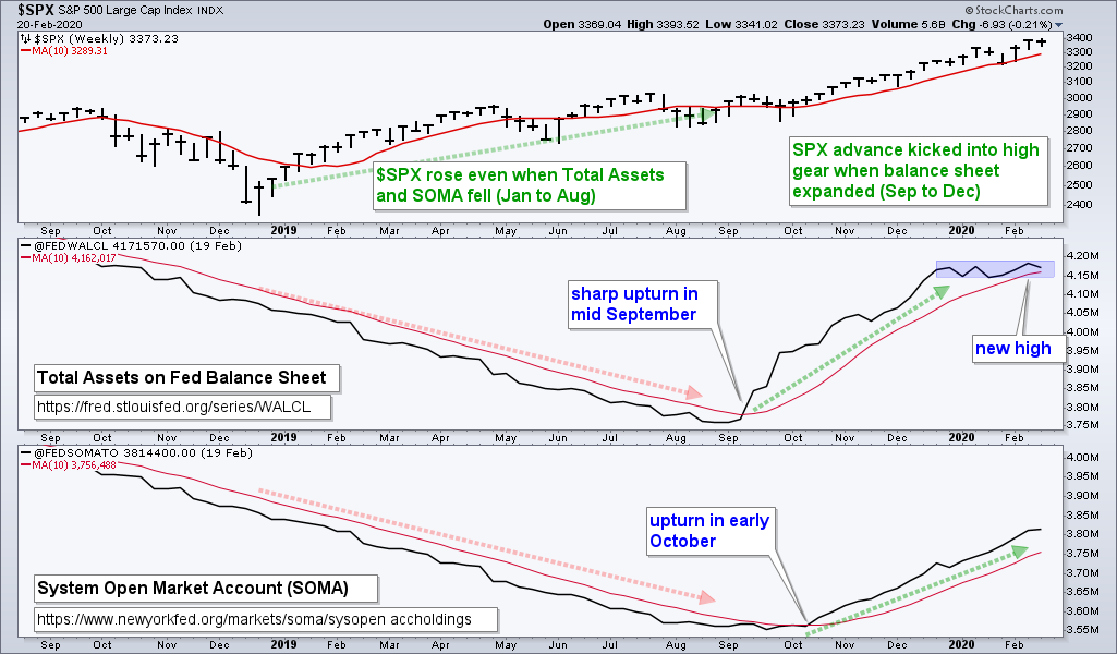
Fed Asset Expansion Slows
After hitting a multi-month high last week, the Fed’s balance sheet contracted a little this week. The general trend is up for Fed assets (expanding), but the degree of expansion leveled off over the last eight weeks (blue zone). The System Open Market Account (SOMA) increased, but the increase was the smallest of the year. There is no alarm bell here, but a slowing or flattening in the expansion could coincide with a correction in the stock market. The key words are “could coincide”. In other words, I am not going to pin a correction forecast on changes at the Fed. The initial upturns in September and October (see chart) were exceptional, as were the sharp expansions in November and December. These coincided with breakouts in QQQ and SPY (late October). The Fed and the chart aligned to produce a powerful advance. Perhaps the Fed and the cautionary tales will align to produce a correction. Links: Fed Balance Sheet [2] and System Open Market Account (SOMA). [3]
Bottom Line: Bull Market with Stealth Correction
The correction is on hold for the S&P 500 SPDR, Nasdaq 100 ETF and S&P MidCap 400 SPDR as all three hit new highs this week. However, a look under the hood reveals a mixed market as we move down in market cap. The Russell 2000 ETF and S&P SmallCap 600 SPDR did not hit new highs and most small-caps are down since January 17th. There is a correction somewhere.
Price action remains strong in the S&P 500 and five of the six big sectors confirmed the new highs. The Index and Sector Breadth models remain firmly bullish. The High-Low Line lines for the major indexes and key sectors are also rising. Following a process and reacting to signals, there is no reason to be bearish and we have not seen any deterioration within the S&P 500. Nevertheless, the cautionary tales remain.