A Serious Deterioration in Small-cap Breadth Relative to Large-cap Breadth (Premium)
Posted By
Arthur Hill, CMT
On
In
Archive |
No Comments
The Composite Breadth Model remains bullish and this means we are still in a bull market environment. Nevertheless, the odds for a correction are building and we are now seeing a dramatic move away from small-caps, which is reflected in some key breadth metrics. I will show a new twist on relative breadth by using differentials for the percentage of stocks above the 50 and 200 day SMAs.
Massive Moves
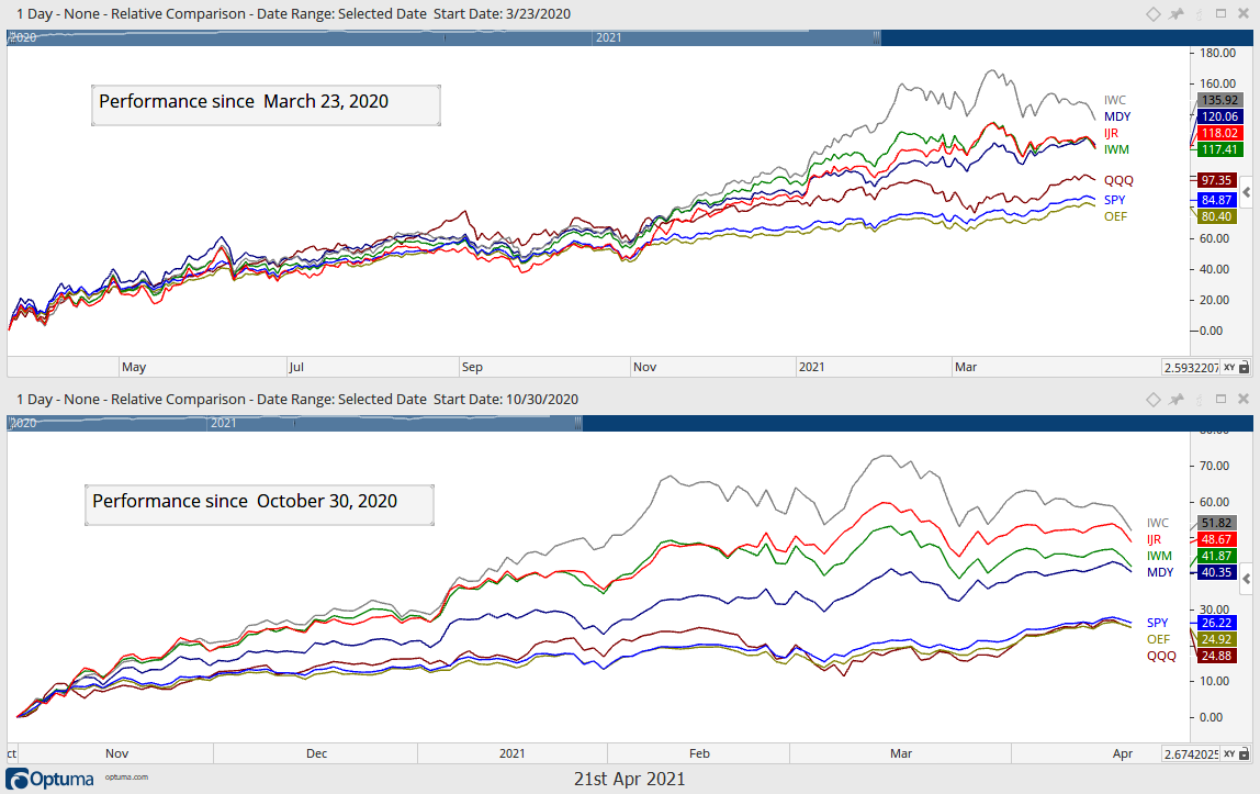
Stocks are up big since late October and up even BIGGER since the March 2020 low. The top window on the chart below shows the percentage change in seven broad market ETFs: the S&P 100 ETF (OEF), the S&P 500 SPDR (SPY), the Nasdaq 100 ETF (QQQ), the S&P MidCap 400 SPDR (MDY), the Russell 2000 ETF (IWM), the S&P SmallCap 600 SPDR (IJR) and the Russell Microcap ETF (IWC). These ETFs are up between 80% (OEF) and 136% (IWC). The largest large-caps (OEF) are up the least and smallest small caps (IWC) are up the most. This shows a clear preference for risk and beta.
The lower window shows performance since October 30th. Again, we see big gains ranging from 25% (QQQ) to 52% (IWC) and small-caps are outperforming large-caps.
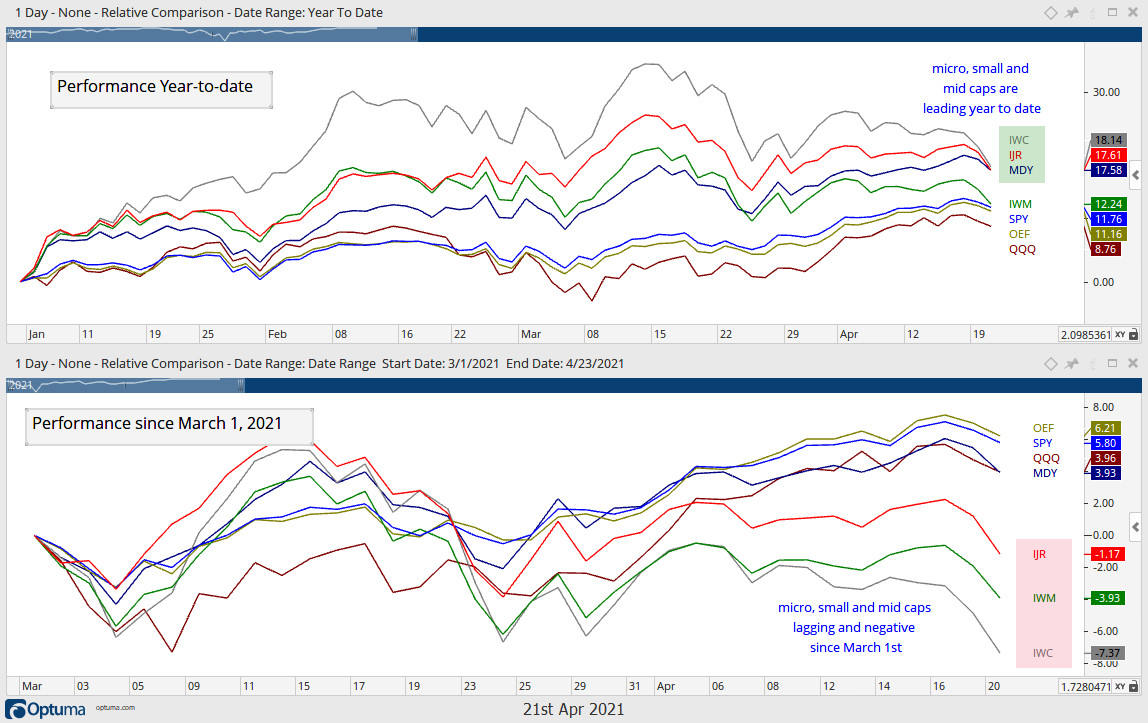
Small-caps are holding up better than large-caps year-to-date, but are underperforming since March 1st. In yesterday’s commentary, I showed that the EW Utilities ETF (RYU), EW Consumer Staples ETF (RHS) and EW REIT ETF (EWRE) were leading the equal-weight sectors since March 1st. Thus, the high-beta end of the market is now lagging (small-caps and micro-caps) and the defensive end of the market is leading. Not only are IWM, IJR and IWC lagging, but they are also down since March 1st.
Large, Mid and Small Cap Breadth Metrics
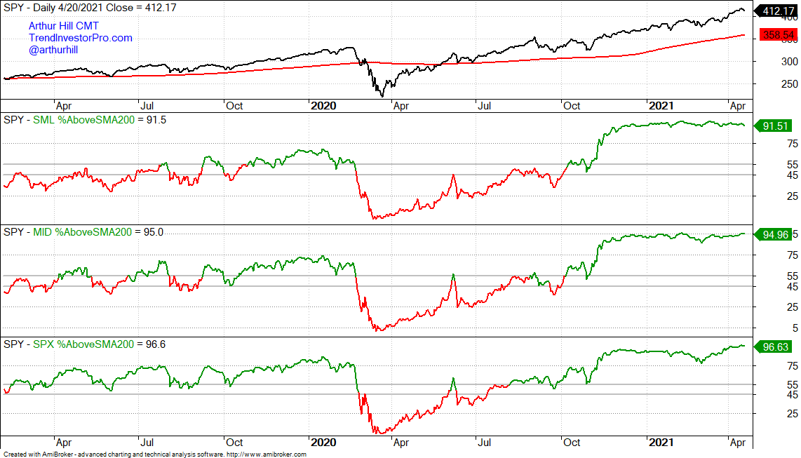
Now let’s look at the percentage of stocks above the 50 and 200 day SMAs for the S&P 500, S&P MidCap 400 and S&P SmallCap 600. Over 90% of stocks in each index are above their 200-day SMAs and this shows broad strength within each group. The gray lines are set at 55% (bullish threshold) and 45% (bearish threshold). Notice how the lines turn green (bullish) after a cross above 55% and red (bearish) after a cross below 45%.
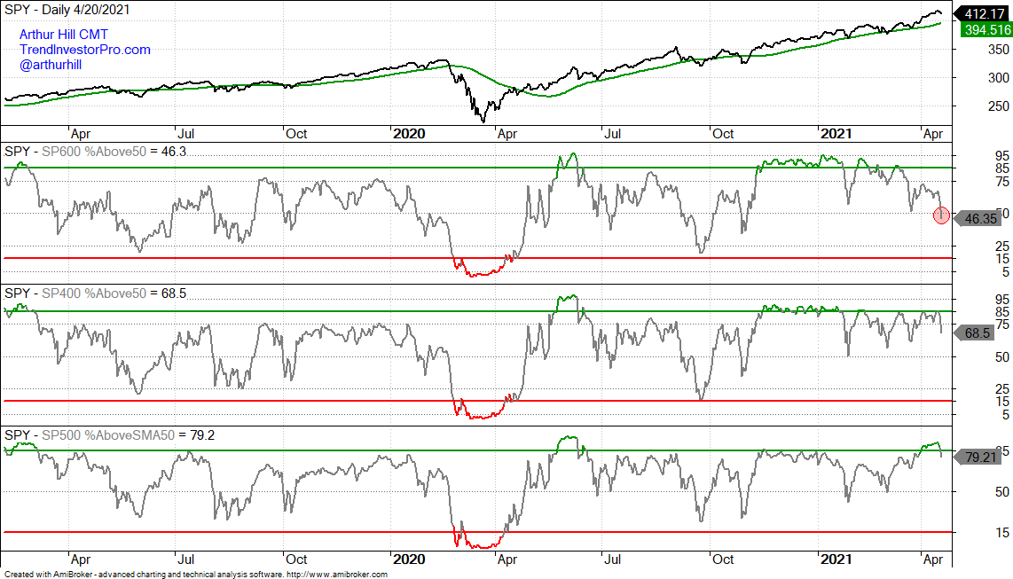
The next chart shows the percentage of stocks above the 50-day SMA for all three indexes. Notice that $SML %Above 50-day SMA dipped below 50% for the first time since November 2nd (red circle). Also notice that it is the only one below 50%. $MID %Above 50-day SMA is at 68.65% and $SPX %Above 50-day SMA is at 79.21%. There is clearly more weakness and selling pressure within the S&P SmallCap 600.
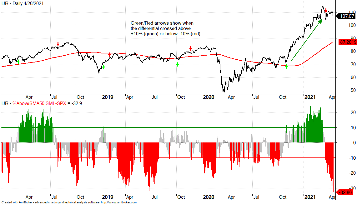
Small-Cap Breadth Relative to Large-Cap Breadth
Now let’s compare small-caps and large-caps looking at some differentials. The top window shows the S&P SmallCap 600 SPDR (IJR) for reference. The lower window shows $SML %Above 50-day less $SPX %Above 50-day with the bullish/bearish thresholds at +10%/-10%. This indicator measures small-cap breadth relative to large-cap breadth. The green/red arrows show when the indicator crossed +10% or -10%. The differential exceeded +10% on October 29th and this is when small-cap performance accelerated (green line-arrow). More recently, the differential moved below -10% on March 23rd and continued lower with a move below -30% this week. Some may consider this “oversold”, but it shows a dramatic shift away from small-caps and points to a correction or at least some underperformance.
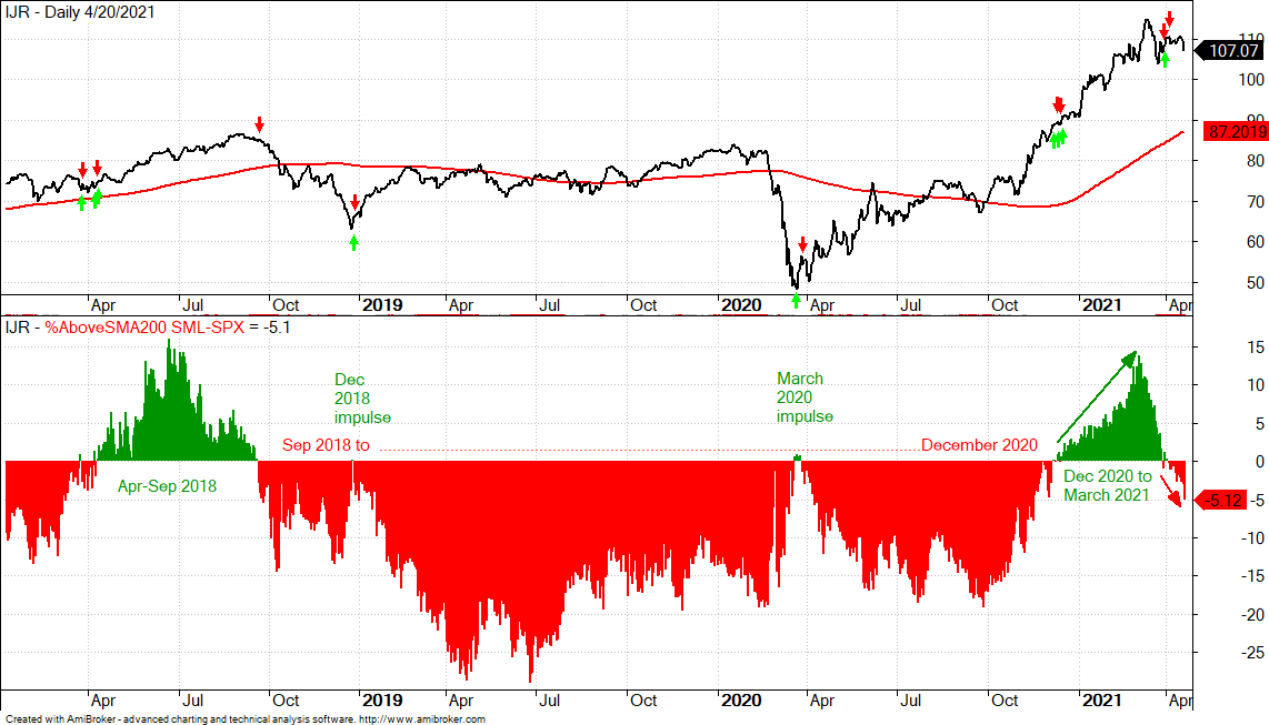
On the next chart, the lower window shows $SML %Above 200-day less $SPX %Above 200-day. The bullish/bearish threshold is simply the zero line because the 200-day is a long-term moving average. The green/red arrows on the IJR chart show when the indicator turned positive (green) and negative (red). Notice that there were positive readings for a few days at the December 2018 and March 2020 bottoms. Suddenly, more small-cap stocks were above their 200-day SMAs than large-caps. This initial impulse did not last long, but it did show a dramatic change and mark two bottoms.
The indicator was mostly green from April to mid September 2018 and IJR moved higher. The deep move into the red foreshadowed the sharp decline from late September to late December 2018. Except for the two blips mentioned above, the indicator was red from late September 2018 until December 2020. It then turned green and exceeded +10% in February-March. The indicator is now red and this means more small-caps are below their 200-day SMAs than large-caps. Small-caps show relative weakness and should be avoided for a while.